googlee7ea825f63edb3f6.html
Showing posts with label Impressionism. Show all posts

Saturday, 1 November 2025

‘RADICAL HARMONY: HELENE KROLLER-MULLER’S NEO-IMPRESSIONISTS’

National Gallery, London


Don’t Diss The Dots!

1886 proved something of a pivotal year for Modernism, witnessing the final Impressionist exhibition and the first showing of the Neo-Impressionists. Who brought in a whole new look, thanks to their originator Georges Seurat.

Impressionism had taken up the then-novel practice of mixing paint ‘wet’ on canvas, giving it an immediate and ‘unfinished’ look. While Seurat precisely painted adjacent dots of contrary colours, which would mix together in the eye, creating a shimmering effect. You can see shows enlargements which demonstrate the workings here. This came to be called Pointilism by critics, though he used Divisionism. (He also suggested Chromoluminarism. For some reason that didn’t catch on.) See for example his ’Port-En-Bessin, a Sunday’ (1888, below.)


And Divisionism proved divisive, in more than name. If it was pilloried by contemporary critics, those were much the some fools who’d done the same to Impressionism. Perhaps more significantly Monet and Renoir refused to exhibit with Seurat. (Though Pissarro not only took up the new look, he helped organise that 1886 show.)

And modern critics, who of course now fawn over Impressionism, seem similarly keen to diss the dots. They slagged the show, criticising not just the participants but the style itself. Perhaps best summed up by the Telegraph headline ’The National Gallery Succumbs to the Plague of Pointilism’. 

With crowds un-following in their wake, attendance was significantly under either the Impressionist shows held here or the National’s recent Van Gogh blockbuster, apparently their most successful show ever. Despite both being part of the same continuum.

Let’s take each group in turn.

Contemporary critics called it “the death of painting”. And, in fairness, you can see what they’re saying. The effect is entirely different to Impressionism. Compositions are not casual-seeming but harmonious, forms not impressionistic but clear-cut, bold in outline even as they flicker in-between those lines. Impressionism made everything seem in constant motion. Here, even things which are in motion no longer look it. Go back to the fluttering flags above. They’re not caught in flight but frozen in place, like a sculpture of a flag. Seurat’s even added a painted frame around the edge of the work, doubling down on the formalism.

Further, some see the artist’s touch as the basis of art, studying his line the way a graphologist would handwriting. Against which Divisionism can seem a near-mechanical process. The works look clean, smoothed over and ‘posterised’. (It’s also hard for us not to think of dot-matrix printing, though that came decades later.) And on the back of this ‘artist’s hand’ fixation comes the snobbery about poster design and reproductive art.


It should be said that Seurat is not represented here by any of his major works. (’Bathers at Asieres’ is in the permanent collection, but wasn’t moved for this show.) His ’Le Chahut’ (1889/90, above) is clearly intended as a centrepiece, given a room almost to itself. And this was part-inspired by concert posters.

Here the integrity of pictorial space is already starting to break down, everything becoming design elements rather than objects in themselves, to a degree that’s almost collage-like. The dancers are reduced to a mechanical line, echoed by the stem of the double bass. Things are compressed together, if this was actual pictorial space those dancers would be kicking the orchestra half the time. The audience seem to be seated behind everyone, but then who’s that leering hatted figure bottom right? Are those flower motifs attached to a wall, or floating in the air? These are all things you’d barely stop to question in a poster image.

We are of course going to ask what’s wrong with that. Colour litho posters were at this point a relatively recent phenomenon, so must have seemed fresh and exciting. Seurat’s contemporary Toulouse-Lautrec regularly moved between paintings and posters. But we should add that to ‘go poster’ to this degree is unusual for Seurat. In fact its quite possibly the only work in the whole show to do this.

Modern critics, shrewdly noticing this did not in fact turn out to be the end of painting, took another tack. Some separated Seurat from his followers, as if it was a one-man movement plus some also-rans. The main selling point for this is his early death, in 1891, at just 31. Modernism borrowed from Romanticism the lustre of the genius-artist who died young. Though if you’re thinking of taking that seriously, know its chief proponent was Jonathan Jones.

But more commonly Divisionism was portrayed as but a waystation in art history, these dot painting actually just a dash, a line linking art’s great nodes of Impressionism and Fauvism. Seen this way, its stillness is an uncanny valley which had to be descended into, in order to climb back out of and reach the next peak.


Vincent Van Gogh might seem to epitomise this. He briefly followed Divisionism, but by the time of ’The Sower’ (1886, above), those sharp dots have grown, become visible, extended into dashes and swirls. Which leads to pretty much the opposite effect. Rather than evoke stillness the work seems to deny it’s existence, pulsing throughout with life.

Monet’s guru, as much as he had one, was Eugène Boudin, who introduced him to painting en plein air. While Seurat read the scientific writings of Michel Eugene Chevreul. Monet painted quickly, trying to capture changing light conditions. Seurat made over a hundred preparatory drawings for the famous ’La Grande Jette’ (also not in show). Notably, the first thing we’re shown here is not a painting but a colour wheel. (The Wikipedia article linked to above contains a simplified version of it.) Divisionism was based not on observation of life but a theory of colour, one not especially found in the wild.

So if Monet was (in the well-known quote) “just an eye”, was Seurat just a brain?

Nobert Lynton said of him: “every aspect of his paintings was severely controlled, proclaiming their basis in thought and knowledge.” He said of himself: “Some say they see Poetry in my paintings; I see only science.” So was the whole thing dry and cerebral, a technical exercise? The Modernist movement which lived up to its formalist stereotype?

Helene Kroller-Muller, wondering where she comes into this? She had enough taste to be the only art collector to buy a Van Gogh during his life. But from there she went on to collect not Fauvism but Neo-Impressionism. And she countered that Seurat "sees the view of the harbour with its boats as the emotion of a religious-poetic disposition.”

And, kids, maybe you’re both right! A poetic disposition is not incompatible with science. In fact Impressionism had its own associations with science, including new investigations into the workings of sight, if not to the same degree.

Impressionism was a brilliant, often literally brilliant, way of doing something necessary. It had begun art again at a time someone needed to, and had done it by going back to the most basic questions - what do we actually see?, how can that be captured on a canvas? Yet imitation of life, it was a good starting-point but too slender a place to settle. Neo-Impressionism needed to move past those questions.

And everything about Impressionism as an art style stemmed from that central purpose - it evoked verisimilitude, immediacy. We should ask a similar question about Neo-Impressionism, not why wasn’t it Impressionism but what was it? Or more accurately, what was it for? Even if it wasn’t made with a purpose in mind it has to find one, or be just a style, a suit of clothes with no wearer.

The show suggests three answers to this. Let’s take each in turn.

How Radical Met Harmony

After a first room in which human figures are either absent or ancillary to the landscapes, suddenly they’re everywhere. And that’s a clue to what’s coming - in fact a pretty hefty one.

Because the show’s first answer might not have been on your Bingo card - its Anarchist Communism. Particularly bamboozling if your default notion of politically charged art is Dadaism.

We’re told “their style went hand-in-hand with radical political ideas… depicting the struggles faced by the working class, in reaction against the industrial age.” Paul Signac is quoted: “justice in society, harmony in art: same thing.” They effectively titled the show in its honour, and it dominated much of the discussion.


Georges Lemmen’s ’Factories On the Thames’ (c. 1892, above) isn’t of beaches or haystacks but… well, the title gives it away. And the change of subject matter includes a change in style. Unlike the precision of Seurat, the smoke leads the eye but also the buildings fade from view in the haze. It looks, in mood if not style, more Whistler. And this mood undermines the argument being made for it. This etherial, it may well be of factories but they’re seen as shining spires, a dreamscape not a workplace.


Jan Toorop’s ’After the Strike’ (c.1888/90, above) is more clearly political. But while Lemmen looks across to Whistler, this looks back to the Realism of Jean-Francois Millet. (The subject of a small show elsewhere in the National, which overlapped with this one.) And truth to tell those heavy-load-bearing bodies vie with the lightness of Divisionism, it would have worked better in Millet’s style.


So we have a work that’s good but not at all political, followed by one that was political but not terribly good. More happily, Maximilian Luce’s ’The Iron Foundry’ (1899, above) manages both. But again it looks elsewhere, only this time forwards - the muscularised, heroic workmen of Socialist Realism. The light of the foundry back-lights them into semi-silhouettes, foregrounded but de-individualised. Significantly, this isn’t still but dramatic The workers form shapes which frame and harness the explosive burst of the foundry, creating diagonals to left and right before central pillars. It’s a strong, affecting work. But to make its point its composition must overrule its style, its Divisionist in a formal sense only.

The show also concedes not everyone signed up for the radicalism. Luce was even arrested in 1894, in a round-up after the French President was assassinated. Toorop and Signac were definite card-carriers, but Anna Boch not. (It doesn’t mention Lemmen.) While Seurat, the great founder, had Socialist sympathies but there’s no reason to think him an Anarchist Communist. We’re told Van Rysselberghe was a key figure in spreading the new art to the Netherlands. But the show makes no mention of him having any particular political convictions, not could I find any on-line. Making the Anarchist Communism seem a little optional.

So why the stress on it? Curators always pounce on connections between art and radical politics, not because it seems so relevant but precisely because it doesn’t. With no modern mass Anarchist Communist movement to contend with, it seems equally enticing and quaint. But here, it may also be in order to counter those notions about this art being dry, clinical and soul-less. Actually, they respond, it was a call to arms!

These times certainly were politically tumultuous. For example, May Day was founded in 1890, commemorating Chicago workers murdered by the State in ’86. In France, 1892 to ’94 was known as The Era Of Attacks

Naturally enough, people thought that the radical new art and radical new politics must go together. In fact, they didn’t. Even if some tried to straddle the two. Despite what Signac says, radical and harmony didn’t go together like a horse and carriage. The times pressed them up against one another, a shotgun marriage. Divisionism’s true calling lay elsewhere.

Painting The Spaces Between


In something of a dimensional leap, we jump from factory floors to interiors of bourgeois life. Figures which are, in the show’s words, “presented as isolated, occupying a world in which geometry and lines of force govern their movements.” Signac’s ’The Dining Room’ (1886/7, above) not only creates an impasse-like space between the two main figures, but adds a servant as a barrier between them.

While their poses might be stiff, this effect comes mostly from the style. They’re as fixed as the furnishings, in a world that looks lifeless. Not conveyed in this thumbnail, but the effect’s compounded by the size of the work, a much greater scale than would normally be granted for such an intimate subject. There’s enough space to get lost in. 
It’s like the old joke that money gives you misery in comfort.


Van Rysselberghe’s ’In July, before Noon’ (1890, above) conversely is an outdoor scene under dappled sunlight. Monet painted many such scenes. Yet here there’s an unease to it. All faces are turned away, both from us and from each other, despite there being five figures. A device we’ve seen used by Walter Sickert, slightly later. There’s a large area of empty space just beyond them, framed in such a way the eye is pulled towards it.

All this may be making a virtue out of a necessity - if you painted in this way nothing could be made to move, so you evoked the stillness like you’d meant to. But two things - first, Signac’s work was painted only two years after he had embraced the new style. If it was a fix he arrived at it remarkably quickly. Besides, a virtue is a virtue.

More pertinently, this was art going with a social trend, only this time one the art was well-suited to convey. This was the Fin de Siele era, and as Wikipedia puts it “cultural hallmarks that were recognized as prominent in the 1880s and 1890s includ[ed] ennui, cynicism, pessimism, and a widespread belief that civilization leads to decadence.”

As we’ve seen, this was a time of anarchists battling authoritarians, with the body count to show it. But it was simultaneously an era of disturbed spirits, of psychic unease, of people no longer knowing each other or even themselves. Eras do not have just one nature, any more than people do.

All Went White

Neo-Impressionism, as we’ve seen, was moving beyond the task of capturing external reality. Emile Verhaeren shrewdly said Seurat’s work was composed of “tones and lines for which reality serves only as a pretext.” And this led to works where, again using the show’s words, the “world of appearances” is only a means to access the ineffable, to convey “absence within an image”. Those dots become like ellipses, what they lead to is space. There’s a kind of serene sublime.


For example Van Rysselberghe’s ’Coastal Scene’ (c.1892) is a way of framing that central area of white. The vertical sticks in the water are something of a compositional master-stroke, offsetting the whiteness without over-balancing it. We know that if we went towards it, it would retreat. It’s insubstantial, ungraspable. And this sense, of it being beyond physical space, is the point.


Johan Thorn Prikker’s ’Basse Hermale, Sun at Noon’ (1904) is not a painting but composed of undulating strokes of chalk. It’s not just minimal, there’s denser marks behind the haystacks than used for them. As with Van Rysselberge, the central area is of space.

And this is where Dualism inherently led. By minimising fidelity to the real world it banished its clutter, its messiness, its jagged corners - to create something harmonious.

It’s bizarre to think that those Van Rysselberge’s were painted two years apart. This seascape serenity is something else entirely to all that to bourgeois ennui. One sees space positively, a clearing-out which rids us of quotidian baggage, the other negatively, as separation, the gulf that widens between us.


But what lends itself to serenity as easily offers melancholy. Henry Van de Velde’s ’Twilight’ (1889, above) has a “profound melancholy”. You feel this liminal space cannot be dawn but must be dusk. Those three thick bands of colour, running the width of the painting, suggest a barrier more than an invitation. The thin trees play the same offsetting role as Van Rysselberghe’s sticks.

And melancholy may not be so far from serenity. In both, the self is being left behind. And Seurat’s ‘Suburb’ (1882/3, not in show) could be read either way up, depending on the viewer’s disposition. Dualism proved dualistic, go figure!

But What Comes After New?

Signac, there’s no doubt, strongly influence Matisse and Derain’s Fauvism, even if they ditched his dots. But the show looks further, claiming by “untethering the picture form its dependence on subject matter” it paved the way for Abstraction. Signac gave his pictures Opus numbers, suggesting an equivalence to musical composition, a practice which was later taken up by Kandinsky. This was especially true of the seascapes, of which there’s no shortage. Toorop’s are particularly semi-abstract, a series of horizontal bands of colour, such as ’Shell Gatherers On the Beach’ (1891, below).


We could, if we wished, see abstraction as the sea, a field of formless colour. We’ve got close to it here, but are still stuck on the shore, looking out. We just need to make that final leap.

But here the show’s essentially repeating a version of its own critics argument, making Neo-Impressionism into a way-station. Yeah, it was fresh for a while, then this other thing showed up which was fresher. If you reduce Modernism to an evolution line, the significant thing about each ism becomes that it led neatly to the next, like a product upgrade. And the whole system becomes hermetic, talking only to itself.

We should ask instead - what was significant about the movement in and of itself? What does a painting of the 1890s tell us about the 1890s? And how do we relate it it from here?

Which, we might hope, we’ve begun to…

Kroller-Muller’s collection is based in a museum which can be seen on-line here.

(NB This is unlikely to mean a return to regular blogging.)

Saturday, 4 March 2023

‘CEZANNE’

Tate Modern, London


”I paint as I see, as I feel. They also feel and see like me, but they don’t dare. I dare.”
-Cezanne

The Dissident Impressionist

When a young man, Cezanne was told by his banker father to abandon his foolish art aspirations and start studying for a respectable career in law. At the same time his best buddy, the radical writer Emile Zola, suggested he join him in Paris. Now, we know how this sort of thing goes. We are already suspecting that it is not eleven rooms of neatly ordered legal papers which lie ahead of us. And indeed, in 1861, at the auspicious age of twenty-one, he did indeed leave his home in Aix-en-Provence for Paris and Zola.

But ultimately, he chose not to choose. Never what you would call a team player, after less than a year he’d left Paris too, and split pretty much the rest of his life between the two places. This cemented him as intellectually as well as literally peripatetic, self-isolating, beholden to no other. He was a paradoxical combination of cantankerous and curmudgeonly, wilfully argumentative while at the same time a recluse who shunned, if not the ways of men, the world of art as much as he could. He fell in with the Impressionists early, exhibiting at their very first group show in 1874. But from then he only appeared in one further. (The third, from a total eight.)


’Rooftops In Paris’ (c.1882, above) neatly demonstrates this by giving up nearly half of the frame to a single angled roof. It’s less of an element in the picture than a barrier placed in front of it, suggesting that even when the artist was in Paris he was never really in Paris.

Early Cezanne, it’s easy to forget, looks almost absolutely unlike his mature style, with paint often slathered on with a palette knife. The show describes this era as “dark, brooding, violent.” (And suggests he was at this point most influenced by Zola’s writing.) He called it Couillarde, which critics and shows take delight in explaining means “ballsy”. Much of it, it’s true, is juvenalia. In fact it’s often literally juvenile, hyper-heightened dramatics - as if he’d gone through a teenage Goth phase. The show seems embarrassed by these, giving only a couple of examples. But in truth, there’s good stuff in among them.


’Sugar Bowl, Pears and Blue Cup’ (1865/70, above) is an example of that rare genre, the ballsy still life. There’s a collision between form and content which makes it involving. The objects are painted in such an intense way, then set against a near-black background, that it feels like rather than simply there they’re asserting their presence.

Landscape In Doubt


From 1870, Cezanne was living at least part of the year in L’Estaque, on the south coast. And quite frequently painting nature scenes en plein air, just like a regular Impressionist. But take 'The Bay of Marseille Seen from L’Estaque’ (c.1895, above) and mentally hang it next to a Monet landscape. In fact why don’t we pick the Monet seascape, the one that gave the school its name, 'Impression, Sunrise'? They don’t look like brothers in arms, they look worlds apart.

First, Monet’s vivid use of colour, so integral to what we now think of as Impressionism, is replaced by something much more muted. (On-line, Cezanne’s paintings are often artificially brightened, seen as an error that needs correcting.) More crucially, as we’ve already seen, Monet’s subject wasn’t objects so much as moments, his method to capture fleeting changes of light and weather. To Cezanne, such things were just an encumbrance. Not only does he give us no clues as to time of day, we can rarely guess what season it is. (It’s often suggested he preferred Provence because of its lesser seasonal variation.)

His work is more delineating, more dispassionate, even clinical. There’s no particular focus of interest, the whole view faithfully depicted in paint, with no more favour than a map-maker would show. Not a record of a fleeting moment, more of a summary. Unlike his view of Paris shown above, there’s no formal barrier between us and the landscape. But it still feel distanced from us, an object for examination. We know that Monet painted rapidly, and Cezanne deliberatively. He used small, diagonal ’constructive’ brush strokes, much more regular and even than Monet’s dabs. Look at some of those spanning dates given behind his paintings’ titles. He could hang on to works for years, and died with many still officially finished.

Also, Cezanne’s father may have issued plentiful orders but also left his son privately wealthy. So he had no financial incentive to be as productive as Monet, something he took full advantage of. Richard Verdi states “only thirteen works of Cezanne’s maturity were accorded the distinction” of his signing them. (Disclaimer: Cezanne was closest to Pissarro, whose work is less distinct from his. But Monet is the go-to Impressionist for most.)

Two terms almost impossible to avoid using over Impressionist art are verite and joie de vivre. They’d paint flaneurs perambulating around Paris, with the sense that they could at any time swap places with the figures in the frame. While with Cezanne there are no figures in the frame to be bothered by swapping with. Not even those diminutive dash figures so often used to convey scale.


And this sense of distance should be seen not as any kind of deficiency but what Cezanne does. ’Turn In the Road’ (c. 1881, above) feels less effective for being more of a close-in view, almost like its a section of a larger canvas which has been blown up. (And note even here there’s not a soul on that road.)


Though I’ve started off with a view which is very Cezanne, they’re not all quite as distanced. ’The Sea At L’Estaque Behind Trees’ (1878/9) has a Parisian-like barrier before us. But those trees transform what would otherwise be quite a similar work to ’Bay of Marseilles’. By inserting themselves between us and the view, they give more of a sense of composition and involvement. They create a contract between their twisting and and the rigid geometry of those roofs and (especially) that jutting chimney.


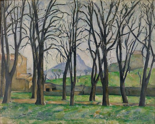
While ’Chestnut Trees At Jas du Bouffan’ (1885/6, above) also uses trees to create compositional order. It’s not just their even spacing. In the lower half, the verticals of the trunks are echoed in the other straight lines of the farmhouse and wall, if at times at right angles to them. But the contoured mountain appears just as the trees break into branches, with the result the trees at once divide and unify the composition. While, from this perspective, the rugged mountain is the same heigh as the two buildings, creating another compare and contrast.

The mountain is Mont Sainte-Victoire. Cezanne painted twenty-nine portraits of his significant other, Marie-Hortense Fiquet. (One is coming up.) A high number, until you consider he painted that mountain no less than eighty times! He read books on it’s geology, the way a portraitist might get to know the backstory of his subject, and in 1902 even moved his studio nearer to it. What was it’s fascination for him?


The later work ’Mont Sainte-Victoire’ (1902/6, above) may answer that. It’s all something of a blur, particularly the foreground. But it’s not like Cezanne came across a blurry image, from a moving train or on a hazy day. This is more like a rough sketch, where lines are tentatively filled in then shifted, then transposed to the painting exactly as they are. Or more like several rough sketches, all combined into one. It’s not the result of a process, it’s the record of a working out.

What could be more of an unchanging fact than a mighty mountain, dominating the horizon? But how well do we truly see it? Is it even possible to capture it on canvas? Isn’t the more honest method to record our continuing failed attempts? In this way the mountain became his white whale.

The show describes his approach to painting “as a process and investigation, where uncertainty plays an integral role.” Robert Hughes is more poetic: “Cezanne takes you backstage...The Renaissance admired an artist's certainty about what he saw. But with Cezanne...the statement ’This is what I see,’ becomes replaced by a question: ’Is this what I see?’ You share his hesitations about the position of a tree or a branch; or the final shape of Mont Ste-Victoire, and the trees in front of it. Relativity is all. Doubt becomes part of the painter's subject.” Cezanne’s method is not about dazzling you with sights, but whispering doubts in your ear.

An Apple For Art History

You can read everywhere about how Cezanne took to still lifes in order to upset the traditional hierarchy of the arts. And there’s little doubt he exulted in that. A famous quote, stuck up on the wall in this show, is “with an apple I will astonish Paris!” But the crucial point is why they were held in so low regard. Which was because they gave little opportunity for either narrative or symbolism, widely regarded as art’s positive and enduring qualities.


With ’The Basket of Apples’ (c. 1893) the basket isn’t just upturned, it’s angle is emphasised by being set against the upright bottle. Added to the white cloth pushed so far in the foreground, and the effect is as if those apples are tumbling out at us. In fact, this ‘still life’ seems a lot more dynamic than may of his landscapes!

Though there’s other reasons. Richard Verdi is probably right to say still lifes partly appealed because in the studio he could control all conditions. (Though even then he could take so long the fruit would start to rot.)

I overheard one punter asking what the apples represented. Which is the wrong question squared. Cezanne is not interested in the apples as apples. To him, the fruit, the bowl, the bottle, all are mere props with which to create form. He’d return not just to these themes but the very same objects, repeatedly, until familiarity stops us noticing them for their own sake, reduces them to elements in a composition. (Picasso and Braque played a similar trick with their short-list of objects used in Cubism.)

And so two contradictory-sounding things are true at once. There’s no great difference between the way he looks at his stiff lifes and his landscapes, they’re both objects of contemplation from which the artist is distanced. Mountains and baskets, bottles and chimneys, apples and cottages, they take on an equivalence. And also, the essence of Cezanne lies in the still lifes. (See up top how they make it into the poster image.)


Even without the title, it’d be clear what the main figure was in ’Still Life With Plaster Cupid’ (c. 1894, above). But here the mini-statue isn’t treated as one more decorative element, as if the pitcher had the week off, the composition is centred around it as if a portrait. Which seems something of a statement, if not an active taunt, rubbing the viewer’s nose in the fact these are not figurative works.

But what we really need to talk about is that table. Nothing has been slipped in your drink, it actually looks so sloped and bent. Then has one solitary apple placed at the end of it, as if atop a slide which it is somehow not rolling down. Yet the foreground is so accurately painted we take a while to notice, we instinctively trust the artist to portray pictorial space ‘correctly’. There’s the second figure at the end, which we come to realise isn’t another statue but a painting within the painting. Then there’s the second frame on the left, forcing us to ask what there is painting-within-painting and what is still life object?

Cezanne does this sort of thing all the time. And he does it to mess with you. To play games with you, to undermine your confidences, to slyly undermine the rules of art you normally take as read. (And the degree to which he took personal delight in being confounding shouldn’t be underestimated.)

One Foot In Arcadia

It’s curious that Cezanne was the Impressionist who most pioneered Post-Impressionism, yet also the one most indebted to Classicism. But to him the timelessness of Classicism, so at odds with the Impressionist drive to capture the moment, appealed. Along with its sense of overarching order. (Which, with typical perversity, he at once pursued and questioned.) This is most evident in his series of Bather paintings, which include the largest work in the show - ’Bathers (Les Grandes Baigneuses)’ (1894/1905, below).


With everything so idealised, with such disinterest in evoking a real place, the doubting Cezanne essentially disappears. For once, we know just what we’re looking at. And the ditching of ‘difficulty’ seems deliberate, for these were the works which Cezanne wanted to be remembered by. Verdi says they were “clearly intended as his artistic testament.”

The trouble is, it’s not good. Not at all.

You can see the thinking. Bathers lack the clothing or other trappings which would tie them to one time period. So they make the ideal subject to combine Classical and Modern themes. But the figures don’t convince as figures. The seated one on the left looks like a sack of flour, strangely sporting a head. Yet neither do they reduce neatly to elements in a composition, the human equivalent of those bottles and apples. Cezanne has one foot in Provence, the other in Arcadia. And it leads to an awkward stance.

Yet these works were popular, including among other artists. Matisse bought one when he could little afford it, and made his credo “if Cezanne is right, I am right.” Now Picasso’s inheritance from Cezanne seems clear enough. There’s twin tracks of it; first Cubism took a similar analytically questioning approach to subjects, and later he took up a similar Neo-Classicism. Matisse’s debt seems harder to discern. Even more than Monet, he was known for his rich and vibrant colours. Colours he delighted to find in the Mediterranean, colours Cezanne stood in front of and disregarded.

But squint at it and it all comes into focus. Cezanne has aligned his figures with the landscape. Look for example at that leftmost angle. Which has it’e echo in Matisse’s ‘Dance’ (1910), where the figures are shown in such abandon they have almost lost individuation, while their surroundings reduced to two simple colour blocks. ’Bathers’ occupies an interchange between more regular depictions and Matisse. Perhaps at the time a necessary one. Yet by the time we get to Matisse it’s just a stepping stone across a river, which we’ve no need to step back on after we’ve crossed. As ever, the peril of being ahead of your time is that time won’t keep you there forever.


The better works here are the ones Cezanne has less grandiose plans for, which he probably regarded as ancillary, such as ’Boy Resting’ (c. 1890, above). The casual pose suggests this figure could get up and walk away, as soon as he chose to.

Friends, Relations, Gardeners

So does this show that Cezanne had a problem with the figure, a stumbling block he was better of circumventing? Nope. In fact, nothing about him could ever be so simple. In fact he could excel at portraits.


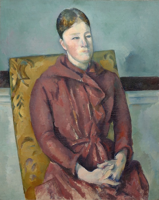
’Madame Cezanne In a Yellow Chair’ (18880/90, above) is of Marie-Hortense, as promised earlier. It’s hardly an ostentatious or attention-grabbing work, but a supremely effective one. Her face is more iconic than ‘realist’, yet perhaps for that reason conveys a great sense of self. Accounts usually focus on her inscrutability, those narrow features enhanced by being set in the highly rounded head, the eyes looking off. But that inscrutability can only come through her sense of presence. Much as with his other subjects, he returned to the same few sitters - family, friends or workers on his father’s estate.


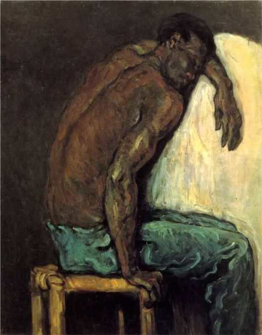
’Scipio’ (1866/8, above) is portrait enough to be named after its subject. But it seems pitched to occupy the impasse between portrait and narrative painting, with it’s figure largely turned away from us. With the emphasis on his physicality yet stillness, the mood is one of weary rest. And of course at this time black people would have been very much associated with physicality. The white… well, whatever that white thing is that he’s leaning on seems there to emphasise his blackness.

So is this, as has been suggested, an anti-slavery work? Perhaps. But we should forever be cautious about reading into art what we want to see. Despite his association with the radicals Zola and Pissarro he was mostly silent on political questions, allowing us to project our wants onto him.

Sombre Still Life

By the late Nineteenth century, Cezanne was becoming increasingly plagued by ill health. At which point many of the themes of his early years return, but with a twist. The young man’s thrilling sense of dalliance with death is replaced by an old man’s sense of grim inevitability. What was brooding and violent becomes sombre.


Compare 'Still Life With Apples and Peaches’ (c. 1905, above) to the earlier ’Sugar Bowl, Pears and Blue Cup’. The colour scheme, the paint style, all is less in your face. And yet while it’s closer in composition to his mature still lifes, it seems nearer in mood to that early work. It’s as if all the elements are the same as he’s been using, save for Cezanne himself, whose older eyes now see in more sombre colours. The contained white of the cloth seems there just to set those colours off.

An Artist For Artists

As we’ve seen both Matisse and Picasso owned works by Cezanne. A list to which we should add Monet… yes the Monet we’ve sent so much time contrasting him from. And he continued to appeal to later generations of artists, including Gauguin and Van Gogh, and - some time later - Henry Moore. As the show says, he’s an artist’s artist. And you can see why. Some artists close off a direction simply by occupying it, straddling it until others are forced to detour around. Cezanne, who always posed questions and foregrounded problems, was the opposite of that.

Yet, whenever anyone is called an artist’s artist or musician’s musician I’m tempted to ask - all very well, but what about the rest of us?

Cezanne himself said he was influenced by the Realists. Who, as mentioned before now, are normally written out of popular art history, their existence challenging the popular myth the Impressionists arose from nowhere. (The indicia here has a particularly absurd sentence claiming art had been unchanged the past four centuries before Impressionism.)

True, the art isn’t the same, but the tone is. There’s a dourness to it, a sense of thrusting the truth in the publics’ face and demanding they look. Their truth was (more or less) political, while Cezanne’s is that we cannot claim to know the truth, but the effect is the same. Aesthetic appeal is seen as a distraction, painting exists to prove a point. A sign you can tap, only done in oil.

And this line continues. You can see the roots of Cubism in Cezanne, clear as day. It’s already budding in those neat, angled little brush strokes of his. (And Braque, Picasso’s co-conspirator in Cubism, praised Cezanne just as much.) Which, of all the well-known Modernist movements, was the most formalist, most concerned with questions around painting, the conventions used to convey objects, and so on.

And Modernism was concerned with such questions, inherently so. Anything that wasn’t simply wasn’t Modernism, by definition. Yet Modernism was also concerned with the modern condition, and how changed times might be reflected in changed art. Impressionism was deeply concerned with this, even if that’s part-obscured by hindsight. It’s central paradox was to create paintings which were unambiguously painted, with brush strokes entirely recognisable as brush strokes, which were still of something. Cezanne’s paintings are primarily paintings, his primary subject art and representation.

And without this second half of the equation Modernism soon becomes dry, hermetic and uninvolving. The reclusive Cezanne seems pitched on the edge of this abyss, falling in, pulling himself out, falling back in again. And it’s consequently almost impossible for those of us who aren’t artists not to have a love/hate relationship to his work. Art should interest the viewer, yes. It should be more than merely decorative. But it should also appeal.

(Just in case anyone’s wondering, why does his formalism bother me more than Giacometti’s? After all, both are about constantly re-positing the most essential questions of art. And I’m not sure I’ve much of an answer. Perhaps because Giacometti’s white whale was the human figure, not an apple or a distant mountain. So there’s always a subliminal association between his capturing the figure and getting to know the person.)

Yet Cezanne fits well into art histories, particularly those which reduce to simple flow charts. An original Impressionist who went on effectively found Post-Impressionism? An artist particularly interested in art theory? Those who see their job as telling us about art are likely to be telling us about Cezanne before long. This prestigious Tate show is thick with punters. But had his name slipped from art history and now needed re-inserting, if this show was the first people were seeing of him, would he then prove so easy a sell? Like Cezanne himself before a subject, I remain skeptical.


Saturday, 10 September 2022

‘WALTER SICKERT’

Tate Britain, London


”The plastic arts are gross arts, dealing joyously with gross material facts”

- Sickert

Confining Interiors

“The first major retrospective of Sickert at Tate in over 60 years.” 
So tell us, Tate Britain, why has it taken you this long to catch up? While you’ve resorted to staging shows for those with the most tangential connection to the UK, here’s a guy who your own biography states was “one of the most influential figures in twentieth-century British art.” 

In 1886, he became a founder member of the New English Art Club who tried to shake British art out of its provincialism. Then, from 1911, the more-modern-still Camden Town group, who usually met in his studio. Which (comics analogy alert) is a little like being in both versions of the Justice League.

Of course Modernism was then very much a continental import, principally via French Impressionism. Sickert himself was a Francophile who frequently lived there, to the extent the Pallant House gallery could devote an exhibition to his time in Dieppe.

And Sickert could not have done what he did without Impressionism, in 1889 even exhibiting in a ‘London Impressionists’ show. But rather than become some second-rate copyist, he took his source and twisted it almost beyond recognition. (NB What’s said next about Impressionism will be broad generalisations at best. For the fuller story go here.)

Perhaps most obviously, Impressionism had a fascination with the light, to the extent some have described the movement as an attempt to paint light. And so became renowned for its shimmering and radiant colours. Whereas Sickert has, to quote the show, an “auburn, brown and black palette”. But more than that, he moved everything into gloom.

It’s hard to show this because so many internet images are ‘corrected’ (possibly auto-corrected) from what he painted, to artificially brighten them. But here’s ’The End of the Act, or The Acting Manager’ (c. 1885/6, below).


And this isn’t like Caravaggio, where light is used to highlight certain aspects set against a dark background, like theatre spotlights. Seemingly vital information is consigned to the gloom, such as the figure’s expression, while one hand is lit arbitrarily. There’s that point where you enter a darkened room, just before your eyes adjust, which Sickert seems to be homing in on. There’s a sense of uncertainty and menace that comes with that inscrutability, as if everything might collapse back into that miasma of murk.


It’s true he did start to incorporate more colour later. (To, we’re told, his agent’s delight.) But in a very particular way. Take ’The Red Shop, or The October Sun’ (c. 1888, above). The bright orange should look highlighted against the sombre browns and greys, like Eisenstein’s flying red flag. Yet it doesn’t *feel* like that to look at it. Perhaps it’s simply that orange is not that much a chromatic contract to brown. But it looks like the visual equivalent of quoting ironically; “yeah, that was sooo orange!” (I have, incidentally, no idea why the title has red in it!) Also, remember that reference to October…


The later ’Baccarat’ (1920, above) has fuller colours. But they look more lurid than radiant, less stimulation and more an assault on the eye. In particular those sharp minty greens and blue-whites of the light shades convey the sting of electric light.


Furthermore, Impressionists painted ‘wet-on-wet’, blending the colours on the canvas, creating that shimmering effect. Sickert not only audaciously pared back his palette, he painted in posterised blocks of colour. See for example his portrait of Audrey Beardsley from 1894 (above). The sleeve, for example, is essentially one colour, with just a couple of highlights.

And all this carries over into mood and tone. Impressionist art is exuberant, has a sense of verite, throws you into the action. Sickert is more detached and observational. Framing devices abound, such as windows or mirrors. And figures are solitary, even when they have other figures around them. Sickert does in art what Pinter did in drama. If an awkward silence had a look, he was able to capture it.


Take for example, ’Ennui’ (1914, above.) The way the figures are aligned only enhances the way they look past each other, and pushes the glass of water (half-empty I’m sure) into the foreground. Behind them, the room looks to be closing in.

Though I confess I’m not actually as much a fan of this work as others, as it lays that all out a little too clearly. Saying aloud that no-one is saying anything doesn’t seem the best strategy, elsewhere he’s more effective in merely suggesting this. Nevertheless, if it’s a bit demonstrational, it demonstrates the point we need to make.

Sickert’s portraits are noticeably inferior to his other work, with the show speculating he painted them for saleability. And this partly explains why. His penchant was for confining interiors, characters trapped in environments, not interacting with one another.


’Girl At A Window, Little Rachel’ (1907, above) gives a rare glimpse of daylight. But we don’t just see the outside world through a window, there’s a kind of double barrier between the frame and the railings. The silhouetted rooftops arguably provide just another obstacle. While the girl’s pose, outstretched arm at right angle to her body, echoes the frame. It doesn’t look like she’s getting out any time soon.

Comparing and contrasting Sickert with Pierre Bonnard (the subject of another recent Tate show) might prove a rich seam. The generation after the Impressionists, both took their tenet that art could capture a moment and upended it. Both made art where the elusiveness was the point. To achieve this both reversed Impressionist methods. Both frequently incorporated reflections and diffracting devices into their compositions.

Yet it’s fascinating how this simple idea can go in two so different directions. Bonnard applied this literally, we could flail but never grasp the material world, real life always passed us by. Sickert’s approach is more narrative, or perhaps anti-narrative, we can’t be sure what’s going on. In fact it seems doubtful the figures he paints know any more than we do. (Sickert was insistent on the narrative element in art, at a time when others considered it retrograde.)

But why should all this be? The great shift in mood can be put down to the way times had soured since the optimism of Impressionism’s heyday, but that was gone into over the Pallant House show. Let’s move more into specifics.

The show does a good job in conveying how Sickert’s use of colour was influenced by the way black and white photographs were shown in print. Technology being more rudimentary back them, it tended to flatten perspective and simplify forms. And as time went on, he worked more and more from photographs.

Also, while he abandoned painting on the spot he’d still sketch observed figures in public places, then work them into paintings once in the studio. And these agglomerations of what were often entirely separate sketches may partially account for the way they look distanced from one another. Invention is often borne from necessity.

The End of the Act


But the most important influence, he’s handily pictured. Sickert painted ’Portrait of Degas in 1885’ (above) in 1928, using an old photo. For the date was significant, it was the year they met. And Sickert didn’t really become Sickert until then, when he fell under Degas’ influence. (The show, alas, sacrifices half a room to pre-Sickert, in order to reiterate this point.)

Let’s not get drawn now into how much Degas was an Impressionist, though it’s known he disliked the tag. It’s true he talked Sickert out of methods which might seem central to the movement, such as painting from life, or painting wet-on-wet, but working slowly and deliberatively. And it’s notable how his work never had that joyous tone so associated with the scene. Let’s see the influence in action…


Degas’ ’The Ballet Scene From Meyerber’s Opera’ (1876, above) devotes a third of the frame to something which is supposed to be placed out of sight in an opera - the orchestra. Then has the tips of their instruments protrude further. While the on-stage dancers look blurry, as if out-of-focus. (They’re playing ghosts, hence the sheet-like costumes.) We see some profiles, but a fair few back of heads.

In paintings of the opera or theatre, we expect the audience’s perspective to be taken on. You look where you’re supposed to be looking, to the stage. After all, the viewer’s perspective in a painting has a similar function, to get to see what you need to. Degas seems to obstinately choose to look at it wrong


Now look at Sickert’s ’Little Dot Hetherington at the Bedford Music Hall’ (c.1888/9). A chunk of audience has replaced the chunk of orchestra, with theatre boxes added to the right. But there’s clear comparisons. The figure on stage is more distinct, she even hogs the title. But repeat descending verticals seem to de-centre her, box her in, while showing up another figure in the wings.

There’s a kind of anti-mimesis at work, an undoing the spell of the theatre like showing the workings in a magic trick. As the show’s keen to say, Sickert was a former actor (only swapping for art at the age of twenty-two) so would have been aware of these tricks.

But if the debt is large, the differences are important too. The show tells us Little Dot is singing ’The Boy I Love Is Up In the Galley’, hence her pointing. And that’s significant. Degas painted opera and ballet, high arts for well-behaved audiences. Sickert’s penchant was for Music Hall, attending (it says here) “almost every night”. Which was a more boisterous, lower-class affair involving more crowd interaction. He frequently painted just the audience.

And Degas’ interest in opera and ballet was partly the challenge of capturing movement, once the subject of a Royal Academy exhibition. Sickert has little to no interest in this, his Little Dot has a held pose. And the downward dash, the a vertical silhouette of a figure would become a Sickert trademark.


While ’The PS Wings in the OP Mirror’ (c. 1888/9, above) effectively echoes the composition of ’Ennui’, the open-mouthed singer placed above the audience so the two seem to be looking past each other. Their faces are Mount Rushmore impassive. (The title comes from the theatre terms ‘Prompt Side’ and ‘Opposite Prompt’.)


There’s another work hung near to ’Brighton Pierrots’ (1915, above), which for some reason is in an oversize frame. Which exposes the normally hidden sides of the canvas, with their nails and splatters of paint. And Sickert does a similar thing within the stage here, in a side view which emphasises not the performers actions but the bare boards. (Another trick he picked up from Degas.) The dancing figure is obscured by the pole, throwing our focus onto the other, who (another vertical silhouette) is stock still. Most of what he’s looking out onto seem to be empty deck chairs.

Remember from earlier that Sickert painted the October sun? Similarly, he was depicting Music Hall in the period of its decline, as its popular entertainment role was slowly usurped by cinema. (In ’Gallery of the Old Mogul’, 1906, he painted one of the first cinema scenes.) While by this point Brighton was no longer the gentrified, fashionable resort it had been in Victorian times. For subject matter he naturally gravitated to places that were fading, events that now seemed empty rituals.

Flesh and Its Failings

Next we come to the most infamous series in Sicket’s career, the Camden Town Murder series. Advance warning, you’re not going to like it much… For there’s no separating these works from the problem of them. It would be truer to say they are their problem. And, once it comes out in the open, you realise it’s been lying latent all along. Whether we like it or not, they rival the Music Hall works as Sickert’s greatest series. But I’m not sure we do like it.

(And for those who haven’t come across this yet, for this section I will have to use links rather than thumbnails. Not because of the suggestions of sexualised violence, but because of the boobies. This is the ludicrous way Google works. Well that and sacking workers who try and unionise.)

Things don’t start off too badly. In 1910, he wrote an essay ’The naked and the Nude’ (his capitalisations), which criticised the Nude genre in art as over-idealised, and disconnected from the actual human figure. Which might seem progressive, an alternative to Gauguin’s fantasy topless Tahitians.

And first he created pastels in the style of (you guessed it) Degas; quite sumptuously eroticised while being given contemporary domestic settings, for example ‘Nude Stretching: La Coiffure’ (1905/6).

But the nude’s face, not especially prominent there, is then steadily de-emphasised. Sometimes he uses compositional devices for this. With ’Woman Washing Her Hair’ (1906) for example, we have to take the title on trust as he brings in a doorframe to crop off her head.

Other times the head is angled away from us, sometimes not but is barely filled in anyway, as if an irrelevant detail. ’La Hollandaise’ (c. 1906) is perhaps the most extraordinary. The room is perhaps shown more dimly lit than usual, but those paint marks suggest more a refusal to paint a face than anything else. If we saw this in a studio, we might wonder if it was finished. It almost resembles the pixellated, anonymised faces of documentaries.

Plus, the figure comes to be shown lying prone. Not in recline, as it often was in the Nude genre, but prone. She lolls so much, it’s pretty hard to work out whether she’s alive or dead. And frequently with the legs and lower body angled towards us, making the pubic region more prominent than the head, a sexualised corpse.

This reaches it’s terminus in ’L’affaire de Camden Town’ (1909), where the figure no longer looks human, more cuts of meat yet to be chopped into joints. If it’s a hard work to look at, it’s partly the combination of extremity with dispassion, with chilling forensicness. Lisa Tickner, writing on the Tate website, describes these works as “electric with violence but nothing is happening. He paints the stasis before or after; it is not clear which.”

The male figure who looms over her reappears in other works, always clothed while she’s always naked. There is never, as you may be expecting any interaction between them. In ‘The Camden Town Murder’ (c. 1908) the figures are at right angles to one another, and they manage to look away, both from each other and us. Her pose, that arm flat but with the hand angled out, seems so unnatural you cannot help but wonder if she still lives.

Why that title? In the midst of this, in 1907, the Camden Town Murder happened. A woman was found murdered at home, lying on her bed with her throat cut. (Her name, often skipped over in accounts, was Emily Dimmock.) Perhaps partly because she worked as a prostitute, and partly because no killer was ever convicted, it became the subject of salacious tabloid interest.

And, piggybacking that interest, Sickert then retitled and partially reworked four of these paintings. (‘The Camden Town Murders’, for example, was previously ’What Shall We Do For The Rent?’) Details of them still don’t match known facts about the discovered body, nor those reported and illustrated lasciviously in the press. (Which didn’t necessarily match.) But it’s not like the implication of murder is suddenly introduced, so much as finally said out loud.

Were they an assault on the Nude genre by dragging it through the mud? This seems the angle the Tate is taking. But they’re way too excessive, too fixated to warrant that. Were they an expose of sexualised violence, intended to shock the viewer into action? Hard to credit it. One he even retitled, in an innuendo-like gag, ’The Prussians In Belgium’ (1912, retitled 1915).

The press wasted no time comparing the murder to the earlier Jack the Ripper killings. And while the notion that Sickert was the Ripper was never credible, it does seem he was one of the many who sent hoax letters claiming to be the killer. And why would someone do such a thing? It suggests a kind of identification with the murderer, an acting out of the killings on the page, done in such a way as to maintain deniability.

(At the opposite bookend, I suspect part of the appeal in claiming Sickert to be the Ripper is that it cuts down the numbers of those who thought like that. The guy who did the dodgy paintings was also the misogynist murderer, the one I’m pointing at now, him, it’s all down to him. It’s like the way conspiracy theories so often insist evil has a single source. In fact, as the number of hoax letters would suggest, this mindset seems widespread.)

But unlike that letter, there is at least an honesty to these works. I suspect Sickert was venting something he possibly didn’t understand in himself, the way the misogynist mind will always come to associate desire with disgust. It may well be that women’s actual bodies don’t often resemble the voluptuous stuff which fill our fantasies, normally fed by the inflated idealisations of popular art. Plus we live in a society where male heterosexual desire is taken as desire’s default form. So it becomes possible to blame women for those supposed failings, the object not looking like the picture on the box.

Plus these are all working class women. There’s a reason prostitutes gained the euphemistic tag ‘working girls’. And for a toff such as Sickert, the assumption was that they were there for your pleasure, and were ultimately disposable. But there’s more to it than that…

Men, I can attest, are made of flesh as much as women. (Well, a bit more gristle in my case.) But the cultural association of women with flesh means that the disquiet with it, the knowledge that at some point or other our bodies will fail us and snuff us out, gets projected onto them. This is accentuated by the knowledge we were born from women, had bodily existence passed on to us like some kind of original sin. So by extinguishing their bodies, perhaps we may be able to escape the trap ourselves. And when inevitably none of that works, you blame them all the harder.

And a tangential thing… I’ve mostly not mentioned Sickert’s long influence over post-war artists, mostly because it’s already been covered in the Tate’s recent ‘All Too Human’ show. But the ‘recipe’ of these works - the naked figure, the white sheets, the iron bedstead, the windowless room - is very much taken up by Lucien Freud. As with Sickert and Degas, there are important differences. But the influence is there.

Taking Things Outside

Perhaps we could do with letting in a little light at this point. Like Degas, Sickert did sometimes paint exteriors. And Like Degas he wasn’t always terribly good at them. (Though he may have been the better of the two.) Of the examples here, he was worst at monumental buildings. Admittedly the best examples of these are of Dieppe, already seen in the Pallant House show so not standing out here.

With the scenes of Venice, this time his work does suffer from Impressionist comparisons. Monet had not only got there first, these efforts seem either imitative of him, or not even that. (Though it may be they were something of a day job. There are three views of the facade of St. Marks, so similar the only possible motive could have been to sell them three times over. And the problem here isn’t that artists sometimes knock out stuff for cash, to keep themselves in brushes and Music Hall tickets. I have a day job too. The problem is when starstruck curators come along and try to claim everything they signed was touched by the hand of genius.)


He was, however, much better at street scenes. Which, once he’d escaped the confines of his own interiors, tended to be less melancholic and more mysterious, more classically Impressionist ’Easter’ (c. 1928, above) shows a flurry of white Easter bonnets in a shop window, as if luminously lighting up the night by themselves. Two solitary figures stand silhouetted by them. By including the less display-like floor above, the image looks similarly everyday and numinous.


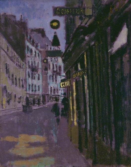
While ’Rue Notre Dame Du Champs, Paris, Entrance of Sergeant’s Studio’ (1907, above) is one of those pictures which seems an invitation, designed to pull you in and allow to drift through those streets. Whatever’s round the curve of the road is made into a temptation, if the blurry figures could be caught up with. The brightest point, the nearest to pure white, is the cafe sign placed almost exactly at the centre of the frame, attracting the eye. The two other signs are made noticeably dimmer.

If Sickert was a problematic figure, so was his mentor. But in his case it’s both less obvious and more extreme. With Degas it’s hard not to see the Dance Masters he so frequently depicted as displaced self-portraits, seated and patrician, the still point of order around which young girls obediently pirouetted. He seems to have played up to his curmudgeon image, and had he lived long enough would doubtless have ranted about immigrants on tabloid TV shows. Sickert the ex-actor was seen more as a wit and a raconteur. But there was a dark side to him which his dark art revealed…