Admittedly symphonic reworkings of
popular songs don't always have the greatest track record. However, as
mentioned after Steve Reich reworked Radiohead numbers three years ago, minimalism from the start saw the divide
between 'serious' and 'popular' music as an encumbrance, a barrier
that needed breaking down. True, in it's heyday this was more by
implication. It was only with post-minimalism, when it became less
bound by it's own structures, where it was able to formally deliver
on it's promise.
And even here Glass effectively meets
Bowie half-way. 'Low' and 'Heroes'
were two of his least poppy albums. As the venue's website puts it:
“During that period David and Brian [Eno] were attempting to extend
the normal definition of pop and rock and roll. In a series of
innovative recordings in which influences of world music,
experimental ‘avant-garde’ are felt, they were re-defining
the language of music in ways that can be heard even today.”
(Asked on the release of 'Low' whether it might
have less chart potential than earlier releases, he replied cheerily
“no shit, Sherlock”.)
Plus, all but three of the nine tracks
Glass uses are Krautrock-inspired instrumentals, with two choices
rather audaciously not even on the original albums. ('Some
Are' and 'Abdulmajid' respectively.)
It's quite a different prospect to Stravinski filching folk tunes.
Though the De La Warr's stage isn't
small, it still has trouble encompassing the forty-two piece
orchestra. I could only see the front end of the piano, so had to
assume there was a player attached to it somewhere. Most instruments
come in duos, trios or even quartets. (Except for the violins who are
arranged in two quartets.) And each mini-ensemble plays the same line
in unision, resulting in a rich and vibrant sound.
For the most part the brass take on the
bass role, underpinning the strings. At points the two get uncoupled,
and the brass players murmer to one another in the background, like
the below-water section of an elegant liner. The result of all of
which is pretty much win-win-win. It's as tuneful as pop music, as
hypnotic as minimalism and as dynamic as classical music.
It perhaps should be noted that this
era marked Bowie at his most sombre. Whereas, once transformed into
Glass's mini-symphonies, it becomes rhapsodic. (And, for two albums
from the acclaimed Berlin trilogy,
quite American-sounding, at points almost bordering on Aaron
Copland.) Some I suppose might not take to that.
However, for fairly obvious reasons,
now seems a good time to celebrate Bowie's music. Plus the downbeat
nature of those albums is often overstated, and was already being
worked out by the second one. The song 'Heroes' is
in itself triumphalist in it's will to overcome adversity. And as
conductor Charles Hazelwood says “it makes perfect sense” to play
them back-to-back as “one great symphonic journey. From the Low
symphony's dark beginnings to the white-hot finale of Heroes.” This
hadn't been Glass' original intention, having written his
'Low' four years before 'Heroes',
in 1992. But then Bowie hadn't been planning out a trilogy either. It
works perfectly, however accidentally.
Performed and partly televised at this
summer's Glastonbury festival, the symphonies became a bit of a
media event. Which is again fitting. Bowie had a talent for bringing
fringe things to the mainstream. And while some purists deride him
for that, he mostly managed to keep the essence of the original in
place. So a tribute which doesn't consist of some 'X
Factor' historically warbling their way through
'Heroes' seems fitting indeed.
Some snippets from Glastonbury...
BORIS
The Haunt, Brighton, Tues 20th Dec
Now coming up to their quarter-decade,
Boris have taken on a bewildering range of sounds from sludge metal
to J-pop, and collaborated with everyone from fellow Japanese
noisemonger Merzbow to (yes, really) Ian Astbury.
This time round they're revisiting
'Pink', an album a mere eleven years old. From
what little I know of the band's extensive and confusing history,
this was seen at the time as something of a breakthrough. While extensive research reveals it wasn't their first release to be divided into
individual tracks, rather than expansive side-spanning dronefests,
earlier albums had tended to be called things like 'Amplifier
Worship' and 'Feedbacker'.
From reputation I'd thought it's sound
to be a combination of hardcore punk, metal and noise rock – all
short, sharp shocks. And indeed there are tracks with piledriver
drums and soaring guitars. But there's many other pieces which belong
to their more commonly employed heavy riffing/ doom drone sound,
reminding us they took their name from a Melvins song.
In fact these tracks are so
different I first imagined they must be bringing in extra material
from different eras. But it seems almost everything did come from
'Pink'. Yet the feeling of watching two different
bands is enhanced by on-stage behaviour. For the punkier songs they
start to move around and engage with the audience, even encouraging a
clapalong. (Well, if Low can have one...) While for the longer numbers they
lapse into the standard shoegazer stance, even wrapped in dry ice.
But then they play the whole thing as
one long set. Rather than pause between tracks they'd link them with
instrumental interludes. (Sometimes quite abstract, sometimes even
ambient.) Which made the set one ever-morphing organism. Rather than
act as a human jukebox serving up a known album, the gig became
something almost impossible to predict.
In fact, for all my normal complaints
about gigs dedicated to albums, I may have even preferred this to the previous time I saw them, some four years ago. Then there
was something of the sense they'd settled into a sound they'd grown
comfortable with. Here they were more volatile, like they were
willing themselves do everything at once and refusing all parameters.
At one point, to a wall of feedback
guitar, drummer Atuso stepped forward, crowdsurfed the length of the
venue, got carried all the way back and placed back on stage to an
uproarious cheer. Only for us to discover, that wasn't even the
finale!
This tour, it seems, had a trailer. (Do
tours have trailers now?)
...while this is from Glasgow, but the
same tour...
The
second in a two-part look at the 'Abstract Expressionism' exhibition at the Royal Academy,
London, (first part here) which doubles as another entry in the series on
abstract and semi-abstract art.
”We
favour the simple expression of the complex thought. We are for the
large shape because it has the impact of the unequivocal. We wish to
reassert the picture plane. We are for flat forms because they
destroy illusion and reveal the truth.”
-
Newman, Gottleib and Rothko, letter to the New York Times, 1943
Just
Abstract Enough
So...
those Abstract Expressionists, just how abstract were they really? Or
for that matter, why feel the pull of abstraction at
all? As covered in the first part, abstraction seemed to offer
universalism in art – a pan-language of non-specifity. And not
having to choose whether to represent involved not
having to choose what to represent.
In this era
America meant the wide open spaces, the Cinemascope of the Western,
but also the skyscraping city. Rightly or wrongly, New York was seen
as the arch-metropolis, the epitome of modernity, quite literally
towering over other towns. The 1962 film 'How the West Was
Won'ended with a montage sequence between the Western trail and a modern multi-lane highway. But montage is a movie trick. How could a visual
artist convey this? By not being stuck with literally depicting
either, Ab Ex were able to suggest both at once. The artists
themselves often moved between urban and rural bases during their
careers, most famously Pollock setting up studio in a Long Island
farmhouse.
Plus, if
counter-intuitively, there's their Surrealist influence. As mentioned
last time, their main interest in Surrealism was automatism. Yet to
the Surrealists this was an end, a creative way to surrender to the
subconscious, while to the Ab Exers it was but a means. So the
Surrealists moved towards symbols, but stopped there. They tended to
blow up symbols, with Dalian hyper-realism, or codify them like Miro.
But Kandinsky's codifying of those symbols until they became
essentially abstract didn't happen for Miro. While, for good or for
ill, the Ab Exers lacked this limit.
However,
though this show is often keen to wax lyrical over, for example,
Rothko “finally pulveris[ing] the figurative residues in his art”,
the clue is not so easily found in the name. Despite such talk,
despite all the ideological fervour and shock reaction which
surrounded the movement, the answer is often 'just abstract enough'.
If Kandinsky, himself a major influence, never truly burnt his boats to representation then much of the
time neither did they.
I
don't intend saying too much about Gorky here, who isn't necessarily
well served by the works shown. But let's start with a look at
'Waters of the Flowery Mill' (1944, above). The
show comments he “had a memorable knack for camouflaging forms that
they hover between objectivity and the organic or convulsive”. And
indeed, peer into it a bit and it looks like a more representative
work overpainted, with sections of the original still poking through.
And in fact Gorky had started out depicting a ruined mill in
Connecticut.
But
if that explains half the title the coloured overpainting seems to
resemble the 'waters'. Gorky had thinned his oils with turpentine, so
they run and smear more like watercolours. It looks like an occluded
front of colour, like the most psychedelic storm ever had been
unleashed on that mill. It's Kandinsky influenced yet with none of
his cosmic elegance. There seems something wild, enticingly out of
control to it. It almost looks ahead to the 'bad trip' sequences of
Sixties cinema. Yet at the same time still pinning it to that mill is
important.
Similarly, David Smith's 'Hudson River Landscape' (1951, above) doesn't represent a
landscape directly.But it's undulations continue to suggest
serpentine river shapes. Marina Vaizey of the Arts Desk describes his sculpture as
“hovering between representation, abstraction and three-dimensional
doodling”. Smith's own picture of it places it before a
landscape.
My
Wife & Other Monsters (De Kooning)
With
Willem de Kooning, however, the show talks of a “lifelong
oscillation between figuration and abstraction”. And while at times
he seems a little confused about the whole business, calling a work
'Abstraction' (1949/50) despite such clear
representational elements as ladders and skulls, his oscillating
rather finding a midpoint seems to cover it. And what's interesting
is that it's not just the figurative works that work, but it's the
figuration that makes them. (Some of the large abstracts frankly
verge on the self-parodic.) De Kooning said “flesh was the reason
paint was invented”, and in fact seems less interested in than fixated
on the subject.
For
example, 'Pink Angels' (1945, above) is based on
the classical genre of the nude. (Anfam believes he has found the
Titian it is based on.) And the tradition of the nude was of course
static and contemplative. De Kooning plays with this, giving us what
looks like a parked posterior in the lower right, but turning giving
the rest of the composition over to a twisting tumult of forms. Is
the main torso attached to that potato head which seems to be looking
back at it? Or is another figure sticking it's neck in? Whose eye is
that in the lower left?
And
there seems something provisional, almost sketch-booky, about those
criss-crossing black lines. Some forms look to be sketched out but
then abandoned. Are the certainties of earlier eras being reduced to
their delineations of the human body, and then parodied with these
grotesque forms?
And
yet there remains something sumptuous and eroticised about all that
piggy-pink, bordered by those sinuous curves. De Kooning often based
elements of his women portraits on cut-outs from glamour magazines. Francis Bacon was painting similarly fractured human forms in
England around this time, sometimes based on classical works,
sometimes bisected by linear frames, sometimes against lurid
backgrounds. But his images were more nakedly disturbing, without
this note of eroticisation.
‘Woman
I’, (1949/50) was, as the name might suggest, the first
in an important series for de Kooning. The famous story is that he
kept reworking it over some
eighteen months, before giving up. Then when the art historian
Meyer Schapiro saw it, with accounts often suggesting a chance
encounter, he was encouraged to take it up again. The series stemmed
from there.
But what's
significant is that the paintings aren’t the result of that long
process, the answer de Kooning came to after all that working out.
The paintings are instead a record of that working out. The unerased
charcoal lines of 'Pink Angels' have now become
oil scrawls, and there's little if any of it's vivid blocks of colour
under those occluded daubs. The thing looks messy, convulsive, less
unfinished than inherently unstable. The canvas doesn't capture the
expression but the struggle to express.
Norbert Lynton
described this series as the “the daughters of 'Demoselles
d'Avignon'”, and it's hard not to think of Picasso. Once
Cubism started to depict living rather than inanimate objects, it’s
analytically divisive eye started to take on a monstrous aspect,
however unintended. It’s like dissecting a frog in science class,
the teacher describes the spread out innards as part of a mechanism
but the child still faints away. This is partly true for Picasso
himself, as some of the Cubist planes found their way into later
portraits, such as 'Weeping Woman' (1937).
But there's
more... Some have suggested that the reason for Picasso's frequent
switching of styles was his frequent switching of lovers. As his
heart would swing almost with each beat, he'd paint his latest beau
lovingly, shortly to be followed by his loathing. Whatever the truth
of this, with 'Woman I' it's like the
contradictions in 'Pink Angels' aren't resolved
but heightened, and de Kooning 's contradictory feelings are fighting
for control of the same canvas. It’s “she loves me, she loves me
not”, only all at once. It’s trying to depict someone and trying
to rub them out trapped in conflict with one another. (Unlike the
philandering Picasso, de Kooning had one long but tempestuous
marriage. Make of that what you want.)
'Woman
as Landscape' (1965/6), with a title either brilliant or infamous, is perhaps the most grotesque of the
bunch. The ‘firm flesh’ of classical sculpture, as bound by rules
of proportion as is geometry, flies out of control, multiplying
itself like cancer cells, bulbously erupting, oozing around the
canvas. It’s simultaneously comic and horrific, the very definition
of grotesque.
These portraits
share a child-like quality. We know the woman in 'Women
I' to be a woman not from anything in her features but her
exaggerated breasts and her women's clothes. (If those are her shoes
and she doesn't just have hooves for feet.) But more, it's as if he's
trying faithfully to depict the likeness of a subject but
unconsciously unloading his psychological baggage concerning it. And
this makes the savagery, the feeling of attack to
the mark-making, still more striking.
On first being
shown, they generated a debate over whether they were misogynistic or
not. It doesn't seem clear why we needed one, the answer stares you
in the face. They certainly mark a good point to reflect how few
female artists there are in this show. But they’re
interestingly misogynistic, they offer insight
into the misogynistic mind. The contradictory roles which patriarchal
society thrusts onto women, normally made into a woman’s problem,
here collide and attempt to overwrite one another.
Up
Abstraction Alley
Regular
readers might concur that I can take to art or music which might not
appeal to the majority. I like to indulgently imagine that, through
writing this stuff, every now and then I'll manage to convey to
someone else just what I see in something. But ironically, every now
and again I'll have pretty much the majority reaction. And in
particular my reaction to the artists here runs the gamut, from
absolute awe to total indifference.
For
example, Franz Klein's furious stabs with painter's brushes just look
to me like something Tony Hancock would throw up to briefly become
the toast of Paris. True, they look expressive. But they only
look expressive. Yes, you can see them as a frozen record of a
gesture. But so what? It seems doubly perplexing that Klein has such
a name when others in the show, such as Pousette-Dart, Smith or Tobey
are less-known.
Yet even Klein
stands above Barnet Newman and Ad Reinhart. The only achievement I
could find in their blocks, squares and stripes of colour was that
they were able to drive themselves further down the blind alley where
Mondrian seemed to have already hit the back wall, an achievement of
sorts even if only of obstinacy. (And yet Reinhardt's cartoons could
be fabulous! Go figure.)
In their case I
just looked across the walls, shrugged and pretty much passed on to
the next room. There seems nothing expressive to these abstracts at
all. It might be bizarre to have such wide-ranging responses to a
show given over to a single movement, in the case of de Kooning to
different pictures by the same artist. But perhaps,
due to their afore-mentioned fixation with individualism, it's
inevitable. And it's also, in it's way, appealing. It
suggests there's no schema to be relied on, that the whole thing's
wide open, that each individual work must be looked at and assessed
on its own merits. This may be more true of visual art than other art
forms, and if so it's to be welcomed.
A much-heralded
hexagonal room, literally the centrepiece of the exhibition, is given
over to Mark Rothko's colour fields – for example 'No. 4
(Yellow, Black, Orange on Yellow/ Untitled)' (1953, above).
Being in this room was, I'll concede, the closest I've come to liking
Rothko. (Though it may have been achieved by comparison to what went
before.) The works seem to shimmer, almost to hover. There are
paintings which come out at you, and paintings which draw you in –
like portals to some other space. Rothko draws you in. And the
feeling is somehow multiplied by multiple paintings - facing each
other, like a room of doors.
This
room was described by Laura Cumming in the Guardian as “a
quasi-chapel”, and there is an association with the coloured light
of stained glass windows. Yet his 'Gethsemane' (1944), placed earlier in the show, looks like a Surrealist work with
the irreligion taken out. While these colour fields can look like
religious works with the religion taken out, like some New Age guru
emitting meaningful-sounding stuff. Notably the guide, which has up
till now said entirely sensible things, starts on stuff like “his
art should in a sense 'defeat' the walls with his plenitude”. Yeah,
deep...
Arguably
it's Rothko's very accomplishment which makes him seductive, and
therefore more dangerous than inferior artists such as Klein.
Rothko's the Pied Piper who can lead you lost. It leaves you thinking
Walter Benjamin was right after all, that art escaped religion when
it beached against modernity and Rothko was left decorating the empty
hulk as everyone else settled in the new land.
Which
seems to link to the famous story of his withdrawing his work from
the Seagram building after finding out it was to be hung in the
restaurant. Leading to the inevitable response - get over it! Rothko
may mark Abstract Expressionism at it's most extreme. He faithfully
reproduced many of Expressionism's self-romanticisations, such as the
depiction of the artist as being beyond society and in touch with
more eternal concerns, and his art thereby being above and beyond
mere commerce.
So many, in fact,
that all Pop Art had to do was to duplicate Dada's withering
critique. (Well, with populism replacing the communism.) Suddenly it
was squaresville to have seriousness of purpose or heroic ambition,
to sit in your studio contemplating a shade of blue. Suddenly it was
de rigeur to be flip and ironic. You didn’t make
art by contemplating the depths of your soul, but by taking surface
features of the world around you and recombining them, in short by
finding virtues in what Ab Ex had seen as problems.
And it was a
similar story with Conceptualism. How to fill those vast shoes Ab Ex
had left us? Don't bother, just kick them away! If they made
gargantuan, aura-emitting canvases we respond with works which are in
themselves incidental – or quite possibly entirely absent. If their
art was to do with the psyche of the individual artist, with art as
therapy, we'll make art as a cultural product, which make it's points
calmly and clearly with none of that self-important tomfoolery. In the recent Tate show 'Conceptual Art in Britain', we saw how
critic and Ab Ex champion Clement Greenberg was a target.
And besides, even
what was positive about Rothko was later supplanted by works such as
Carlos Cruz-Diez’s instillation 'Chromosaturation'
(2010), part of the Haywards' 'Light Show', in which three connected
rooms were saturated with the three primary colours. If Rothko
offered us a door into a colour field, Cruz-Diez opened it and pulled
us through.
Expressionism
Goes Fractal (Pollock)
But
if this seems to be shaping up into an overarching rule, where too
much abstraction is just too bad, it's time to come to the grand
exceptions. Let's remember the image on my visual art blog page, the one picked to sum up
the art that I like, is a Pollock. (Not one in this show, but still a
Pollock.)
This
show was pre-announced with the news that his 'Mural'
and 'Number 11, 1952', better known and henceforth
referred to as 'Blue Poles', were “to be united for the first and probably only time”. And it
not only dedicates it's largest room to them but hangs them on facing
walls, inviting us to compare them.
Certainly,
both are affecting works. I'll often notice other gallery-goers
spending more time reading the indicia than looking at the works.
They'll quickly glance over the thing they nominally came to see, and
they're off. Yet with the Pollocks people knew to linger, trying to
take in the immensity of the thing. We are, however, better off
contrasting them...
'Mural'
was painted in 1943, when Pollock was commissioned by Peggy
Guggenheim to cover a wall of her Manhattan townhouse. It remained
his largest work, and in the words of curator David Anfam
“jump-started abstract expressionism”. It is a
great work. And yet placed in this context, when we can see what
comes ahead, what's most noticeable is how rooted in representation
it is. Another work is called 'Enchanted Forest'
(1947), and like it this is a forest. You can see the canopy at the
top of the picture, the accumulated debris of the ground at the base,
the black thrusts of the tree trunks and branches taking up the
centre. The colour scheme is verdant greens and autumnal yellows.
And
there are ways in which 'Blue Poles' (1952, above)
is similar, thick black lines running over and connecting swirls of
colour. The 'poles' were even made by applying planks of wood. And
yet now the forest is truly gone...
Formally the
change is that this is one of Pollock’s drip works, where he'd
flick the brush above the canvas without directly touching it. These
works have sometimes been called Fractal Expressionism, an evocative
name as one effect is that you never know when to stop looking. Bald
canvas is visible at the edges. Yet there still seems to be no back
to the picture, no canvas wall for your eye to come to rest against,
just further fractal-like recessions. And the harder you look, the
foreground seems to move out, into the room with
you, in almost a 3D effect.
Lou
Reed once said that with 'Metal Machine Music' he
wanted to create a long composition not based around repeated beats
but which never stood still - “like the universe”. And the poles,
the most immediately striking part of the painting, grow nodes at
intervals - like the lines which join up the bright stars in maps of
constellations. (Those long central strokes appear in other works,
for example 'Phosphoresence', 1947.) But then, if
a clear night, as you keep watching the sky the once-dark background
behind those constellations becomes richer and richer. With Anselm Kiefler, as he left the earth behind and grew more cosmic, he
left me behind. But with Pollock it's the exact opposite. His heart
belonged out there in the stars.
Except
that 'Blue Poles' isn't depicting the universe,
even in part, the way 'Mural' is in part depicting
a forest. Note in the Lou Reed quote he says “like” the universe,
and similarly with Pollock this is merely an analogy. Pollock is
painting the cosmic in the other, broader sense of the word – the
immensity and irresolvable complexity of everything, the way we
struggle to comprehend what's inside an atom and at the same time
look hopefully up at the sky. Pollock was more like Mark Tobey than
he was Gorky or de Kooning, his desire was to describe the
indescribable and abstraction was his chosen means. He could take
abstraction and make it work.
And there's
another point which seems associated. People hear of his drip
painting method and imagine a kind of rock’n’roll painter,
throwing up works in some state of absolute abandon while swigging
from a bottle of JD, outside of and against any artistic tradition.
’Time’ magazine’s nickname for him, Jack the
Dripper, best conveys this. The fact that he died in 1956, when
rock’n’roll was still starting up, should tell us how accurate
any of that was.
In fact Pollock
was a deliberative painter, who tried out his drip technique before
he’d exhibit any of the works, ensuring he’d mastered it like a
neophyte labours to master a brush. (And this was precisely his
innovation. Ernst had already dripped paint onto works, but used it
as a random element he could then paint around.) And, having invested
all that time and energy, he did not always take kindly to the
suggestion he just chucked paint about for a living, barking back “no
chaos damn it!” A page on the Tate’s website specifically debunks Pollock myths, including “probably the most absurd and easily refutable fantasy…
that he… created his best works while drinking.”
And in fact we
need to refute all this from an earlier point. When you hear Harold
Rosenberg coined the term 'action painting' the same year as 'Blue
Poles', it might seem auspicious. Yet when the Telegraph describes it in terms of “spiralling
skeins of paint that recorded the physical reach of [Pollock’s]
body and arm” they're reciting the received wisdom. We’ve been
trained to see those arcs of paint like the motion lines in comic
strips.
But in fact,
unlike 'Mural', rather than picture it being flung
into life you can't really conceive of 'Blue Poles'
being painted at all. I know full well how it was done, there's
abundant film of him at work. (While almost any art book can be
guaranteed to have a still of him.) But I can't stand before the
painting and apply the knowledge, I can't visualise it in the process
of happening. Rather than see the expressive gestures you do in
Klein, or the ceaseless overpainting of de Kooning, it seems almost
impossible to trace it back to the hand of the artist who made it.
There's no unpicking it like a jumper. It's too intricate, too
endlessly layered. Even the human touch of the signature, in the
lower left, looks slightly incongruous. The thing looks just
there, impossible to trace back to it’s
construction.
Above
all, and contrary to the stereotype of An Ex angst, 'Blue
Poles’ is not melancholic but rhapsodic. To quote Norbert Lynton it's “graceful rather than violent or wild,
rhythmic rather than random, balletic and mystical in effect”.
True, every word.
Cosmic
and Visceral (Clyfford Still)
If
Pollock has the largest room of the show and Rothko the centrepiece,
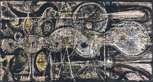
Clyfford Still is given the next size up. Plus it's a piece of a
Still, 'PH-950' (1950) making up one version of
the poster (see up top). He seems to be the the third of the show's
self-styled hits. It's an audacious move to so big up an artist most
won't have even heard of. But it's one which delivers. A great favourite of
mine was 'PH-150' (1950), detail below.
Still
seems to have been an individualist among individualists, a maverick
even compared to mavericks. In 1961, keen to distance himself from
the art market, he moved from New York and spent the rest of his life
on a Maryland farm. While his conditions for showing his work were so
exacting they pretty much guaranteed it wasn't shown at all. Happily,
things seem to be changing with a dedicated Still museum existing in
Denver since 2004. (From which the works on show here were loaned.)
If
Pollock's signature mark was the fleck, Still's was the tear. To the
point where I initially assumed he'd been influenced by the look of
torn wallpaper and peeling paint. (Perhaps influenced by a photo in
the previous room, Minor White's 'Resurrection (Peeled Paint on Window, Jackson Street, Produce Area, SanFrancisco', 1951.) The idea of blown-up images of something
everyday set against Pollock's cosmic macroscopes seemed appealing.
And in fact something still clings to it in my mind, even if it's an
official wrong answer.
In
fact, they seem intended as something more geological. (Which of
course still offers a complementary opposite to Pollock, just of a
different sort.) The show describes them as “by turn visceral and
cosmic”, and they seem redolent of the way the geography we treat
as facts on the ground is in fact the result of rupturous violence,
mountain ranges thrusting themselves into being. The show speaks of
“verticality being Still's enduring leitmotif”, representing
“spiritual transcendence”, navigating”yawning abysses” like
seismographs of soul journeys.
Despite
such talk, despite their vast size, they don't seem at all
ostentatious and self-important. In fact, in another comparison with
Pollock, it's hard to imagine them being composed. They look too
immediate to be deliberated. The best works are those where the
colour is applied flatly, without a 'painter's touch'. They all have
those alphanumeric titles, as if just named after catalogue numbers.
Like all great artists, Still can make the whole thing look easy.
Time
was when I saw American Abstract Expressionism as a load of
self-important, man-paining flim-flam designed to impress art
critics, with Pollock and de Kooning as the exceptions that proved
the rule. True, I had already gone past that not altogether nuanced
view. But one advantage of this group show is that it brings to the
fore some of the lesser-known names. Some of which have cropped up
here. Others were more deservedly forgotten, but that's life.
But putting on a
show now also creates a direct comparison between our era and theirs.
And times have long since shifted from the days when Ab Ex occupied
the cutting edge, championed by critics and often derided by a
bemused public. The two have effectively swapped sides, almost as
much as they have over Impressionism. And these works are so at odds
with today’s post-modern art market they confirm the old adage
about the past being another country. Which makes now a very good
time to look at them again.
Once Ab Ex seemed
to have trounced all criticism, been given it's head and gone off the
deep end, and Pop Art seemed a necessary corrective. But for us it’s
the reverse. And the surprising thing is that many reviews did seem
to acknowledge that. To quote the Telegraph again: “At a time when
the virtual world has rendered most aspects of life slightly ersatz
and people crave authenticity, the art here has all the realness and
rawness anybody could possibly want.” Yup.
“I
want to express my feelings rather than illustrate them.”
- Jackson
Pollock
Advancing
American Art
American Abstract Expressionism, it's a
movement so wrapped up in mythologisation that it makes the
Surrealists seem straightforward. It arose at a time when America had
come to dominate the Western world, not just politically but through
mass culture. A culture widely perceived abroad as crass and vulgar,
junk food for the eyes and ears. After all, no previous Modernist
movement had been American-based, surely that said it all.
And yet Ab Ex succeeded in turning the
thing around until it seemed quintessentially American. The natural
centre of new art became the New World. The art became notorious and
celebrated, the artists celebrities. Like their near contemporaries the Method actors they seemed to bring a new
seriousness, even an intensity to American painting - which had
previously seemed a popular art form. As painting's James Dean, Jackson Pollock received an iconic 'Life' magazine
photoshoot in 1949. Several artists, Pollock among them, died
obligingly young.
It’s somehow remarked on sagely that
this all-American art-form had so many European emigres involved;
Rothko, Gorky and de Kooning. And of course such talk laces the
American myth rather than undermines it - it’s supposed to be
arriving on the expansive shores of the bold New World which allowed
them to reinvent both their art and themselves. (In fact both Gorky
and de Kooning were already painting before emigrating.)
These days, and much like Method
acting, it seems clear enough that the opposite is true - the
movement was based in European traditions. It’s supposed newness
came from simple popular unfamiliarity with what had gone before.
(Particularly domestically, where Modernism had not till then managed
to lay many roots.) It’s like Sybil’s line in ‘Fawlty
Towers’, that Freud might have started practising
psychiatry in the 1880s but it’s only recently we’ve seen them on
the television.
The show largely disregards such
misapprehensions. It defines the movement as “the emotional
intensity of German Expressionism and the formal aesthetic of
European abstraction”. Certainly the name proved to have sticking
power, despite their being European abstract expressionists more than two decades before. They
concede a Surrealist influence too, largely through adopting
automatism, but that just further underlines the point.
But if we're going to try and look past
all that mythologisation, finding the roots isn't enough. You need to
examine why it took up those roots, and how it branched from them.
The show has this to say:
“The
fledgeling Abstract Expressionists shared one common experience....
they lived during an age of extremes and catastrophes that
encompassed two World Wars, the Great Depression, the Spanish Civil
War, atomic devastation and the ensuing Cold War.”
Except the spread of those events
papers over a break. The name Ab Ex was first coined by the critic
Robert Coates in 1946, by which time all but the last two of the
items were done and dusted. We had gone from direct, material threats
like war or hunger to more remote concerns such as the Bomb – a
mighty shadow hanging over you, but different to shells exploding in
your face.
Admittedly, and inevitably, Ab Ex
pre-existed it's own name. Richard Pousette-Dart's
'Undulation' (above) looks like a fully formed Ab
Ex work, a large canvas of at most semi-representational shapes made
up from thickly encrusted paint in a dark palette, despite being
dated to 1941/2.
But America had not been occupied like
France or bombed like Britain. Of course the soldiers who had fought
in those conflicts were often profoundly affected by their
experiences. But in a sense that confirms the shift, they then had to
reconcile those experiences to their re-domesticated lives on their
return home. The sheer extremity of what had
happened, less the experience but the knowledge that
Auschwitz and Hiroshima had occurred, didn't seem to fit in the world
yet was unforgettable. And, as none of the prominent Ab Ex artists
had seen service, they were in a sense ahead on that curve.
And that break cannot help but have an
effect on the artwork, perhaps best
encapsulated by Adorno’s famous comment “poetry after Auschwitz
is barbaric”. Virtually all forms of Modernism hitherto had
some sense of “nowness”, precisely because it had lived through
interesting times. But with those events either behind you or no
longer immediate art came to be made with the high-minded desire to
be transcendent of everyday concerns, to reach the universal. "I
am not interested in illustrating my time,” commented Clyfford
Still. “A man's 'time' limits him, it does not truly liberate him.”
In his book 'Abstract Expressionism', (Thames &
Hudson, 1990) curator David Anfam comments astutely how they
“realised that timelessness is often a timely need”.
Yes, All Individuals
And yet, as paradoxical as it sounds,
at the same time that it expanded their focus also fell inwards. William Seitz said the movement valued “the individual over
society.” And this individualism, this sense that art exists
primarily as a manifestation of the creator’s mind, is also key to
Ab Ex. The art is about the artist. “Every good artist paints what
he is”, Pollock insisted. In this way it’s almost a complete
contrast to the public art of post-war Britain, whose tendency was to pure
universalism.
This individualism led to the notion
that Abstract Expressionism was all about angst, a simplification but
not one entirely without merit. Within a relatively short period of
time, art went from the Great Depression to your
great depression. As Rothko put it “art sank into melancholy”. In
general, the post-war period responded to the new existential threats
with a growth of interest in... well,
Existentialism, an interest often manifested in art.
For
example the Tate's 1993 show of post-war Parisian art was called
'Art and Existentialism'. While Sartre visited
America in January 1946, to great acclaim. Notably there's a popular
association of both Existentialism and Ab Ex with suicide, even if in
the former case Camus specifically outruled it. Gorky and Rothko took
their own lives, while Pollock's early death
has been described as “quasi-suicidal” due to self-destructive
habits.
If this is the first group show since
'58, perhaps this individualism led them to divide themselves early
into a set of solo exhibitors. With for example the original
Expressionists, Munch didn’t paint much like Kirchner. A novice
could distinguish the two. And yet no-one has the slightest trouble
in seeing them both as Expressionist artists, as different branches
sprouting from the same tree. And the same could be said about the
original abstract artists, such as Kandinsky and Malevich. While the association between the American Abstract Expressionists is
much, much looser. (To the point where even that loose label doesn’t
even hold. Something we’ll come onto in the second part.)
Curiously all this leaves out one
aspect of the story which was uniquely American - the Federal Art Project of the pre-war era, whose
willingness to commission artists to make large-scale public murals
allowed them to earn a crust during the Depression while giving them
a taste for the large scale. Most first generation Ab Exers had been
involved with it, quite possibly it was only excepting Still. (Who
doesn't seem to have joined anything much.)
This omission may be because of the
widely held belief that the anti-subject matter of Ab Ex allowed
artists to stay with the scale while abandoning the FPA's Socialist
principles, something post-War America had quickly turned against.
Motherwell's frequent titular salutations to the defeated Spanish
Revolution linger like none-gone bygones, strangely unattached to the
works they label.
It’s undoubtedly true that the CIA came to promote Ab Ex through the Propaganda Assets Inventory. As evidence America wasn’t merely Hollywood
and hamburgers but could be highbrow, and as an exemplifier of its
individualist values. It's also true that one of the reasons their
involvement was kept so secret was to keep it from the artists
themselves, who mostly retained their leftist or anarchist
sympathies. And yet the link remains, it was that new approach to art
which allowed them to be used. (In his book Anfam criticises the
notion Ab Ex was “de-Marxified”.)
Unphotographable,
That Awful Bigness
The
works are famous for their grand scale, and the Academy makes the
size of it's main galleries a selling point of the show. This scale
is often associated with the artists' ambition, which then gets
glibly associated with their American-ness. Which itself gets
justified by references to the size of the American landscape. This
isn't entirely baseless. Pollock spoke of “the vast horizontality
of the land” and Still it's “awful bigness”, managing to sound
remarkably like a character from a Western.
But
above all it's a further example of how rooted Expressionism always
was in Romanticism. Arguing American exceptionalism here would be to
claim the Alps are just poky and parochial. Pollock's 'Portrait
of H.M.' (1945, above) for example, is clearly rooted in Turner's vortices. There may even be the white triangle of a yacht
sail in the centre of it, like one of Turner's many sea storms. But
scale isn't the whole of the story. there's something more important
afoot, more tied to the era...
In Walter Benjamin’s famous phrase on modern times “that which
withers in the age of mechanical reproduction is the aura of the work
of art.” Benjamin wrote in 1936, a few short years before the first
Ab Ex works. Once, not long previously, seeing a painting involved
going to see it. Gradually, innovations in photography and other
forms of reproduction had chipped away at that. They were not as far
along this path as us, where something like Munch's 'The
Scream' is reproduced over and again on coffee mugs, tea
towels and fridge magnets. But they were on that path. Art could
already be disseminated, passed around like loose change.
To Benjamin, this was to be welcomed.
To him “Mechanical reproduction... emancipates the work of art” -
it could now be extracted from religious associations, which he saw
as merely advanced forms of superstition. But the Ab Ex artists took
precisely the opposite turn. Their response was to try and get that
aura back, to return to the resplendence of the original work of art,
by making art almost impossible to reproduce. To misquote Rodgers and
Hart, their favourite works of art were unphotographable.
Huge scale, vast enough to engulf you,
was one strategy. (Contrary to all the common advice, they’d
sometimes suggest viewers stand as close to the paintings as they
could.) These works are experiential in a way that, say, Dali's
aren't. (And if there seems something quasi-religious here, a sense
that art must have a 'Churchiness' to it, Richard Poussette-Dart said “my definition of religion amounts to
art and my definition of art amounts to religion.” Watch this space
for more on that sort of thing...)
It’s true that that all the
well-known works are large-scale, that for example the smaller
Pollocks don’t have the same impact as his better-known vast
pieces. And yet Mark Tobey’s works are not sizeable, while David
Smith’s sculptures might even be called small by the standards of
the day. Scale was but one strategy among many. Paint could be so
thickly encrusted the work virtually became a relief. Rothko would
add powdered pigment to his colour fields, to sparkle and give them
an added lustre. The defining quality behind all this is the
experiential.
And perhaps inevitably they were pushed
in this direction partly by the art they could themselves see in
person. In their early years war prevented their visiting Europe. But
viewable in New York galleries were both Picasso's 'Guernica'
and Monet's 'Water Lillies', and the imposing
shadows of both are cast right through this show. (And similar
large-scale works were taken up in post-War Europe, if not to the
same degree. Giuseppe Pinot-Gallizio's 'Cavern of Anti-Matter', for example, was
145 metres long.)
As someone whose political sympathies
are with Benjamin, and whose head is most likely to be found stuck in
in reproductive art (comics, prints, film etc.) this should of course
seem to me to be precisely the wrong direction to take. And perhaps
that’s what fascinates me about it. But there's more. It's often
said that new art forms can reinvigorate old ones, by throwing them
back on themselves, forcing them to do what they're uniquely
qualified to do. Perhaps there's a similar story for new means of
perception.
This does mean that one of
Modernism’s best-known movements was essentially anti-Modernist.
But if it was successful on its own terms, those are perhaps the best
terms to take. When you do stand in front of these original works,
you are very often struck with the requisite awe. I
saw Pollock's solo show at the Tate back in 1999 when I was only just
starting to attend galleries, and was astonished by how
unreproducible it was, how the apparent art snobbery of valuing the
original work turned out to be valid. (I'll inevitably add some
low-res thumbnails before I post this. They won't really tell you
anything, but they'll help break up the text.)
The
Limits of Language
Another
key feature of Ab Ex was it's interest in symbolism. To generalise
more than a little, previous painters had used objects primarily for
their symbolic value. (We recognise some of the more standard symbols
without thinking about them, a skull signifying death, an hourglass
time and so on.) Whereas with Ab Ex they sought to cut out the middle
man.
Whether
Pollock's 'Male and Female' (1942/3, above)
matches our current attitude to gender essentialism... that's too
obvious to go into, really. Let's look more at how
the painting works. Certainly, it's not Pollock as we think of him,
his trademark swirls of paint only creeping into the corners. But
even at this early stage we can see him cutting out the
representational to go straight for the symbolic. Signs and symbols
are prioritised over objects, the fleeting look of things discarded
in an attempt to get at their essence.
The
black columns represent the torsos of the titular two figures. They
do (kind of) sprout heads and feet, but really function as magnetised
rods gathering up representative symbols. Mathematic equations adorn
the male figure and really the whole thing is a kind of equation,
where the symbols add up to a result. Pollock even, and quite
definitely, paints the 'and' from the title with those three
diamonds. We're asked to see a union, a coming together, between male
and female essences.
It
also makes for quite a formalised work, the surface divided up quite
rigidly into areas. Yet it's painted in a way which makes it look
immediate. We're used to seeing symbols as neat geometric icons, the
digital equivalent of roadsigns as we navigate websites and click on
software. Pollock depicts them roughly and rawly, as rawly as
anything from classic Expressionism. Or perhaps even as their
contemporary Jean Dubuffet, with his Art Brut. Like Dubuffet, much Ab
Ex is about the primacy of mark-making in art. That afore-mentioned
ostensible contradiction between the eternal and the intensely
personal is, at least aesthetically, surmounted.
But
equations, aren't they closer to written language? Look to David
Smith's welded steel sculpture 'The Letter' (1950,
above). It's arranged in neat rows of shapes, arranged on lines like
calligraphy which stray between semi-discernible letterforms (such as
Y's and I's) and hieroglyphic symbols. They also stretch back into
the third dimension, as if going behind the page. Ab Ex is popularly
supposed to be about vast colour fields, yet these concerns with the
borders of language keep coming back.
Take
Williem De Kooning's 'Zot' (1949, above), which
places it's (already meaningless) title in the lower left, then
blurs, stretches and distorts letter forms across the rest of the
canvas. It looks like language was left out in the rain. The word
sounds like something from Russian Futurism's anti-language and,
taking up where they left off, he depicts the limits of language -
language being take about as far as it can and breaking under the
strain.
Mark
Tobey's 'Written Over the Plains' (1950, above)
might initially seem similar to De Kooning ,with it's equally
indecipherable letter forms. But there's no Dada in it. It sees
inadequacy not in the language but in us.
It's
title refers to hieroglyphic shapes found on ancient tablets, many of
which remain unreadable to us. (A later work, from 1963, is called
'Parnassus', after the Ancient Greek home of
poetry.) There are languages within the Western alphabet where I'm
not sure I'd recognise an word of, for example Finnish. And yet when
you take the familiarity of that Western alphabet way, what is left
becomes mystifying at a more basic level. (At the British Museum show on the Hajj for example, I was taken by
the aesthetics of Arabic script.) It's language turned back into
pictures, which reduces us to the stupefied level of small children
staring mutely at the pages of a book.
And
I say “pictures” partly because we know that ancient languages
were often hieroglyphic. Which might suggest they could reverse
Semiotics' most basic conception, that language is inherently
divisive - involving a separation between the signifier and the
signified, the name and the named. Perhaps they were some
ur-language, not just ancient but primal, not an abstract code
through which we look at the world, but part of the world.
Of course, linguistically or historically, we know this to be a
non-starter. But place those ideas in an artwork and they take on a
poetic force. Tobey, a Bahai who'd stayed in a Zen monastery, has a
similar spiritualist sense to Malevich, where art can't frame the
ineffable yet can use it's own inadequacy in order to point to it.
But
perhaps at this point we should cycle back. There are, as seen,
significant differences between these three paintings. But there are
still more significant similarities. Tobey's “white writing”
look, which soon became a term for his style, is also reminiscent of
equations on a whiteboard, and it's roughness with graffiti, which
leads us back to Pollock. All share an interest in signs and symbols
over objects and scenes, a desire to create a graphic language not
imitative of reality.
Coming
soon! The Abstract Expressionists - just how abstract were
they? (Which will also involve looking at the artists on a more
individual level.)