googlee7ea825f63edb3f6.html
Showing posts with label Sculpture. Show all posts

Saturday, 20 May 2023

‘SOULS GROWN DEEP LIKE THE RIVERS’

Royal Academy, London


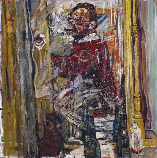
“My art is evidence of my freedom”
- Thornton Dial

Birds Unflown

This show is subheaded ’Black Artists From The American South’, raising something interesting right at the start. The Great Migration, a pivotal event in Black American history, saw unprecedented numbers escape Southern segregation for newly opened-up jobs in the Northern cities. As this led to developments such as the electrification of Blues, we tend to think that when they left they took culture with them. We even came to use ‘urban’ as a polite euphemism when we didn’t want to say ‘black’.

The Civil Rights movement, starting in the mid-Fifties, may have been based in the South. But as that turned into Black Liberation, both broader in scope and more radical in expression, it expanded North and West, and took up more of a cultural form. The Tate’s recent show ‘Soul of A Nation (Art In The Age of Black Power)’ largely focused on this.So those who got left behind in that migration, surely they just got left behind. There were, in words from a work here, ’The Birds That Didn’t Learn How To Fly’.

Like all such assumptions, as soon as you say it out loud you see the absurdity of it. The majority stayed in the South, after all. So this show arrives as a welcome correction.

Both title and exhibits come from the Souls Grown Deep Foundation and Community Partnership of Atlanta, “dedicated to promoting the work of Black artists from the American South and supporting their communities by fostering economic empowerment, racial and social justice, and educational advancement”. And the title comes via a poem by Langston Hughes.

Most of this art was created not just outside of the art market but without access to art materials, and so was made with whatever the artist managed to forage. Take for example Lonnie Holley’s ’Copying The Rock’ (1995), below.


Holley himself has given us a choice of two explanations. The guidebook quotes him: “We can’t just copy the past. We got to deal with the new. Sometimes it’s like living in hell.” While Laura Porter writes of attending a talk where he said it was about the unreproducible quality of nature, where a photocopy of a rock is at best a poor approximation of its source. Which makes it sound almost like Magritte – “Ceci n’est pas un rocher”.

And who would be vain and rash enough to disagree with an artist about his own work? You’re looking at him. For more, I would say is afoot. Neither accounts for the seismic violence in it, as if the copier had been destroyed in the attempt of copying. Then there’s that savage statement scrawled on the lid - “it’s like I’m living in Hell”. (Alluded to only in the first explanation.)

It suggests to me the black American experience is a kind of unparseable truth, an oppression so extreme and so ingrained it can’t be communicated - any attempt will just wreck the recording device. I doubt you’re supposed to think of it, but it brought to my mind the famous Malcolm X quip - “we didn’t land on Plymouth Rock, Plymouth Rock landed on us.”


Art is so often views, windows onto other places. Which we then rate according to how realised those other places are. Whereas Ronald Lockett’s ’Oklahoma’ (1995, above) is precisely the reverse, a frame without a picture, a kind of anti-window, the grille added almost as a taunt. It’s not a portal but a blocking device. And a most beleaguered one at that, various strips of sheet metal stuck together as if repeatedly patched up against the pitiless elements. The accumulation of sedimentary layers comes to be a common motif here.

Why’s it called ’Oklahoma’? Especially when the artist was from Alabama. That 1995 date is a clue. It commemorates the Oklahoma City bombing, where white nationalist terrorists killed 168 people.

And this sets the tone. References to oppression as a physical force run through the show, but the expression is normally oblique. There’s some drawings by Thornton Dial, with titles like ’Katrina’ (2005) and ’Slavery’ (2009), but the images aren’t the direct expressions they would suggest. Their dominant theme is discombobulation. ’Slavery’ may well be set in a plantation field, but it's a whirl of body parts as if they’re being washed down some giant plughole.


While his ’Blue Skies: The Birds That Didn’t Learn How To Fly’ (2008, above) hangs rags weatherbeaten from a line. They’re hung so low the image is dominated by that sky, which is actually gun-metal grey. It looks more like another oppressive weight than an escape route. And dour, acerbic titles such as that recur. Joe Minster titled a sculpture ’And He Hung His Head And Died’ (1999, while Richard Dial (Thornton’s son) called a 1988 piece ’Which Prayer Ended Slavery’.

Art As Alchemy

But everything above, while true, makes it too easy to overlook an equally vital fact - this art is not just creative and inventive, it’s actively playful. It’s like the famous story of the young Miles Davis being told by a college lecturer that Blues was the raw, inarticulate cry of the suffering black man, and him shouting back “you’re a goddamn liar!” The Thornton Dial quote up top… it’s up top because, if there was one takeaway you should take from this show, it would be that.


And this sense can’t be separated from the use of found materials. Ralph Griffin’s ’Midnight’ (1978, above) is really not much more than a bit of old wood. We effectively accept that art can find nascent identity in organic things. Sculptors commonly say they already see the shape inherently in the block of material, which their work only realises. So it’s only a small step to noting that you position a piece of wood in a certain way and it already resembles something. But just as significant is what he adds, the tin legs, the red plastic for eyes. To find life in nature, even dead nature, is one thing. To do it for tin and plastic is another. In a splendid detail, the nails that hammer in those bits of plastic become the pupils for the eyes.


Hawkin’s Bolden’s ’Untitled’ (1989, above) is more an assemblage than Griffin. The source of his materials, an old pot, a section of drainpipe, a baking tray, could scarcely be more obvious. So obvious there’s something comical to it. But there’s something charged about it too. It’s simultaneously a bunch of stuff stuck together and an entity.


Thornton Dial’s ’Tree Of Life (In the Image of Old Things’) (1994, above) decorates a wood assemblage with paint and decorative objects, including a crown. The concept of a single tree as the wellspring of all life is well known across cultures. Here Dial applies it to dead wood. Creativity can bring fruit even to barren trees.


…while his ’Stars Of Everything’ (2004, above) turns tin cans into brightly coloured stars. This is another show where thumbnail images get across little, in particular not conveying the 3D quality of this work, they way it seems to both recede and come out at you. As the stars are physically attached to the canvas we see them fade in size and colour, like looking at a full night sky.

The bird figure, in monochrome green, doesn’t seem an obvious addition. It cannot be resolved into a scene, it isn’t standing before a star field, its stepping out of the work and its dead eyes meet our gaze. (The guide suggests he’s an alter ego for the artists, like Ernst’s Loplop.)

What kind of mind looks at an old tin can and thinks of stars? My brain boggles at even the prospect of it! Dial described art as “a bright star up ahead in the darkness of the world.” And the quote which came unprompted to my mind this time was Wilde’s, “we’re all of us in the gutter, some of us looking at the stars.”

The show says “theirs is a story of transcendence, of the recuperative power of recycled - and reimagined - material.” And there is something alchemically transformative in turning detritus into stars. The origins of materials are normally hidden in art, mere props for the artist to exert their will upon them, their previous state pushed into the background. Think for example what a statement it is for a painter to leave even a small area of bare canvas on a work. While these materials are taken up less with a sense of “I will defy these constaints by finding a way to work with what you have reduced me to.” And more “hey, more cool stuff in this other dumpster over here!”

These old bits of driftwood or junk are transformed but also somewhere between elevated and realised, as if they had buried qualities only now brought to light. Some of the artists have commented that they themselves felt written off, allowing them to identify with the discarded. “I had been thrown away as a child, and here I was building something out of unwanted things,” said Lonnie Holley. Perhaps we should see the materials more as collaborators.


But while found materials might work for sculptors and assemblage-creators, it’ll be different for painters, right? Wrong. Mary T Smith’s ’Untitled’ (1984, above) doesn’t just use distressed piece of old corrugated tin for a canvas. It utilises those corrugations to capture the coloured stripes in the design. It’s not like she needed something to work on and in des
peration resorted to this, it’s like the material inspired the composition.


While Sam Doyle takes another old tin panel in ’LeBe’ (late 70s, above), and turns it into a romantic image. The figures are built around that central depression in the panel, until they become mirror images of one another, sheet-metal crossed lovers. Their arms don’t cross or go under one another, just un-naturalistically reflect. While the point where their mouths meet has a pair of lips painted flat on. You could see those lips and eyes as forming a single face. The artist’s initials split across the two sides perhaps suggest different parts of his personality coming together.


Jimmy Lee Sidduth painted on board rather than canvas. For which there is a tradition. (Well, more of one than there is tin.) But he painted with with grass stains, berry juice or - in ’Atlanta’ (1988, above) - mud. The restricted palette and painted borders are primitive. But the road leading up to the cityscape, with its ever-escalating towers, soaring till they touch the upper border? That isn’t so different to the way Nevinson depicted New York. Part of the appeal is the dynamic fusion of ‘folk’ forms with ‘modern’ content, a folk-art city.


While Purvis Young’s ’Carrying the Angel to the People’ (1994, above), is a kind of synthesis of stained glass windows and cave art. Particularly conveying the latter is the use of red ochre, a commonly available ‘paint’ even in stone age days, and the dominance of that giraffe-like animal. (Young apparently calls it a ‘freedom horse’.) While the sense of several scenes inside an overall design is more stained-glass window. We may note that, however varying those forms are in our common response to them, both are forms of religious art, and Young often gives his work religious themes, his figures sporting halos.

Not All Art is Protest


But we should also look at the exceptions here. Not all art is protest, not even by the extended definition we’ve come to here. And we should protest the notion it should be. Nor are black artists obliged to make ‘black art’. Charlie Lucas’ scrapyard assemblage ’Three-Way Bicycle’ (c. 1985) is Dada, resembling a functional object less and less the more you look at it. While the figure looks less riding the bicycle than part of it.


While Eldren M. Bailey’s plaster sculpture ’Dancers’ (1960s, above) captures the sweeping contours of those figures, even to the point of bending anatomy, in a way similar to Matisse. Their hair could be said to be in black style, but the theme of the work is simple love of the dance.

Primitive Modernists

So, does all this mean we’re looking an an exhibition of outsider art? Formally speaking, these folk operated outside the art market, or at least for much of their careers. And if this was all that was meant by that term, it would be fine to use. But the point is… it’s not, is it? And in fact its nebulousness is a large part of the problem.

We often like to romantically imagine pure outsider artists, possessing what we lack, uncontaminated by the art world the way noble savages are by civilisation. But while this art may have been made by marginalised Americans, they were still Americans, not some lost tribe in pure isolation. There’s every indication they were aware of developments in art. Dial’s ’Blue Skies’ looks like someone who has seen Abstract Expressionism, for example.

Nor was the influence just one-way. It’s impossible to see this show and not think of Rauschenberg. But it seems that, Texas-born, it was Rauschenberg who saw and became influenced by this art rather than the other way around. He was of course a great artist. But it’s another case of white folk gaining recognition for picking up on what black creators were doing. It’s like being told by everyone Captain Beefheart was a true original, then discovering Howlin’ Wolf.

A more interesting question might be, how aware were they of primitive art? Joe Minter devoted a whole area in Alabama to his works, which he called ’African Village In America’. And he’s quoted as saying “I’m listening to the ancestors coming through me to you”. Yet there’s no particular reason for a Black American to find their identity in that, any more than I look on the Sutton Hoo hoard and see myself. It’s the black American experience we see expressed here.

But at the same time… even if you’ve no greater empathy with primitive art, with its totemic functions, you’re less primed to treat it reverentially. You have more a sense of “this is mine to play with”, it becomes more malleable in your hands. What Minter thought wasn’t true. But believing it was empowering nonetheless.

And this cannot help but lead onto another question…

Unsurprisingly, artists without access to art materials didn’t tend to have much access to art galleries either. So came the yard show. One Americanism we Brits have had to grapple with is the yard sale. To sell off our tat, we need to lug it to a flea market. While they just turn their front yard into a shop. Now it seems we need to add to this the “distinctly Southern phenomenon” of the yard show, art taking the place of tat.

It’s not specified, but despite the common name it doesn’t look like this was a way to sell work. (And your neighbours were unlikely to be any better off than you.) It seems more about having a space to build up your works, until they combine into a kind of installation piece. The guidebook has a photo of Good Bread Alley in Miami which Purvis Young has pretty much entirely covered in paintings, even at the price of them overlapping one another (below).


And this takes us to yet another question - how was all this viewed by their neighbours? Was it seen as creating an indigenous black culture, or articulating popular concerns? Did artists become local celebrities, perhaps not always understood but still championed for brightening up their neighbourhoods? Were they tolerated as eccentrics, like Alfred Wallis in St. Ives? Or dismissed as weirdos? The show doesn’t consider this at all, alas.

Which leads to the most common criticism of this show, that it treats the work too reverentially. If its habitat is the accumulated yard sale, this art exhibition looks more like an art exhibition. (See for example the Time Out review.) I’m semi-sympathetic to this, but wonder if the yard show works best for individual artists or self-defined groups, so it doesn’t really matter if everything sloshes together into one mega-work. While round robin shows such as this may require some separation between the pieces. (There should be more photos and videos of the yard shows, that much is true.)

The works here date from the Sixties up to today. (The most recent being from last year.) Which means it starts at pretty much the point Modernism expired. Visit most contemporary exhibitions and they just look moribund, a corpse stuffed with some po-mo buzzwords. And you come away sadly concluding that ours is just not the era for visual art. Except here the art is not dry and sterile at all, but bold and alive. It virtually crackles with creativity! It’s like the primal purpose of art has not been forgotten after all. And yet we only hear of it now?

The question is of course its own answer. Ultimately, it’s not our times that screw up visual art, so much as the dead hand of the art market. Like the tourist industry does to places, it seizes excitedly on anything outside itself but only to subsume it. Outside that ever-grasping shadow, artists can still create.

Which raises the question, is there an way we can discover art like this, without it falling under the Art establishment’s sway? In short, there isn’t. There’s no showing this stuff in a secret hush-hush gallery, and not telling Jonathan Jones. Further, it’s true to say that all the disadvantages these artists faced became their advantages. But it’s also easy to say, for us at least. Subsisting is not always the easiest way to live, and finding a market to sell your wares had obvious advantages. The art market is a form of the labour market, something we may not like but can’t simply ignore. While we continue to live under the system we live under, there’ll be no right answer to this. But this show’s a testament to the credo that creativity will always find a way.


Saturday, 4 June 2022

‘POSTWAR MODERN: NEW ART IN BRITAIN 1945-1965’

Barbican Gallery, London


“Scavenged materials were fashioned into futuristic bodies. Wounded, collapsed and shattered forms were countered with primeval goddess imagery that celebrated fertility and rebirth; ambiguously gendered bodies throb with mutant energy.”
-from the programme

The New Brutalism 


A full stop may seem an unusual way for an exhibition to start. Yet this one does, and it proves the very best place. John Latham’s ’Full Stop’ (1961), also on a version of the poster, is on a quite monumental scale for so simple a work. It might initially seem asking to be compared to Malevich’s Black Square.

Except that seemed more a symbol, leading to thoughts of eternity and mortality. Even without the title, this would seem more a sign. It’s spray-painted, presumably using a stencil. And if you blew up a typewritten mark to that size, you’d probably get something similar, discernible yet faintly smudged. And a sign has to be of something…

The artist Frank Auerbach said of the immediate postwar era: “There was a curious feeling of liberty about, because everyone… had escaped death in some way.” Seen this way, you’re looking at the full stop from behind, from a future you never expected to have. And the liberty this leads to is of course is a heady liberty, knowing your continuing existence is down to little more than chance. But that in itself wouldn’t have lasted for the next twenty years.

After the Tate’s ‘All Too Human’ show, I pointed out that in Leon Kossoff’s art “London is monumental but at the same time turbulent, ceaselessly overwriting itself.” This could well have originally been rooted in the dropping bombs which rewrote (or de-wrote) the landscape overnight. But his art also refers to post-war developments, quite literally so. In many ways it’s in antithesis to a London marked by bomb sites for successive decades, a London which never really got over the War. His is a London which effectively never stands still.

For this initial heady rush soon combined with pressing political questions. There was a widespread feeling against simply going back to the world as it was before the war, the world which after all had led to the war. But then what to replace it with?

All the uneasy ambiguity so on show here comes from there. War had swept away all the old certainties, revealing an empty deck haunted by shadows. The tension over what might come next was both enthralling and anxiety-inducing. The show speaks of the iconic bomb site as a microcosm of the nation, representing “suffering, loss - but also hope.” The artist Franciszka Themerson talks of living in a “strange universe… [we] grope around, full of fears, pleasures, anxieties, violence, joys and tragedies, stupidities and anger.”

Sometimes the show tries too hard to make every piece fit, such as suggesting William Turnbull’s bronze reliefs resemble those bomb sites, which they don’t. But it is right to call his sculpted figures “totemic and brutalised, appearing as though… subject to forces beyond their control.” Much of what’s arresting about this art is its convulsive quality, as if this is what the times compelled to be made. (Notably, Turnbull was calling a work ’War Sculpture’ in 1956.)

Except all that overlooks a vital ingredient. It’s tempting to imagine art as arising solely out of its social conditions, in defiance of history or tradition. After all, Modernism’s credo was always “away with what was before, we start again”. Its method of progress is not evolutionary, but a series of definitive statements, with quite definite full stops.

But in truth, of course, it was always reacting against the art that had just happened. In the Guardian, Laura Cummings is more on the money. calling it “a magnificent antidote to the cultural triumphalism of the government-sponsored 1951 Festival of Britain.”

As seen in the exhibition ‘Out There: Our Post-War Public Art’, postwar reconstruction involved a large amount of public art being commissioned, as part of the new spirit of benevolent public institutions sometimes dubbed “Modernist Florence”. In this way, one form of Modernism became orthodox, even official.

It became claimable that this movement, associated with the post-war politics of planning and order, had robbed art of its mystery, made it into something orthodox and reassuring, ultimately tame. Was this a fair assessment? Not really, no. But art history has seen more baseless takes.

So the International Style epitomised by Henry Moore and Barbara Hepworth became the throned King who needed toppling. If their art was smooth and about pure form, we would be rough and abrasive. If they used stone and polished wood, we’d get our materials from the scrapyard. (Often literally.) No artwork was thought worth its salt unless it looked left out in the weather. Above all, if they were optimistic and celebratory, we’d parade our anxieties.

In short, these guys were the punks! Unafraid to shock, disdainful of the easy certainties of utopianism, wired with negative energy. This came to be dubbed the New Brutalism, a term coined by Alison and Peter Smithson, with Reyner Banham. (Yes it took three people to come up with a two-word name, perhaps due to postwar job creation schemes.)


Lynn Chadwick’s sculpture ’The Seasons’ (1956, above) is a handy visualisation of this. “Designed”, say the indicia, “as an opposition between an angular pyramid shape and a branch-like form alive with tendrils and shoots.” The pyramid looks a pure form, but acts as a shield for what’s behind it - something more monstrous precisely because it seems to writhe with life. Chadwick was turning the seasons, from festive Spring to bleak Winter. (Disclaimer: Chadwick exhibited himself at the Festival of Britain, and won some public commissions. But then punk bands sometimes got on ’Top of the Pops’.)


And it’s in these two coming together that the magic happens. In the room ’Choreography of the Street’, the show has the wit to present photos of the urban landscape against the collages and print designs of Eduardo Paolozzi and Robyn Denny. Check out, for example Denny’s ’Austen Reed Maquette’ (1958) next to Roger Mayne’s ’God Save The Queen (Hampden Crescent, Paddington)’ (1957, both above). The frenzy of cut-out letters, in part shouting ‘LONDON NOW’, is both bookend and companion to the urban dereliction of two kids outside a shuttered and graffiti’d building. Bizarrely, it’s such a punk record sleeve in the making it’s even been named for it. Just like the Seventies, life seems to flit between vivid dreams and harsh realities.


Chadwick’s ’The Fisheater’ (1951), with its wire metal frame, looks like a rebellion against the stone-block materiality of Moore’s sculpture. As the title suggests this is not a bird which flies free and sings from the sheer pleasure of it. This is a remorseless hunting machine, it’s beaky head like an arrow tip. “Fisheater” is what fish would call birds, had they the language.


And Elizabeth Frank’s ’Harbinger Birds’ (1960/1, example above) possibly push this along further. They look like pieces of scrap metal who have somehow sported legs and are walking. Those legs are bent backwards but, with some human proportion, seem placed between bird and man. The show points out that in the war Frank was both “exposed to air raids” and saw crashed planes. The name recalls the way birds were often seen as omens or portents, while suggesting more like this will come.


While Nigel Henderson’s collage ’The Growth of Plant Forms’ (1956, above) takes a 2D view which should render its subject familiar and diagrammatic, something reassuringly explained in a science textbook. Instead it makes life itself seem strangle and ungraspable. These last three works, it would be tempting to see them as using nature to stand for our ids, possessing inescapably savage truths. But it’s more than that. All three works seem so monstrous because they are so unparsable, so irreducible to our reason. The savage is at the same time brutally simple and utterly strange, even at the very same time that he is a part of us.

The Savage Machine

And the combination of the savage and the machine recurs. In one sense a machine is savage, it has an animal purposefulness, it acts out its nature with no need of morality. Lawrence Alloway called this era ‘Britain’s New Iron Age’, and described Paolozzi’s sculpture as “hieratic as a mummy but as wild as a drugstore”. A splendid phrase which could be applied more widely. Notably, perhaps wary of past problems, there’s no particular ‘primitive’ place or time which is venerated.


The Paolozzi sculptures are all excellent, of course, looking like a budget British version of ’Terminator’, and all the better for it. But ’St. Sebastian 4’ (1957, above) is the most captivating, because it has the most familiar human features. Yet though we recognise and respond to these, they come through the conventions of child art - an oversize round head, a block of a torso below which juts two legs. (The work is ‘signed’, titled and dated via a metal plate screwed into its base.)


John McHale’s ’First Contact’ (1958, above) is a primitivist depiction of a family watching TV. At a time when TVs were housed in great cumbersome boxes, McHale gives us a screen that floats, a kind of apparition. And for all its avowed crudity it’s remarkable how it captures in a 2D image how these figures are looking at that rectangle. The thick black line around the screen then joins the figure on the left and passes to the rest of the family. It’s as if its prolonged cathode-ray influence has turned this family into these cyborg beings. Having stared into the machine so long they have become machines themselves.

Yet while there’s something highly Dada about this, it’s a world away from another Dada image of a consuming family, Heartfields’ incandescently furious ‘Hurrah! Der Butter Ist Alle’. Both have humour in their own way, but McHale’s is impish, with its tomato slices for eyes, and light fittings for mouths. In its sensibility, it’s Pop. Might the mass media change us, down to your very marrow? Then bring it on! We were due a change.

McHale had said “we can extend our psychic mobility. We can telescope life, move through history span the world.” ITV was just two years old, a choice between channels then still a novelty. Of course, in our era of Celebrity Big Brother, he may seem as idealised as Moore.


Let’s compare Avinash Chandra’s ’Early Figures’ (1961) to another classic work of Modernism, Fernand Leger’s ‘Three Women’ (1921/2). Leger proposes a unity between the human figure and machine, to the extent they can be depicted the same way. Which is bright and smooth surfaces, as if the whole world were made from chrome. There’s an exuberance to his art which is almost child-like. It almost recalls the anthropomorphised machines of children’s books and cartoons.

Whereas Chandra’s isn’t some machine fresh out of the factory, with it’s shop-bought colours, but battle-worn. The Leger might have even come to look like this, had it been left out in the weather those intervening years. And the figures and machine parts morph, the circles of faces echoed in cogs, forming an incomprehensible cluster of parts. It’s hard to avoid returning to Alloway’s description of both hieratic and wild. It recalls that von Daniken trope beloved of science fiction films, where ancient art is found containing modern technology.


Franciszka Themerson’s ’Eleven Persons And One Donkey Moving Forwards’ (1947, above) is arguably titled back to front. It’s that sweep of motion across the frame which you notice first, the cartoonishly reductive figures almost there merely to instance that motion. Jewish, Themerson had fled Nazi-occupied Europe, losing almost all her family. The addition of a donkey recalls the Bible, which makes the story a timeless one. Notably the figures aren’t moving from or two anywhere, they’re just in motion, as if demonstrating an immutable law of life.


Then, in 1959, she painted ’How Slow Life Is And How Violent Hope’ (1959, above), effectively a counter to the earlier work. The feet incline forwards but the vast, bell-shaped bodies, and the whole style of the work suggest otherwise. The figures are effectively mired in thickly encrusted oil, gouged lines sometimes defining forms and at others cutting across them. These almost shapeless things will have to drag the dead weight of themselves if they are ever to move.

…And How Are Things At Home?

After the Tate’s ‘All Too Human’ show I pointed out that Walter Sickert, while a forerunner to this era, was “only a precursor [because] he paints scenes” - and domestic scenes at that! McHale for example depicts what would by rights be a family lounge, but eliminates everything bar what interests him – the family and the TV screen. Yet elsewhere the front room was becoming inviting territory all over again. A focus on the domestic might ostensibly seem a retreat from the social anxieties that gave this era its tension and energy. In fact, anything but…


Jean Cooke and John Bratby were both artists and both in troubled marriages. To each other, as it happens. The self-portrait as statement is scarcely an innovation of this era. Nevertheless, it’s notable what lengths Bratby goes to with ’Self-Portrait In a Mirror’ (1957). Self-portraits are normally done in a mirror, but Bratby not only paints himself painting, he frames the mirror within the picture frame, adds shimmer to it, and then places bottles before it. This is assertive, he’s almost literally a self-made man. He looks ensconced at home, doing what he does where he belongs.


While in Cooke’s ’Mad Self-Portrait’ (1954, above) her white top accentuates her black eye, and her stiff gaze adds to the uncomfortable viewing. The show stops short of saying he gave her that eye, perhaps that’s not known. But he pathologically limited her painting time (her work is much smaller than his), sometimes destroyed her art and was known to be violent to her.

It’s the one point in the show when we see the Fifties we think we know, the one that preceded the Sixties. We want feminism to come along and rescue her, while knowing we are years too early for that. The only hint of escape is that open window.

Bratby is, by now, not easy for us to look with favour upon. But out of their unequal race, the most interesting work is his. ‘Jean and Still-Life In Front Of a Window’ (1954). The table is raked like a piece of primitive art, then crammed with goods. Many in such brilliant white they look to illuminate the room. The labels Tale & Lye, Corn Flakes and Shredded Wheat have been added in obsessive detail.

1954 was the year rationing finally ended in Britain, and this work seems to come from a mind overwhelmed by consumer choice. These goods surely didn’t just come from the corner shop, but arrived from some higher realm. In fact they seem to exude more life than the distanced figure. Who, a domestic nude, seems to deliberately clash conventions with the emerging Pop movement.

While Bill Brandt’s photographs take an entirely different look at domestic life. He moved away from photo-journalism on, the show tells us with some relish, VE Day. For a work like ‘Nude, Micheldever, Hampshire’ (1948) he used a new wide-angle camera. The expanded depth of field which results is accentuated by the figure’s outstretched arm, and open-palmed invitation. ‘Inner’ notably doubles as a description for the domestic and the world of the mind, and Brandt gives us a domestic which isn’t confined or parochial, but a rabbit hole to fall into and find a world of otherness.

With the nudity of the figure and clean staging it is, admittedly, a re-invention of Surrealism nearly three decades later. The mysteriously semi-open door is a common Surrealist device, widely found in the work of Dorothea Tanning (as we saw). But it’s a re-invention that gets Surrealism, that doesn’t think it’s about day-glo outrages so much as defamiliarising the everyday.

Colour Coming off the Ration


The show includes a poster for the Whitechapel Gallery’s celebrated ’This Is Tomorrow’ exhibition in 1956, featuring Richard Hamilton’s celebrated collage ’Just What is It That Takes Today’s Homes So Different, So Appealing?’ (above). Yet those bright colours of mass production, which seem so central to the work, are reduced to black-and-white, losing much of the detail in the process. To see the colour original, you had to see the show. Rationing had ended, if only just. But it does still seem a snapshot of austerity Britain.


Then you come across Gillian Ayers’ ’Break-off’ (1961, above). It looks completely spontaneous, like a coloured doodle blown up to giant size, losing nothing of its immediacy. The elongated proportions are effective in giving it a sense of motion. It may well be influenced by American Abstract Expressionism, but feels quite un-angsty or ponderously timeless. In fact it’s immediate and positively rhapsodic!

With Hamilton a small… if pitifully small degree of the original still comes through. You’d see the poster and know what sort of work it was. While with Ayers colour is all! Sometimes a painting seems to come along and reacquaint you with colour - bright pinks, deep oranges, full blacks, as if they’d only just been invented and so needed demonstrating. It’s a fantastic work and falls within the two-decade remit of the title. But the show’s right to say it. This is one era ending, and another thing beginning…


I am a little more undecided over which side of the wire Alan Davie belongs, perhaps because he has less of that immediate impact. The two works of his on show are ’Creation of Eve’ (1956, above) and ’Marriage Feast, or Creation of Man’ (1957). And the repeat use of ‘creation’, as a verb, is significant. A painting is static by definition, and yet Davie seems able to defy that. These works feel incohate as your eye is pulled around them, incapable of staying fixed. Like Pollock of the same era they seem to crackle with energy.

Combined with which… Unlike Pollock, they incorporate recognisable elements. The revolt against representation was the fight the American Ab Exers made theirs, but that didn’t necessarily translate to everyone who came after. And when combined with their gargantuan size this cannot help but you think of symbolic or narrative art, of murals or reliefs. It’s a thought that you can never either confirm or deny, which hangs about in your mind. In what would seem one of the defining artistic questions of this era, divided into such rigid camps that it could literally lead to fistfights, Davie instead dances in the no-man’s land. It’s this indeterminacy, this thing-betweenness, which becomes his selling point.

(Pop Art should, were there any logic in the world, prove a similar break point. But, as seen after the Pallant House show, British Pop Art was a wilfully self-contradictory beast not as reducible as its younger American sibling. Paolozzi, for one, absolutely belongs here.)

What Weird Flowers Grew 

It may feel like faulting the show for a virtue to say it’s too comprehensive. But, with no less than forty-eight artists, at points it is. Two decades of art can’t be compressed into two floors of a gallery. For example Victor Pasmore and his Objective Geometry compatriots (sometimes confusingly titled Constructivists) seem outside the scope of this narrative, and would have been better slotted in elsewhere.

(Or just forgotten. Truth to tell, their art wasn’t great. It looks like they deduced, quite correctly, that the gallery circuit was a hermetic world. But then assumed the problem somehow lay with the materials. So ditch the fancy oils for perspex and sheet metal, and the masses would be reached. They weren’t.)

I was born the year after this exhibition ends. Which does seem the cusp of a change. The baby boomer generation, for example, officially ended in 1964. And rather than playing in any bomb sites, my childhood memories are of new housing estates springing up. And naturally, you cannot be anything other than fascinated by what you just missed.

On the other hand, it’s more than just me! What weird flowers grew from those bomb sites! The programme talks of “an art more vital and distinctive than has tended to be recognised”. Which if anything undersells it. The truth is that Britain - yes, Britain! - in the Fifties - yes, the Fifties! - was a high-water-mark of Modernist art.

But is it as impressive as American Abstract Expressionism, the cross-Atlantic art of this era, as seen in the Royal Academy show? Yes, I think it is. But it’s as British as that was American, less grand and ostentatious, more the made-do-and-mend Modernism of ’Blue Peter’ viewers, but just as vital - if not more so.

Name after name I’d simply not come across before, and I’m always seeking out this stuff. Laura Cummings’ Guardian review described Franciszka Themerson as a “discovery”, and Matthew Holman in the Arts Newspaper “a revelation”, so it isn’t all my ignorance.

You can’t help but wonder, after this gallery’s own recent Dubuffet show, which has much in common with here - if he’d been unfortunate enough to be born British, would he have been memory holed too? How could this rich history have been so forgotten?

Partly it doesn’t fit our standard narrative of a Fifties in cultural stasis, when everyone just patiently awaited the Sixties to come around so something could happen, then discovered the actual Sixties weren’t showing up till the mid-decade. We imagine the grey diet, the boiled cabbage and spuds, set the flavour for everything else. And once set these narratives become self-replicating, you don’t lift the lid on boxes you imagine to be empty. So there’s a special buzz to seeing one of Auerbach’s vast and sweeping encrustations of paint, simultaneously monumental and energised, to discover it’s tiled ’Willesden Junction, Early Morning’ (1962).

And partly because it’s so many of these artists weren’t British, as so many then would have narrowly defined it. Themerson’s story, however tragic, is far from uncommon, and the show is soon using the line “another refugee from Nazism”. While others came from what had recently been, or in many cases still were, the colonies.


On one level, there’s an absurdity to calling these guys outsiders. For one of the many old certainties to fall in this time was the supposed whiteness of Britain. This is demonstrated in the Shirley Baker’s photos of Sixties working-class Manchester, or the paintings of Eva Frankfurther such as ’West Indian Waitresses’ (1955, above), another of the poster images. The racist mind, perpetually in panic mode, will frame whiteness as something always just about to be lost, whatever era it is thinking of. But British history has been made by wave after wave of immigration, and the supposed integrity of our shores is simply a lie. No wonder Nigel Farage gets so fretful over beaches.

But more to the point, as ever, we should welcome these newcomers and hear what they have to say. It’s like Freud discovering the unconscious, and the Nazis then talking as if he’d invented it. Some may have been their bringing in continental Modernist traditions, as if concealed in their clothing. Burt mostly it was their situation, their sense of rootlessness, which led to their questioning. Their art was like a geiger counter, helpfully identifying every area of disquiet and unease. We needed these outsiders to really see us, to tell us about ourselves. Inevitably, not all welcomed the information.


Let’s take a slightly orthogonal example. For this whole era it was still illegal to be gay. And Francis Bacon’s ’Man in Blue’ series of 1954 (example above) is thought to stem from the covert world of gay liaisons at that time, like blind dating inside a spy movie.

But if that’s the work’s impetus, it scarcely tells us the whole story. The picture’s large and full of open space yet, dark and centring in on that bulky figure, feels claustrophobic - as ‘open’ as a spider’s web. The blurred face suggests anonymity, while at the same time adding to the thick air of menace. It’s a lightning rod for a repressive society, forever banishing things but then inevitably being drawn towards them.

In the admittedly unlikely event you’d like to read more of me ranting obsessively about… deep breath… Francis Bacon, Gustav Metzger, Eduardo Paolozzi, more Bacon plus some Lucien Freud, Leon Kossoff, Frank Auerbach, & Francis Newton Souza, then these are the links you need!


Saturday, 4 January 2020

ART AFTER THE FIRST WORLD WAR: THE AFTERMATH


The first of a three-part series on Modernist art after the Great War, with each section fairly self-contained. This looks at the most immediate responses, taking its cues from Tate Britain’s 'Aftermath: Art in the Wake of World War One' and Tate Modern’s 'Magic Realism: Art in Weimar Germany 1919/33’.

“Even the ruins have been destroyed!”

-Georges Rouault

Self-Assassinating Art

A short film by Lucien Le Sant, ’An Airship Over the Battlefield’ (1919) was wisely given place in the first room of the show. Though it should have been the very first thing the attendee saw, setting the context for all that followed. Mile after mile of devastated land in Flanders is laid out, destruction of an industrial scale.

Interestingly those images were aestheticised from the start, with Michelin publishing battlefield guides in both French and English. And, while cameras were officially banned from the front line, they were still smuggled in. Perhaps for the first time, art’s role as reportage was being upstaged.

Further, the show includes copies of ’Assassinated Art’ magazine, published in Paris during 1917. Its purpose was propagandist, the damaged sculpture and architecture it showed always caused by the Hun. But the term could be applied more widely. It wasn’t just that artworks were destroyed by such events, they struck at art’s very ability to respond.

For how could art hope to capture something this size? It’s the larger and more ostentatious works which attempt this and fail, such as William Orpen’s heraldic ‘To the Unknown British Soldier In France’ (1923). (Though stand by for more Orpen coming up.) True, the larger works tend to be official commissions and formally commemorative, but then that is two problems getting aligned. For art to get a purchase, it needed to bring a human scale to inhuman events.


Take Lemenbruch’s ‘Fallen Man’ (1915/16, above). This sculpture is simple and striking, taken in within a few seconds yet so resonant. I said of the Henry Moore Tate exhibition that his sculpture is auto-chthonian, showing life as emerging from the earth. This is the reverse, the figure seeming to sink back into its plinth, the faceless head already semi-buried. (And we should remember that many of the war dead drowned in mud.) The weight of the material, that heavy bronze, something we normally just accept with sculpture, thereby becomes part of the piece.

The sculpture is life-size, so when you stand by it you cannot help but associate yourself with it. But at the same time the positioning of the arms mirror the legs, as if this fallen thing had never stood. And if this all makes for a despairing work, three years later Lemenbruch took his own life.

And if Lemenbruch seems Moore’s antithesis, it’s become a truism to comment how the Great War upturned Modernist values. One of which was the veneration of the machine. Now the Great War was being referred to as ”the machine war.” (Though we should note this characterisation comes from it being the first war fought between advanced capitalist countries, not the first time machines were used for killing.) A fighter pilot in the TV documentary ‘I Was There: The Great War Interviews’ commented “our enemies were not the men in the machines. Our enemies were the machines themselves.”


In one sense Lemenbruch’s statue returns to Classicism, in that it shows an anatomically accurate human figure. Whereas Marcel Gromaire’s ’War’ (1925, above) seems to be using Modernism’s tools against itself.

He shows soldiers turned not even into machines, which at least have some dynamism to them, but bunker-like architecture - as though in the four-year face-off of trench warfare they became subsumed by their roles. This is emphasised further by the metal sheet with a slit upon the hillside behind them.

Back in 1906, in his acclaimed novel ‘The Jungle’, Upton Sinclair wrote “It was stupefying, brutalising work; it left no time to think, no strength for anything. She was part of the machine she tended, and every faculty that was not needed for the machine was doomed to be crushed out of existence. There was only one mercy about the cruel grind - that it gave her the gift of insensibility.” This is the ‘gift’ these figure have been given.

The show then smartly places this next to a maquette for Eric Kennington’s ’Soissons Memorial for the Missing’ (1927). Here the soldiers seem to be taking on the geometric form of their kit as if by osmosis, hands becoming cubic blocks. Yet the effect here is not of dehumanisation but, if anything, of mass-produced toy plastic soldiers. Kennington was after a combination of “majesty and peace.” (Photo of the finished memorial via this link.)

Where the Bodies Aren’t Buried


As covered when looking at Paul Nash, there’s a widespread view that British War art was held back by shirking from showing its horror. His blasted trees referred to dead bodies euphemistically, like those who ask for directions to “the smallest room”. Yet, as seen previously, even the presumption is untrue - bodies were sometimes shown. See for example Christopher Nevinson’s ironically titled ’Paths of Glory’ (1917, above, with more on Nevinson next time.) The title comes from an equally ironic 1750 poem by Thomas Gray. (Whether that inspired the 1935 novel by Thomas Cobb then adapted for film by Stanley Kubrick in 1957, I could not tell you.)

Nevinson manages to imbue his still scene with a sense of savagery, partly by incising lines into the paintwork to represent barbed wire, as if he’d graffitied his own work. It extends forwards, to the edge of the frame, as if seeking to snag us.

When the work was censored, he exhibited it with brown paper covering the offending bodies bearing the word ‘censored’. In an Orwellian twist, he then discovered the word ‘censored’ was itself censored. This might seem to fit with the way cenotaphs, set up post-war in both Britain and France, are quite literally empty tombs. Even remembrance was to be euphemistic, the slain whisked off-stage.


While William Orpen, previously a society painter, painted the aftermath of Passchendale with ’Zonnenebeke’ (1918, above.) He was, and remained, profoundly affected by the loss of life he encountered. Nevertheless, it has to be said none of that makes it into the work. Rather than visceral or immediate, with that grand and tempestuous sky suspiciously giving just the right amount of mood lighting it looks staged.


Whereas his ’A Grave In a Trench’ (1917, above) uses a helmet as a symbol of an absent man, a frequent trope. Yet the work is much stronger. It’s an oil painting, but in its brightness without solidity it looks more like a watercolour. The ground is virtually bleached white, yet dotted with brightly coloured flowers and patches of grass. It looks like one of those early spring days where buds have started to sprout, but the lack of warmth in the air makes the slight seem unreal. This is the Spring those who saw war cannot experience.

I am not what you would call a great fan of censorship. But censorship necessitates compliance, and necessity can begat invention. And in art new and less familiarised ways of conveying something, creeping up upon the point, are often more effective.

So the complaint that these artworks show us a more sanitised representation of death rather than the thing itself, that kind of misses the point. Showing representations of things is what art does. It is never going to be as immediate as reality. Me and, I would guess, most folk who attended this show have not been to war. We haven’t seen the equivalent of a work colleague die bloodily in front of us. An artwork, however unsparing, isn’t going to convey that. And it is not the task of art to try.

Art For the End Times

There’s a room in the show titled ‘Return To Order’. A phrase I’m (semi) familiar with after Norbert Lynton’s ‘The Story of Modern Art’ one of the first books on Modernism I read, devoted a chapter to ‘Calls To Order’. In the show’s words, people “looked back to earlier art forms (for) longed-for harmony and regeneration”. This was normally the comforting, regularised world of Classicism. The Pallant House devoted an interesting exhibition to this development in British art recently.

Yet the orderliness here seems more to do with Romanticism than Classicism. Not all the paintings in this section are bad. Some are, while others are accomplished but dull, doing the done-before. To the extent that I half-wondered if the show was rigging things in order to prove it’s thesis. Notably some of the German artists, such as Georg Schrimpf, were later taken up by the Nazis as ‘non-degenerate’.


Paul Nash’s brother John painted ‘The Cornfield’ (above) in 1918 while still officially a war artist. And it’s genuinely corny. After first the sublime and then the negative sublime we’re back to the tweely pastoral, a tidy nature, as if those bad memories need speedy over-writing. It’s the sort of thing people think Paul Nash painted, without bothering to look at his work properly. (And yet some of John’s war work is good, such as ‘Over The Top’.)

The same room contains Stanley Spencers. Post-War Spencer returned to his home village of Cookham in Berkshire, and often painted local scenes. Yet while they might ostensibly seem as parochial, as much a retreat from difficult subjects as John Nash, there’s actually far more going on.


For example ‘Christ Carrying The Cross’ (1920, above) links Cookham carpenters carrying ladders with Jesus bearing his cross, the mundane with the eschatological. (Jesus of course having been brought up by Joseph in the carpentry trade.) As he does so often, Spencer provides a strange combination of homeliness and yearning, of the mournful and the mystical, of a deeply personal vision conveyed via busy crowd scenes.

The show tells us he believed “God could be found in everyday events”. This seems true, but insufficient. The thin curtains around the figures at the windows resemble angel wings, but also the thinnest of membranes around portals. The whole painting is pallid, as if the colour has been eked from it.

Spencer said “I still feel the necessity of this war”. But his was not a political or even earthly necessity. The War proved to us that this world was no more than a hinterland for the next. In the early days of the Christian Church believers often assumed the second coming was imminent, that materiality itself would shortly fade and all become spirit. Spencer seems to inherit this sense. It’s clearer still in other works such as ‘The Resurrection, Cookham’ (1924/7).


And if Spencer is linked to the well-known post-War rise in mysticism, as the bereaved turned to mediums and spiritualists, so were other artists. Albert Birkle painted another cross-bearing scene transplanted to modernity, this time Berlin, in ’Cross Shouldering (Fredrichstrasee)’ (1924, above). However Spencer’s Jesus is almost lost in a crowd he seems to belong in. Brikle’s is foregrounded and placed low in the frame, emphasising the weight of his burden. While he’s singled out by his halo, the grotesque faces of the crowd either ignore or actively jeer at him. A suspicious mounted cop presides over proceedings. The crowds are crammed into a long horizontal frame, unlike Spencer offering no blue sky. To Birkle, religion and modernity vie with one another, and that weight will be borne forever until that grimacing crowd repent.


While Herbert Gurschner’s 'The Annunciation’ (1929/30, above) seems to do everything it can to set itself in Biblical times. The term it makes me think of is Jacob’s ladder, a past time where heaven and earth were connected, depicted by the co-existence between (a kind of) realism and symbolism. The title suggests this is when Gabriel visited Mary. And the positioning of their hands is mirrored, as if this is the two realms connecting.

There was a perpetual doctrinal debate about whether angels had a corporeal existence or not. The painting gives us not only pictorial space, but an open door through which he could have walked. Yet he’s barefoot while Mary is shod, and looks so much like a creature of spirit. It’s painted as though he, and in particular the flower he carries, is the light source. His gestures suggest he’s magicked up the flower, which presumably stands for God’s message.


Ernst Barlach’s ’Floating One’ (1927, above) is almost a bookend to Lemenbruch’s ‘Fallen Man’. Both use the physical weight of a life-sized sculpture in bronze, but Barlach then literally elevates his. The show tells us it’s “often described as an angel”, yet with no wings, arms crossed and eyes closed, it suggests that death goes with resurrection. It was displayed in Gustrow Cathedral. (Destroyed by the Nazis, it was recast after the Second World War.) Perhaps significantly, if the two sculptures point in different directions, they both point away from this life.

Art After The Sense Is Gone

There were also other directions to take in search of other worlds. It could be argued, if a little reductively, that war turned Nash from a Romantic into a Surrealist artist. But then it could be argued that it was war which created Surrealism. Had not all that was supposed to make sense turned out to make no sense at all?

Shellshocked soldiers were venerated as having a more authentic response than flag-waving patriots, the Surrealists “channelled these symptoms into approaches that rejected rationality and conscious thought.” This fetishising of ‘the mad’, as if they were a lost tribe functioning outside of society rather than individuals broken by it, is typical of the Surrealists. (And succeeding bohemian groups.) Though it’s also true many Surrealists saw war for themselves.


Andre Masson was wounded in combat and sent to a mental hospital. His ’The Picardy Road’ (1924, above) is thought to recall the time he was stranded in a battlefield overnight. Notably it has multiple connections with Nash; trees, vegetation, tomb-like structures, all set in a maze-like composition. (Compare it to Nash’s ’The Ypres Salient At Night’, 1918.)

But Masson’s trees are not blasted stumps, they’re sprouting sinister growths, tendrils appearing all over the painting. Where Nash was so often crepuscular this is nocturnal, as if what’s a mere wasteland by day blooms strangely by night, a prominent moon summoning up an other-world in silvery brown. The id-space that appears when consciousness leaves the stage. Where Nash was elegiac it not funereal, Masson imbues everything with sentience and menace.


Coming soon! How steel was rehabilitated...