The
latest in a series on artists who dealt in abstraction and
semi-abstraction. (Which is of course a thin cover for this being
another art exhibition review which gets written up absurdly late.)
Previous entry, on Kandinsky here.

“By
Suprematism I mean the supremacy of pure feeling in creative art. To
the Suprematist the visual phenomena of the objective world are, in
themselves, meaningless; the significant thing is feeling.”
- Malevich
The
Modernist Magpie
For
the longest time, I associated the Russian artist Kazimir Malevich
with Mondrian. An artist whose formulatory early years turned out to
be their best work. An artist who, as soon as he'd figured out what
he wanted to do, had boxed himself into a corner. In Mondrian's case
a yellow box, in Malevich's a black one. But the same difference. His
Black Square, beloved of art history books, was a full stop – the
cul de sac of the path of abstraction. Once it was reached there was
nothing left to do but turn back again.
With
Mondrian, I still contend that's pretty much true. Yet Malevich's
story turns out to be richer...
For
an artist renowned for having so singular a style, it's weird to
watch Malevich starting out by looking like everybody else. And it
really is everybody else. He's able to cycle
through so many Modernist styles so quickly, taking from each
elements that suit him, like a Magpie in flight. Just get ahead of
yourself for a second and scroll down to glance at at the next six or
seven illos. They're not just from the same hand, they were created
within a four year period.
Seeing
an exhibition like this can be like reading a book where you already
know the ending. It can distort your vision of what's happening right
now. So, despite our natural tendency to look for Malevich expunging
elements from his art, we should pause a moment to consider what
stays. Abstraction is commonly assumed to lead from landscapes or
still lives; the human figure so strong an image in our minds it
needs to be suppressed before we can start to see a picture's formal
elements. (Try looking at a still life of a vase of flowers merely as
shapes and colours, then try the exercise again for a portrait.) But
the human figure remains dominant, perhaps even a fixation, in
Malevich's art right up to the switch-over. A rare landscape can even
be called simply 'Landscape' (1906).
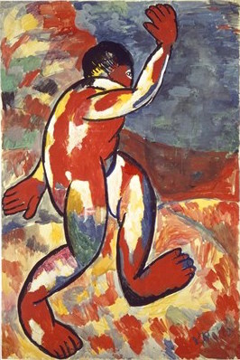
Matisse
is a visible early influence, for example in 'Bather'
(1911, below). With it's bold outlines, it's real or apparent blocks
of vibrant colour, it's an evocation of movement. It's audaciously
simplified figure shows little interest in anatomical accuracy, the
torso is simply a sausage from which protrudes oversized flapping
hands and striding feet.
Malevich
soon joined the Donkey's Tail group. With a name presumably working
as a self-styled irony, they determined not to be merely imitative of
art abroad but (as the show puts it) “fusing the innovations of the
Western avant-garde with the simplified forms and expressive colour
of [their own Russian] popular prints and religious icons.” And as we saw with the 'From Russia' show, this would prove a
potent cocktail. The magic beans of Western Modernism were brought
back and plant in the rich soil of Russian folk art, leading to some
very bold beanstalks indeed.
The
common folk became the subject for painting, with an almost totemic
emphasis on the figure of the Peasant. He's clearly seen as the
emblem for Russia, much as John Bull was for Britain. But paintings are frequently
named after their central figures, who are themselves named after
their activity, such as 'The Floor Polishers'
(1911/12). Their facial features are normally boldly outlined,
evoking types rather than depicting individuals. See for example
'On the Boulevard' (1910, below), where the figure
is emphasised by being thrust out at you. If we include the bench he
sits on, he extends beyond the frame in all four directions, with a
disconnected landscape placed behind him like a theatre flat.

But
Malevich was already moving beyond Matisse. In for example ,'The
Scyther' (1911/12, below) the background is reduced to
shades of red, and works somewhere between a scene and a form of
patterning. It offers a vivid colour contrast to the foreground
figure. With his neatly gradated black and silver-grey (looking
almost like a piece of modern vector art) and mask-like face, the
figure looks as metallic as the scythe he carries. And yet, rather
jarringly, his feet are unshod.

And
this change was coming through fresh winds blowing from the West. The Knave of Diamonds exhibition of December 1910 first brought
Cubism to Russia, and spawned an indigenous group named after it.
However, as we saw in an earlier review, distance allowed the Russians
to take the seemingly irreconcilable Cubism and Futurism and combine
them into their own synthesis – which they promptly (if
uninventively) titled Cubo-Futurism. Nevertheless, most examples were
more Futurist, more concerned with dynamism and speed. (See for
example Natalya Goncharova’s ‘The Cyclist’, 1913). Malevich,
conversely, stayed closer to the more contemplative Cubism.

With
'Head of a Peasant Girl' (1912, above) Malevich
employs sombre browns and greens, the cooler colour scheme of Cubism,
rather than the bright blocks he'd first borrowed from Matisse and
were still being employed by the Futurists. The show finds “the
title challenging the viewer to find the trace of a recognisable
image in a complex arrangement of planes”. You can't, and yet like
a Zen exercise the image seems perpetually just out of reach.
The
title actually has a second challenge, for there's a pleasing irony
in Malevich insisting so modern a painting should still be dedicated
to a Peasant Girl. Yet at another point he seems less assured that he
can continue to combine his influences. 'The Woodcutter', effectively a sequel to 'The
Scyther', has on it's back 'Peasant Women in Church' (both 1912), not only a more traditional piece of folk art but, as
its title would suggest, religious in theme. It suggests an artist
divided, not sure which way to go.
And
yet he did. Modernism is often caricatured as a series of dry, formal
innovations, hermetically disconnected to anything outside the artist
world and its fixations. And if there's a moment of truth to that,
Cubism is it. It's innovations weren't important so much as
revelatory. But it was art for artists. And those artists needed to
swallow it down, learn it's lessons and move on. That's pretty much
what Picasso did, and he was the school's co-founder. And that's
precisely what Malevich does. His Matisses, however good they look,
are merely more Matisses. Whereas his Cubist works, however typical
they look, show him already working his way out of them.
As
if the brew wasn't already heady, Dadaism is then thrown into the
mix. Though it was never named as such in Russia it seems to have had
the same impetus as in Germany, the looming shadow of the First World
War. In 1913 Malevich collaborated on the 'Zaum'
manifesto which boldly called for “the dissolution of language and
the rejection of rational thought”, and started wearing the
signifying wooden spoon in his buttonhole. The signature paradox of
Dada, nihilist destructiveness combined with wanton playfulness, is
at work - though in Malevich's case... well, let's check out which
face is uppermost.

‘American
in Moscow’ (1914, above) is a reason-defying collage of
objects, including that identifying wooden spoon and the (at least in
the popular mind) arch-Surrealist totem the fish. Among the
chopped-up words and images are three chopping devices – a sabre, a
saw and scissors. Even the scales on the fish's back, emphasised by
being placed before the man's face, look sharp enough to cut.
Writing in the Telegraph, Richard Durrant comments “accomplished
as all these early pictures are, every single one is a pastiche”.
He’s right. But they’re so accomplished. And
both those points are nowhere more true than with this work. It's
almost the consummate early Malevich.
Beneath the chaotic jumble it's well-composed... in fact too
well-composed, too realized. Dada relishes in its nihilism,
audaciously defying you to find it aesthetic. It's disruptive,
volatile and even violent. Whereas this is art merely masquerading as
anti-art. It's a great work of art. That's its success and its
failure.
Nevertheless,
it was Dada rather than Cubism that was to prod Malevich into
abstraction. And that's less surprising than it might appear. Though
people commonly couldn't find the images in it, Cubism was never
intended as abstract or even proto-abstract. It treated objects much
like flat-pack furniture in reverse, it took the seeming solid and
disassembled it. It asked why we'd want to see objects from just one
perspective in art, when that's not the way the world works. But
multiple perspectives would prove not liberating enough for Malevich.
Not
that Dada was any more proto-abstract. It sought to undermine
language's functionality at the point of use, to make its descriptive
powers seem arbitrary and thereby meaningless. But the lesson
Malevich took from it was ultimately different - that you could cut
language from its earthly moorings, and rather than use it to point
at objects attempt to express the ineffable. “Zaum” was most
likely a nonsense term akin to Dada itself, a jeer at language's
inadequacy. The nearest English equivalent might be “blah”. But
Malevich seems to have taken it to mean something more like “aum”.
Coined to express nothing, he took it to mean everything.
And
so he went and painted a big black square.
Be
Square

'Black
Square' (1915, above), as he decided to call it, is called
by the show “one of the iconic paintings of the Twentieth Century”
or
by the Times' Rachel Campbell-Johnston the “Mona Lisa of
Modernism”. (She uses the line early, so it pokes above the parapet
of the great Murdoch paywall.)
The
date I've given above follows convention, it's when the work was
finished. But Malevich himself always used 1913, when he first had
the idea. Which suggests it might even be the the first conceptual
work of art, its idea more important than its realisation. (The same
year, in 'Village' he simply wrote the word
“village” on a canvas, arguing that “encompass[ed] the entire
village” rather than get tied down in specifics the way an image
inevitably would.)
And
look when it comes. It wasn't the full stop I'd previously imagined.
As it comes early in his abstract works if it's any form of grammar
it's an opening quote. When the show calls it “the starting point
for a wholly new approach to art”... well bugger me for a
know-nothing but they prove themselves right! Malevich was soon
calling this approach Suprematism, and crying
“arise comrades, and free yourself from the tyranny of objects!”
Realising
it in fact proved problematic, for such a large block of black paint
would inevitably crack over time. (Look up close at the illo above.)
To try and overcome this he repainted it four times, though it makes
you wonder why he didn't just stitch a square of black material onto
the canvas.

And,
there being multiple versions, we even get to see it twice. Just in
case you didn't get the point the first time. And in fact I'm not
being sarky there. In December 1915 he staged 'The Last
Exhibition of Futurist Painting 0.10', which doubled as the
first Suprematist show. (The only known photo of it is above.) This
is duplicated by the Tate, though more sparsely as only twelve of the
original twenty paintings have survived. And seeing it in this
context, rather than standalone, gives it more meaning. Hung across
the top corner, its simultaneously part of and outside and above the
other works. Notably its been placed next to some of the more
detailed pieces, providing a contrast. In fact, though I've no idea
whether this is actually the case, it looks like the other works were
made to go around it.
The
show makes much of this being the place where, in Russian Orthodoxy,
the icon would be hung in the home. (Ironically its also the place a
modern power object goes, the playback screen in shops showing
punters the security cameras are working.) There's debate about
whether this is meant as some Dadaist provocation or a genuinely
spiritualist gesture. My money's on the second one. In fact it made
me think of the way Hebrew scrolls would only use a placeholder for
the name of God, but still place that placeholder into a sentence.
The exhibition looks like it's built up as a sentence in that way,
the works as words, meaning stemming from context.
Yet
in a sense this all exhibits the limits of Malevich's approach.
Language always depends on context for meaning. It can point at the
ineffable, but only by contrasting with the here and now. Malevich
has expelled the representational from his art, but we still need the
represented - to see it framed by the real world for it to have
meaning. 'Black Square' needs the context of what
it isn't to be what it is. (I
had a similar feeling at the 'From Russia' exhibition, which included a photo of the
Black Square above the artist on his deathbed.)
Suprematism
Supreme
By
this point Malevich has successfully reduced his art down to one
colour, and one that strictly speaking isn't even a colour. Even the
off-whites which border his black shapes are so
off as to be no more than non-black, something to stop the eye
settling there. But, in the one moment of truth to the theory he
needed to pull back from the absolutism of 'Black
Square', colour then comes back in all it's boldness.

Take
'Suprematism 55' (1916, above) with it's bright
blocks of colour, even the background replacing the cold off-white of
'Black Square' with a warm sandy yellow. This
leads the show to claim “at the heart of Suprematism was colour”.
However, while colour is an important component, it's not the key
feature of these works.
The
Futurist dynamism he initially passed over for Cubism returns in all
its glory, and the colour is there to serve that dynamism. We can
think of abstraction and perspective as opposites, one seeing the
picture frame as a window on a world and the other insisting its just
a flat surface. But this work has a powerful sense of spatial depth,
that black tadpole floating as if several feet above the brown
rectangle. The diagonal black line emphasises the perspective, like a
dropping rope. Yet where Futurist dynamism was convulsive his is
elegant, those shapes seeming to serenely glide. (I know it's not the
point, but I can't help but see biplane shapes in there.) For all
it's abstraction it feels not sterile but alive,
full of movement. It provides everything 'Black Square'
withheld.
And
it's these works which carry the show. Notably it's this, and not the
better-known 'Black Square' which becomes the
show's poster image (up top). In fact, as Malevich started using a
black square in place of his signature, it becomes little more than
an authenticating rubber stamp, added to each corner.
With
Malevich it's easier to come at him from what he isn't doing, before
arriving at what he is. Miro called a series of painting
'Constellations', as if they were as vast and
awe-inducing as the night sky. While alternately, the first
atom-splitting experiments have been considered an influence on
Cubism. As we saw with Alexander Calder, he quite possibly combined
both. And indeed one of the appealing features of abstract art can be
having your sense of scale with-held, so you've no idea whether
you're gazing up at the immense or peering into the microscopic.
But
for Malevich either option – the cosmic or the subatomic – seems
still too earthly, too tied to regular human perception. It was more
like he was tapping into some heightened realm of pure geometry,
something which could only exist through being painted – but was no
less 'real' for all that. His term Suprematism does not relate to
'superb' but 'above' or 'beyond'. Works echo this in their immaterial
titles, such as 'Mystic Suprematism' (1920/22) or
'Supremacy of the Spirit' (c. 1920).
Robert
Burghardt and Gal Kim point out: ”The most obvious
strategy for representing universalism is abstraction. The abstract,
like the universal, evades the concrete. In the abstract formal
languages lies a certain openness that allows space for one's own
thinking and associations. It facilitates multiple interpretative
approaches and engenders fantasies.” ('Signal' 3, PM Press) (They're writing about Yugoslav Partisan
Memorials but the point transfers.)
”Everything
Has Disappeared”
And
this leads to a peculiar paradox with Malevich. The most active part
of his career coincided with the most politically eventful era in
modern Russian history. He went to Moscow shortly before the 1905
Revolution, fought in the First World War and witnessed the new
post-revolutionary Russia. It's events which led to the political
commitment of Rodchenko's photo-montage, Eisenstein's cinema or
Tatilin's vow to redesign everyday life. And yet among them here's
this mystic, his art self-avowedly removed from all earthly things.
To him surely those political events were like the off-white behind
the black square, not something worth focusing on.
Materialsm,
the idea that humans are products fo their social context, that we
cannot arbitrarily transcend that context just by thinking hard, is
axiomatic to communism. Suprematism seems the very opposite to all of
that. Surely it was merely an aesthetic movement with delusions.
And
yet he seems to have seen it differently. He claimed in 1915 “our
world of art as become new, non-objective, pure. Everything has
disappeared; a mass of material is left from which a new form will be
built.” And if a cynic might claim that as mere boiler-plate
Modernism, at other times he more explicitly tied artistic changes to
the political. In 1919 he stated “painting died, like the old
regime, because it was an organic part of it”.
Rachel
Spence writes of “the Russian avant-garde's fantasy of a social
re-ordering so radical it was often conceived in cosmic rather than
earthly terms”. ('Art Quarterly', Spring '15)
She is of course using the analogy to dismiss such hubris. But its
actually sound. If Malevich was other-worldly, there's also the sense
that events in this world had led us to more easily access that other
world. Revolution raised us, much like Mass is held to connect
Catholics to God.
He
taught art, and far from being remote or ascetic proved a galvanising
figure. His charges formed their own group, the Champions of New Art,
taking up the black square as their emblem. (Members included Popova
and Lissitzky, creator of the famous piece of abstract agit-prop 'Beating the Whites With the Red Wedge', 1919.)
The
Revolution, when it arrived, affected Malevich's art in two ways.
First there's the Architectons. Much like the Constructivists, he was
searching for a more practical application for art, so created works
which lay somewhere between sculpture and scale models for buildings.
But the truth is, they don't really work as either. As stated above,
Malevich's art needs a frame. It's subject was the ineffable, with
abstraction as a means to describe the indescribable. It works as a
kind of portal, an other-world only bordering ours. Objects which
physically exist in our space do not play to his strengths.
Also,
true to his words that “painting died” and “everything has
disappeared”, he again starts to strip elements away. The dynamism
disappears, and those pure blocks of solid colour dissolve. They're
as formal as the earlier 'Last Exhibition' works,
but instead of black-on-white they're... yes, really...
white-on-white. Check out for example 'White Suprematist
Cross' (1920/21, below). If we're going to continue with
our grammar comparisons, these are like the ellipses that trail off a
sentence like...

And
if that seems rather like a film that ends by fading to white, like
the story should really have stopped there, perhaps it should. But
instead...
Back
to Peasantry (Tragedy and Farce)
Stalin
soon rose to power, and it's scarcely a spoiler to say that part of
his plan to suppress all dissent was to impose a socialist realist
orthodoxy on art. Added to which, in a point played up in Orwell's
'Nineteen Eighty-Four', those who had earlier
shown an excess of zeal for the revolution were now considered
problem cases. What was wanted was those who'd just obey.
Malevich, in short, was primed to get it from both barrels. He had
only ever left Russia once, on a speaking tour of Germany, but that
was used as evidence of fraternisation with the enemy and proof of
“bourgeois” qualities. Many of his works survived only because
orders to destroy them were disobeyed.
Perhaps
unsurprisingly given the circumstances, he soon decided painting
wasn't quite dead after all and returned to the point most acceptable
to the new regime – the Donkey's Tail era. However, when his
peasants reappear, its history repeating as both tragedy and farce.

'Head
of a Peasant' (1928/9, above) is something of a sequel to
'The Scyther', but the eyes look heavy, the
mask-like face less universalised than stamped with the
dehumanisation of enforced collectivism. (In other works the main
figure has an alarming egg-shaped void for a head.) The figures
behind could be foraging as much as farming, while above them war
planes fly in formation before a darkening sky. As the show puts it
“his inert figures against a pared-down landscape convey a sense of
dislocation, alienation and despair. The peasant, long established as
the embodiment of the Russian soul, is reduced to a faceless
mannequin.”
You
could debate how deliberate all this is. Is Malevich like
Shostakovich, encoding the dissidence he couldn't state openly? Or is
he like Vertov, trying desperately to adjust to the new realities but
unable to sing the new slogans with any cheer? It probably doesn't
matter much. The result is the same. If some of his early works were
pastiches, these are almost pastiches of his own early work.
He
followed a career almost as neat as one of his geometric forms. But
unlike his patented square it was a triangle. There's a steady ascent
to the late Tens and early Twenties, at which point he seemed able to
lift himself from the ground, but which is followed only by decline.
Yet the view from that apex... it's no exaggeration to call it
other-worldly – so let's focus on that for the finish.
As
a general rule, I like to think of abstraction as something which
expanded the territory for art, freed it from being tied to
representation. Which is distinct from the notion of 'pure
abstraction'. If it instead switched art over, trading in hillsides
and rivers for squares and circles, then it surely swapped one set of
confines for another. It seems to make more sense to see those
normally regarded as the pioneers of abstraction, such as Kandinsky,
in terms of expansion rather than exchange.
So perhaps the most
fascinating thing about Malevich is that his abstraction was
pure, that he did disdain anything short of that as “a mere
imitation of reality”. And yet he found a way to make that work.
He's the man who made geometry glide and sing.
Coming
soon! More of this sort of thing...


