
”An Old War, Not Even a Cold War...”
Starter for ten – Think of all the post-war British figurative artists who are likely to receive retrospectives at the Tate. Then look down at the piece of paper upon which you’ve written ‘Francis Bacon’ and wonder why.
Bacon himself sought to keep the answer mystical. He infamously refused any political or philosophical interpretation of his work, denying any influence from expressionism or existentialsm or congruence with current events. Well, he also denied ever making preparatory sketches and then a slew of them turned up after his death. Now he seems so emblematic of an era he’s practically marinaded in it.
This exhibition takes the opposite tack, even providing a timeline to set events of his life alongside the Cuban Missile crisis, the death of Stalin and so on. (It’s also notable that, though Bacon was painting before the War, none of those works are shown here. Traditionally, exhibitions show one or two early works – even when they’re just juvenalia.)
Now if your main image of the Cold War reflected in popular culture is Frankie Goes to Hollywood videos, you may not at first recognise the connection here. A few paintings do feature two figures tussling, with the viewer never sure whether they’re fighting or fucking. (Something which literally put Bacon on trial on one occasion.) But most feature figures in isolation. (Not single figures, but figures in isolation.) Where do they fit into these post-war climes?
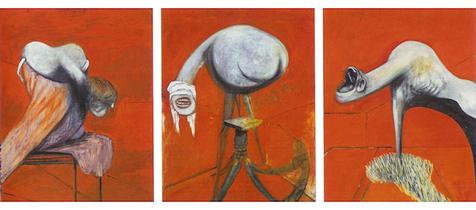
A key feature is that almost all the works are interiors. (Even Two Figures in the Grass, despite that titular grass!) Of course the interior stands for the psychological. Bacon is trying to capture not real rooms he has seen but something far more conceptual. The handouts describe the figures as “trapped within the composition,” and indeed its ambiguous whether we are looking at a frame or a cage. It’s reminiscent of Sartre’s 1944 drama No Exit, where Hell is presented as a giant hotel. It’s not so much inescapable as there’s simply nothing else outside of it. Crucially, these figures are not so much at war with themselves as with their very existence. If you were to distill Bacon down to a simple phrase it would be ‘flesh is a trap’. “Well of course,” he’s quoted as saying, “we are meat.” (Oh the irony he took the name of a cut of meat!)
It probably is hard for the young folk of today to understand how all-pervasive the Cold War felt at that time. It was a war for which we must all stand ready to fight, which could never actually be fought. It came to feel not merely political but existential, as if Berlin Walls inevitably imposed themsevles not just between nations but between (and within) individuals. Separation came to feel so much the natural state of things that it transcended the unique conditions which created it and it inscribed itself back through history - even into pre-history. Bacon’s animal paintings mirror the cod-Freudian pseudo-science of Desmond Morris and Robert Ardrey, whose books filled the era - usually adorned with a snarling baboon transforming into a businessman, or something similar. (The handouts locate these paintings in a post-Darwinian condition, yet that alone would not explain the preponderance of these books in the post-war era.)
The result is a paradox in Bacon that is perhaps true of existentialism in general. Its concerns are universal, it seeks to present immutable truths about the human condition. But at the same time it’s profoundly of an era. Intriguingly, Bacon chooses to play up this paradox until it turns round to his advantage. Adrian Searle notes how many of his incidental details are contemporary – “modern furniture, men in suits, plumbing, fitted carpets.” In Trevor Griffiths’ Comedians a character who sees Buchenwald finds the horror not in the slaughter but in its combination with the mundane accoutrements of everyday life – coat pegs next to gas taps. (“This was a place like any other!”) Bacon puts in his plumbing for the same reason.
But even without that element, none of the above would necessarily dismiss Bacon as a period piece. Some of his fixations now seem outdated, it’s true, such as the anti-clericalism. (There does now feel something shock-by-numbers about all those bestial Popes.) But art does not die when taken out of its era, any more than it gets taken to a place where it can be catalogued objectively. Its journey through each subsequent era redefines it: like a man on an expedition encountering new worlds and cultures, until he is no longer the man who first set out.
Hail the Drab Screams!
The crucifixion paintings are made the centrepiece here, granted a room all of their own. This breaks with the chronology and puts Forties and Sixties works alongside each other, providing us with the chance to compare them. If you want it in a soundbite, the Forties Bacon is the guy Ralph Steadman got it from and the Sixties Bacon Gerald Scarfe.
Traditionally paintings depict a timeless space or else embrace some form of narrative, but neither belongs here. The Forties paintings are not just rougher in execution, but have a writhing quality, a feeling of flux, as if the paint has almost not quite managed to pin down the struggling figure and place it in it’s cage. Perhaps this effect came partly from Bacon’s habit of working from photographs, they often have the sense of blurry motion photographs without attempting to reproduce the outward blur. This gives them the tension that propels them, as if the war of being was waging before our eyes with no hope of resolution. They’re given a dark and muted palette, reminiscent of a world of post-war austerity. Some are so dark you peer into them like caves, your eyes attempting to adjust to the gloom. These are the drab screams.
Later works are both bigger in scale and more detailed, but in a different sense are starker. More plastic, they have a forensic quality, like joints of meat trapped inside shrink-wrap at the supermarket. They sometimes depict wounds but often look more as if the skin surface had somehow been rendered transparent, becoming a mere bag of bones and organs. (Eliot’s “skull beneath the skin.”) The figures are less often monstrously ambiguous and more often ‘distorted human’, with faces in particular looking like a cross between Picasso’s Demoiselles d'Avignon and a fairground hall of mirrors. Palettes become more vivid, in fact just plain louder.
The exhibition offers an explanation for this change in style, which it saves for a later room. It transpires that, on visits to Tangiers, Bacon had found the light a revelation and reacquainted himself with van Gogh. There’s even an imitation van Gough of his on show (dated ’57), which is poor in itself but arguably significant in spite of that.
But is there another explanation? Could it be that in the Sixties society went into colour and Bacon, not wanting to get left behind, abandoned his drab screams with their rationing-era hues? This suggestion isn’t necessarily as cynical as it may sound. As we’re already seen, he was but one of many artists who subscribed to the myth he stood outside his time – and a myth was all it ever was. Having previously been so influenced by the preceding era, why would the next one not have a similar effect upon him? The zeitgeist is something bigger and more compelling than mere fashion, and even the strongest of steerers can find himself caught up in its sway.
Then again, let’s add a cynical twist. Though there are changes of imagery visible here, they are not huge. Many visitors might not even notice them. Bacon was literally an obsessive artist, painting and repainting the same images over and over. Perhaps the only thing left to him to vary was the style, the size and the colour the screams came in.
Of course the clincher is the value of the later works. Some are good, but overall the trade-off is a familiar one. Ultimately, they become plastic in the second sense of the word. They’re more polished, but the same time they polish over something of the vital force. They lose the sense of claustrophobia and convulsiveness that makes the earlier works so memorable. If the earlier figures were fascinating for never quite being pinned down, here they’re caught in a gaudy spotlight like failed jail escapees. Bacon was simply better when he was messier. The drab screams win out over the technicolour ones.
As things descend through the Eighties and Nineties the canvases grow bigger still – and the figures correspondingly smaller. A charitable soul might call these minimal, though semi-empty might be a more accurate term. Large geometric shapes start to appear and vie with the figures. Adrian Searle comments: “feel the disengagement – yours as well as his – setting in.” The busy gallery-goer can speed-visit rooms Nine (‘Epic’) and Ten (‘Late’) here, and not worry about missing much.

“A Gust of Cheap Magazines...”
How would Bacon compare to Philip Guston, whose own retrospective went on show a mere four years ago? (As covered in Ye Olde Printe Days of Lucid Frenzy!) There are striking similarities. They were not only defiantly figurative artists in an era of abstraction, but had similar themes and obsessions. At times they even share motifs, such as the dangling lightbulb. They can even seem to swap them, pointy red arrows hovering around details of interest might feel like a Guston device but actually its Bacon. However, the chronologies differ markedly - by the time Guston reverted to representation (the late 60s) Bacon was over twenty-five years into his game. And of course Bacon never turned against abstraction, he merely decried it from the start. But perhaps the real difference between them is something else, which we’ll approach sideways.
The Telegraph’s Richard Dorment sniffs “his attempt to symbolise the human condition might appeal to an adolescent or a fan of science fiction.” But this snide comment actually brings up an interesting point. Bacon’s influence on popular art feels huge, you see echoes all around you in Scarfe, Giger, Clive Barker and many others. But for someone so influential, Bacon himself seems to have been paradoxically uninterested in popular culture. While you can’t miss the Bud Fisher in Guston (to the point where he’s been accused of plagiarism), Bacon’s corresponding totem would have to Velazquez. He may have used photos of low culture events (such as boxing), but his work transformed them out of recognition. Dorment typifies the art establishment ‘s disdain for Bacon, as someone they saw as a showman and cheap populist. But, from his insistence on his works being shown behind glass to his retrogressive disdain for abstract art, Bacon saw himself as a Proper Artist. He may have tried to escape the cage of flesh, but never the snare of capital-A Art.
Guston’s dallying with low culture game him a vibrancy and a shot of humour which (however black) is missing from Bacon. The handouts claim “he faced death with a defiant concentration of the exquisiteness of the lived moment”, but that’s merely auto-luvvie-seak. This show ends with a figure stepping away from the viewer into a black square. It’s like Malevich upside-down, the geometric shape representing not eternity but nothingness – the end of a struggle which could never be won. Bacon might have opened the door to so many followers, but could only close his own.
The Tate's on-line guide has a nifty interactive 'explore' function for following the show virtually. This may be handy if you don't think you'll make the show. However, it's so thorough, if you are thinking of going in person, you're probably better off not clicking on it until afterwards.