googlee7ea825f63edb3f6.html
Showing posts with label Folk Art. Show all posts

Friday, 8 September 2017

'REVOLUTION: RUSSIAN ART 1917-1932' 2: THE RADICAL FRINGE

Royal Academy, London
(A sequel to something started here)


“The Bolsheviks could not have retained power for two and a half months, let alone two and a half years, without the most rigorous and truly iron discipline”
- Lenin

The Peasants Are Not Gruntled

On reaching this show’s ’Fate of the Peasants’ section, smartly hung so it’s the first work you encounter, Boris Grigoriev’s ’Land of Peasants’ (1917, below) gives the most guarded of welcomes. There’s the golden corn fields, stretching over the horizon, which would later become a staple of socialist realist kitsch. Yet they’re placed to the back of an elongated frame, with a whole lot of figures arranged between us and them. Three adult faces, abetted by two children, push themselves to the front of the composition, not in bright peasant colours but black, white and brown. Hands clutch implements tightly enough to make fists.


While his ’Old Dairy Woman’ of the same year abets the title character with the large horned head of a bull, one lot of leathered skin not looking dissimilar to the other. In their slightly reserved welcome, the images aren’t unlike Grant Wood’s ’American Gothic’ (1930), simultaneously shown in the Academy’s other gallery as part of ‘America After The Fall’.

And how could it be otherwise? Despite the Bolsheviks’ reassuring symbol of the Hammer and Sickle, promising the peasants partnership, it was the factory worker who was considered the revolutionary subject. The peasant was an unfortunate necessity, often seen as suspect if not an active obstruction. Ideology was so strong people would dismiss the peasants even as their bellies rumbled.

This relationship is accurately if inadvertently summed up by a dish of a peasant girl, designed by Elizaveta Rozendorf in 1920. The head of it’s nominal subject is caught in the side dip, semi-obscuring it and instead throwing the focus on the pumpkin she carries. It’s oversized, almost as wide as her arm is long.

At best the revolution would be brought to the peasants, intact and fully formed, allowing them to climb aboard. Check out the clip below of Dovzhenko's ‘Earth’ (1930). They’re almost unmoving before the tractor arrives, as if the country was some pre-revolutionary purgatory and all that was good and new came from the city.


While Grigory Ryazhsky’s ’The Collective Farm Team Leader’ (1932, above) portrays that tractor-based collectivism once in place. As with the revolutionary images we saw last time, it’s centred round a central block of red. But this time it’s not only naturalised but has softer oranges and yellows radiating around it. This probably stems from being painted date, actually the final date in the show’s span, when the anti-formalism of socialist realism was ascendant. But it was anti-formalism only of a sort. There’s something almost heraldic about the tractor at her shoulder, and the labouring peasants arranged around her.

But not only was Russia primarily agricultural, the combination of revolution and war with the Whites had increased the rural population, as many fled the impoverished cities to go back to the land. And the peasants, meeting mistrust with mistrust, would often resist the enforced collectivisation and “requisitioning” of their grain by hiding or even destroying their crops. This only increased after June 1918, where conscription to fight the Whites was enforced on pain of death.

But once things had been very different. It wouldn’t be too much of a generalisation to say that Russian art had divided between those who wanted to take up an international Modernism versus those who wanted to immerse themselves in an indigenous folk art. Seen one way, that distance to Paris was vast. Seen another, that space was actually a treasure trove brimming with unique art history. (Older readers may remember my waxing more about this after the ‘From Russia’ exhibition, staged at the Academy almost a decade ago.) Things had begun to change only in the years leading up to the revolution. And much of the old attitudes remained.


Certainly Symbolist painter Mikhail Nesterov painted ’Philosophers’ (above) during 1917, as if none of the events going on about him had registered. The two philosophers stand, sombre and static, clearly intended as metonyms of Russia. They don’t seem to look at the landscape. Cut off at the knees by the framing, they seem more plantedin it – as much as the trees behind them. The wooden walking stick aids the comparison.

It’s quite likely the Futurist artists would glower to be hung in the same space as this. Yet in it’s stillness it’s a companion piece to those industrial Futurist works – the way an opposite bookend can be seen as a companion piece. And besides, it’s simply a great painting, in that it not only conveys all that it intends but seemingly without even trying.


Marc Chagall, meanwhile, makes for a good example of the fusion of these approaches. Though Belarus born, he had moved to Paris and only been back in Russia after the First World War had made a trip home permanent. His ’Promenade’ (1917/18, above) is not sombre or ordered, assuming some eternalised tradition, but possessed of great vivacity and abandon. He was recently married and the two figures are believed to be the happy couple. The male figure clutches a bird in one hand while the woman flies in another, suggesting the symbolism of folk magic. The dome of the Orthodox Church behind them completes the picture of the idyllic Russian village.


Similarly, the prologue to Grigory Kzointsev and Leonid Truberg’s film ’The Youth of Maxim’ (1935, above) is not of a static peasant past like Dovzhenko but captures the wild rush of a sleigh ride. After an initial blur of lights the camera settles aboard the sleighs themselves, cutting sharply from one to the other.Mixing it up, a car can be seen among them. The music, though based on polkas, is by Shostakovich.


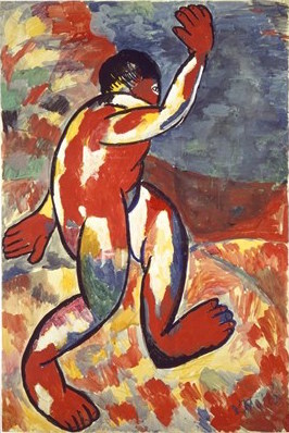
But perhaps the most telling way the peasants were depicted were the two runs by Malevich. As recounted after the Tate show dedicated to himMalevich originally evoked the peasant as a symbol of the Russian soul. However by the time of his (not entirely voluntary) return from abstraction the type had become a contentless form. In ’Peasants’ (1930, above) faceless faces peer back at you, the plain behind them featureless save for bands of colour.

Notably, the show comes up against the same problem as I did after that Tate show, in working out the balance between intent and forced circumstance at work. It states “blank faces hauntingly evoke lost identity on the collective farm”, as if the work’s a quiet protest. But then adds “these were Malevich’s attempt to conform to the Soviet dogma that required art to be representational.” Whichever, perhaps the two were snapshots taken of a work in regress.

And speaking of Malevich...

Permission to Deviate

One nice feature of making an exhibition so all-embracing, so concerned with spanning the breadth rather than searching for the through-line, is that it captures works which would have passed through the clutches of more focused fingers. This next section’s on the mavericks – the artists who saw their activity as enabled by the Revolution, and may even have cheered it on, but without the same sense of being in service to it. To them, it just gave them permission to pursue their own path as far as it went.

Malevich is a classic example of an artist who would have been horrified to hear he’d been consigned to maverick status. Not only did he see his art as very much in step with the Revolution, in his teachings he persuaded many to agree with him. (In contrast to the ostensibly similar abstraction of Kandinsky, who was back in Russia-revolution but often had his teachings dismissed as irrelevant and “bourgeois”.)

You might think that after being the subject of an entire Tate show, Malevich was a done subject. Not so. Like the Tate show, duplicating one of his contemporary exhibitions proves a masterstroke, this time the 1932 retrospective ‘Fifteen Years of Artists of the Russian Soviet Republic’. (They did love their catchy titles.) A photo of the original exhibition is below.


Malevich’s work doesn’t just seem to benefit from being shown as a group, it even starts to look like one great meta-work just made up of individual components. With the Suprematist works arranged symmetrically behind some of his architectrons (which impressed me little when seen in isolation), the whole thing does look remarkably like an altar. And the three central Suprematist paintings look designed to be shown in this arrangement, one aligning right and the other left.

Malevich claimed he was painting in his Suprematist style two years before he’d exhibit anything, which given the speed of change at the time seems bizarre. The most likely answer is this, he understood this need for them to not be seen singly but as a group.

It was common for artists of the era to either design for, or have their works copied onto, everyday objects such as plates or teapots. This was seen as one way to bring art to the masses, and perhaps was more effective in the days before the exit-through-gift-shop was doing a roaring trade in such things.

However, perhaps as proof of Malevich’s maverick status, when the State Porcelain Factory put his work on plates the result is merely jarring and ineffective. His art aimed at the ineffable, and became trapped when pinned to objects in this world. The Design Museum’s ’Imagine Moscow’ exhibition (coming up, honest) commented that Malevich was influenced by his contemporary Pavel Ouspensky, who propounded esoteric theories of a fourth dimension beyond our perceptions.


Pavel Filonov (who briefly appeared in the previous instalment) may have been something of a fellow traveller to Malevich. Both actively supported the Revolution, even though their own art was essentially mystic in nature. Except where Malevich envisaged other dimensions, Filonov saw our reality as one level in a picture simultaneously bigger and smaller.

We tend to think of the human head, representing both individual identity while forming one of the most basic shapes, as one of the those irreducible ‘building block’ of art. Yet with Filonov’s ’Heads (Human in the World)’ (1925/6, above), we can only show a detail for the whole thing is remarkably intricate. (A larger, complete version of it lies here.) The heads, though never realist, vary in detail - some are completely cartoony. At first glance they seem to be arising out of a geometric lattice. Yet the points where the lines bisect often become frames for still-smaller images, as though the heads are themselves a mass of tattoos. While at one point the background shows quite a naturalist scene, of a red-roofed shack out in the woods.

Some reviewers compared Filonov’s works to fractals, yet no elements really recur. Filonov himself called it “universal flowering” or “anti-Cubism” - a form of Cubism uninterested in surface features but inner elements. The show suggests a metaphor for time, saying “his images seem to emerge from the flow of memory, representing ancestors, folklore and urban groups”. Certainly the emphasis on heads suggests Filonov is talking about what constitutes us. But the notion’s probably too narrow. Instead we need the shamanic conception of ‘the web without a weaver’, where time, space and scale are assumed to be not just interconnected, influencing one another, but indivisible parts of one integral tapestry.

Unlike the always accomplished Malevich, Filonov was closer to an outsider artist. Remarkably he manages to keep ’Heads’ explicable by reducing the colour scheme and pushing some elements so boldly into the foreground. There’s a kind of tipping point, where we only recognise the work’s complexity at the moment we find ourselves getting lost in it. However, at other times he simply indulged his obsessions without such consideration for the viewer. ’Formula of Spring’ (1927/9) offers no way in to it whatsoever.

After the ‘From Russia’ exhibition, I’d dismissed Kuzma Petrov-Vodkin as a mere copyist. And it’s true that, though they gain more attention, his ‘revolutionary’ works such as 'Fantasy' (1925) or ‘Death of A Commissar’ (1927) just look odd and off. His influences were more Russian icon painting, Western Renaissance and Post-Impressionism than the seemingly de rigeur Russian Futurism. As the show says “ultimately his art is metaphysical rather than political, a reflection of the human spirit and the cycle of life”. It's Petrov-Vodkin’s portraits and still lifes which sing.


We effectively saw this last time with the contrast between ’Still Life With a Herring’ (1918) and ’Beside Lenin’s Coffin’ (1924). But let’s add to the mix ’1918 In Petrograd (Petrograd Madonna)’ (1920, above). Ironically, conditions in Petrograd were probably at their worst in the year between when the work was labelled and painted, when the city was besieged by the Whites. But they were not a picnic at any point.

There’s a strange dichotomy between the work’s apparent subject and where your attention goes, like one of those family snapshots which just happens to catch the Twin Towers being hit in the background. Those amassed and yet strangely isolated figures at ground level pull at your attention, but Petrov-Vodkin is all about the saintly figure on the balcony. The blue of the building which frames her is a very Renaissance touch.

Ironically it may be Petrov-Vodkin’s lackings as a political artist which saved him when the shutters came down in the Thirties. In 1932, as Malevich and Filonov languished in official disapproval, he was appointed President of the Leningrad Regional Union of Soviet Artists. There was simply no sinning Russian Futurism to beat out of him.


Konstantin Yuon had once been an Impressionist artist, which seems a long way from ’New Planet’ (1921, above). You could match this work to the regular Revolutionary iconography examined last time, with Kustodiev’s brobdignigian Bolshevik and the minaret replaced by planet-sized symbols. We see the red planet coming in towards the earth, the masses flocking to it, as the yellow one recedes. (Blue and gold are the standard colours of Russian Orthodoxy, so maybe yellow could be made a stand-in.)

Yet those rays of light seem introduced precisely to screw with the simplicities of the colour scheme. And more importantly, with so vast a scale, that reading would seem reductive - as well as blind to the work’s tone. Kustodiev's Bolshevik is raised into a giant, but remains human against the minaret. There’s nothing human level here. It could be described as cosmic but there’s also something eschatological to it, as if the historical forces of the time were as remote but as powerful in their effects as the gravitational pull of nearby planets. The Royal Academy magazine refers to it’s “euphoric energy”, (no. 133) but “convulsive” would seem closer. The figures mill this way and that, in some combination of hope and fear. Many raise their hands as if hoping to climb aboard, others simply run away.

Time To Stop Play


With both the Russian Futurists and the mavericks, when they thought they finally tasted freedom it was in fact their last gulp of air. But perhaps it was always the crisotunity of Modernism to live the most in the most interesting times. There’s only one other place which can rival Russia in the whole history of modern art. (Let alone Modernism.) And that’s Germany from the same era. And the people there didn’t have much of an easy time of it either.

Alas, times managed to become uninteresting without getting easier, and they did it fairly soon. The show separates the Revolutionary days from the Stalinist era via an appropriately long corridor. As we’ve seen, the 1932 exhibition ‘Fifteen Years of Artists of the Russian Soviet Republic’ still included Modernist work. But in April of the same year the Union of Soviet Artists formed, to enforce Socialist Realism. The Great Purges of 1936/8 saw no reason to exclude artists from their ranks of those they imprisoned, exiled and killed. Nikolai Punin, who curated the ’Fifteen Years’ exhibition, was among them. Filonov became so marginalised that he simply starved to death.

To say art was censored in Stalinist Russia is perhaps too feeble. It wasn’t about a list of things you couldn’t say, because instead there was a list of things you should say, that you were obligated to say and with instructions on how to say them. The resultant Socialist Realist kitsch was a glut of bad taste. It reeks of that fake pine freshness smell they put in cleaning products, the better to mask the smell of the gulags.

The way everything is so overwhelmingly jumbled together in such a cacophony is at once the success and the failure of the show. There’s perhaps too much of an emphasis on painting over posters and films, with the latter displayed as something of an afterthought – the films in particular were often hard to see. But this also means you can catch a little... a very little... of the heady feeling of the days it depicts. You'd stand in front of something like a classic Kandinsky, then think “must press on, more to see”.

Which means no review can possibly be comprehensive, but must inevitably settle for scattershot. Like the recent Abstract Expressionism show, only more so, everything is thrown in rather than reduced to a neat narrative. Like that show, it often throws up names brand new to me, and this time from an era I fancied I knew something about. The Russian Revolution will stay with us for a long time yet.

Coming soon! Meanwhile back in Soviet Moscow…
Coming sooner! Probably something else...

Friday, 25 November 2016

'MALEVICH: REVOLUTIONARY OF RUSSIAN ART'

The latest in a series on artists who dealt in abstraction and semi-abstraction. (Which is of course a thin cover for this being another art exhibition review which gets written up absurdly late.) Previous entry, on Kandinsky here.


“By Suprematism I mean the supremacy of pure feeling in creative art. To the Suprematist the visual phenomena of the objective world are, in themselves, meaningless; the significant thing is feeling.”
- Malevich

The Modernist Magpie

For the longest time, I associated the Russian artist Kazimir Malevich with Mondrian. An artist whose formulatory early years turned out to be their best work. An artist who, as soon as he'd figured out what he wanted to do, had boxed himself into a corner. In Mondrian's case a yellow box, in Malevich's a black one. But the same difference. His Black Square, beloved of art history books, was a full stop – the cul de sac of the path of abstraction. Once it was reached there was nothing left to do but turn back again.

With Mondrian, I still contend that's pretty much true. Yet Malevich's story turns out to be richer...

For an artist renowned for having so singular a style, it's weird to watch Malevich starting out by looking like everybody else. And it really is everybody else. He's able to cycle through so many Modernist styles so quickly, taking from each elements that suit him, like a Magpie in flight. Just get ahead of yourself for a second and scroll down to glance at at the next six or seven illos. They're not just from the same hand, they were created within a four year period.

Seeing an exhibition like this can be like reading a book where you already know the ending. It can distort your vision of what's happening right now. So, despite our natural tendency to look for Malevich expunging elements from his art, we should pause a moment to consider what stays. Abstraction is commonly assumed to lead from landscapes or still lives; the human figure so strong an image in our minds it needs to be suppressed before we can start to see a picture's formal elements. (Try looking at a still life of a vase of flowers merely as shapes and colours, then try the exercise again for a portrait.) But the human figure remains dominant, perhaps even a fixation, in Malevich's art right up to the switch-over. A rare landscape can even be called simply 'Landscape' (1906).

Matisse is a visible early influence, for example in 'Bather' (1911, below). With it's bold outlines, it's real or apparent blocks of vibrant colour, it's an evocation of movement. It's audaciously simplified figure shows little interest in anatomical accuracy, the torso is simply a sausage from which protrudes oversized flapping hands and striding feet.


Malevich soon joined the Donkey's Tail group. With a name presumably working as a self-styled irony, they determined not to be merely imitative of art abroad but (as the show puts it) “fusing the innovations of the Western avant-garde with the simplified forms and expressive colour of [their own Russian] popular prints and religious icons.” And as we saw with the 'From Russia' show, this would prove a potent cocktail. The magic beans of Western Modernism were brought back and plant in the rich soil of Russian folk art, leading to some very bold beanstalks indeed.

The common folk became the subject for painting, with an almost totemic emphasis on the figure of the Peasant. He's clearly seen as the emblem for Russia, much as John Bull was for Britain. But paintings are frequently named after their central figures, who are themselves named after their activity, such as 'The Floor Polishers' (1911/12). Their facial features are normally boldly outlined, evoking types rather than depicting individuals. See for example 'On the Boulevard' (1910, below), where the figure is emphasised by being thrust out at you. If we include the bench he sits on, he extends beyond the frame in all four directions, with a disconnected landscape placed behind him like a theatre flat.


But Malevich was already moving beyond Matisse. In for example ,'The Scyther' (1911/12, below) the background is reduced to shades of red, and works somewhere between a scene and a form of patterning. It offers a vivid colour contrast to the foreground figure. With his neatly gradated black and silver-grey (looking almost like a piece of modern vector art) and mask-like face, the figure looks as metallic as the scythe he carries. And yet, rather jarringly, his feet are unshod.


And this change was coming through fresh winds blowing from the West. The Knave of Diamonds exhibition of December 1910 first brought Cubism to Russia, and spawned an indigenous group named after it. However, as we saw in an earlier review, distance allowed the Russians to take the seemingly irreconcilable Cubism and Futurism and combine them into their own synthesis – which they promptly (if uninventively) titled Cubo-Futurism. Nevertheless, most examples were more Futurist, more concerned with dynamism and speed. (See for example Natalya Goncharova’s ‘The Cyclist’, 1913)Malevich, conversely, stayed closer to the more contemplative Cubism.


With 'Head of a Peasant Girl' (1912, above) Malevich employs sombre browns and greens, the cooler colour scheme of Cubism, rather than the bright blocks he'd first borrowed from Matisse and were still being employed by the Futurists. The show finds “the title challenging the viewer to find the trace of a recognisable image in a complex arrangement of planes”. You can't, and yet like a Zen exercise the image seems perpetually just out of reach.

The title actually has a second challenge, for there's a pleasing irony in Malevich insisting so modern a painting should still be dedicated to a Peasant Girl. Yet at another point he seems less assured that he can continue to combine his influences. 'The Woodcutter', effectively a sequel to 'The Scyther', has on it's back 'Peasant Women in Church' (both 1912), not only a more traditional piece of folk art but, as its title would suggest, religious in theme. It suggests an artist divided, not sure which way to go.

And yet he did. Modernism is often caricatured as a series of dry, formal innovations, hermetically disconnected to anything outside the artist world and its fixations. And if there's a moment of truth to that, Cubism is it. It's innovations weren't important so much as revelatory. But it was art for artists. And those artists needed to swallow it down, learn it's lessons and move on. That's pretty much what Picasso did, and he was the school's co-founder. And that's precisely what Malevich does. His Matisses, however good they look, are merely more Matisses. Whereas his Cubist works, however typical they look, show him already working his way out of them.

As if the brew wasn't already heady, Dadaism is then thrown into the mix. Though it was never named as such in Russia it seems to have had the same impetus as in Germany, the looming shadow of the First World War. In 1913 Malevich collaborated on the 'Zaum' manifesto which boldly called for “the dissolution of language and the rejection of rational thought”, and started wearing the signifying wooden spoon in his buttonhole. The signature paradox of Dada, nihilist destructiveness combined with wanton playfulness, is at work - though in Malevich's case... well, let's check out which face is uppermost.


‘American in Moscow’ (1914, above) is a reason-defying collage of objects, including that identifying wooden spoon and the (at least in the popular mind) arch-Surrealist totem the fish. Among the chopped-up words and images are three chopping devices – a sabre, a saw and scissors. Even the scales on the fish's back, emphasised by being placed before the man's face, look sharp enough to cut.

Writing in the Telegraph, Richard Durrant comments “accomplished as all these early pictures are, every single one is a pastiche”. He’s right. But they’re so accomplished. And both those points are nowhere more true than with this work. It's almost the consummate early Malevich. Beneath the chaotic jumble it's well-composed... in fact too well-composed, too realized. Dada relishes in its nihilism, audaciously defying you to find it aesthetic. It's disruptive, volatile and even violent. Whereas this is art merely masquerading as anti-art. It's a great work of art. That's its success and its failure.

Nevertheless, it was Dada rather than Cubism that was to prod Malevich into abstraction. And that's less surprising than it might appear. Though people commonly couldn't find the images in it, Cubism was never intended as abstract or even proto-abstract. It treated objects much like flat-pack furniture in reverse, it took the seeming solid and disassembled it. It asked why we'd want to see objects from just one perspective in art, when that's not the way the world works. But multiple perspectives would prove not liberating enough for Malevich.

Not that Dada was any more proto-abstract. It sought to undermine language's functionality at the point of use, to make its descriptive powers seem arbitrary and thereby meaningless. But the lesson Malevich took from it was ultimately different - that you could cut language from its earthly moorings, and rather than use it to point at objects attempt to express the ineffable. “Zaum” was most likely a nonsense term akin to Dada itself, a jeer at language's inadequacy. The nearest English equivalent might be “blah”. But Malevich seems to have taken it to mean something more like “aum”. Coined to express nothing, he took it to mean everything.

And so he went and painted a big black square.

Be Square


'Black Square' (1915, above), as he decided to call it, is called by the show “one of the iconic paintings of the Twentieth Century” or by the Times' Rachel Campbell-Johnston the “Mona Lisa of Modernism”. (She uses the line early, so it pokes above the parapet of the great Murdoch paywall.)

The date I've given above follows convention, it's when the work was finished. But Malevich himself always used 1913, when he first had the idea. Which suggests it might even be the the first conceptual work of art, its idea more important than its realisation. (The same year, in 'Village' he simply wrote the word “village” on a canvas, arguing that “encompass[ed] the entire village” rather than get tied down in specifics the way an image inevitably would.)

And look when it comes. It wasn't the full stop I'd previously imagined. As it comes early in his abstract works if it's any form of grammar it's an opening quote. When the show calls it “the starting point for a wholly new approach to art”... well bugger me for a know-nothing but they prove themselves right! Malevich was soon calling this approach Suprematism, and crying “arise comrades, and free yourself from the tyranny of objects!”

Realising it in fact proved problematic, for such a large block of black paint would inevitably crack over time. (Look up close at the illo above.) To try and overcome this he repainted it four times, though it makes you wonder why he didn't just stitch a square of black material onto the canvas.


And, there being multiple versions, we even get to see it twice. Just in case you didn't get the point the first time. And in fact I'm not being sarky there. In December 1915 he staged 'The Last Exhibition of Futurist Painting 0.10', which doubled as the first Suprematist show. (The only known photo of it is above.) This is duplicated by the Tate, though more sparsely as only twelve of the original twenty paintings have survived. And seeing it in this context, rather than standalone, gives it more meaning. Hung across the top corner, its simultaneously part of and outside and above the other works. Notably its been placed next to some of the more detailed pieces, providing a contrast. In fact, though I've no idea whether this is actually the case, it looks like the other works were made to go around it.

The show makes much of this being the place where, in Russian Orthodoxy, the icon would be hung in the home. (Ironically its also the place a modern power object goes, the playback screen in shops showing punters the security cameras are working.) There's debate about whether this is meant as some Dadaist provocation or a genuinely spiritualist gesture. My money's on the second one. In fact it made me think of the way Hebrew scrolls would only use a placeholder for the name of God, but still place that placeholder into a sentence. The exhibition looks like it's built up as a sentence in that way, the works as words, meaning stemming from context.

Yet in a sense this all exhibits the limits of Malevich's approach. Language always depends on context for meaning. It can point at the ineffable, but only by contrasting with the here and now. Malevich has expelled the representational from his art, but we still need the represented - to see it framed by the real world for it to have meaning. 'Black Square' needs the context of what it isn't to be what it is. (I had a similar feeling at the 'From Russia' exhibition, which included a photo of the Black Square above the artist on his deathbed.)

Suprematism Supreme

By this point Malevich has successfully reduced his art down to one colour, and one that strictly speaking isn't even a colour. Even the off-whites which border his black shapes are so off as to be no more than non-black, something to stop the eye settling there. But, in the one moment of truth to the theory he needed to pull back from the absolutism of 'Black Square', colour then comes back in all it's boldness.


Take 'Suprematism 55' (1916, above) with it's bright blocks of colour, even the background replacing the cold off-white of 'Black Square' with a warm sandy yellow. This leads the show to claim “at the heart of Suprematism was colour”. However, while colour is an important component, it's not the key feature of these works.

The Futurist dynamism he initially passed over for Cubism returns in all its glory, and the colour is there to serve that dynamism. We can think of abstraction and perspective as opposites, one seeing the picture frame as a window on a world and the other insisting its just a flat surface. But this work has a powerful sense of spatial depth, that black tadpole floating as if several feet above the brown rectangle. The diagonal black line emphasises the perspective, like a dropping rope. Yet where Futurist dynamism was convulsive his is elegant, those shapes seeming to serenely glide. (I know it's not the point, but I can't help but see biplane shapes in there.) For all it's abstraction it feels not sterile but alive, full of movement. It provides everything 'Black Square' withheld.

And it's these works which carry the show. Notably it's this, and not the better-known 'Black Square' which becomes the show's poster image (up top). In fact, as Malevich started using a black square in place of his signature, it becomes little more than an authenticating rubber stamp, added to each corner.

With Malevich it's easier to come at him from what he isn't doing, before arriving at what he is. Miro called a series of painting 'Constellations', as if they were as vast and awe-inducing as the night sky. While alternately, the first atom-splitting experiments have been considered an influence on Cubism. As we saw with Alexander Calder, he quite possibly combined both. And indeed one of the appealing features of abstract art can be having your sense of scale with-held, so you've no idea whether you're gazing up at the immense or peering into the microscopic.

But for Malevich either option – the cosmic or the subatomic – seems still too earthly, too tied to regular human perception. It was more like he was tapping into some heightened realm of pure geometry, something which could only exist through being painted – but was no less 'real' for all that. His term Suprematism does not relate to 'superb' but 'above' or 'beyond'. Works echo this in their immaterial titles, such as 'Mystic Suprematism' (1920/22) or 'Supremacy of the Spirit' (c. 1920).

Robert Burghardt and Gal Kim point out: ”The most obvious strategy for representing universalism is abstraction. The abstract, like the universal, evades the concrete. In the abstract formal languages lies a certain openness that allows space for one's own thinking and associations. It facilitates multiple interpretative approaches and engenders fantasies.” ('Signal' 3, PM Press) (They're writing about Yugoslav Partisan Memorials but the point transfers.)

”Everything Has Disappeared”

And this leads to a peculiar paradox with Malevich. The most active part of his career coincided with the most politically eventful era in modern Russian history. He went to Moscow shortly before the 1905 Revolution, fought in the First World War and witnessed the new post-revolutionary Russia. It's events which led to the political commitment of Rodchenko's photo-montage, Eisenstein's cinema or Tatilin's vow to redesign everyday life. And yet among them here's this mystic, his art self-avowedly removed from all earthly things. To him surely those political events were like the off-white behind the black square, not something worth focusing on.

Materialsm, the idea that humans are products fo their social context, that we cannot arbitrarily transcend that context just by thinking hard, is axiomatic to communism. Suprematism seems the very opposite to all of that. Surely it was merely an aesthetic movement with delusions.

And yet he seems to have seen it differently. He claimed in 1915 “our world of art as become new, non-objective, pure. Everything has disappeared; a mass of material is left from which a new form will be built.” And if a cynic might claim that as mere boiler-plate Modernism, at other times he more explicitly tied artistic changes to the political. In 1919 he stated “painting died, like the old regime, because it was an organic part of it”.

Rachel Spence writes of “the Russian avant-garde's fantasy of a social re-ordering so radical it was often conceived in cosmic rather than earthly terms”. ('Art Quarterly', Spring '15) She is of course using the analogy to dismiss such hubris. But its actually sound. If Malevich was other-worldly, there's also the sense that events in this world had led us to more easily access that other world. Revolution raised us, much like Mass is held to connect Catholics to God.

He taught art, and far from being remote or ascetic proved a galvanising figure. His charges formed their own group, the Champions of New Art, taking up the black square as their emblem. (Members included Popova and Lissitzky, creator of the famous piece of abstract agit-prop 'Beating the Whites With the Red Wedge', 1919.)

The Revolution, when it arrived, affected Malevich's art in two ways. First there's the Architectons. Much like the Constructivists, he was searching for a more practical application for art, so created works which lay somewhere between sculpture and scale models for buildings. But the truth is, they don't really work as either. As stated above, Malevich's art needs a frame. It's subject was the ineffable, with abstraction as a means to describe the indescribable. It works as a kind of portal, an other-world only bordering ours. Objects which physically exist in our space do not play to his strengths.

Also, true to his words that “painting died” and “everything has disappeared”, he again starts to strip elements away. The dynamism disappears, and those pure blocks of solid colour dissolve. They're as formal as the earlier 'Last Exhibition' works, but instead of black-on-white they're... yes, really... white-on-white. Check out for example 'White Suprematist Cross' (1920/21, below). If we're going to continue with our grammar comparisons, these are like the ellipses that trail off a sentence like...


And if that seems rather like a film that ends by fading to white, like the story should really have stopped there, perhaps it should. But instead...

Back to Peasantry (Tragedy and Farce)

Stalin soon rose to power, and it's scarcely a spoiler to say that part of his plan to suppress all dissent was to impose a socialist realist orthodoxy on art. Added to which, in a point played up in Orwell's 'Nineteen Eighty-Four', those who had earlier shown an excess of zeal for the revolution were now considered problem cases. What was wanted was those who'd just obey. Malevich, in short, was primed to get it from both barrels. He had only ever left Russia once, on a speaking tour of Germany, but that was used as evidence of fraternisation with the enemy and proof of “bourgeois” qualities. Many of his works survived only because orders to destroy them were disobeyed.

Perhaps unsurprisingly given the circumstances, he soon decided painting wasn't quite dead after all and returned to the point most acceptable to the new regime – the Donkey's Tail era. However, when his peasants reappear, its history repeating as both tragedy and farce.


'Head of a Peasant' (1928/9, above) is something of a sequel to 'The Scyther', but the eyes look heavy, the mask-like face less universalised than stamped with the dehumanisation of enforced collectivism. (In other works the main figure has an alarming egg-shaped void for a head.) The figures behind could be foraging as much as farming, while above them war planes fly in formation before a darkening sky. As the show puts it “his inert figures against a pared-down landscape convey a sense of dislocation, alienation and despair. The peasant, long established as the embodiment of the Russian soul, is reduced to a faceless mannequin.”

You could debate how deliberate all this is. Is Malevich like Shostakovich, encoding the dissidence he couldn't state openly? Or is he like Vertov, trying desperately to adjust to the new realities but unable to sing the new slogans with any cheer? It probably doesn't matter much. The result is the same. If some of his early works were pastiches, these are almost pastiches of his own early work.

He followed a career almost as neat as one of his geometric forms. But unlike his patented square it was a triangle. There's a steady ascent to the late Tens and early Twenties, at which point he seemed able to lift himself from the ground, but which is followed only by decline. Yet the view from that apex... it's no exaggeration to call it other-worldly – so let's focus on that for the finish.

As a general rule, I like to think of abstraction as something which expanded the territory for art, freed it from being tied to representation. Which is distinct from the notion of 'pure abstraction'. If it instead switched art over, trading in hillsides and rivers for squares and circles, then it surely swapped one set of confines for another. It seems to make more sense to see those normally regarded as the pioneers of abstraction, such as Kandinsky, in terms of expansion rather than exchange. 

So perhaps the most fascinating thing about Malevich is that his abstraction was pure, that he did disdain anything short of that as “a mere imitation of reality”. And yet he found a way to make that work. He's the man who made geometry glide and sing.


Coming soon! More of this sort of thing...

Saturday, 9 May 2015

'LOWRY AND THE PAINTING OF MODERN LIFE'


The final part in a series of art exhibition reviews which are both hopelessly late and focus on modernism and the city. Earlier parts were on the Ashcan painter George Bellows and photography and the contemporary city.

"I saw the industrial scene and I was affected by it. I tried to paint it all the time. I tried to paint the industrial scene as best I could. It wasn't easy. Well, a camera could have done the scene straight off."

”A Very Fine Industrial Subject Matter”

It may be, of all people, Noel Gallagher we have to thank for this. Though Lowry's work was well collected, much sat in vaults and an ongoing campaign was calling for it to be better shown. But when he commented in an interview “they're not considered Tate-worthy” he wrapped the whole thing up in a snappy soundbite. After which there was really only one way to prove him wrong. (Though the Tate have denied this and claimed their exhibition was already in the works.) The choice of Tate Britain over Tate Liverpool may have been an attempt to shake the 'Northern', and thereby supposedly provincial, tag. (Or not compete with the Lowry in Salford.)

At the same time, the degree of Lowry's marginalisation from the art establishment may be part-mythologised. He became a member of the prestigious Royal Academy in 1962, and after his death in 1976 they gave him a full reteospective exhibition. Nevertheless, as some reviews demonstrated, his work can still be sneered at.

Perhaps it endured a triple whammy from disdain from critics. It was in a naïve style, it straightforwardly depicted scenes of ordinary working class life without any obvious need for gatekeepers. And – most heinous of all – it was popular! It sold particularly well in prints, its illustrational nature not losing too much in the translation to reproduction. Much antagonism is a simple case of snobbery. The disdain may well have been mutual. Like the earlier William Roberts, with whom Lowry has much in common, he was a cantankerous and private character, who turned down more honours than anyone else in Britain.

However, all of that obscures more than it enlightens. You can't really answer the question 'Was Lowry any good?' without asking 'what exactly was he doing?'


Let's start with the late work 'Piccadilly Circus, London' (1960, above), partly because it screws with the notion of Lowry being all about some kind of 'Northernness'. It was painted years before I was born, yet contains enough that's recognisable to me to spark off memories in my head – those bright red Routemaster buses, as if built to be oversize children's toys. But we have to get past all that. Lowry was painting the world of his day as he saw it. We have to think ourselves back to a time when all those giant-size Bovril adverts were boldly new, when for visitors to London it was akin to seeing today's Piccadilly Circus, with its futuristic banks of multiplex screens.

And for that reason the show's title is bang-on. Lowry didn't paint these scenes for us, arriving decades later. He painted modern life for a contemporary audience. Understanding this explains how he was influenced by Impressionist and post-Impressionist studies of real life (though the shows' placing examples side-by-side perhaps emphasises their differences above their similarities), and how he was taken seriously by French critics even when their British brethren only offered him disdain. As the curators put it:

“For Lowry thinking about painting... meant always thinking about what is most vivid, and pictorially unfamiliar, in contemporary life. The crowd at a football match, or a sky full of chimneys belching smoke, or the red of a London double-decker bus, any of them might jolt painting back to life.”

Lowry is – there's no avoiding it - repetitive. His motifs arrived early and, while he found variation within them, he didn’t venture outside them much. (And when he tried the results weren’t always successful. As several reviews stated, 'The Cripple' is just a poor knock-off of Otto Dix.) There are those who counter that his subject matter, the rhythms of city life, was equally repetitive. And they’re right, though the repetition does at times pale on you in a large comprehensive exhibition such as this.

But there’s an upside. The repetition, the naïve style keeps telling you this should all be straightforward. But, much like folk art, there’s something beguiling about it, it never quite settles. In this way the persona Lowry affected and so rigidly stuck to - a straightforward Northerner, with a day job and little time for intellectualisations - should be seen as part of his art as much as a self-defence mechanism.

People have seen in Lowry social reformist criticism, celebrations of working class life, disdain for the passive masses, straightforwardly nice little scenes and more. That's the advantage of deadpan. Everybody is able to project themselves onto those blank-faced figures. And in so doing, they miss Lowry. Despite his twee image, he didn't shy from showing the darker side of city life. We'll see examples later. But the point is the way the tone fluctuates, between the quiet celebrations of street life and the murmurs of unease – sometimes within the same work.


The early 'Coming from the Mill' (1930, above) might seem an archetypical clog-footed, chimney-belching Lowry. Stop a moment and you can see significant formal similarities to George Bellows' 'New York'. The scene is witnessed from the same elevated, slightly removed viewpoint. There's the same division of the composition into bands , with lower zone given to an accumulation of barely individuated figures, figures depicted in a way which could only be described as figurative. They even share a horse and cart! Less obviously but still present - both artists were happy to create from composite, not feeling constrained to fidelity to present scenes purely as they came across them. Perhaps above all there's the same sense of painterliness – that we are looking at a painting of something urban and modern - something we're not used to seeing painted.

Nevertheless the differences are bigger, so much bigger that its the similarities which need pointing out. In Bellows' era it might still have felt natural to paint rather than photograph the city. But by Lowry's time, twenty years later even in this early work, it was a conscious choice. (Check out his quip up top about using a camera.) And not uncoincidentally the sense that we're looking at an undisguised representation is enhanced. Bellows work is as dynamic and forceful as the New York it depicts, whereas Lowry's Northern England is in every sense an ocean away. The style is more naïve, the palette paler and more limited, colours often applied flatly. While a large part of Bellows' composition is the vertiginously receeding perspective, Lowry effectively resorts to perspective only where he has to. (In, for example, the stub of a sidestreet.) In the upper half of the painting he abandons it entirely, painting the equivalent of theatre flats. As Laura Cumming put in the Guardian: “The surface of his paintings is wall-like in itself: solid, obdurate, opaque.” He often painted on panel or board, to emphasise this sense of flatness.

Perhaps we should hear the case for the prosecution. Not writing particularly of this work, Richard Durrant lamented in the Telegraph:

“By contrast with [the] masters, the mediocrity of Lowry’s painting technique is blindingly obvious… [he] created pictorial space with lines, not brush work. He would draw the outlines of buildings with a straight edge and then colour them in…. But then, Lowry’s Manchester isn’t a recognisable place populated by real people but a toy town from a picture book intended for small children.”

Notably, he specifically compares Lowry disfavourably with Bellows. Its rather like those elderly relatives you had who’d complainingly compare the Beatles and Stones to classical music. All they could hear was what the music wasn't doing. He draws the outline of what Lowry does, but then fails to colour it in. It’s a description which thinks it’s a critique.

Lowry is quite deliberately deploying folk art styles, strongly associated with the rural past, to depict urban and contemporary subjects. So, while there certainly is something toytownish about his street scenes, that should really be seen less as a diss than a description. At the same time we see those chimneys rise so loftily above the human figures below, there is something diminutive about the whole scene. They look like dioramas.

To quote Laura Cumming again: ““He is never in it, of it, among it; there is no sense of… his proximity. Everything is tiny, distanced.” Its like the frame is there so the artist can be outside of it, so much as other stuff can be within it. Because, after all, what are dioramas and toytowns for? They're mini-environments which allow children to make microcosms of the world, the better to grasp the real thing. The small becomes a manipulable version of the large, the map a means to control the territory, art as a form of sympathetic magic.

How did he arrive at this? Lowry once said:

"We went to Pendlebury in 1909 from a residential side of Manchester, and... at first I disliked it, and then after about a year or so I got used to it, and then I got absorbed in it, then I got infatuated with it. Then I began to wonder if anyone had ever done it... and it seemed to me by that time that it was a very fine industrial subject matter. And I couldn't see anybody at that time who had done it - and nobody had done it, it seemed."


"At first I detested it, and then...One day I missed a train from Pendlebury - (a place) I had ignored for seven years — and as I left the station I saw the Acme Spinning Company's mill ... The huge black framework of rows of yellow-lit windows standing up against the sad, damp charged afternoon sky. The mill was turning out... I watched this scene — which I'd looked at many times without seeing — with rapture...

Moving house, missing a train... Lowry is effectively telling us his origin story twice, giving us two separate cinematic-style revelation moments to pin his art to. And when a man says he was bitten by a radioactive spider than later struck by a radioactive cannister while crossing the read – well, we're entitled to feel a little suspicious. Let's note Wikipedia also describes him as “a secretive and mischievous man who enjoyed stories irrespective of their truth”.

But if the tales are too good to be true, that's because they should be true. Bellows painted the city as a new thing, sights men had never before beheld as great new bridges and buildings went up, and which thereby transformed those who did behold it. Lowry paints the modern too. But he paints over-familiar streets with which we've become too accustomed, something we've stopped seeing and need to see anew.

”The Patterns Those People Form”

I'm not sure when or how the term 'matchstick men' got associated with Lowry. Was it another example of a dismissive term coined by some self-important critic, which later gained general acceptance, and so had its sting drawn? Or was it a generic term, analogous to 'stick figure', which just got attached to him? It seems to have been cemented in culture via the medium of popular song, Status Quo's 1968 hit 'Pictures of Matchstick Men' (though that really only borrows the term) and 1978's ghastly 'Matchstick Men and Matchstick Cats and Dogs' by professional Northerners Brian and Michael.

Brian and Michael's effort, risible enough to make Don McLean's 'Vincent' seem insightful by comparison, has quite possibly been more damaging to Lowry than any snooty Southern critic. But not just through it's naff-ness. The point about the matchstick men fixation is that it throws the emphasis in the wrong place. Lowry painted environments then placed his figures within them. If we don't get that we may as well hang his works upside-down.


Look back at the figures in 'Coming From the Mill', the caps and bonnets, their characteristic half-hunched way of walking – like they're a typeface in italics. They look quite similar to the isotope symbolic figures of workers, devised by Otto Neuwirth only five years before Lowry's painting. (The examples above designed by Gerd Arntz and Rudolf Modley respectively.) Yet we should remember that these figures are coming from work (in 'Piccadilly Circus' they're not so uniform), and that this this was a time when people dressed more uniformly, when clothing signified belonging not the need to stand out.

Lowry commented: “Natural figures would have broken the spell of my vision, so I made them half unreal.” And the half is as important as the real. Like Bellows before him, he painted his figures on the brink of identification. And unlike those isotype figures, designed to be identical, flickers of individuation run through them if you look hard enough.


Their scale can vary greatly. In 'The Football Match' (1949, upper above) they're essentially ants. What counts is the shape they make. Whereas with 'Lancashire Fair, Good Friday, Daisy Nook' (1946, lower above) the foreground figures are enlarged enough to take on identities, one small girl in a red coat even gazing back at us. The white ground emphasises the bright colours of their Sunday best clothes. Yet it's equally important that they receed into the background, and there be no precise tipping point where the characterised figures become an anonymised mass. We're not seeing characters set against a crowd background. We're seeing a crowd.


Lowry often uses figures like a musical composer would notes, for example in 'An Accident' (1926, above). The gathering crowd serves to obscure whatever's going on with the titular accident (actually a suicide), they're the title-belying subject of painting. Which creates a work both euphemistic and allusive. Lowry referred to “the patterns those people form, an atmosphere of tension when something's happened”. They're not an anonymous mass, visual statistics. But they do belong to their environment, like animals in a habitat, like flocks of birds in trees.

”The Dreadful Environs”

If the show perhaps underplays Lowry's portraits, it does show many of his bleak industrial landscapes. These are almost his other face to the street scenes – predominantly night over day settings, and instead of the usual teeming crowds largely bereft of human figures. (I remembered them as predominantly portrait while the street scenes were landscape, but looking back it seems there's many exceptions to this.)

They are if anything more diagrammatic than the street scenes, with what the show describes as a “sharp-edged geometry” almost reminiscent of Klee. Sometimes the elements are so iconic they draw their meaning from context as much as the code they're drawn in, like symbols on a map.


There's no human figures at all in 'River Scene (Industrial Landscape)' (1935, above), but the incongruous cottage effectively stands in for one, a friendly but faint puff of white emitting from its chimney amid all the black air. Typically of these scenes, its reminiscent of Paul Nash's work - though, ironically, less his depictions of the British countryside than his renderings of No Man's Land in the First World War. (See for example 'The Menin Road', 1919).  There's the same sense of a landscape simultaneously barren and littered with detritus – an almost post-apocalyptic sense of nature not just despoilt but denatured. In fact there's a remarkable overlap with paintings Lowry made of the Blitz, though this and other works preceded them.

The gallery guide quotes Orwell's 'Road To Wigan Pier' (1937): “I remember a winter afternoon in the dreadful environs of Wigan. All round was the lunar landscape of slag heaps... it seemed a world from which vegetation had been banished, nothing existed except smoke, shale, ice, mud, ashes and foul water.” We should remember environmental controls were almost non-existent at this time – add it to the landfill, stick it in a stream, anything went so long as it went.

The sheer number of times Lowry painted rivers cannot be coincidental. In his time, rivers and canals were still workplaces, throughways used for transporting goods. Though you can just about make out a direction for the river here, its hard to imagine it flowing. It simply looks stagnant. There's a connection between the way it seeps into its surroundings and the way the sombre mood of the painting infects the viewer.

Yet for all the ways in which these scenes are like some pollution-sodden riposte to bucolic Romanticism Lowry finds a kind of poetry even here; the guide speaking of “a rueful, almost admiring recognition of the ugly grandeur of the industrial scene”. It's reminiscent of something the Italian director Michaelangelo Antonioni once said:

”It's too simplistic to say... that I am condemning the inhuman industrial world which oppresses the individuals and leads them to neurosis. My intention... was to translate the poetry of the world, in which even factories can be beautiful. The line and curves of factories and their chimneys can be more beautiful than the outline of trees, which we are already too accustomed to seeing. It is a rich world, alive and serviceable... The neurosis I sought to describe... is above all a matter of adjusting. There are people who do adapt, and others who can't manage, perhaps because they are too tied to ways of life that are by now out-of-date.”

Post War: Sun Over Pendlebury

One of the exhibition's main theses is to find a path of development in an artist often assumed to be uniform and unchanging:

“From the Second World War onwards, Lowry's art took a different tack. For all his solid Lancashire Conservatism, he responded profoundly to the new political and cultural realities of Britain after 1945. The obstreperous vitality of the working class becomes increasingly a subject. His style grew more comic and cartoonish. It edged deliberately towards the 'popular'.”


And certainly, there's much to this. Compare the illos above, the pre-war 'Coming From the Mill' and 'An Accident' against the later 'Piccadilly Circus' and 'Lancashire Fair'. Or look at the large 'VE Day' (1945, above). Its composition is similar to 'Lancashire Fair' but on a still-bigger scale. The horseshoe of houses frames a street party, while the bunting-decked streets receed on either side to suggest similar scenes going on throughout the city. In a small yet significant detail, the foreground figures are slightly cropped by the base of the painting, almost starting to erode the once-distinct separation of the viewer from the view. Those chimneys have stopped belching their sombre browns, bright primary colours are starting to spark up. Its as if the once-trudging crowd find their own will, their own collective identity.

There may be a biographical as much as a social explanation for this. Lowry spent most of the Thirties caring for his bedridden mother, who died in October 1939. This was a time where he gained his own independence, coming out into the world he'd only been able to paint as his mother slept. And perhaps not uncoincidentally, it also seems to be during this period his popularity took off. The same year marked his first London exhibition.

But there's a problem - this is also what comes to construct the 'beloved Lowry', the kitsch national treasure. In the distance, Brian and Michael are starting to don their oversize cloth caps. The show, however, is keen to point out that Lowry didn't permanently swap to the sunny side of the street.


Take for example 'A Protest March' (1959, above). Seen from an unusually elevated perspective, the figures march in ranks, largely in funereal black, their enlarged and outstretched feet marking a heavy trudge. I People come out of their doors but look on bemused, none joining in. t's definitely a march, more than a demonstration or parade. Its the protest march not as celebration of resistance but as obligation, as the rote marker of something which will inevitably fall upon us. The self-assertiveness of working class identity is far from here.


Similarly, 'Ancoats Hospital, Outpatients Hall' (1952, above) is a rare interior for Lowry. The National Health Service was often celebrated in art of this period, for example by Barbara Hepworth, but Lowry presents it less as a benevolent institution than... well, as an institution. The large space, the crowds amassed on benches, you'd be forgiven for first mistaking it for a train station.

People-free Panoramas


The centrepiece of the show, though it comes at the end, is five large panoramas painted in the early Fifties. Notably, the poster image is an enlargement of one of these - 'Industrial Landscape', (1955, above). In a sense they're a fusion of the street scenes with the earlier industrial landscapes, though they're so grand in size any sense of the human element is thrown out. They're more pictogrammatic maps of whole neighbourhoods, sewn together by stitching flyovers and arterial rivers.

Chance handed me a way of framing this shift in scale. After the show I took the coach out of London. At first the windows give you a straight-on, elevated view of the streets around you – much like the earlier scenes. But as the coach then climbs up on the Westway flyover, the immediate environment falls away and the panorama of London stretches out around you.

The show quite rightly focuses on the first of these being made for the 1951 Festival of Britain. A seeming pinnacle of post-war optimism, the event perhaps also marked the point where that world went sour – creating a mechanised, bureaucratised world where people are almost incidental.

The show gives us a long quote from John Berger contextualising these, let's take a sample: “Their logic implies the collapse still to come. This is what has happened to the 'workshop of the world'... the ineffectiveness of national planning... the shift of power from industrial capital to international finance capital”. But Berger's quote is from 1966, ten to fifteen years after the event, and ironically may have become more appealing to us today. Its more hindsight than insight. As ever, Lowry's response is creatively ambiguous – more so than Berger supposes. We think of flyovers as soulless non-places, most probably litter-strewn and graffiti-covered. But when Lowry painted them, most likely they'd only been built. (Much like Turner's railway viaducts.) Unlike the soot-soaked streets of the Thirties that accumulated in earlier rooms, these scenes are gleaming clean. It's like shuffling through some mortal coil and arriving at a kind of heaven. As with all effective dystopias, he has given his creation something of the compelling pull of utopias.

As with the change in his Forties work, there may be a more biographical explanation. And in fact it's almost the same explanation, just the other way up. By 1951, Lowry was 64. This could be the work of an older man feeling less engaged with the world. The cartoonist Eddie Campbell once said of his own youth: “I was more physically involved in things. I live a more mental life now... My sensations of the real world, the grass and the trees and the concrete aren't as sharp as they were”. ('Arkensword' 17-18) It’s possible Lowry spent little more than a decade alive in the world, the rest framing it from one angle or another.