News for comic fans! Not one but two new issues of ‘Fanscene’ have just dropped! And they contain not one but two pieces by me! Respectively ‘Cometh The Hour, Cometh The Zine’, about the Eighties incarnation of the comics zine ‘FA’. (A biiiiig influence on my thinking about comics, back in the day.)
Plus ‘We Come To Bury High Culture, Not To Praise It’, recollections of the small press comics scene of the Nineties and Noughties. Not to mention a whole bunch of other, and no doubt better, stuff, courtesy the tireless efforts of compiler David Hathaway-Price.
In these cash-strapped times, PDF versions are free to download, via this link. These are likely to be the last issues, and I myself am semi-retired from comics. In fact I’ve even forgotten how to spell ‘sequential’.
“In a world defined by territorial control Surrealism has demanded liberation and served artists as a tool in the struggle for political, social and personal freedoms.” - Opening quote from the show
Not All Roads Lead From Paris
At the Arts Desk, Sarah Kent faulted this show for ”focusing on the periphery rather the epicentre… on followers rather than originators”, complaining about the lack of Ernst or Dali paintings. (She specifies paintings presumably because Dali has an art object here, and was too busy fulminating to spot the Ernst.)
Okay, critics don’t tend to be a preceptive bunch, so perhaps we shouldn’t fault her for not taking in all three words of the show title. But this centralist, hierarchical mindset is telling, and self-perpetuating. She and her fellows have hardly been starved of what they want. Let’s look at the London Tates alone… The Last Ernst show was ’91, perhaps a while ago. But the stultifyingly orthodox ’Surrrealism: Desire Unbound' was 01/02, then the uneasy mishmash ’Dali And Film’ ’in 07, then a (genuinely great) solo Miro show in ’11.
But this doesn’t stop with the Tate. Sarane Alexandrian’s book ’Surrealist Art’ dedicates a chapter to ’Surrealism Around The World', in which the only non-European country it visits is Japan. Small world, it seems.
In truth, Andre Breton, self-appointed Pope of Surrealism, has for too long dominated the story, with his slew of blessings and excommunications. Even if it weren’t so over-familiar, his is too narrow a map to navigate by. Following it in negative, taking up those he cast out, as the Hayward’s ’Undercover Surrealism’ did in ‘06, is better. But that still adheres to the same damn map, when it needs throwing out altogether.
Surrealism wasn’t a holy order or an exclusive members’ club. And it didn’t appear fully formed from a few lofty brows. Far from all roads leading from Paris it sprang up in a great many places, because the need for it was there. Despite its less-than-unblemished relations with colonialism in its Parisian guise, it was taken up by many anti-colonial groups. Senegalese artist Leopold Senghor commented “we accepted Surrealism as a means, but not as an end, as an ally, not as a master.” This show starts with an enlarged copy of a Surrealist map from 1929, centred on the Pacific and resizing nations according to their level of interest.
And the official reaction might suggest they were on to something. You lose track of the times you’re told of groups being suppressed, or artists getting banged up or going on the run. As one example, Eugenio Granell (more of whom anon) first fled Francoist Spain, then the Dominican Republic, this time to escape Stalinists, before settling in Puerto Rica.
What Do We Want? The Liberation Of Desire!
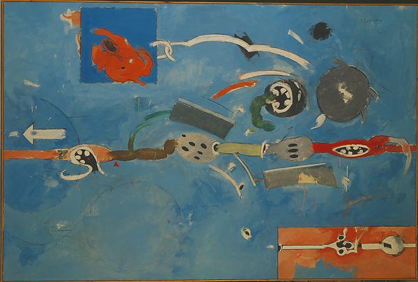
One of the many places the show discovers an enduring influence is the radical America of the Sixties. The Chicago Surrealist Group were involved in the well-known protests against the Democratic National Convention in ’68, while the Students For a Democratic Society journal ’Radical America’ put out a special issue called ’Surrealism In the Service of the Revolution’ (Jan. ’70, above). Another news-sheet was titled ’Surrealist Insurrections'.
This rekindled interest spurred old guard artist Jean Miro to respond with ’May ’68' (1968/73, above). It’s dominated by a huge splat of black paint as if hurled by a projectile. The subdued colours beneath suggest a nicer, more staid painting has had its graphic style wrested from it by those wild black strokes, one system yielding to another. As if he couldn’t agree with events readily enough, the artist had added his own handprint nine times.
And this is both more accurate and better to hear than the Surrealism we’re so often told of, aesthetes dreaming limpidly of other worlds while ignoring the one they’re actually in. But while Dada, or at least strands of Dada, lent itself easily to political agitation Surrealism has a more involved relationship. For example, Kamel el-Telmissany’s ’Wound’ (1940) is a hard-hitting visual image, but too straightforward, too readily comprehensible to be called Surrealist. (Despite being in this show.)
Let’s take something we can all agree looks the part. Helen Lunderberg’s ’Plant and Animal Analogies’ (1933/4, above). What are all these things doing within one frame? Both the title and those white dotted lines make it clear we should be looking for connections between these objects. As an example, the cut cherry on the left leads to a cutaway diagram of it.
But what about when it then connects to the belly of that torso? Well, analogies can suggest themselves. The cherry stone might suggest pregnancy, that would be a plant/animal analogy. Okay then, what about the line on the right? What sense can be made of that? Perhaps the white network it points to (veins?, nerves?) could be compared to the tree behind it. But no white lines there.
Next let’s look at something with the guidelines taken out - Magritte’s ’Time Transfixed’ (1938, above). Trains come out of tunnels, and hence apertures. And we associate trains with timetables, and hence time. (An association which may have been stronger back then.) So put a timepiece on top of the aperture of a fireplace and what do you expect to happen but summon a train? There’s the visual parallel between the front of the engine and face of the clock. It may also be a play on the way paintings are frozen while still depicting moving objects. (Echoed in the title, though Magritte himself disliked it.) It would have worked better with an actual model train, thrust through a hole cut into the canvas.
Except here it resolves a little too neatly. Surrealism’s primary aim, after all, is to disrupt. With Surrealism, the more you can reduce the cake back to the recipe, the less delicious it will taste. The show describes this rather well, as art which needs to “both suggest and subvert logical connections.” The game is to entice you into a maze of signs, then lose you there. Lunderberg’s the better Surrealist, even if Magritte’s more of a name.
Consequently, Surrealism can sometimes divide between the art that’s good and the art’s that it’s possible to write about, which can be a bit of a problem when writing about it. As I said after the DPG’s show on British Surrealism:
“Its credo should be ‘never knowingly understood’, and not just by the know-nothings of the dominant culture. It should be inexplicable even to Surrealists, with artists surprised by what springs from their own hands.”
A Hallucinatory Metamorphosis
Marcel Jean’s ’Surrealist Wardrobe’ (1941, above) features multiple apertures semi-obscuring a view. What we see of the view is pretty view-like, and it’s tempting to think that we should treat this as a kind of tantalising peepshow onto freedom. If we can’t cross this barrier we should at least look through it as much as we can, into the bucolic delights of whatever enchanted Narnia that lies beyond. The wooden blockade might be said to stand for dominant ideology, the wardrobe the restrictive roles thrust upon the self by social conformity, or some such. Hanging it in the very first room might subliminally push you towards this reading, as we’re here to see what lies ahead.
However, despite the title it resembles no actual wardrobe. It’a a crazy accumulation of apertures, some lying recursively inside others, and including letterboxes - which don’t get added to wardrobes much. As seen in the recent Dorothea Tanning show, Surrealist art has apertures aplenty. Jean has gone as far as to screw actual metal plates around the key holes. Because they’re the point of the picture, more so than the view beyond. This is the liminal place Surrealism occupies, between dream and waking, conscious and unconscious. It stands at the interchange, and invites us to stand there too.
Similarly, the Portuguese artist Artur Cruzeiro Seixas made the assemblage ’No Longer Looking At The Earth, But Keeping Feet Firmly On the Ground’ (1953, above). A buffalo hoof combined with what we take for a bird’s head, one of many ‘spliced’ Surrealist assemblages which stick together two seemingly irreconcilable objects. Yet we shouldn’t see this as a sight to stir our contemplation, like the proverbial Buddhist listening to the sound of one hand clapping.
Again, we should say “this is us”. We are not integral creatures, we are wing and hoof. We are these things even if they contradict, feet on the ground the same time as head in the clouds. And the fact that these elements are spliced, not bolt-ons added to a more recognisable body, emphasises this.
If the alter ego and animal familiar were frequent Surrealist devices, this is part of the reason why. Birds are commonly employed, perhaps most famously with Ernst’s Loplop. For they allow the bird part of us to stretch away as the rest of us stays moored, at least conceptually. So you’d scarcely need to be an initiate to guess that Leonora Carrington’s ’Self-Portrait’ (1937/8, above) is a triple self-portrait. Her mane of hair, her pointing hand, the anthropomorphised face on the hyaena don’t hide any of this.
Though more interesting is the white horse, the way it’s in two places. The rocking horse inside the room, overlapping with Carrington-as-herself, and the wild horse running free outside the window even have identical poses. To return to Jean’s metaphor, only her familiar can both be in the wardrobe and go to the lands beyond. And it can only do it by being both sides of the barrier at the same time.
So, you may be asking, just how does this perspective translate to radical politics?
Hear the title of Mayo’s ’Baton Blows’ (1937), then get told by the indicia that it was a time of great civil unrest and (its inevitable corollary) police violence in his home city Cairo, and you immediately build a mental picture. But it’s probably not of the picture he’s painted (below).
There’s a picture plane, with trees on a distant horizon line. But the figures are pushed right up into the foreground, like they haven’t noticed. And rather than ordering themselves into two opposed camps the figures are inter-twisted irresolvably. To the point they don’t look like they’ll ever be separable again. If they’re differentiated it’s into pink versus off-white, with nothing to clue us in which side is which. Mayo’s signature is in the bottom right corner, just below the lolling tongue of one collapsed figure. Just like Turner turned his back on narrative painting to present just the storm, Mayo shows us just the battle.
And this isn’t unusual. Raoul Ubac’s exposed print ’The Battle of the Amazons’ (1939, above) is a similar composition. It’s if anything still more ambiguous. Composed of cut-up photos, re-shot and over-exposed, are its figures fighting one another, or merging together? (Some accounts claim the original photos were all of the same model.) While the Mosambiquan artist Malangatana Ngewnya’s ‘Untitled’ (1967) arguably goes further in absolutely filling the foreground, with barely a scrap of negative space.
Lee Miller’s 1941 photo of a fallen, damaged statue (above) is part of her series ’Grim Glory: Pictures of Britain Under Fire’. It could perhaps be seen as war propaganda, an inventory of cultural treasures the Nazis cruelly destroyed. Yet in that case why would it be titled ’Revenge On Culture’?
Roland Penrose, quoted in the show, says Surrealism aims “to provoke a hallucinatory metamorphosis”. And, as much as Dadaism, Surrealism was born of war. Which does a very similar thing, blasting holes in accepting norms, literally and metaphorically turning things over. If anti-fascist, they were not necessarily anti-war. War could be seen as cousin to revolution, a kind of liberating catharsis, which allows art to rebel against its originally programmed purpose, to become something new. It plays the same role in the real world as the collage artist’s bond-slipping scissors do for workaday images.
’The Guide’ (1862, above) by Cuban artist Herve Telemaque, combines a diagrammatic style with elongated forms. Until it’s quite hard to work out what is an object and what are motion lines. With the result that there’s something slightly anthropomorphised about those shapes. With an arrow pointing off the canvas it’s about as near to animation as a canvas can be. Other shapes are roughly sketched in, perhaps emerging or fading. Art, even a painting, should not be seen as a fixed thing. Metamorphosis, transformation, these are not incidents but the inherent state of things.
The Charged Object Strikes Again!
Bluffer’s tip! Should you want to sound like you know something about Surrealism, don’t say sagely “mmm, the dream.” (And still less “the fish”.) Instead, use “ahh, the charged object.” Regular readers, should they exist, will remember me waxing lyrical on this after both ’British Surrealism’ and the Academy’s ‘Dail Duchamp‘ show. And, as the show reminds us, 1936 saw the Surrealist Exhibition Of Objects.
The show has the smarts to place two objects next to one another - Joyce Mansour’s ’Nasty Object’ (1965/9) against Dorothea Tanning’s ’Pincushion To Serve As Fetish’ (1965). Mansour has driven nails and other shards of metal into a sponge ball, until the ball itself invisible is no longer visible. While Tanning called hers “a superstitious if not actually shamanistic object, and yet to my mind it’s not so far from a pincushion.” , Both recall the way primitive magic works, where fetishes must be pierced for their power to be released. Art is taken as having transformative powers, but these will only work for those who interact with it.
An over-emphasis on painting is one of the many ways Surrealism gets misrepresented and disempowered. Film and photography weren’t just present, there were arguably *more* useful because we so readily ‘accept’ them, take them for real. Happily, the show makes efforts to include both.
Take for example the short from Czech film-maker Jan Svankmajer, ’The Flat’ (1968, still above), which brings these elements together. The indicia, and seemingly every review, seemed determined to read the Prague Spring into this, without ever specifying how that’s supposed to work. In fact, I don’t think it does.
A while back, looking at Sartre’s novel ‘The Age Of Reason’, we found that for the lead character to be free his possessions must become “no longer his accomplices” but “anonymous objects... mere utensils”. Things must be seen as things, tools for use, make sentimental attachments with them and they will tie you down.
Surrealism could scarcely take a more opposite view, its perspective comes from recognising objects as entities; to be recognised, to enter into accordances with, the most humble modern objects seen as possessing spirits. Svankmajer’s hapless protagonist attempts to use a bed just as a bed, a door just as a door, a tap a tap. Naturally, they take offence and resist. If we do not see such objects as charged things, if we don’t make connections to them, their magic will work not for but against us.
But there’s an exacerbating factor at work. As with Sartre, our protagonist is youthful, his life still for him to make. And this is demonstrated through the furniture of a rented room. These things are not his, but strangers to him. By the end he’s able to sign his name beneath the “was here” graffiti of the previous tenants, and the accord is struck. (Ever gone back to a shared house and seen someone else living in your old room. Just as you did, but them? There’s a strangeness to it like little else.)
We might wonder what this is all about. And ask, if we’re to be interested in Surrealism, do we now need to believe beds are sentient? No small part of the answer is that it brings artistic benefits. As the Swiss-American artist Kurt Seligmann commented:
“Magic philosophy teaches that the universe is one, that every phenomenon in the world of matter and of ideas obeys the one law which co-ordinates the All. Such doctrine sounds like a program for the painter: is it not his task to shape into a perfect unity within his canvas the variety of depicted forms?” (NB Seligmann is in the show, but not this quote.)
But also, when decrying the consensus reality the Western world has built around it, its natural to look for counter-models. Chesterton, not much of a Surrealist in the main, said: “The whole object of travel is not to set foot on foreign land; it is at last to set foot on one's own country as a foreign land." Your aim is always to look at what you were always looking at, just from a new angle.
And Modernist artists had already used the form of tribal art as a means to counter Renaissance conventions, most famously with Picasso and his African masks. To now incorporate the content, as part of a much wider programme of disruption, seemed a natural next step. And Freud, as ever their go-to guide, yet again seemed to have written a handbook for this.
In ’Objects That Can Speak For Themselves’, Chris Fite-Wassilak identifies two poles for this kind of animism in art. At one end, an object’s “power was, for the surrealists, more like a mirror – one that could reflect the hidden, interior mind of the person who chose that object.” This way, objects became akin to Rorschach tests, the point is not the thing itself but the reactions it stirs in you. (The alert reader will have spotted this essentially re-objectifies objects, turns them back into our servants. The non-alert reader will have spotted the same thing.)
Then at the opposite pole he places Paul Nash, who had his own Tate show, where the artist can only borrow objects which retain their inscrutability. (“Nash’s attitude is one of a more direct animism, where the object isn’t a reflection of the artist, but might be placed in a position to speak for itself, as it were.”)
You could probably go on and on with this. But best not to…
Style As Means
Instead let’s ask, how do you get that over? Surrealism wasn’t a style in art, like Cubism or Constructivism. It was first and foremost an approach, one that didn’t necessarily require artistic means of expression at all. And when it did, that’s all they were - means. Artists who don’t have remotely similar styles can be - and are - Surreal. It’s hard to think of another art movement where the works could be so stylistically different as they are here, and yet still belong together.
Danish artist Wilhelm Freddie is represented by ’My Wife Looks At The Petrol Engine, The Dog Looks At Me’ (1940, above). And that flatly descriptive title carries over into the work. Each brick and coloured ball is diligently detailed, then that deadpan style carried over into the strange dog creature. It’s not presented fantastically, but as if it all makes sense to someone, even if that person isn’t us. From the ’Dali Duchamp’ show, we saw Dali did just this. And there’s a choice quote from him here, about “materialising… with maximum tangible reality, ideas and fantasies of a delirious character.”
While ’The Sea’ (1929, above) by Japanese painter Harue Koga combines naturalistic styles and pseudo-scientific cutaway diagrams. It’s a collage which looks like it should be resolvable, but isn’t. The cutaways suggest we should see things two-dimensionally, we’re not looking back but down. In which case the submarine’s directly beneath that sailboat, but then the bird’s about the same size.
And where does the woman swimmer fit in either way? Unless she’s a colossus, we’re supposed to see her in terms of pictorial depth. Perhaps she, and the right quarter of the frame, might be a separate unit from the rest? That would explain why the sea’s at two levels, not something it commonly does. But then they’re made to overlap. And those horizontal-striped fish still look suspiciously large. And, after the original confusion over the horizon line, why does the lighthouse float just above it? It’s like one of those sentences which obey all grammatical rules while making no sense.
But conversely, the Haitian Hector Hyppoliyte’s ’Ogun Feray’ (c.1945, above) could scarcely be in any more a naive style. It doesn’t dramatise the objects so much as flatten the human figure, turns him into an object as much as them. Until there’s such an equivalence it scarcely seems surprising they’ll jump up and dance the way they’re doing.
While New Zealander Len Lye took a similar approach, but with a film - ’Tusalava’ (1929, still above). Initially we could just be watching the filmstrip run past the projector. First, abstract shapes emerge. And it’s remarkable how soon we start to anthropomorphise these. (With me, literally a few seconds in.) These turn into cellular creatures, then develop into totemic forms, as if up to now they’ve been gestating. Crucially these forms aren’t articulated, they don’t ‘come alive’ in the conventional sense, they stay as moving shapes. But it simply doesn’t feel that way to watch.
And much of this comes from Lye using the warm imperfections of filmstrip, the graininess, the blotches and streaks. The shapes pulse with life in a way smooth vector art would not.
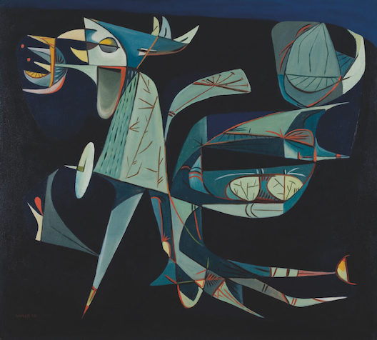
So Surrealist art had to occupy one pole or the other - hyper-real or naive? Not really. Eugenio Granell’s ’The Pi Bird’s Night Flight’ (1952, above) is sharp and realised, but iconic in look. The bird creature is laid out in two dimensions, against a flat black background. Does such a bird really exist? No use asking me. But even if it does, it’s immediately clear that Granell isn’t interested in capturing the outer look but it’s spirit, as if enlisting it as some form of totem.
Romance Is Dead?
Modernism was intended as a reaction against Romanticism. It’s something which Dada would simply have spat at. (Brecht hung banners behind his plays stating “Don’t stare so Romantically”.) But Surrealism’s relationship is more complicated. At its worst it simply inherited. Romanticism’s reaction to the Enlightenment, a headlong rush to escape the confines of reason, had at the time been something current. But Surrealism could pick up on this many generations later as if it was still a live debate. Which it did by simply transferring the sublime from out there, in nature, to in here, the human mind. Which, as we’ve seen before, wasn’t even that much of a switch. But what about when it was at its best?
The Italian artist Enrico Baj created ’Body Snatcher in Switzerland’ (1959, above) by taking an existing kitsch Romantic landscape and painting that monstrous monolith figure over it, part graffiti, part provocative cartoon, part Lovecraftian clash of reality systems. Note how its bulging lower regions hover over that poor peasant woman. It works partly by taking Romanticism at its own game and upping it. For Romanticism often depicted nature just this way, dark, animate, inscrutably strange.
While Remedois Varo’s 'The Flight’ (1960, above) took the familiar Romantic image of a figure ascending the heights of remote, craggy, cloud-strewn peaks and simply added a female figure to the mix. We are, I think, supposed to see them a sailing on a cloud boat, a brilliantly delirious notion. (It’s part of a triptych representing her, all done in that sharply precise illustrational style, belying the strangeness of the subject matter, and all superb.)
’Nudes’ (1945, above) by Egyptian artist Samir Rafii of course dates from the end of the war, into which others have read significance. But there’s a timeless ‘folk apocalypse’ feeling to this work that’s more Bosch-like. We’re used to art that shows the sombreness of the aftermath of a massacre. Just as we’re used to art that presents the revenge of nature. But, well, not really this…
All the figures are, I think, female. And women are of course often victims of war. Except here I think they’re victims of a nature which is itself feminised. The hunting birds set us up to see the figures as victims of the trees. In Romanticism Nature is seen in terms of the sublime; which is, by definition, depersonalised, a remote and overpowering force, the storm that tosses your boat without noticing you’re there. Here it is anthropomorphised and monsterised simultaneously.
And that foreground tree, all spikily protruding branches, isn’t just pinning that poor foreground figure. It seems to replace her upper half, that hairy birds’ nest the nearest thing to a head, as if some symbiotic creature. It also seems to echo her pubic hair, making another connection. It’s as if one part of our nature was at war with another, to the point of massacre. (Ignorant of Arab names, with no many female figures, I first assumed this must be by a female artist. Wrongly, as it happens.)
Discovery Not Invention
Surrealism’s sometimes presented as individualised, furiously dreaming Bohemians, like prospectors of their own private subconscious, hoping to come back up with some artistic gold. In fact it was always a group effort. The show acknowledges this throughout, talking of ‘convergence points’ and quoting Simone Breton on “images unimaginable by one mind alone.”
Sadly then, despite it being so related a concept, automatism (creating art without conscious direction) becomes an afterthought. Literally so, as it’s mostly consigned to the last room. And it mostly focuses on automatist techniques, as if it was all a means to an end, not a source of artworks in itself. Whereas, to quote Michael Richardson:
“The real importance of automatism lay in the fact that it led to a different relation between the artist and the creative act. Where the artist had traditionally been seen as someone who invents a personal world, bringing into being something unique to his own 'genius', the surrealists conceived themselves as explorers and researchers rather than 'artist' in the traditional sense and it was discovery rather than invention that became crucial for them.”
At the least it should be said that, much as with the debate over abstract art, the notions weren’t rigidly exclusionary. The artist could slip between both, as they chose.
Due to the dearth of good examples on show here, we need to break protocol and look at a work which appeared in an earlier post. Which is not even hung in the automatist section. Gordon Onslow Ford’s ’A Present For the Past’ (1947, above) appeared in the DPG’s ‘British Surrealism’ exhibition. After which I said: “With its birds and that central egg form, it doesn’t seem composed so much as grown…. creativity doesn’t work by logical progression but is more akin to morphogenesis.” As the artist said himself of painting without a plan, “in venturing into the inner worlds, nothing was lost.”
(NB There is a flaw running right through all of the above. To present Surrealism as a cohesive political and philosophical movement requires a whole lot of forcing the pieces. This was a movement, not a regiment. With a cast list so culturally and geographically disparate, it’s better seen as sketching in some of the through lines.)
This show is simultaneously uneven and overwhelming. There are misfires, and works which don’t even belong here. But there’s a high hit rate, higher than I could possibly cover. Much like Post-war Modern’ at the Barbican, I was struck between the eyes, again and again, by artists I’d no prior knowledge of. With the double-whack of these two shows, gallery-going has resumed in earnest!
“Scavenged materials were fashioned into futuristic bodies. Wounded, collapsed and shattered forms were countered with primeval goddess imagery that celebrated fertility and rebirth; ambiguously gendered bodies throb with mutant energy.” -from the programme
The New Brutalism
A full stop may seem an unusual way for an exhibition to start. Yet this one does, and it proves the very best place. John Latham’s ’Full Stop’ (1961), also on a version of the poster, is on a quite monumental scale for so simple a work. It might initially seem asking to be compared to Malevich’s Black Square.
Except that seemed more a symbol, leading to thoughts of eternity and mortality. Even without the title, this would seem more a sign. It’s spray-painted, presumably using a stencil. And if you blew up a typewritten mark to that size, you’d probably get something similar, discernible yet faintly smudged. And a sign has to be of something…
The artist Frank Auerbach said of the immediate postwar era: “There was a curious feeling of liberty about, because everyone… had escaped death in some way.” Seen this way, you’re looking at the full stop from behind, from a future you never expected to have. And the liberty this leads to is of course is a heady liberty, knowing your continuing existence is down to little more than chance. But that in itself wouldn’t have lasted for the next twenty years.
After the Tate’s ‘All Too Human’ show, I pointed out that in Leon Kossoff’s art “London is monumental but at the same time turbulent, ceaselessly overwriting itself.” This could well have originally been rooted in the dropping bombs which rewrote (or de-wrote) the landscape overnight. But his art also refers to post-war developments, quite literally so. In many ways it’s in antithesis to a London marked by bomb sites for successive decades, a London which never really got over the War. His is a London which effectively never stands still.
For this initial heady rush soon combined with pressing political questions. There was a widespread feeling against simply going back to the world as it was before the war, the world which after all had led to the war. But then what to replace it with?
All the uneasy ambiguity so on show here comes from there. War had swept away all the old certainties, revealing an empty deck haunted by shadows. The tension over what might come next was both enthralling and anxiety-inducing. The show speaks of the iconic bomb site as a microcosm of the nation, representing “suffering, loss - but also hope.” The artist Franciszka Themerson talks of living in a “strange universe… [we] grope around, full of fears, pleasures, anxieties, violence, joys and tragedies, stupidities and anger.”
Sometimes the show tries too hard to make every piece fit, such as suggesting William Turnbull’s bronze reliefs resemble those bomb sites, which they don’t. But it is right to call his sculpted figures “totemic and brutalised, appearing as though… subject to forces beyond their control.” Much of what’s arresting about this art is its convulsive quality, as if this is what the times compelled to be made. (Notably, Turnbull was calling a work ’War Sculpture’ in 1956.)
Except all that overlooks a vital ingredient. It’s tempting to imagine art as arising solely out of its social conditions, in defiance of history or tradition. After all, Modernism’s credo was always “away with what was before, we start again”. Its method of progress is not evolutionary, but a series of definitive statements, with quite definite full stops.
But in truth, of course, it was always reacting against the art that had just happened. In the Guardian, Laura Cummings is more on the money. calling it “a magnificent antidote to the cultural triumphalism of the government-sponsored 1951 Festival of Britain.”
As seen in the exhibition ‘Out There: Our Post-War Public Art’, postwar reconstruction involved a large amount of public art being commissioned, as part of the new spirit of benevolent public institutions sometimes dubbed “Modernist Florence”. In this way, one form of Modernism became orthodox, even official.
It became claimable that this movement, associated with the post-war politics of planning and order, had robbed art of its mystery, made it into something orthodox and reassuring, ultimately tame. Was this a fair assessment? Not really, no. But art history has seen more baseless takes.
So the International Style epitomised by Henry Moore and Barbara Hepworth became the throned King who needed toppling. If their art was smooth and about pure form, we would be rough and abrasive. If they used stone and polished wood, we’d get our materials from the scrapyard. (Often literally.) No artwork was thought worth its salt unless it looked left out in the weather. Above all, if they were optimistic and celebratory, we’d parade our anxieties.
In short, these guys were the punks! Unafraid to shock, disdainful of the easy certainties of utopianism, wired with negative energy. This came to be dubbed the New Brutalism, a term coined by Alison and Peter Smithson, with Reyner Banham. (Yes it took three people to come up with a two-word name, perhaps due to postwar job creation schemes.)
Lynn Chadwick’s sculpture ’The Seasons’ (1956, above) is a handy visualisation of this. “Designed”, say the indicia, “as an opposition between an angular pyramid shape and a branch-like form alive with tendrils and shoots.” The pyramid looks a pure form, but acts as a shield for what’s behind it - something more monstrous precisely because it seems to writhe with life. Chadwick was turning the seasons, from festive Spring to bleak Winter. (Disclaimer: Chadwick exhibited himself at the Festival of Britain, and won some public commissions. But then punk bands sometimes got on ’Top of the Pops’.)
And it’s in these two coming together that the magic happens. In the room ’Choreography of the Street’, the show has the wit to present photos of the urban landscape against the collages and print designs of Eduardo Paolozzi and Robyn Denny. Check out, for example Denny’s ’Austen Reed Maquette’ (1958) next to Roger Mayne’s ’God Save The Queen (Hampden Crescent, Paddington)’ (1957, both above). The frenzy of cut-out letters, in part shouting ‘LONDON NOW’, is both bookend and companion to the urban dereliction of two kids outside a shuttered and graffiti’d building. Bizarrely, it’s such a punk record sleeve in the making it’s even been named for it. Just like the Seventies, life seems to flit between vivid dreams and harsh realities.
Chadwick’s ’The Fisheater’ (1951), with its wire metal frame, looks like a rebellion against the stone-block materiality of Moore’s sculpture. As the title suggests this is not a bird which flies free and sings from the sheer pleasure of it. This is a remorseless hunting machine, it’s beaky head like an arrow tip. “Fisheater” is what fish would call birds, had they the language.
And Elizabeth Frank’s ’Harbinger Birds’ (1960/1, example above) possibly push this along further. They look like pieces of scrap metal who have somehow sported legs and are walking. Those legs are bent backwards but, with some human proportion, seem placed between bird and man. The show points out that in the war Frank was both “exposed to air raids” and saw crashed planes. The name recalls the way birds were often seen as omens or portents, while suggesting more like this will come.
While Nigel Henderson’s collage ’The Growth of Plant Forms’ (1956, above) takes a 2D view which should render its subject familiar and diagrammatic, something reassuringly explained in a science textbook. Instead it makes life itself seem strangle and ungraspable. These last three works, it would be tempting to see them as using nature to stand for our ids, possessing inescapably savage truths. But it’s more than that. All three works seem so monstrous because they are so unparsable, so irreducible to our reason. The savage is at the same time brutally simple and utterly strange, even at the very same time that he is a part of us.
The Savage Machine
And the combination of the savage and the machine recurs. In one sense a machine is savage, it has an animal purposefulness, it acts out its nature with no need of morality. Lawrence Alloway called this era ‘Britain’s New Iron Age’, and described Paolozzi’s sculpture as “hieratic as a mummy but as wild as a drugstore”. A splendid phrase which could be applied more widely. Notably, perhaps wary of past problems, there’s no particular ‘primitive’ place or time which is venerated.
The Paolozzi sculptures are all excellent, of course, looking like a budget British version of ’Terminator’, and all the better for it. But ’St. Sebastian 4’ (1957, above) is the most captivating, because it has the most familiar human features. Yet though we recognise and respond to these, they come through the conventions of child art - an oversize round head, a block of a torso below which juts two legs. (The work is ‘signed’, titled and dated via a metal plate screwed into its base.)
John McHale’s ’First Contact’ (1958, above) is a primitivist depiction of a family watching TV. At a time when TVs were housed in great cumbersome boxes, McHale gives us a screen that floats, a kind of apparition. And for all its avowed crudity it’s remarkable how it captures in a 2D image how these figures are looking at that rectangle. The thick black line around the screen then joins the figure on the left and passes to the rest of the family. It’s as if its prolonged cathode-ray influence has turned this family into these cyborg beings. Having stared into the machine so long they have become machines themselves.
Yet while there’s something highly Dada about this, it’s a world away from another Dada image of a consuming family, Heartfields’ incandescently furious ‘Hurrah! Der Butter Ist Alle’. Both have humour in their own way, but McHale’s is impish, with its tomato slices for eyes, and light fittings for mouths. In its sensibility, it’s Pop. Might the mass media change us, down to your very marrow? Then bring it on! We were due a change.
McHale had said “we can extend our psychic mobility. We can telescope life, move through history span the world.” ITV was just two years old, a choice between channels then still a novelty. Of course, in our era of Celebrity Big Brother, he may seem as idealised as Moore.
Let’s compare Avinash Chandra’s ’Early Figures’ (1961) to another classic work of Modernism, Fernand Leger’s ‘Three Women’ (1921/2). Leger proposes a unity between the human figure and machine, to the extent they can be depicted the same way. Which is bright and smooth surfaces, as if the whole world were made from chrome. There’s an exuberance to his art which is almost child-like. It almost recalls the anthropomorphised machines of children’s books and cartoons.
Whereas Chandra’s isn’t some machine fresh out of the factory, with it’s shop-bought colours, but battle-worn. The Leger might have even come to look like this, had it been left out in the weather those intervening years. And the figures and machine parts morph, the circles of faces echoed in cogs, forming an incomprehensible cluster of parts. It’s hard to avoid returning to Alloway’s description of both hieratic and wild. It recalls that von Daniken trope beloved of science fiction films, where ancient art is found containing modern technology.
Franciszka Themerson’s ’Eleven Persons And One Donkey Moving Forwards’ (1947, above) is arguably titled back to front. It’s that sweep of motion across the frame which you notice first, the cartoonishly reductive figures almost there merely to instance that motion. Jewish, Themerson had fled Nazi-occupied Europe, losing almost all her family. The addition of a donkey recalls the Bible, which makes the story a timeless one. Notably the figures aren’t moving from or two anywhere, they’re just in motion, as if demonstrating an immutable law of life.
Then, in 1959, she painted ’How Slow Life Is And How Violent Hope’ (1959, above), effectively a counter to the earlier work. The feet incline forwards but the vast, bell-shaped bodies, and the whole style of the work suggest otherwise. The figures are effectively mired in thickly encrusted oil, gouged lines sometimes defining forms and at others cutting across them. These almost shapeless things will have to drag the dead weight of themselves if they are ever to move.
…And How Are Things At Home?
After the Tate’s ‘All Too Human’ show I pointed out that Walter Sickert, while a forerunner to this era, was “only a precursor [because] he paints scenes” - and domestic scenes at that! McHale for example depicts what would by rights be a family lounge, but eliminates everything bar what interests him – the family and the TV screen. Yet elsewhere the front room was becoming inviting territory all over again. A focus on the domestic might ostensibly seem a retreat from the social anxieties that gave this era its tension and energy. In fact, anything but…
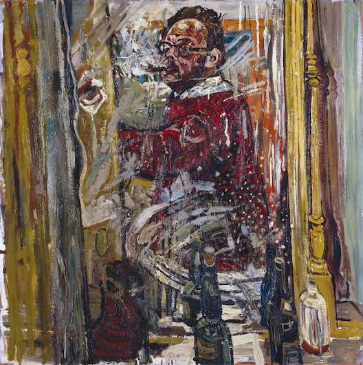
Jean Cooke and John Bratby were both artists and both in troubled marriages. To each other, as it happens. The self-portrait as statement is scarcely an innovation of this era. Nevertheless, it’s notable what lengths Bratby goes to with ’Self-Portrait In a Mirror’ (1957). Self-portraits are normally done in a mirror, but Bratby not only paints himself painting, he frames the mirror within the picture frame, adds shimmer to it, and then places bottles before it. This is assertive, he’s almost literally a self-made man. He looks ensconced at home, doing what he does where he belongs.
While in Cooke’s ’Mad Self-Portrait’ (1954, above) her white top accentuates her black eye, and her stiff gaze adds to the uncomfortable viewing. The show stops short of saying he gave her that eye, perhaps that’s not known. But he pathologically limited her painting time (her work is much smaller than his), sometimes destroyed her art and was known to be violent to her.
It’s the one point in the show when we see the Fifties we think we know, the one that preceded the Sixties. We want feminism to come along and rescue her, while knowing we are years too early for that. The only hint of escape is that open window.
Bratby is, by now, not easy for us to look with favour upon. But out of their unequal race, the most interesting work is his. ‘Jean and Still-Life In Front Of a Window’ (1954). The table is raked like a piece of primitive art, then crammed with goods. Many in such brilliant white they look to illuminate the room. The labels Tale & Lye, Corn Flakes and Shredded Wheat have been added in obsessive detail.
1954 was the year rationing finally ended in Britain, and this work seems to come from a mind overwhelmed by consumer choice. These goods surely didn’t just come from the corner shop, but arrived from some higher realm. In fact they seem to exude more life than the distanced figure. Who, a domestic nude, seems to deliberately clash conventions with the emerging Pop movement.
While Bill Brandt’s photographs take an entirely different look at domestic life. He moved away from photo-journalism on, the show tells us with some relish, VE Day. For a work like ‘Nude, Micheldever, Hampshire’ (1948) he used a new wide-angle camera. The expanded depth of field which results is accentuated by the figure’s outstretched arm, and open-palmed invitation. ‘Inner’ notably doubles as a description for the domestic and the world of the mind, and Brandt gives us a domestic which isn’t confined or parochial, but a rabbit hole to fall into and find a world of otherness.
With the nudity of the figure and clean staging it is, admittedly, a re-invention of Surrealism nearly three decades later. The mysteriously semi-open door is a common Surrealist device, widely found in the work of Dorothea Tanning (as we saw). But it’s a re-invention that gets Surrealism, that doesn’t think it’s about day-glo outrages so much as defamiliarising the everyday.
Colour Coming off the Ration
The show includes a poster for the Whitechapel Gallery’s celebrated ’This Is Tomorrow’ exhibition in 1956, featuring Richard Hamilton’s celebrated collage ’Just What is It That Takes Today’s Homes So Different, So Appealing?’ (above). Yet those bright colours of mass production, which seem so central to the work, are reduced to black-and-white, losing much of the detail in the process. To see the colour original, you had to see the show. Rationing had ended, if only just. But it does still seem a snapshot of austerity Britain.
Then you come across Gillian Ayers’ ’Break-off’ (1961, above). It looks completely spontaneous, like a coloured doodle blown up to giant size, losing nothing of its immediacy. The elongated proportions are effective in giving it a sense of motion. It may well be influenced by American Abstract Expressionism, but feels quite un-angsty or ponderously timeless. In fact it’s immediate and positively rhapsodic!
With Hamilton a small… if pitifully small degree of the original still comes through. You’d see the poster and know what sort of work it was. While with Ayers colour is all! Sometimes a painting seems to come along and reacquaint you with colour - bright pinks, deep oranges, full blacks, as if they’d only just been invented and so needed demonstrating. It’s a fantastic work and falls within the two-decade remit of the title. But the show’s right to say it. This is one era ending, and another thing beginning…
I am a little more undecided over which side of the wire Alan Davie belongs, perhaps because he has less of that immediate impact. The two works of his on show are ’Creation of Eve’ (1956, above) and ’Marriage Feast, or Creation of Man’ (1957). And the repeat use of ‘creation’, as a verb, is significant. A painting is static by definition, and yet Davie seems able to defy that. These works feel incohate as your eye is pulled around them, incapable of staying fixed. Like Pollock of the same era they seem to crackle with energy.
Combined with which… Unlike Pollock, they incorporate recognisable elements. The revolt against representation was the fight the American Ab Exers made theirs, but that didn’t necessarily translate to everyone who came after. And when combined with their gargantuan size this cannot help but you think of symbolic or narrative art, of murals or reliefs. It’s a thought that you can never either confirm or deny, which hangs about in your mind. In what would seem one of the defining artistic questions of this era, divided into such rigid camps that it could literally lead to fistfights, Davie instead dances in the no-man’s land. It’s this indeterminacy, this thing-betweenness, which becomes his selling point.
(Pop Art should, were there any logic in the world, prove a similar break point. But, as seen after the Pallant House show, British Pop Art was a wilfully self-contradictory beast not as reducible as its younger American sibling. Paolozzi, for one, absolutely belongs here.)
What Weird Flowers Grew
It may feel like faulting the show for a virtue to say it’s too comprehensive. But, with no less than forty-eight artists, at points it is. Two decades of art can’t be compressed into two floors of a gallery. For example Victor Pasmore and his Objective Geometry compatriots (sometimes confusingly titled Constructivists) seem outside the scope of this narrative, and would have been better slotted in elsewhere.
(Or just forgotten. Truth to tell, their art wasn’t great. It looks like they deduced, quite correctly, that the gallery circuit was a hermetic world. But then assumed the problem somehow lay with the materials. So ditch the fancy oils for perspex and sheet metal, and the masses would be reached. They weren’t.)
I was born the year after this exhibition ends. Which does seem the cusp of a change. The baby boomer generation, for example, officially ended in 1964. And rather than playing in any bomb sites, my childhood memories are of new housing estates springing up. And naturally, you cannot be anything other than fascinated by what you just missed.
On the other hand, it’s more than just me! What weird flowers grew from those bomb sites! The programme talks of “an art more vital and distinctive than has tended to be recognised”. Which if anything undersells it. The truth is that Britain - yes, Britain! - in the Fifties - yes, the Fifties! - was a high-water-mark of Modernist art.
But is it as impressive as American Abstract Expressionism, the cross-Atlantic art of this era, as seen in the Royal Academy show? Yes, I think it is. But it’s as British as that was American, less grand and ostentatious, more the made-do-and-mend Modernism of ’Blue Peter’ viewers, but just as vital - if not more so.
Name after name I’d simply not come across before, and I’m always seeking out this stuff. Laura Cummings’ Guardian review described Franciszka Themerson as a “discovery”, and Matthew Holman in the Arts Newspaper “a revelation”, so it isn’t all my ignorance.
You can’t help but wonder, after this gallery’s own recent Dubuffet show, which has much in common with here - if he’d been unfortunate enough to be born British, would he have been memory holed too? How could this rich history have been so forgotten?
Partly it doesn’t fit our standard narrative of a Fifties in cultural stasis, when everyone just patiently awaited the Sixties to come around so something could happen, then discovered the actual Sixties weren’t showing up till the mid-decade. We imagine the grey diet, the boiled cabbage and spuds, set the flavour for everything else. And once set these narratives become self-replicating, you don’t lift the lid on boxes you imagine to be empty. So there’s a special buzz to seeing one of Auerbach’s vast and sweeping encrustations of paint, simultaneously monumental and energised, to discover it’s tiled ’Willesden Junction, Early Morning’ (1962).
And partly because it’s so many of these artists weren’t British, as so many then would have narrowly defined it. Themerson’s story, however tragic, is far from uncommon, and the show is soon using the line “another refugee from Nazism”. While others came from what had recently been, or in many cases still were, the colonies.
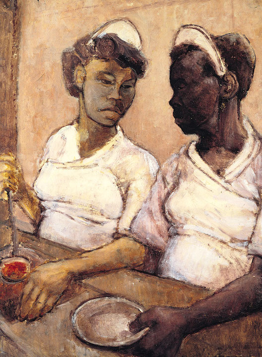
On one level, there’s an absurdity to calling these guys outsiders. For one of the many old certainties to fall in this time was the supposed whiteness of Britain. This is demonstrated in the Shirley Baker’s photos of Sixties working-class Manchester, or the paintings of Eva Frankfurther such as ’West Indian Waitresses’ (1955, above), another of the poster images. The racist mind, perpetually in panic mode, will frame whiteness as something always just about to be lost, whatever era it is thinking of. But British history has been made by wave after wave of immigration, and the supposed integrity of our shores is simply a lie. No wonder Nigel Farage gets so fretful over beaches.
But more to the point, as ever, we should welcome these newcomers and hear what they have to say. It’s like Freud discovering the unconscious, and the Nazis then talking as if he’d invented it. Some may have been their bringing in continental Modernist traditions, as if concealed in their clothing. Burt mostly it was their situation, their sense of rootlessness, which led to their questioning. Their art was like a geiger counter, helpfully identifying every area of disquiet and unease. We needed these outsiders to really see us, to tell us about ourselves. Inevitably, not all welcomed the information.
Let’s take a slightly orthogonal example. For this whole era it was still illegal to be gay. And Francis Bacon’s ’Man in Blue’ series of 1954 (example above) is thought to stem from the covert world of gay liaisons at that time, like blind dating inside a spy movie.
But if that’s the work’s impetus, it scarcely tells us the whole story. The picture’s large and full of open space yet, dark and centring in on that bulky figure, feels claustrophobic - as ‘open’ as a spider’s web. The blurred face suggests anonymity, while at the same time adding to the thick air of menace. It’s a lightning rod for a repressive society, forever banishing things but then inevitably being drawn towards them.


.jpeg)