googlee7ea825f63edb3f6.html
Showing posts with label Modernism. Show all posts

Saturday, 1 November 2025

‘RADICAL HARMONY: HELENE KROLLER-MULLER’S NEO-IMPRESSIONISTS’

National Gallery, London


Don’t Diss The Dots!

1886 proved something of a pivotal year for Modernism, witnessing the final Impressionist exhibition and the first showing of the Neo-Impressionists. Who brought in a whole new look, thanks to their originator Georges Seurat.

Impressionism had taken up the then-novel practice of mixing paint ‘wet’ on canvas, giving it an immediate and ‘unfinished’ look. While Seurat precisely painted adjacent dots of contrary colours, which would mix together in the eye, creating a shimmering effect. You can see shows enlargements which demonstrate the workings here. This came to be called Pointilism by critics, though he used Divisionism. (He also suggested Chromoluminarism. For some reason that didn’t catch on.) See for example his ’Port-En-Bessin, a Sunday’ (1888, below.)


And Divisionism proved divisive, in more than name. If it was pilloried by contemporary critics, those were much the some fools who’d done the same to Impressionism. Perhaps more significantly Monet and Renoir refused to exhibit with Seurat. (Though Pissarro not only took up the new look, he helped organise that 1886 show.)

And modern critics, who of course now fawn over Impressionism, seem similarly keen to diss the dots. They slagged the show, criticising not just the participants but the style itself. Perhaps best summed up by the Telegraph headline ’The National Gallery Succumbs to the Plague of Pointilism’. 

With crowds un-following in their wake, attendance was significantly under either the Impressionist shows held here or the National’s recent Van Gogh blockbuster, apparently their most successful show ever. Despite both being part of the same continuum.

Let’s take each group in turn.

Contemporary critics called it “the death of painting”. And, in fairness, you can see what they’re saying. The effect is entirely different to Impressionism. Compositions are not casual-seeming but harmonious, forms not impressionistic but clear-cut, bold in outline even as they flicker in-between those lines. Impressionism made everything seem in constant motion. Here, even things which are in motion no longer look it. Go back to the fluttering flags above. They’re not caught in flight but frozen in place, like a sculpture of a flag. Seurat’s even added a painted frame around the edge of the work, doubling down on the formalism.

Further, some see the artist’s touch as the basis of art, studying his line the way a graphologist would handwriting. Against which Divisionism can seem a near-mechanical process. The works look clean, smoothed over and ‘posterised’. (It’s also hard for us not to think of dot-matrix printing, though that came decades later.) And on the back of this ‘artist’s hand’ fixation comes the snobbery about poster design and reproductive art.


It should be said that Seurat is not represented here by any of his major works. (’Bathers at Asieres’ is in the permanent collection, but wasn’t moved for this show.) His ’Le Chahut’ (1889/90, above) is clearly intended as a centrepiece, given a room almost to itself. And this was part-inspired by concert posters.

Here the integrity of pictorial space is already starting to break down, everything becoming design elements rather than objects in themselves, to a degree that’s almost collage-like. The dancers are reduced to a mechanical line, echoed by the stem of the double bass. Things are compressed together, if this was actual pictorial space those dancers would be kicking the orchestra half the time. The audience seem to be seated behind everyone, but then who’s that leering hatted figure bottom right? Are those flower motifs attached to a wall, or floating in the air? These are all things you’d barely stop to question in a poster image.

We are of course going to ask what’s wrong with that. Colour litho posters were at this point a relatively recent phenomenon, so must have seemed fresh and exciting. Seurat’s contemporary Toulouse-Lautrec regularly moved between paintings and posters. But we should add that to ‘go poster’ to this degree is unusual for Seurat. In fact its quite possibly the only work in the whole show to do this.

Modern critics, shrewdly noticing this did not in fact turn out to be the end of painting, took another tack. Some separated Seurat from his followers, as if it was a one-man movement plus some also-rans. The main selling point for this is his early death, in 1891, at just 31. Modernism borrowed from Romanticism the lustre of the genius-artist who died young. Though if you’re thinking of taking that seriously, know its chief proponent was Jonathan Jones.

But more commonly Divisionism was portrayed as but a waystation in art history, these dot painting actually just a dash, a line linking art’s great nodes of Impressionism and Fauvism. Seen this way, its stillness is an uncanny valley which had to be descended into, in order to climb back out of and reach the next peak.


Vincent Van Gogh might seem to epitomise this. He briefly followed Divisionism, but by the time of ’The Sower’ (1886, above), those sharp dots have grown, become visible, extended into dashes and swirls. Which leads to pretty much the opposite effect. Rather than evoke stillness the work seems to deny it’s existence, pulsing throughout with life.

Monet’s guru, as much as he had one, was Eugène Boudin, who introduced him to painting en plein air. While Seurat read the scientific writings of Michel Eugene Chevreul. Monet painted quickly, trying to capture changing light conditions. Seurat made over a hundred preparatory drawings for the famous ’La Grande Jette’ (also not in show). Notably, the first thing we’re shown here is not a painting but a colour wheel. (The Wikipedia article linked to above contains a simplified version of it.) Divisionism was based not on observation of life but a theory of colour, one not especially found in the wild.

So if Monet was (in the well-known quote) “just an eye”, was Seurat just a brain?

Nobert Lynton said of him: “every aspect of his paintings was severely controlled, proclaiming their basis in thought and knowledge.” He said of himself: “Some say they see Poetry in my paintings; I see only science.” So was the whole thing dry and cerebral, a technical exercise? The Modernist movement which lived up to its formalist stereotype?

Helene Kroller-Muller, wondering where she comes into this? She had enough taste to be the only art collector to buy a Van Gogh during his life. But from there she went on to collect not Fauvism but Neo-Impressionism. And she countered that Seurat "sees the view of the harbour with its boats as the emotion of a religious-poetic disposition.”

And, kids, maybe you’re both right! A poetic disposition is not incompatible with science. In fact Impressionism had its own associations with science, including new investigations into the workings of sight, if not to the same degree.

Impressionism was a brilliant, often literally brilliant, way of doing something necessary. It had begun art again at a time someone needed to, and had done it by going back to the most basic questions - what do we actually see?, how can that be captured on a canvas? Yet imitation of life, it was a good starting-point but too slender a place to settle. Neo-Impressionism needed to move past those questions.

And everything about Impressionism as an art style stemmed from that central purpose - it evoked verisimilitude, immediacy. We should ask a similar question about Neo-Impressionism, not why wasn’t it Impressionism but what was it? Or more accurately, what was it for? Even if it wasn’t made with a purpose in mind it has to find one, or be just a style, a suit of clothes with no wearer.

The show suggests three answers to this. Let’s take each in turn.

How Radical Met Harmony

After a first room in which human figures are either absent or ancillary to the landscapes, suddenly they’re everywhere. And that’s a clue to what’s coming - in fact a pretty hefty one.

Because the show’s first answer might not have been on your Bingo card - its Anarchist Communism. Particularly bamboozling if your default notion of politically charged art is Dadaism.

We’re told “their style went hand-in-hand with radical political ideas… depicting the struggles faced by the working class, in reaction against the industrial age.” Paul Signac is quoted: “justice in society, harmony in art: same thing.” They effectively titled the show in its honour, and it dominated much of the discussion.


Georges Lemmen’s ’Factories On the Thames’ (c. 1892, above) isn’t of beaches or haystacks but… well, the title gives it away. And the change of subject matter includes a change in style. Unlike the precision of Seurat, the smoke leads the eye but also the buildings fade from view in the haze. It looks, in mood if not style, more Whistler. And this mood undermines the argument being made for it. This etherial, it may well be of factories but they’re seen as shining spires, a dreamscape not a workplace.


Jan Toorop’s ’After the Strike’ (c.1888/90, above) is more clearly political. But while Lemmen looks across to Whistler, this looks back to the Realism of Jean-Francois Millet. (The subject of a small show elsewhere in the National, which overlapped with this one.) And truth to tell those heavy-load-bearing bodies vie with the lightness of Divisionism, it would have worked better in Millet’s style.


So we have a work that’s good but not at all political, followed by one that was political but not terribly good. More happily, Maximilian Luce’s ’The Iron Foundry’ (1899, above) manages both. But again it looks elsewhere, only this time forwards - the muscularised, heroic workmen of Socialist Realism. The light of the foundry back-lights them into semi-silhouettes, foregrounded but de-individualised. Significantly, this isn’t still but dramatic The workers form shapes which frame and harness the explosive burst of the foundry, creating diagonals to left and right before central pillars. It’s a strong, affecting work. But to make its point its composition must overrule its style, its Divisionist in a formal sense only.

The show also concedes not everyone signed up for the radicalism. Luce was even arrested in 1894, in a round-up after the French President was assassinated. Toorop and Signac were definite card-carriers, but Anna Boch not. (It doesn’t mention Lemmen.) While Seurat, the great founder, had Socialist sympathies but there’s no reason to think him an Anarchist Communist. We’re told Van Rysselberghe was a key figure in spreading the new art to the Netherlands. But the show makes no mention of him having any particular political convictions, not could I find any on-line. Making the Anarchist Communism seem a little optional.

So why the stress on it? Curators always pounce on connections between art and radical politics, not because it seems so relevant but precisely because it doesn’t. With no modern mass Anarchist Communist movement to contend with, it seems equally enticing and quaint. But here, it may also be in order to counter those notions about this art being dry, clinical and soul-less. Actually, they respond, it was a call to arms!

These times certainly were politically tumultuous. For example, May Day was founded in 1890, commemorating Chicago workers murdered by the State in ’86. In France, 1892 to ’94 was known as The Era Of Attacks

Naturally enough, people thought that the radical new art and radical new politics must go together. In fact, they didn’t. Even if some tried to straddle the two. Despite what Signac says, radical and harmony didn’t go together like a horse and carriage. The times pressed them up against one another, a shotgun marriage. Divisionism’s true calling lay elsewhere.

Painting The Spaces Between


In something of a dimensional leap, we jump from factory floors to interiors of bourgeois life. Figures which are, in the show’s words, “presented as isolated, occupying a world in which geometry and lines of force govern their movements.” Signac’s ’The Dining Room’ (1886/7, above) not only creates an impasse-like space between the two main figures, but adds a servant as a barrier between them.

While their poses might be stiff, this effect comes mostly from the style. They’re as fixed as the furnishings, in a world that looks lifeless. Not conveyed in this thumbnail, but the effect’s compounded by the size of the work, a much greater scale than would normally be granted for such an intimate subject. There’s enough space to get lost in. 
It’s like the old joke that money gives you misery in comfort.


Van Rysselberghe’s ’In July, before Noon’ (1890, above) conversely is an outdoor scene under dappled sunlight. Monet painted many such scenes. Yet here there’s an unease to it. All faces are turned away, both from us and from each other, despite there being five figures. A device we’ve seen used by Walter Sickert, slightly later. There’s a large area of empty space just beyond them, framed in such a way the eye is pulled towards it.

All this may be making a virtue out of a necessity - if you painted in this way nothing could be made to move, so you evoked the stillness like you’d meant to. But two things - first, Signac’s work was painted only two years after he had embraced the new style. If it was a fix he arrived at it remarkably quickly. Besides, a virtue is a virtue.

More pertinently, this was art going with a social trend, only this time one the art was well-suited to convey. This was the Fin de Siele era, and as Wikipedia puts it “cultural hallmarks that were recognized as prominent in the 1880s and 1890s includ[ed] ennui, cynicism, pessimism, and a widespread belief that civilization leads to decadence.”

As we’ve seen, this was a time of anarchists battling authoritarians, with the body count to show it. But it was simultaneously an era of disturbed spirits, of psychic unease, of people no longer knowing each other or even themselves. Eras do not have just one nature, any more than people do.

All Went White

Neo-Impressionism, as we’ve seen, was moving beyond the task of capturing external reality. Emile Verhaeren shrewdly said Seurat’s work was composed of “tones and lines for which reality serves only as a pretext.” And this led to works where, again using the show’s words, the “world of appearances” is only a means to access the ineffable, to convey “absence within an image”. Those dots become like ellipses, what they lead to is space. There’s a kind of serene sublime.


For example Van Rysselberghe’s ’Coastal Scene’ (c.1892) is a way of framing that central area of white. The vertical sticks in the water are something of a compositional master-stroke, offsetting the whiteness without over-balancing it. We know that if we went towards it, it would retreat. It’s insubstantial, ungraspable. And this sense, of it being beyond physical space, is the point.


Johan Thorn Prikker’s ’Basse Hermale, Sun at Noon’ (1904) is not a painting but composed of undulating strokes of chalk. It’s not just minimal, there’s denser marks behind the haystacks than used for them. As with Van Rysselberge, the central area is of space.

And this is where Dualism inherently led. By minimising fidelity to the real world it banished its clutter, its messiness, its jagged corners - to create something harmonious.

It’s bizarre to think that those Van Rysselberge’s were painted two years apart. This seascape serenity is something else entirely to all that to bourgeois ennui. One sees space positively, a clearing-out which rids us of quotidian baggage, the other negatively, as separation, the gulf that widens between us.


But what lends itself to serenity as easily offers melancholy. Henry Van de Velde’s ’Twilight’ (1889, above) has a “profound melancholy”. You feel this liminal space cannot be dawn but must be dusk. Those three thick bands of colour, running the width of the painting, suggest a barrier more than an invitation. The thin trees play the same offsetting role as Van Rysselberghe’s sticks.

And melancholy may not be so far from serenity. In both, the self is being left behind. And Seurat’s ‘Suburb’ (1882/3, not in show) could be read either way up, depending on the viewer’s disposition. Dualism proved dualistic, go figure!

But What Comes After New?

Signac, there’s no doubt, strongly influence Matisse and Derain’s Fauvism, even if they ditched his dots. But the show looks further, claiming by “untethering the picture form its dependence on subject matter” it paved the way for Abstraction. Signac gave his pictures Opus numbers, suggesting an equivalence to musical composition, a practice which was later taken up by Kandinsky. This was especially true of the seascapes, of which there’s no shortage. Toorop’s are particularly semi-abstract, a series of horizontal bands of colour, such as ’Shell Gatherers On the Beach’ (1891, below).


We could, if we wished, see abstraction as the sea, a field of formless colour. We’ve got close to it here, but are still stuck on the shore, looking out. We just need to make that final leap.

But here the show’s essentially repeating a version of its own critics argument, making Neo-Impressionism into a way-station. Yeah, it was fresh for a while, then this other thing showed up which was fresher. If you reduce Modernism to an evolution line, the significant thing about each ism becomes that it led neatly to the next, like a product upgrade. And the whole system becomes hermetic, talking only to itself.

We should ask instead - what was significant about the movement in and of itself? What does a painting of the 1890s tell us about the 1890s? And how do we relate it it from here?

Which, we might hope, we’ve begun to…

Kroller-Muller’s collection is based in a museum which can be seen on-line here.

(NB This is unlikely to mean a return to regular blogging.)

Saturday, 16 November 2024

‘FRANCIS BACON: HUMAN PRESENCE’

National Portrait Gallery, London 


“We are human beings, our greatest obsession is with ourselves.”
- Bacon

The Self As A Moving Target

First off, don’t go thinking this is the equal of the Tate retrospective. Then again, that was fifteen years ago so this is the easier show to see now. And it has its moments of insight, as we’ll see…

For a story which gets so messy, with so much paint slathered across canvases, it starts off with surprising neatness. Post-War British art was dominated by Francis Bacon and Lucien Freud, with their return to figuration. Spurred by Freud’s first solo show and Bacon’s ‘Three Studies For Figures At the Base of a Crucifixion’ both in ’44.

And the two were friends. Freud’s wife is quoted commenting that they met for dinner almost every day, and often for lunch too. Yet they were similar the way bookends are, as complimentary opposites. Freud worked slowly, obsessively and always from life. Bacon tried that, but soon gave up on it. A trivial-sounding detail which becomes a thread to keep tugging at.

When he did use models, he normally brought in friends. Yet he was soon asking for them to be photographed instead. Even for his many self-portraits. He worked from photographs when painting the cast of William Blake’s head, despite owning a copy of it. He repeatedly worked on, in his phrase, distorted records, of Velazques’ ’Portrait of Pope Innocent X’ and Van Gogh’s ’Painter On The Road to Tarason’. But from reproductions, he never saw the originals. (In the latter case, it had been destroyed in the War, only reproductions existed.) Not the normal artist’s impulse.

And let us not forget the New York School were at this same time creating a style or art which they thought could hold photography at bay. Bacon’s instincts took him in the opposite direction.

One reason is a combination of collage and mutation-through-reproduction. After that first mark on a cave wall, all art has existed in the context of its influences, so in some way has been a reply to them. But with mass media this became more and more prevalent. The more that had already been said, the less and less could anything be added which wasn’t some sort of reply. It was in this context that Bacon chose to make his images from already existing images.

He kept a large, (and characteristically disordered) collection of photos and reproductions, from all sources - torn from the pages of art books or clipped from newspapers or cheap magazines. One photo (from 1950) shows some of these laid out on his studio floor, jumbled and paint-splattered, high art, history and nature studies thrown in together. It doesn’t look far from a Paolozzi collage of the same era. And from much the same motives, to break down creative hierarchies.

But there’s a bigger reason…

The show is full of photographs, to the point you can’t help but think a few more paintings might have been an idea. But that might well be how he wanted it, for he cultivated images both of himself and his studio (with its legendary messiness). They’re almost a part of his art, as much so as if he’d been a performer.


And two hung in the same batch give us our clue. ’Francis Bacon’ by JS Lewinski (1950, above) is a multi-exposure double image. While ’Francis Bacon At the Marlborough Gallery, London’ by Guy Bourdin (1986) shows his face in motion blur before one of his own images, inevitably creating a comparison. (That wasn’t to be tracked down. But then you’ve seen motion blur.)

And none of his paintings look exactly like either of these. But they look quite like both of them, there’s a familial resemblance. Even if we say there’s only motion blur because the photo “went wrong”, only a photo would “go wrong” like that. Photography had its own visual vocabulary, which painting could borrow like languages use loanwords. There’s a looser, more fluid approach to imagery which photography had enabled.

The shows says shrewdly that he sought to “exploit our familiarity with the traditional portrait form to shocking effect.” Because we know how portraits work, don’t we? For much of their history they were there to convey status, launder the reputations of usurpers and embezzlers by placing them loftily on the wall. Inevitably, they were still- in the way hieratic art was still.

Bacon’s figures are plasticated, amorphous, sweeping curves of paint which neither go abstract or quite resolve into a face. Portraits are supposed to be adjacent to still lifes. Bacon’s figures seem to shift before us, slithering, ungraspable. We’re not the stuff of statues, we’re protoplasmic. Many have words like “study” in the title, like they’re unfinished and quite possibly unfinishable. Just look, for example, at  ’Portrait of Man With Glasses III’, (1963) below.


And if the portrait had to some extent been democratised in previous decades, we still assumed our identities were fixed. After all, above all things, we know who we are. Yet there’d been what David Bowie called “that triumvirate at the beginning of the century, Nietzsche, Einstein, and Freud. They really demolished everything we believed. 'Time bends, God is dead, the inner-self is made of many personalities’.” Bacon was using modern methods to convey a modern theme, while using his chosen genre to exploit the discrepancy between modernity and tradition.

It All Comes Into Colour (But Black and White Was Better)

Early Bacon wasn’t just monochrome, it was so murky you peer into his paintings like darkened rooms. When colour is used, it's not too different to spot colour in printing. You are often unsure what are objects in space and what are lines representing psychological states, like those wiggly lines in cartoons which represent anger and so on. Take 'Study For a Portrait’ (1949, below).


But by the early Sixties that had started to change. Works become bigger and brighter, as if someone just hit the light switch. Sizes enlarge and the figures correspondingly shrink, become more situated in a ‘real’ space. See for example the couch potato in another ’Study For a Self-Portrait’ (1963, below).


The show is laid out to present this as if its Bacon coming into his own. The first section is essentially a long corridor, which you travel through to arrive into a bright and spacious room. Except I feel precisely the opposite. There’s a nightmarish quality to the earlier works which is banished by all this light.

About the same time, he started to paint and re-paint a relatively small group of friends. (The show puts this down to the death of his lover Peter Lacy, in 1962.) And this large room is divided into sections, devoted to each of these. Which isn’t the way to go. It may have worked for Freud, but not here. The portraits don’t differ in style or imagery very much, their subject is more the person holding the brush than the one smeared across the canvas. Rather than his chief motive being fidelity to his subjects, he could switch from one to another mid-portrait. Bacon’s art at its best was universal, more than particular.

As Laura Cumming points out in the Guardian: “Likeness is almost beside the point… If it weren’t for the photographs threaded through this show, could you really tell [these subjects]? The one recognisable face is Bacon’s own.”


Except there’s one glaring exception to this rule, and that’s George Dyer. Their relationship was tempestuous to the point of violence, but he seems to have been Bacon’s great love. The show saves for its finale the 1973 triptych which portrays his suicide. But perhaps more interesting is ’Portrait Of George Dyer In a Mirror’ (1968), which looks like multiple images of him scalpel-bladed together. The presence of the mirror suggests truth, and recalls Bacon’s comment “no matter how deformed it may be, it returns to the person you are trying to catch.”

Overall, the image suggests Bacon was divided whether to capture or obliterate him. The flying flecks of white paint are added to other Dyer portraits and, as far as I could see, to no others. There’s little avoiding the suggestion that someone has been jerking off to this disturbing scene.


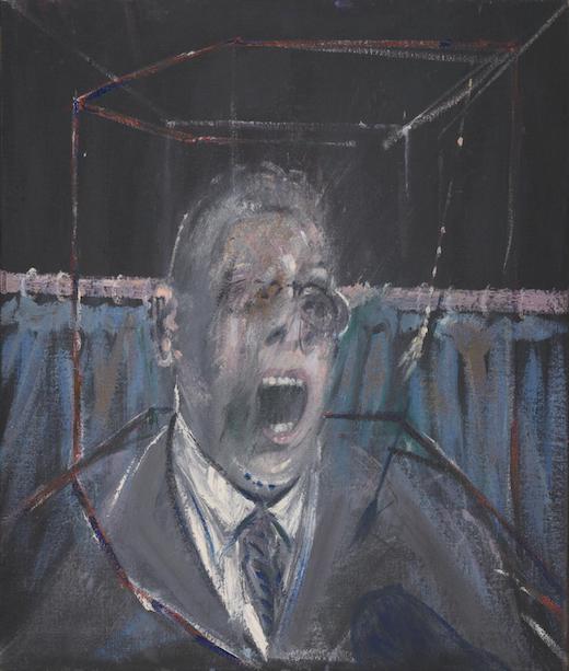
And there’s other upsides. An early work, ’Study For a Portrait’, (1952) was based on the well-known still from Eisenstein’s film ’Battleship Potemkin’ (both above). But while the broken eyeglasses remain the figure is swapped from female to male. Bacon’s earlier era was in general very male-dominated. Which, when combined with its themes, does start to stray towards man-painy. While in the later portraits women feature more. The poster image, for example, is of Muriel Belcher (up top).

Then there’s the small heads…

Most of Bacon’s paintings of this era were on an almost monumental scale. But at the same time, as the name might suggest, the heads aren’t even life size. With the show arranged around subject model, again and again these are hung adjacent to the large paintings. They look almost like punctuation marks between words. But you notice it quickly - the smaller is the better. See for example ’Three Heads of Muriel Belcher’ (1966, below). The poster image is the middle one.


The heads are normally arranged in triptychs like that, sometimes diptychs. And they look to me like they were composed together, with the combination in mind. (I hve no way of proving that. But that’s how they look.) They’re not sequential, like a mini comic strip. But when the individual images suggest movement anyway, lining them up like this enhances the sense. The eye’s movement across them comes to suggest movement within them.

At the time, that old Tate show seemed pretty comprehensive. So it must be a tribute to Bacon that there was more to say about him.

Saturday, 14 September 2024

‘THE SHAPE OF THINGS: STILL LIFE IN BRITAIN’

Pallant House Gallery, Chichester


The State of Things Back Then

Still lives, we’re soon told, had traditionally been pushed to the bottom in the hierarchy of the arts. Laid out in rank order, these were - Historical scenes, Portraiture, Genre painting, Landscapes and (as you may have guessed) Still Life. That slightly oddly named “genre painting” meant everyday scenes. So what this came down to was Important People Doing Important Things, Important People Looking Important, Unimportant People (Possibly Doing Things), No People But Big and Not People Not Even Big. You can see the thinking. They weren’t educational or morally instructive, they were just of things. 

So what was any self-respecting Modernist to do? Upend the hierarchy, of course. Pull the bottom level out to collapse the thing, like a Jenga tower.

Yet in one way this can seem counter-intuitive, for we think of Modernism as being about creating newly dynamic art for a newly dynamic age. But it also, in general not just in art, took against the grand historical sweep and took to the close focus. The most clear-cut example must be Joyce’s ’Ulysses’ (1920), reworking the Odyssey into a single day of a quite regular life. At the time physics turned its gaze from stars and planets to particles.

Perhaps the ranking wasn’t all that surprising. We are egocentric creatures who are primed to see reflections of ourselves, and in no place less than our art. In fact, it can sometimes feel like we invented the thing just so we could make ourselves a flattering mirror. And as always, taking something out can create its own form of presence. When not sated our innate egoism doesn’t go away but into overdrive. Denied the desired sight of human beings we carry on looking for it anyway. And this can be put to use, in different ways…


How often, for example, have you seen a scene such as the one above? Solid-looking furniture before an open log fire, accumulated and exotic objects, clearly a mansion of some kind. But instead of the tweed-wearing Lord, in ’Amaryllis’ (1951) Stanley Spencer has placed a plant. (The plant of the title, in fact.) Pushing itself front and centre, running almost the full length of the frame, occupying the space art normally reserves for humans, it grabs at your attention. While the plant has more than one flower, one is firmly turned to face us, accentuating the anthropomorphism. You’re soon ascribing some form of sentience to it, just from context and positioning. (‘Day Of The Triffids’ was published the same year. Coincidence? Yes, probably.)


Whereas William Nicholson’s ’The Silver Casket and The Red Leather Box’ (1920, above) hints at a helmeted human figure. Intentional or otherwise, you cannot not see it there. Pushing this implication further is the silhouette of, presumably, the artist reflected in the casket.


But there’s as many approaches to still lives as there are in any other genre. Edward Wadsworth’s ’Bright Intervals’ (1928, above) places together a clutch of objects. Now objects should be simple, functional things, instruments for our use. And we immediately see they’re all related to the sea, and are painted in a vivid but limited palette, almost like a striped flag. (It was painted in tempura.) The title emphasises both these at once.

So its a work which should surely be easy to parse, yet somehow its not. Its like a sentence made up of words you know, which seems to follow grammatical order, but gives up no sense. I suspect its concerned with the distinction between the ideal world, represented by the objects in the foreground and the real word beyond, represented by the sea. The curve of the blueprints is echoed by the prow of the ship. It has the deep blue we associate to the sea, which is here rendered green. A barrier (a wall, a window?) lies between the two. The territory never matches the map.

Yet of course the whole point here is that we don’t understand, that these simple objects elude us. How did such a thing come about?

Prior to Modernism, many works were tableaus. They were painted via models holding stilted poses for long periods, while the artist debilitated and laboured. And for the most part they looked it. Their purpose being to convey a point (the Nativity, victory in a battle and so on), naturalism wasn’t strived for. So, while ostensibly of people, they were stiff and rigid. Art stilled life. Still lifes such as this essentially reverse things, painting inanimate objects as an arrangement of elements, but in a manner which feels elusive.


But there’s another, more oblique, influence. Edwaert Collier’s work above is titled ’Vanitas Still Life’ (1694) and Vanitas was often used as a name for this Dutch genre. “They sought,” the show says, “to convey the transience of life through arrangements of inanimate symbolic objects.”

(We’re also told that from the Seventeenth century these were imported. I confess to not being sure how we’re supposed to take this. This is a show devoted to, in its own words, “Modern and Contemporary British artists”. Had the snobbery over still lives been stopped a good couple of centuries before Modernism began? Or were they considered exceptions to the rule, before Modernism came along to take them up? But no matter. Let’s focus on what they did, and how they were received.)

The stillness of them feels foregrounded, creating an eerie calm. It’s like breaking into the room of a person long dead, their possessions lying as they are. We become aware what has happened to them will come to us. We are transient, our things will outlast us.

At this point I’ll take a guess. My guess is that this was not how they were received, at least not at this point, the early days of British Modernism. Some of the symbols used are effectively universal, the widely repeated skull to stand for death scarcely needing much interpretation. But many were specific to another time and place, a shared understanding gone. (In the way that one work here uses roast beef to represent England.) They arrived to British Modernists inscrutable and mysterious, devoid of a code book. Which of course made them enticing. So why not do the same to someone else?


And this leads to works such as Mark Gertler’s ’The Dutch Doll’ (1926, above) which possess a sinister, suggested animism, lurking near the surface without emerging. If you looked away and back, would things have moved? As the show says, ‘Still Life’ is “a contradictory name”, why not play that up?

The doll, placed centre where the human figure would normally go, is a clear enough source of this. As children we imbue dolls with life, a habit we never absolutely break from. But the picture is full of such suggestions. The flowers are of course painted, but on their vase is a painting of flowers. The playing cards also perform a picture-within-a-picture function. While the plant to the left seems to be composed of moving tendrils, enhanced by the sharp painting style. And the red curtain to the right suggests we’re looking at a stage, which makes everything on it props but also actors.

Outside this show, elsewhere in the gallery, Claire Rudland is quoted as saying: “There is more than what we see, there is something other.” She’s describing her own work. Yet it’s as fitting for this and many other works in the show.

Ask Not What, Ask Instead How

Objects, then, can be both present and elusive. But there’s also other approaches. One is to paint not just still lives but the same few objects over and over. With familiarity they fade from your attention, which instead falls on *how* they’re depicted. Which is perhaps Modernism in essence. Questions of how can never be disentangled from questions of why. (Cubism played a similar trick.) And from there, you’re free to take any route you want.


In ’The Cup And Saucer’ (1915, above), Harold Gillman homes in and fills the surround, so the title objects contain almost the only white in the composition. But rather than give them a smooth coat as would befit china, the paint is crusted thickly and in varying shades. Rather than something dull and solid, they seem to radiate and shimmer before you. (Who could have guessed a cup and saucer could be made into something so vivid?)


John Duncan Fergusson’s *’The Blue Lamp’* (1920, above) bears some compositional similarity - close-cropped, and centred around a white object. But its made up of bright, solid blocks of colour, held within thick red outlines, to the degree it could almost be a screenprint. The elements act almost like notes in a composition. In style, the two works are worlds apart.

While Winnifred Gill’s ‘Still Life With Glass Jar and Silver Box’ (1914) keeps the heavy outlines, then makes the colours beneath them shift around and recur. Gunmetal grey seems reserved for shadows, but the two shades of brown dart around the composition. (The restrictions of the First World War already in place, Gill used a tea chest lid for a canvas.)

The Path To Abstraction Is Paved By Things


As artists were mostly interested in cups or fruit not in their own right but for their formal qualities, this meant still lifes played a prominent role in the path to abstraction. You can see the timeline over several Ben Nicholson works in the show. The first step is to make them into symbols. With ’Striped Jug and Flowers’ (1928, above) you don’t imagine grasping that jug by the handle. It’s an image of a jug, flattened into a representation, abstracted from any environment. Even as the flowers seem more three-dimensional.


Then eighteen years later, the almost fully abstract ’Still Life, Cerulean’ (1946, above) retains the lines of the jug handle at upper right.

…all of which may be true. But you cannot help feel the show overplay this a little, in order to fit it to their theme. The *’Expressionists’* show at the Tate (currently still running) demonstrates the same thing happening with landscape art. (Yes, one whole rung up the Academy’s hierarchy of genres!) At this time, all roads non-figurative led to abstraction - and sometimes figurative too.

Things During Wartime

Remember how we came in? The still lifes which inspired all this conveyed the transience of life by depicting the relative permanence of things? And how British Modernists instead created works which were dazzling and brilliant?

Then it seems something came along to burst this bubble. Around the year 1939, should you need a clue. And so we arrive at a room called the jolly 'Death, Decay and Post-War Austerity’. Skulls were back in a big way.


One of the best works is Edward Burra’s ’Still Life With Teeth’ (1946, above), precisely because it eschews such standard images and instead manages to make a fruit bowl menacing. The objects aren’t just pushed to the foreground but monstrously oversized. And other apparently domestic objects are also infused with lurking threat, the show talks of how the cutlery is imbued with “the sinister allure of weapons”.

The teeth and shoe are the only signs of human life, save a tiny figure fleeing the scene, long-shadowed in a de Chirico boulevard. Our misadventures have borne these monstrous fruits, which now dominate and push their creators from the frame. This is life thrown out of balance, as hallucinogenic as Dali yet more intimate. (This would be a good time to remember that the Pallant House once had a great show dedicated to Burra.

Things - Not What They Used To Be

Then, after that final twist, things lost their lustre. Modernism had essentially won its battles, nobody was really talking about the hierarchy of genres any more, and so  still lifes 
had little use. But it's natural enough. Nothing is useful forever, not even things. 

Alas the show, which has up to now been enthralling, doesn’t work out this is the time to stop. Instead it progresses into Pop Art. Which does something entirely different. The representation of things, which had once been central, was no longer a question. Now the closer you could make the representation to the things themselves, the better. In a time of mass production, make art which looked like product. Airbrush. Or screnprint. Collage. Or just take the objects themselves and use them.

And what does this change? It changes everything! Pop Art appropriates, takes and recombines. (This is particularly daft when the Pallant House has already had a Pop Art show, which laid out all of this.)


Though one work which both belongs in context and is worth seeing is John Bratby’s (rather splendidly named) ’Still life With Chip Fryer’ (1954, above). As translucent doesn’t work well in painting, you can by tradition use white for glass. Here Bratby uses pure white not just for glasses and bottles but a whole bunch of objects, including a sieve. Others are bright blue.

Products include brand names, which might seem classic Pop Art. But all this is amassed together onto a drab brown table with drab wooden chairs in a drab room of bare floorboards. It looks like a collision, a clash of reality systems, a foreign invasion, almost like the Science Fiction device of sticking alien spaceships in Trafalgar Square. Its a fifties were the Forties and Sixties were struggling for control. (Regular reminder - great artists weren’t always great people. Bratby was an abuser.)

But let’s end there before we run into Rachel Whiteread. If this show loses its way later on, art did too. So let’s look to its successes. Early Modernists had a slightly paradoxical relationship to the still life. They saw a life in things which loftier-minded artists had missed. While at the same time they saw a nailed-down subject which allowed them to focus on questions of how. The result is works on what might seem the dryest and dullest of subjects, which are full of life. 

Saturday, 10 August 2024

POST-PUNK’S FRACTURE LINES (SHOPKEEPER THINKING IN A SEA OF SIGNS)

...continuing 'Intensify The Contradictions', my deep dive into Post-Punk and New Pop via Simon Reynolds' 'Rip It Up', first part here.)


“It is the destiny of signs to be torn from their destination, deviated, displaced, diverted, recuperated, seduced. It is their destiny in the sense that this is what always happens to them; it is our destiny in the sense that this is what always happens to us.”
- Baudrillard

So then… Post-Punk was a bold, rigorous programme with a clear plan to liberate music from commodification, unfortunately scuppered when too many practitioners were tempted away by dollar bills? Guess what? No.

In fact to claim there was a ‘real’ Post-Punk scene which then ‘sold out’ by ‘going commercial’ is to fail to grasp the single most fundamental thing about it - that it insisted upon, even paraded, it’s own lack of authenticity. We should take it at its word. If New Pop marked the failure of Post-Punk, the point where its libertarian militancy soured into a Po-Mo world of signs, it was weaknesses and contradictions already present in the Post-Punk scene which allowed it to appear.

First, let’s remember Modernism itself led to, and in fact set itself up for, Post-Modernism. Second, Post-Modernism (prevalent in academia since the early Seventies) was by this point already sending out tentacles into popular culture. Post-Punk therefore became the first Modernist movement after the concept of Post-Modernism had arisen, and so forced to co-exist.

Reynolds describes the era as “the systematic ransacking of twentieth century art and literature”; yet classic Modernist movements did little to cite or reference their brethren. If they did mention them at all, it was almost invariably to highlight their redundancy. This ceaseless referencing of Modernism is actually a feature of Post-Modernism! In other words, Post-Punk was riddled with Post-Modern concepts from the start. SPK’s Graeme Revell was fond of saying annoying things like “today there is no reality, everything is real and everything is unreal” even before he became a Hollywood soundtrack composer. Devo called themselves a “postmodern protest band”.

If Adam Ant drew the ire of the more truculent paleo-Punks, Green fits the bill for anyone who wants to yell ‘sell out’ in a more polysyllabic form. Like a soap villain, like Dali to the Surrealists, he obligingly ticked all the Judas boxes - explicitly moving from an interest in Gramsci and other Marxists into Post-Modernism. (Which mostly involved saying smart-sounding rubbish like “what has meaning is what sells, and what sells is what has meaning”.) In a hilarious image, Reynolds recounts him contemplating his shift while listening to Michael Jackson and reading Derrida. In this way he followed the example of many of the original French and Italian Post-Modernists, ex-Sixties militants who needed a justification for their inaction which was still rooted in ‘radical’ terminology.

But Post-Punk had exploited an ambiguity which in some senses related to the difference between Modernism and Post-Modernism. As Reynolds himself has said “Post-Punk still had a tremendous seriousness, a tremendous conviction that music had power or that it could change the world… it was pre-irony, it was pre-retro culture.” The Fall memorably sang “I still believe in the R+R dream.” Without creating such conundrums, its doubtful Post-Punk would have been successful on any level, as music or as cultural provocation. Nevertheless, by problematising its own statements Post-Punk opened the floodgates to the sea of signs.

Similarly, Post-Punk drank deeply from Conceptual art. As Reynolds says of Throbbing Gristle, “their music was in a sense merely a delivery system for their ideas”, but he could have picked any band from these pages really. Indeed, it’s quite possible many bands saw their main delivery system as ranting to the ’NME’ about prizing Brechtian alienation techniques above guitar solos, but needed to go through the cumbersome process of releasing a record to get the ’NME’ interviewing them in the first place. Conceptualism isn’t the same thing as Post-modernism. It makes art that is more about ideas than about works, which doesn’t necessarily suggest there are now only ideas. But inevitably the concepts blur, and arguably blur more in the popular mind than they do on paper.

Another thing the paleo-puritans like to do is counterpose the ‘independence’ of smaller record labels against the majors, what Reynolds called “a post-socialist micro-capitalism in the face of top-down corporate culture” and Green dubbed “squattage industry”. Again, Green made himself an obliging target for this when he abandoned Rough Trade for Virgin. Reynolds feels inspired by their “rapid response nature, so much more suited to the speedy stylistic fluctuation of the Post-Punk universe”. The small labels and fanzine production system, and the DIY ethic in general, was doubtless important in enabling a lot of material that would never have been conventionally released. But when it is presented in this purist way its tempting to ask a simple question – isn’t micro-capitalism … ahem … just a form of capitalism that’s... er... smaller?

Furthermore, one of the perils of the self-styled avant-garde is being slightly – but only ever slightly – ahead of events. Micro-capitalism and post-Fordism were then becoming vital touchstones of the Thatcherite ‘revolution’ then sweeping Britain. As Jon Savage, the Wise Brothers and so many others have argued, Punk’s DIY ethic fed neatly into the Thatcherite cult of entrepreneurship. For example, Factory gained its name from the preponderance of ‘Factory closing down’ signs they saw around recession-hit Manchester - they thought maybe they should open one. In fact their famous club, the Hacienda, actually replaced an old textile factory. (Now a block of yuppie flats named, with no sense of irony, after the Hacienda.)

But the humour was double-edged; light-weight, flexible, leisure-based, they were one of the ‘new industries’ Thatcher extolled while the slow, lumbering majors worked more like the cumbersome centralised factories. This was successful enough as a business model that many majors were forced into ‘partnership’ with minors, or even to absorb some of their practices.

The electronic bands even became scabs! (In a manner similar to the Wapping strike against new printing technology.) The Musician’s Union had started a ‘Keep Music Live’ campaign and strike at the BBC, concerned they’d collectively lose their jobs to a plug-in box. Ian Craig Marsh of the Human League recollects the mentality as “almost Stalinist”, while the band responded with the slogan ‘Keep Music Dead.’

New management practices extended to within the ‘bands’ themselves. Many abandoned the fixed employment, everyone-on-a-wage structure for a flexible labour model where “a production company could hire (and fire) session musicians on a flat-fee, no royalty basis.” Once Scritti had followed the commune model, where whoever was staying at the squat was in the band. Green defended their new working practices, ironically enough with the same argument that had named Public Image Limited – they’d become “a kind of production company”. Yet PiL’s name had been a provocation, behind which existed (at least in theory) a camaraderie of equals. Green’s corporate-looking Scritti was instead just what it said on the lid.

And crucially, the shopkeeper mentality that was a necessary component of DIY had always contained the seed of such entrepreneurial thinking. Independent labels had been a route to an important end. But to suggest they are inherently ‘outside the system’ is absurd. As Andy Gill argued, defending Gang of Four’s then-controversial decision to sign to EMI: “the point for us was not to be pure… It just wouldn’t be on our agenda to be on a truly independent label, as if such a thing could even exist.”

Saturday, 6 July 2024

MODERNISM’S LAST CRY (FINDING THE FUTURE IN THE PAST)

(...being the latest instalment of 'Intensify the Contradictions', my deep dive into Post-Punk. First part here.)


“Every act of creation is first an act of destruction.”
- Pablo Picasso

“We hated everything that wasn’t modernist. It was like Cavaliers and Roundheads, total warfare.”
- The Human League’s Martin Ware, (G2 28/11/08)


Reader be afraid, be very afraid, for all this talk of musical influences has been but the warm-up to our main theme – Post-Punk’s chief influence was non-musical, even anti-musical. And it will take two instalments to cover. Post-Punk was at heart a late burst of Modernism. As Reynolds puts it, the era saw “the systematic ransacking of twentieth-century modernist art and literature. The entire period looks like an attempt to replay virtually every major modernist theme and technique”.

It had long been a truism that bands were formed at Art College not Music College. But then suddenly, out of the blue, it was no longer enough to hang around and soak up the bohemian ambience. You now needed to listen to the lectures!

Of course, like Punk, Modernism had set out to shock. Mayakovsky had titled his Futurist manifesto ‘A Slap in the Face of Public Taste’ while the Italian Futurists luxuriated in “the pleasure of being booed.” Like Post-Punk provocation was integral to the project, a scream against the shackles of custom.

There isn’t really a sound-bite definition of Modernism, so let’s try two. Sartre said of the Modernist sculptor Giacometti: “He does not recognise such a thing as progress in the fine arts… one must begin again from scratch.” Art history was not a march of progress but a set of shackles to be thrown off. The only way art can be created is to perpetually start again from first principles, what is already laid down is already suspect. And of course this was how Post-Punk saw the history of Rock music.

But also, Brecht described art as “not a mirror held up to reality but a hammer with which to shape it.” Art was no longer to concern itself with reflecting (and thereby reassuring) it’s surrounding culture, but shocking and challenging it. Agreed notions, even over something so simple or innocuous as what a vase of flowers looks like, were to be overturned. Consequently the artifice of art, the subjective view of the artist, was no longer to be hidden but emphasised, foregrounded.

‘Good’ art as some sort of end in itself was to be torn down. Art was now a cultural intervention, its function (social change) as much a function as with designing any refrigerator or airplane. Aesthetics was now not a comfort zone but a strategy. Manifestos detailing the aims and intentions of the artist became as important as the artwork itself… indeed at it’s most self-parodic Modernism came to feel like a set of provocative manifesto statements with a few artworks cobbled together last-minute in order to illustrate them. Again, the way Post-Punk saw music.

And at the same time it’s ceaseless questioning was also self-questioning, it remained ever-alert to the possibility it’s own methods were insufficiently radical. This perhaps reached an apogee with Duchamp’s anti-art, which was intended to be self-sabotaging as a means to take the rest of art down with it.

Unlike the multi-media approach, this was not something borrowed from the Sixties. The art styles filtered through hippy culture were Art Nouveau and perhaps some light Surrealism. Hippy ‘happenings’ were influenced by Fluxus ‘events’ (as we’ll see), but without the conscious emulation of Dada. Post-Punk stole from the Sixties Underground and from Modernism, but with two separate hands.

Prog, meanwhile, inclined to a Victorian Romanticism which itself looked back to Greek myths, medieval heraldry and the like. Their sleeves composed scenes and landscapes depicted illustrationally. Post-Punk could then react as strongly as Modernists had to the original Romanticism, and in much the same way.

True, Jaime Reid had been designing Dada-influenced sleeves before the Pistols even split. But Punk had always hidden such ‘arty’ elements under a bushel of feigned anti-intellectualism and cartoon yobbery. Needless to say, this only made the Post-Punks more keen to emphasise their Modernist influences. It proved the perfect opportunity to filch the library card carefully hidden inside Punk’s leather jacket, hold it aloft and ask to borrow it.

The chief influence in this was of course Krautrock, the prior music scene which had been most Modernist influenced. Kraftwerk, for example, openly acknowledged their inheritance from the Bauhaus, Faust from Dada. But these were two of many Modernist movements to have had a German base. It was something already there, something you could take to organically. Whereas Post-Punk took it up more overtly. Krautrock hadn’t come with a reading list, Post-Punk emphatically did.

The accepted wisdom had been that rock music supplanted visual art as the dominant form of youth expression. The electric guitar was so much more immediate, more kinetic, more modern that it made the paint brush redundant.

Post-Punk’s trick was to reverse all that by parading its Modernist influences. With its flag-waving for book-smarts, it held itself not only against Punk but even its two main musical influences. With Reggae you’re supposed to feel the force of Jah, not be won over by theological arguments concerning his existence. This tendency was more exacerbated with Dub, which lacked even Roots’ ‘conscious’ lyrics. Dub saw words as but another sound-source, to be played with even if that meant pulling them out of any coherent order. Dub was at heart spiritual music.

As this allowed a way out of Rock, it’s perhaps significant that music forms of Modernism (for example Futurist noise works or Satie’s piano works) were not particularly taken up by Post-Punks. Non-musical influences seemed a positive advantage, a way of dodging the now-familiar traps. (Similarly, a great many bands named themselves after a book, film or painting, from the Fall to Joseph K. Significantly, many bands today are more wont to puppyishly name themselves after terms already used by previous bands, such as Radiohead.)

You could even come to see Post-Punk’s internal divisions all coming from the factions picking one Modernist strand or other and then running with it. The Slits and the Pop Group were the Fauvists, banging their drum to slip the shaping shackles of ‘civilisation’ and rediscover some long-lost essential self – disrupting the normal to get back to the natural. (Or projecting this ideal onto some feral love object, as in the Pop Group’s ‘She’s Beyond Good and Evil’ with lines like “Western values mean nothing to her”.) The Slits smeared themselves with mud on their debut cover, in a literal bid to get ‘back to the earth’.


Gang of Four, Magazine and Devo took almost the opposite tack. Latter-day Dadaists, they ridiculed any claim that art was some automatic escape route out of culture. Their art was self-consciously conscious, anti-instinctive, always trying to draw attention to it’s own artifice. Magazine ridiculed such Fauvist notions in ’Back to Nature’, Devoto sneering the line “I couldn’t act naturally if I wanted to.” An early Gang of Four track crosstracked standard love-song devotions with a list of trivial details of the recording process.


Pere Ubu and Talking Heads were the Surrealists. Punk had kept Rock’s earnest notion that the lyrics to songs were ‘important’, they’d merely moved from meaningful pontifications to street-corner rabble-rousing. Throwing a spanner into this, they’d sing any nonsense with such conviction that the listener could still be fooled that it all must still mean something somehow. But, as Talking Heads put it, “Facts don’t do what I want them to.”

PiL, though their antics kept a foot in the Dada camp, were primarily Expressionists, creating soundscapes for psychic states. As Wobble said later: “PiL are expressionist, like Jackson Pollock... we were like those New York loft dudes in the 1950s.” Reynolds’ comparison of their seminal ’Death Disco’ to Munch’s painting ‘The Scream’ is a good one. In fact, the cover of ’Second Edition’ (‘Metal Box’s reissue), features the bands’ faces distorted in fairground-mirror echoes of the Scream. Lydon’s old sneering stabs and jibes were replaced by strings of impressionist inward-looking images – from jeers to wails, from Gillray to Munch. The similarly Expressionist Banshees even called their first album ’The Scream.’ 


The Human League and Heaven 17 were Futurists, in fact the Human League’s original name had been the Future! Though by the height of their fame they played pure Pop, they originally celebrated the white heat of the technology that was taking us into a bold machine-built tomorrow. (They sang on ’Blind Youth’ “Take hope… your time is due, big fun coming soon… now is calling.”)

Industrialists like Throbbing Gristle and Neubaten were yang to their yin. They took Futurism or, more often, Constructivism but unlike other factions they inverted it. Constructivism had embraced the link between man and machine and collapsed the distinction between artist, architect and engineer. But to the Industrialists things were no longer being built but just wearing down. The very term ‘industrial’ was ironic, a reference to recession-hit Britain’s ‘post-industrial’ status. Test Dept in particular were keen to play up Constructivism’s worker fetish and its shady links to totalitarianism. During the first Gulf War, they performed beneath a giant portrait of Saddam Hussein.

The only rule was not to be so obvious as to name yourselves after the strand you were most in sympathy with. That would be like turning up for a gig in the same band’s T-shirt. Hence the all-too-obvious Future had to change their name to the Human League. Cabaret Voltaire had their Dada elements, but despite the name were more of the anti-Constructivist camp. Bauhaus were, as Reynolds notes, not of the Bauhaus school at all but Expressionists. Only gormless Johnny-come-latelies Art of Noise gave away their copyism by naming themselves after a Futurist term. (Luigi Russolo’s 1913 manifesto… but you knew that already, right?)

And we are not, in fact, done with Modernism just yet…