
”The plastic arts are gross arts, dealing joyously with gross material facts”
- Sickert
Confining Interiors
“The first major retrospective of Sickert at Tate in over 60 years.” So tell us, Tate Britain, why has it taken you this long to catch up? While you’ve resorted to staging shows for those with the most tangential connection to the UK, here’s a guy who your own biography states was “one of the most influential figures in twentieth-century British art.”
In 1886, he became a founder member of the New English Art Club who tried to shake British art out of its provincialism. Then, from 1911, the more-modern-still Camden Town group, who usually met in his studio. Which (comics analogy alert) is a little like being in both versions of the Justice League.
Of course Modernism was then very much a continental import, principally via French Impressionism. Sickert himself was a Francophile who frequently lived there, to the extent the Pallant House gallery could devote an exhibition to his time in Dieppe.
And Sickert could not have done what he did without Impressionism, in 1889 even exhibiting in a ‘London Impressionists’ show. But rather than become some second-rate copyist, he took his source and twisted it almost beyond recognition. (NB What’s said next about Impressionism will be broad generalisations at best. For the fuller story go here.)
Perhaps most obviously, Impressionism had a fascination with the light, to the extent some have described the movement as an attempt to paint light. And so became renowned for its shimmering and radiant colours. Whereas Sickert has, to quote the show, an “auburn, brown and black palette”. But more than that, he moved everything into gloom.
It’s hard to show this because so many internet images are ‘corrected’ (possibly auto-corrected) from what he painted, to artificially brighten them. But here’s ’The End of the Act, or The Acting Manager’ (c. 1885/6, below).

And this isn’t like Caravaggio, where light is used to highlight certain aspects set against a dark background, like theatre spotlights. Seemingly vital information is consigned to the gloom, such as the figure’s expression, while one hand is lit arbitrarily. There’s that point where you enter a darkened room, just before your eyes adjust, which Sickert seems to be homing in on. There’s a sense of uncertainty and menace that comes with that inscrutability, as if everything might collapse back into that miasma of murk.
.jpeg)
It’s true he did start to incorporate more colour later. (To, we’re told, his agent’s delight.) But in a very particular way. Take ’The Red Shop, or The October Sun’ (c. 1888, above). The bright orange should look highlighted against the sombre browns and greys, like Eisenstein’s flying red flag. Yet it doesn’t *feel* like that to look at it. Perhaps it’s simply that orange is not that much a chromatic contract to brown. But it looks like the visual equivalent of quoting ironically; “yeah, that was sooo orange!” (I have, incidentally, no idea why the title has red in it!) Also, remember that reference to October…


Furthermore, Impressionists painted ‘wet-on-wet’, blending the colours on the canvas, creating that shimmering effect. Sickert not only audaciously pared back his palette, he painted in posterised blocks of colour. See for example his portrait of Audrey Beardsley from 1894 (above). The sleeve, for example, is essentially one colour, with just a couple of highlights.
And all this carries over into mood and tone. Impressionist art is exuberant, has a sense of verite, throws you into the action. Sickert is more detached and observational. Framing devices abound, such as windows or mirrors. And figures are solitary, even when they have other figures around them. Sickert does in art what Pinter did in drama. If an awkward silence had a look, he was able to capture it.

Take for example, ’Ennui’ (1914, above.) The way the figures are aligned only enhances the way they look past each other, and pushes the glass of water (half-empty I’m sure) into the foreground. Behind them, the room looks to be closing in.
Though I confess I’m not actually as much a fan of this work as others, as it lays that all out a little too clearly. Saying aloud that no-one is saying anything doesn’t seem the best strategy, elsewhere he’s more effective in merely suggesting this. Nevertheless, if it’s a bit demonstrational, it demonstrates the point we need to make.
Sickert’s portraits are noticeably inferior to his other work, with the show speculating he painted them for saleability. And this partly explains why. His penchant was for confining interiors, characters trapped in environments, not interacting with one another.

’Girl At A Window, Little Rachel’ (1907, above) gives a rare glimpse of daylight. But we don’t just see the outside world through a window, there’s a kind of double barrier between the frame and the railings. The silhouetted rooftops arguably provide just another obstacle. While the girl’s pose, outstretched arm at right angle to her body, echoes the frame. It doesn’t look like she’s getting out any time soon.
Comparing and contrasting Sickert with Pierre Bonnard (the subject of another recent Tate show) might prove a rich seam. The generation after the Impressionists, both took their tenet that art could capture a moment and upended it. Both made art where the elusiveness was the point. To achieve this both reversed Impressionist methods. Both frequently incorporated reflections and diffracting devices into their compositions.
Yet it’s fascinating how this simple idea can go in two so different directions. Bonnard applied this literally, we could flail but never grasp the material world, real life always passed us by. Sickert’s approach is more narrative, or perhaps anti-narrative, we can’t be sure what’s going on. In fact it seems doubtful the figures he paints know any more than we do. (Sickert was insistent on the narrative element in art, at a time when others considered it retrograde.)
But why should all this be? The great shift in mood can be put down to the way times had soured since the optimism of Impressionism’s heyday, but that was gone into over the Pallant House show. Let’s move more into specifics.
The show does a good job in conveying how Sickert’s use of colour was influenced by the way black and white photographs were shown in print. Technology being more rudimentary back them, it tended to flatten perspective and simplify forms. And as time went on, he worked more and more from photographs.
Also, while he abandoned painting on the spot he’d still sketch observed figures in public places, then work them into paintings once in the studio. And these agglomerations of what were often entirely separate sketches may partially account for the way they look distanced from one another. Invention is often borne from necessity.
The End of the Act

But the most important influence, he’s handily pictured. Sickert painted ’Portrait of Degas in 1885’ (above) in 1928, using an old photo. For the date was significant, it was the year they met. And Sickert didn’t really become Sickert until then, when he fell under Degas’ influence. (The show, alas, sacrifices half a room to pre-Sickert, in order to reiterate this point.)
Let’s not get drawn now into how much Degas was an Impressionist, though it’s known he disliked the tag. It’s true he talked Sickert out of methods which might seem central to the movement, such as painting from life, or painting wet-on-wet, but working slowly and deliberatively. And it’s notable how his work never had that joyous tone so associated with the scene. Let’s see the influence in action…

Degas’ ’The Ballet Scene From Meyerber’s Opera’ (1876, above) devotes a third of the frame to something which is supposed to be placed out of sight in an opera - the orchestra. Then has the tips of their instruments protrude further. While the on-stage dancers look blurry, as if out-of-focus. (They’re playing ghosts, hence the sheet-like costumes.) We see some profiles, but a fair few back of heads.
In paintings of the opera or theatre, we expect the audience’s perspective to be taken on. You look where you’re supposed to be looking, to the stage. After all, the viewer’s perspective in a painting has a similar function, to get to see what you need to. Degas seems to obstinately choose to look at it wrong.

Now look at Sickert’s ’Little Dot Hetherington at the Bedford Music Hall’ (c.1888/9). A chunk of audience has replaced the chunk of orchestra, with theatre boxes added to the right. But there’s clear comparisons. The figure on stage is more distinct, she even hogs the title. But repeat descending verticals seem to de-centre her, box her in, while showing up another figure in the wings.
There’s a kind of anti-mimesis at work, an undoing the spell of the theatre like showing the workings in a magic trick. As the show’s keen to say, Sickert was a former actor (only swapping for art at the age of twenty-two) so would have been aware of these tricks.
But if the debt is large, the differences are important too. The show tells us Little Dot is singing ’The Boy I Love Is Up In the Galley’, hence her pointing. And that’s significant. Degas painted opera and ballet, high arts for well-behaved audiences. Sickert’s penchant was for Music Hall, attending (it says here) “almost every night”. Which was a more boisterous, lower-class affair involving more crowd interaction. He frequently painted just the audience.
And Degas’ interest in opera and ballet was partly the challenge of capturing movement, once the subject of a Royal Academy exhibition. Sickert has little to no interest in this, his Little Dot has a held pose. And the downward dash, the a vertical silhouette of a figure would become a Sickert trademark.

While ’The PS Wings in the OP Mirror’ (c. 1888/9, above) effectively echoes the composition of ’Ennui’, the open-mouthed singer placed above the audience so the two seem to be looking past each other. Their faces are Mount Rushmore impassive. (The title comes from the theatre terms ‘Prompt Side’ and ‘Opposite Prompt’.)

There’s another work hung near to ’Brighton Pierrots’ (1915, above), which for some reason is in an oversize frame. Which exposes the normally hidden sides of the canvas, with their nails and splatters of paint. And Sickert does a similar thing within the stage here, in a side view which emphasises not the performers actions but the bare boards. (Another trick he picked up from Degas.) The dancing figure is obscured by the pole, throwing our focus onto the other, who (another vertical silhouette) is stock still. Most of what he’s looking out onto seem to be empty deck chairs.
Remember from earlier that Sickert painted the October sun? Similarly, he was depicting Music Hall in the period of its decline, as its popular entertainment role was slowly usurped by cinema. (In ’Gallery of the Old Mogul’, 1906, he painted one of the first cinema scenes.) While by this point Brighton was no longer the gentrified, fashionable resort it had been in Victorian times. For subject matter he naturally gravitated to places that were fading, events that now seemed empty rituals.
Flesh and Its Failings
Next we come to the most infamous series in Sicket’s career, the Camden Town Murder series. Advance warning, you’re not going to like it much… For there’s no separating these works from the problem of them. It would be truer to say they are their problem. And, once it comes out in the open, you realise it’s been lying latent all along. Whether we like it or not, they rival the Music Hall works as Sickert’s greatest series. But I’m not sure we do like it.
(And for those who haven’t come across this yet, for this section I will have to use links rather than thumbnails. Not because of the suggestions of sexualised violence, but because of the boobies. This is the ludicrous way Google works. Well that and sacking workers who try and unionise.)
Things don’t start off too badly. In 1910, he wrote an essay ’The naked and the Nude’ (his capitalisations), which criticised the Nude genre in art as over-idealised, and disconnected from the actual human figure. Which might seem progressive, an alternative to Gauguin’s fantasy topless Tahitians.
And first he created pastels in the style of (you guessed it) Degas; quite sumptuously eroticised while being given contemporary domestic settings, for example ‘Nude Stretching: La Coiffure’ (1905/6).
But the nude’s face, not especially prominent there, is then steadily de-emphasised. Sometimes he uses compositional devices for this. With ’Woman Washing Her Hair’ (1906) for example, we have to take the title on trust as he brings in a doorframe to crop off her head.
Other times the head is angled away from us, sometimes not but is barely filled in anyway, as if an irrelevant detail. ’La Hollandaise’ (c. 1906) is perhaps the most extraordinary. The room is perhaps shown more dimly lit than usual, but those paint marks suggest more a refusal to paint a face than anything else. If we saw this in a studio, we might wonder if it was finished. It almost resembles the pixellated, anonymised faces of documentaries.
Plus, the figure comes to be shown lying prone. Not in recline, as it often was in the Nude genre, but prone. She lolls so much, it’s pretty hard to work out whether she’s alive or dead. And frequently with the legs and lower body angled towards us, making the pubic region more prominent than the head, a sexualised corpse.
This reaches it’s terminus in ’L’affaire de Camden Town’ (1909), where the figure no longer looks human, more cuts of meat yet to be chopped into joints. If it’s a hard work to look at, it’s partly the combination of extremity with dispassion, with chilling forensicness. Lisa Tickner, writing on the Tate website, describes these works as “electric with violence but nothing is happening. He paints the stasis before or after; it is not clear which.”
The male figure who looms over her reappears in other works, always clothed while she’s always naked. There is never, as you may be expecting any interaction between them. In ‘The Camden Town Murder’ (c. 1908) the figures are at right angles to one another, and they manage to look away, both from each other and us. Her pose, that arm flat but with the hand angled out, seems so unnatural you cannot help but wonder if she still lives.
Why that title? In the midst of this, in 1907, the Camden Town Murder happened. A woman was found murdered at home, lying on her bed with her throat cut. (Her name, often skipped over in accounts, was Emily Dimmock.) Perhaps partly because she worked as a prostitute, and partly because no killer was ever convicted, it became the subject of salacious tabloid interest.
And, piggybacking that interest, Sickert then retitled and partially reworked four of these paintings. (‘The Camden Town Murders’, for example, was previously ’What Shall We Do For The Rent?’) Details of them still don’t match known facts about the discovered body, nor those reported and illustrated lasciviously in the press. (Which didn’t necessarily match.) But it’s not like the implication of murder is suddenly introduced, so much as finally said out loud.
Were they an assault on the Nude genre by dragging it through the mud? This seems the angle the Tate is taking. But they’re way too excessive, too fixated to warrant that. Were they an expose of sexualised violence, intended to shock the viewer into action? Hard to credit it. One he even retitled, in an innuendo-like gag, ’The Prussians In Belgium’ (1912, retitled 1915).
The press wasted no time comparing the murder to the earlier Jack the Ripper killings. And while the notion that Sickert was the Ripper was never credible, it does seem he was one of the many who sent hoax letters claiming to be the killer. And why would someone do such a thing? It suggests a kind of identification with the murderer, an acting out of the killings on the page, done in such a way as to maintain deniability.
(At the opposite bookend, I suspect part of the appeal in claiming Sickert to be the Ripper is that it cuts down the numbers of those who thought like that. The guy who did the dodgy paintings was also the misogynist murderer, the one I’m pointing at now, him, it’s all down to him. It’s like the way conspiracy theories so often insist evil has a single source. In fact, as the number of hoax letters would suggest, this mindset seems widespread.)
But unlike that letter, there is at least an honesty to these works. I suspect Sickert was venting something he possibly didn’t understand in himself, the way the misogynist mind will always come to associate desire with disgust. It may well be that women’s actual bodies don’t often resemble the voluptuous stuff which fill our fantasies, normally fed by the inflated idealisations of popular art. Plus we live in a society where male heterosexual desire is taken as desire’s default form. So it becomes possible to blame women for those supposed failings, the object not looking like the picture on the box.
Plus these are all working class women. There’s a reason prostitutes gained the euphemistic tag ‘working girls’. And for a toff such as Sickert, the assumption was that they were there for your pleasure, and were ultimately disposable. But there’s more to it than that…
Men, I can attest, are made of flesh as much as women. (Well, a bit more gristle in my case.) But the cultural association of women with flesh means that the disquiet with it, the knowledge that at some point or other our bodies will fail us and snuff us out, gets projected onto them. This is accentuated by the knowledge we were born from women, had bodily existence passed on to us like some kind of original sin. So by extinguishing their bodies, perhaps we may be able to escape the trap ourselves. And when inevitably none of that works, you blame them all the harder.
And a tangential thing… I’ve mostly not mentioned Sickert’s long influence over post-war artists, mostly because it’s already been covered in the Tate’s recent ‘All Too Human’ show. But the ‘recipe’ of these works - the naked figure, the white sheets, the iron bedstead, the windowless room - is very much taken up by Lucien Freud. As with Sickert and Degas, there are important differences. But the influence is there.
Taking Things Outside
Perhaps we could do with letting in a little light at this point. Like Degas, Sickert did sometimes paint exteriors. And Like Degas he wasn’t always terribly good at them. (Though he may have been the better of the two.) Of the examples here, he was worst at monumental buildings. Admittedly the best examples of these are of Dieppe, already seen in the Pallant House show so not standing out here.
With the scenes of Venice, this time his work does suffer from Impressionist comparisons. Monet had not only got there first, these efforts seem either imitative of him, or not even that. (Though it may be they were something of a day job. There are three views of the facade of St. Marks, so similar the only possible motive could have been to sell them three times over. And the problem here isn’t that artists sometimes knock out stuff for cash, to keep themselves in brushes and Music Hall tickets. I have a day job too. The problem is when starstruck curators come along and try to claim everything they signed was touched by the hand of genius.)

He was, however, much better at street scenes. Which, once he’d escaped the confines of his own interiors, tended to be less melancholic and more mysterious, more classically Impressionist ’Easter’ (c. 1928, above) shows a flurry of white Easter bonnets in a shop window, as if luminously lighting up the night by themselves. Two solitary figures stand silhouetted by them. By including the less display-like floor above, the image looks similarly everyday and numinous.
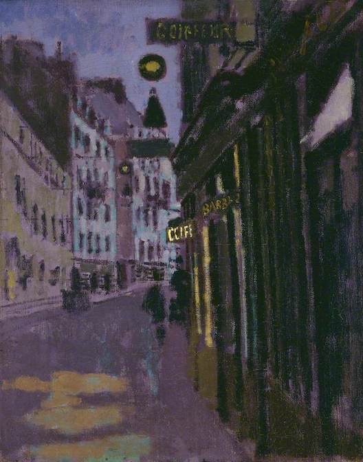
While ’Rue Notre Dame Du Champs, Paris, Entrance of Sergeant’s Studio’ (1907, above) is one of those pictures which seems an invitation, designed to pull you in and allow to drift through those streets. Whatever’s round the curve of the road is made into a temptation, if the blurry figures could be caught up with. The brightest point, the nearest to pure white, is the cafe sign placed almost exactly at the centre of the frame, attracting the eye. The two other signs are made noticeably dimmer.
If Sickert was a problematic figure, so was his mentor. But in his case it’s both less obvious and more extreme. With Degas it’s hard not to see the Dance Masters he so frequently depicted as displaced self-portraits, seated and patrician, the still point of order around which young girls obediently pirouetted. He seems to have played up to his curmudgeon image, and had he lived long enough would doubtless have ranted about immigrants on tabloid TV shows. Sickert the ex-actor was seen more as a wit and a raconteur. But there was a dark side to him which his dark art revealed…
No comments:
Post a Comment