googlee7ea825f63edb3f6.html

Friday, 25 September 2009

“THEY DON’T MAKE THEM LIKE THIS ANY MORE...”


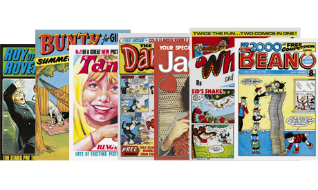
... and indeed they don’t. Last week witnessed one of the strangest moments yet in British comics history. Children’s comics briefly returned to the newsagents’ shelves, albeit stuffed within the pages of the Guardian as part of a giveaway of “classic comics”! Of course there’s a rub to the tag-line I’ve turned into my title, for needless to say they’re actually aimed at nostalgic adults (with cover dates between 1971 and 1984) rather than relaunched for today’s children. In fact I had visions of kids asking their parents what these strange-looking new supplements were all about, much like the youngster I once heard in a charity shop asking his mum what a pile of LPs were. (He didn’t believe the answer.) However, at least one letter-writer reported her daughter asking where she could buy more copies of Tammy!


Despite my being in the target age group, none of this intended nostalgic glow penetrated my cantankerous hide. At the time I only ever read one of these titles with anything approaching regularity, Whizzer and Chips. I glanced over The Dandy from time to time, but it had far too many text blocks under the panels and looked too olde-worldey even for me. I never so much as considered Roy of the Rovers, seeing the appeal of football comics even less than the game itself. (Dan Dare had been to both Venus and Mars, and yet you want me to read about some guys kicking a bit of dead cow around a field?) And of course I never read any of the girls comics. Indeed, a schoolboy reading girls comics might have stuck out somewhat in the early Seventies Midlands.


So the whole exercise might have passed me by had it not been for Tammy. Glancing through it I was reminded of the oft-repeated argument that girls’ comics were actually better than boys, that the more mature readership forced their creators into providing better stories and artwork. (A somewhat ironic assertion as girls’ comics vanished off the shelves before boys’ did.) Much of the artwork in this comic is great, perhaps due to the fact that each artist is allowed their own style. (I remember boys’ comics of this era as looking much more homogenous.) Of course that freedom didn’t extend to artists signing their work so I can’t tell you who any of them are (though ‘Glen’, below, looks to be by Jim Baikie).


Of course that image may be enhanced by putting this comic alongside the wearisome Roy of the Rovers. (I still prefer Dan Dare, quite frankly.) Tammy perhaps came out during a heyday for comics. The boys’ Countdown, for exampled, debuted later that same month – February 1971. Nevertheless, I contend that this comic does more than shine in dull company...


I previously knew Tammy by reputation, as one of a triumverate (with Jinty and Misty) that had revitalised girl’s comics in the early Seventies. However, I don’t think I could have told you that it actually launched that triumverate, under the editorship of Gerry Finley-Day. The successive titles may have gained more renown due to the greater involvement of fan favourite Pat Mills. (And some comments I came across on-line on-line suggest that the successor comics did take things further.) Yet it was Mills himself who said: "I've always felt Tammy was in some ways ahead of my Battle and Action... I hope one day the male readers will see just how relevant Tammy is in beginning the process.” (From this feature via Down The Tubes. See also Jenni Scott’s interview with Pat Mills on similar themes from an old Caption convention, complete with audience question from me!)
In fact even the Guardian feature implicitly acknowledges the comic’s importance. While all the other titles had been represented rather randomly (albeit with an ‘event issue’ for Roy of the Rovers) only Tammy takes things back to the first issue. (Though sadly lacking the free gift ring and bracelet, unless of course the newsagent nicked mine!) It also offers a contrast with a more ‘regular’ girls comic, a Bunty from the following year. (For some reason a longer ‘Summer Special’ rather than a regular issue.) The comparison’s not perfect, as Bunty was aimed at a younger readership. (Notably it includes several one-page humour strips.) But it’s to hand, and besides I don’t exactly have a huge reservoir of girl’s comics to call up on.


Bunty excelled in what were most commonly called ‘Cinderella stories’, in which trials and travails are piled upon the juvenile heroine to a torturous degree. A heroine would be called upon to roll a large rock up a hill, particularly if she had a wooden leg and a glass arm. The story would work even better if a malevolent Aunt would try to prevent her by chucking other rocks downhill at her. Work in a boarding school setting and a dead pet or two and you were away...


This title, though, is in one way a misnomer as these stories involved exceedingly few visits to balls, let alone any getting together with handsome princes, and a whole lot of chores and ugly sisters. As Pat Mills comments in the interview linked above, this emphasis on endurance frequently appeared in the boy’s comics as well. But there the hero would always at some point triumph above adversity, even if only temporarily. (For example the Victor’s ‘Tough of the Track’ would get repeatedly knocked down by life but still go on to win his race.) Heroines would be called upon to endure adversity, on an excruciating weekly basis. Passivity was a positive value for girls, just as activity was for boys.


Despite the fairy-tale origins of the phrase, if we exclude the gag strips only one story here has a fantastical setting – ‘Lydia and the Little People’ – but it is significant. Lydia doesn’t travel to a wonderland but becomes trapped in a world of endless Sisyphan chores, such as scrubbing the street (yes, the street!) so the (apparently all male) little people can hold their outdoor parties. While other strips do not duplicate this otherworldly setting, they do reproduce this travailing sense of existence. Indeed, precisely what they lack is the ‘real world’ to escape back into and throw your scrubbing brushes away.


‘The Four Marys’, apparently Bunty’s longest-lasting strip, was (not altogether surprisingly) a boarding-school tale – though all the title characters seem to be learning from school is how to cook and sew. However their efforts are being thwarted by two bullies, Veronica and Mabel. They defeat the bullies by bringing along some children, which horrify them so much they even agree to the “polishing, scrubbing” to escape their “sticky” mitts. As if it wasn’t clear enough that girls should be learning how to become mothers and housewives the bullies are given identical short ‘flapper’ haircuts while the Mary all have longer, more ‘womanly’ hair.


One interesting feature, however, is that the bullies mostly pick on one Mary, ‘Simpy’, because “she is of the lower classes”. Simpy responds “I’m not ashamed of being working class. I’m proud of it, in fact, and I like doing housework.” Wikipedia comments:


“At the time of Bunty’s creation, this was a rather political topic - admission to upper-class public schools still mainly ran on wealth, and the class divide was a hotly debated issue. Simpy, although accepted without question by the other Marys, nevertheless had a good deal of prejudice from her classmates, and many of her plotlines were centered around the difficulty of dealing with her separation of class.”


Indeed this aspect of the storyline shouldn’t be underestimated. Though a departure from the Cinderella theme (for Cinderalla’s poverty had familial not social causes, stemming from her step-sisters) it is quite typical of comics of this era. (The already-mentioned ‘Tough of the Track’ played a similar role in boy’s comics, coming from the wrong side of those tracks.) However, let’s also remember “the time of Bunty’s creation” was 1958, some way before 1972. Furthermore, class identity took a different form in the Seventies to today, before those repeated pronouncements such as John Major’s “we are all middle class now.” It was then seen as an inheritance, a sense of belonging, whereas now it is perceived more as an individual decision, a question of aspiration. (Those who see society as some steady progression towards egalitarianism may wish to reflect upon this point.) Finally, Simpy’s response that she likes doing housework should remind us that simply to assert class identity is in itself merely conservative.


There could be said to be another point of departure from Cinderella in these two strips. While Cinderella is rescued from her servitude by the interventions of the Prince, the girls here free themselves. Lydia escapes the Little People by solving a puzzle, while the Four Marys trick and outwit their bullies. However this may be down to the standalone, single-story nature of the Summer Special. (Indeed, Lydia’s strip seems strangely to start in the middle.) In the regular comic, the masochism could have been perpetually stretched out, only being brought to a halt when the strip finally dipped in popularity and had to be closed. (Which in the Four Marys’ case was 2001!)


Anyone expecting Tammy to dispense this Cinderella theme (and perhaps serialise The Female Eunuch in strip form instead) might be disappointed. Indeed, given this first episode, a strip like ‘No Tears For Molly’ might even have appeared in Bunty. A servant girl arrives for duty at a country house in the Twenties, to find herself perpetually bullied by the “more superior servants”. Uncomplaining throughout, in one panel she even describes her “posh” room in a letter to her mother as she sits in her windowless box. In ‘Our Janie - Little Mum’, the pinafore-clad Janie devotes herself full-time to caring for her family after her own mother has died. (However, unlike Molly, Janie has a much more modern setting – a block of council flats.)


However, other strips push against the passivity of the Cinderella theme. ‘Girls of Liberty Lodge’ starts at yet another tyrannous public school, but before the first page is over Miss Valentine has quit her teaching job there to open her own “freedom school. The girls will be free to come and go as they please.”


But even less passive is Julie Jeffries in the splendidly titled ‘My Father My Enemy’. The daughter of a dictatorial mine owner at the turn of the century, she turns against him - declaiming “those ‘common people’ are the ones that you keep in luxury. They work like slaves and their children starve while you give yourself airs.” In a panel I’ll have to reproduce for you to believe me, she runs to the miners and explains to them the value of collective action – “He can’t sack you all, or the mine would have to close down! You’ve got to stick together to defy him!” They truly don’t make ‘em like that any more!


At the same time, there is almost a sense of ‘too good to be true’ about this episode. It reads almost like the result of a dare rather than the start of a regular series, unlike other strips here it’s not at all clear where it can go next. (It is set too late, after all, for Julie to lead her miners to the First International Congress.) It would be interesting to read future installments...


This strip does foreground something notable about Tammy. With Bunty only in the fantastical ‘Lydia and the Little People’ had the bullies been male. In Tammy they’re male in a majority of the strips, even if only explicitly the father in this particular example.


Another significant difference is in the treatment of time. Bunty takes place in quite a time-transcendent world of boarding schools, riding lessons and Victorian cobblers shops. (Though a minority of strips aimed at something more contemporary, such as ‘Rose Budd Model Girl.’) ‘Lydia’ is even explicitly set in a nightmare place where time never progresses. Just as a woman’s work is never done, the past never ends but merely keeps up a continuum with the present. Though several Tammy strips are also set in the past they are always specified as such, while the contemporary strips are similarly coded (through hair and clothing styles etc).


Perhaps most interesting of all is the opening strip, ‘The Secret of Trebaran’, where Trudy Smith falls back in time into the Puritan era. (To have her radio described as “an instrument of the devil!”) Here domination is not so much an intrinsic feature of life, something to be endured, but is associated with the past, with previous generations. (The country and city may also be tagged in a similar way.) It’s also notable in ‘The Girls of Liberty Lodge’ that it’s “young teachers” who want to join the freedom school – “they seem just the types we want.” By opening up the generation gap, Tammy shut the lid on a timeless continuum which must merely be endured. You can debate whether it was a symptom of a new era or an enabler if chicken-and-egg questions are something you enjoy.


Now that the week’s supplements are over, is there anywhere next for British children’s comics? Reading the Guardian letter about the girl who wanted more Tammy made me wonder what a girls’ comic of today might look like. Then I started imagining a strip about the reality TV contestant who endured the bullying to win the show, scoop the prize and get a Zoo magazine centrespread out of it.


...after which, Bunty didn’t sound so unappealing after all...

Wednesday, 2 September 2009

SPOTLIGHTING SPOTIFY, OR ‘OUR ONLINE PLAYER COULD BE YOUR LIFE’

The first of a two-part series in which an old man discovers new media and a lucid frenzy ensues. (Disclaimer: The Spotify player is currently only available in Western Europe. But I expect that it will expand, that similar products arise elsewhere or possibly even both at once.)


Back somewhere in the mists of time, so long ago that Doctor Who was still on the telly, I borrowed the NME Book of Rock from my school library. Lacking access even to something so simple as a photocopier, I’d diligently copy any interesting-sounding entries out on my Mum’s manual typewriter. I had that red folder full of badly typewritten sheets for years afterwards, as precious a document as any pirate’s treasure map. I knew it would take me years of solid and valiant effort, but eventually I would track down each band it referred to...

...which is pretty much the way it turned out. Over fifteen years might have gone by between my hearing of Pere Ubu and my actually hearing anything by them. Music was like that, you see, or at least the real and vital music. While the radio played the same ‘top’ forty tracks on rotation, real music was something arcane and transgressive and inherently underground - something to devote yourself to. (This was a particular feature of music, a fact most borne out by adult fears. To their minds, comics merely encouraged illiteracy. Music led to delinquency.)

These days a mate e-mails me about seeing a band, and ten seconds later I’m checking them out on Spotify. Being somewhat technologically backward, I missed out on a lot of the intervening steps, so maybe that only seems particularly weird to me. But maybe that’s precisely why you need me to tell you just how weird all that is.

That is, if I can tune out of Spotify long enough to type it up, for of late my music system has been taking a rare rest. But it’s not just that I’ve turned to listen to more music on Spotify, since Spotify’s been around I’ve been listening to more music. In fact I’ve been plugged into it’s player like something out of Videodrome. Truly it is almost an embarrassment of riches. If it hasn’t got all of everything, it’s got pretty much a taster of everything. Yes, Pere Ubu are on there. As are Nurse With Wound, Agitation Free or Jackie O Motherfucker. Brother, it ain’t just Coldplay!

Sometimes I’ve tried my damnedest to out-obscure it, only for it to come up with not only the desired result but suggestions for still-more obscure acts to hear out. I even finally heard the Minutemen, whose classic ‘History Lesson Part Two’ inspired this piece’s header. What’s more, they’re committed enough to keep adding acts. The Mekons drew a blank when I first searched for them, now they’re up and running.

It would be like smacking a gift horse in the mouth to criticise it for its few lapses and limitations. Copyright compliant as they are, there’s pretty much nothing they can do about stuff of disputed ownership. (Will I ever hear Captain Beefheart’s Lick My Decals Off Baby without paying absurd ‘rarity’ prices I can’t afford?) My inner nerd recoils when albums are dated wrongly or bands with similar names get confused, presumably because those functions are automated. (The writeup on Camera Obscura starts “not to be confused with the Scottish twee pop outfit with the same name”, when in fact that Scottish twee poppers are the only outfit featured. Ah well, some of us quite liked them!)

It might be more on the money to criticise Spotify from the opposite angle, as too much of a good thing. In an earlier entry, I half-seriously argued for the rationing of art. Spotify, meanwhile, is more like one of those magic dishes in folk-tales which refills as soon as you’ve eaten from it. Even when I really get into a track, I still don’t listen to it as much as when I’ve invested in the CD. (While I never listened to the CD as much as I did the LP back in my youth, when I knew by rote each precious note.) And there are inherent distractions involved in music-by-computer. Even if you can focus your mind enough not to think “I’ll just check my e-mail or tomorrow’s weather” it’s an extra effort not to think “would Wikipedia have an entry for this band?” or similar.

But I also found I got better. With no Ministry of Rationing around any more, I learnt to ration myself. At first I was like those scenes of Homer Simpson snacking, reaching out with more hands than I had ears, unable to listen to any one track all the way through... oh look, they’ve got this... ooh, and that too... let’s just check to see if there’s also... Once I finally had it in my head that they had it all and that they didn’t shut at 5pm like a shop, I finally managed to take my time.

Certainly, it’s one more nail in the identity politics of music I was describing earlier. But that old music wasn’t willfully obscure, for the most part they tried to distribute it as well as they could. They weren’t making treasure chests to be buried, but music to be heard. Even if you know not everybody’s going to get what you’re doing, the easiest way to get it to those who will is to make it available to everyone.

Besides which, knowing you’re never going to hear it all is a salutary life lesson. It may even mark the distinction between my obsessive compulsiveness and fully fledged Aspergers. I’d already learnt that my red folder didn’t contain the complete canon as I’d once innocently assumed, that tracking down the good music is like pinning down a hydra. The more of it you get to, the more you become aware of that’s still out there. And isn’t that a good feeling? Like any artform, most music is made by grunts devoid of imagination and devoted to greenbacks. But there’s a whole host of people out there who don’t think that way...

But the question I’m really interested in is whether Spotify will change the way we listen to music. (Rather than just the place I plug my headphones into.) I’ve found I use it as either a personal radio station and a jukebox. When I’m working, I can just ask it to cycle through the entire catalogue of an artist (or even label) where even the longest CD required changing. At the same time I’m normally working at my computer, so should I choose I can change the channel without even getting up. When I stop working, I can cruse it’s byways for the stuff my ears have previously missed out on. In short, I have all but abandoned my music system for a hybrid of things – but none of those things is another music system.

The key to the whole thing for me is the playlists. Now in one sense, playlists are just the modern equivalent of mixtapes. And the old way of making mixtapes now seems to be so laborious as to be hilarious; trying to time tracklengths on your watch then inevitably getting the sums wrong and having the tape conk out twenty seconds before your grand finale; deciding to reverse the order of tracks two and three then realising that meant the tedious business of going through the whole process again from the beginning. Moreover, every copy you made took quality down a generation and surrendered more territory to the ever-encroaching menace of tape hiss, a perpetual nemesis whose entropic force could at best be held off. For me it was like writing letters with a quill pen and tying them to the leg of a passing pigeon, then a mate tapping you on the shoulder to tell you everyone else is using e-mail.

But that’s the very point – playlists are now so easy to assemble that they cannot help but rise to dominance. I’ve found a strange reversal of function come upon me when aboard Spotify, in which I hunt out tracks which might conceivably work on my latest playlist. Albums are no longer inviolate, their borders became porous. Those more modern than me probably already own i-Pods or shopped from download sites which have served to cut into their integrity (and quite possibly gone on to do some of that ‘texting’ on the subject). Perhaps it even started with CD players and their ‘random’ button which blew apart sequencing.

Of course some might see a Darwinian effect here, allowing the weaker tracks to be weeded out now they can no longer herd in with the stronger. All artists have to do is to provide filler-free releases, and listeners will have no need to slice and dice their output. And it’s true, when CDs ran longer than LPs there was a corresponding increase in filler which could now be cut down.

But I’d suggest we’re also losing something. Ironically there’s a parallel loss of power. I suspect a large part of the appeal of playlists lies in being enabled to create something yourself, you are not merely passively consuming. (This may be why the ads always feel more insidious during playlists, they’re intruding into something of yours.) With the mixtape everything was editable. You could cut from one song to another, or edit in snippets from the radio, a DVD or even your mates talking. While playlists erode the boundaries of the album, the track has simultaneously become irreducible. You can’t do anything even as simple as cut out that intro you don’t like. With playlists you are never creating a collage, but merely ordering menu items.

But there’s a greater loss. I can remember people celebrating the i-Pod’s ‘shuffle’ feature as a liberation, and my pointing out that it was only comparatively recently when (most evidently through Sergeant Pepper) the album-as-entity was presented as an advance. Before that, albums were merely handy carrier-bags for bunches of songs. (Even the early Beatles albums were ruthlessly reordered when released in America.)

Think of the subtle but decisive distinction between album and playlist. There are lots of similarities, after all. With both you sequence the songs in an aesthetically pleasing way. You might choose to save your best number for last. You may even give the assortment some vague sort of theme, maybe ‘music-hall-like’ or ‘northern’. (Certainly the Beatles did little more than that for Pepper.) But each song’s a part of a mindset, created by a set group of people within a set time. Consequently, each song becomes like a facet of some overall object, bigger than the sum of those parts but only visible through them. The term ‘concept album’ now has lots of negative associations, of interminable rock operas about stoned pixies. But in a sense any half-decent album is a concept album, virtually by definition.

Any fool knows the final track on Pepper, ‘A Day in the Life’, to also be it’s finest. But listening to the rest of the album first (even the filler tracks) sets it in a context which enriches it. Otherwise it’s like skipping to the final movement of a symphony. Appreciating an artist involves trusting them, giving up time to them, even taking a little bit of rough with the smooth. It approximates aspects of a personal relationship, over and above a service encounter. Spotify hands us the tools not to surrender to that trust, to break down the walls of the album unit and plunder from what’s inside. But like anything broken it’ll be harder to put back together.

Now if you’ll excuse me, there’s still a couple of old Robert Wyatt albums I haven’t heard. If there’s anything particularly good I might use it for that playlist I’m working on...

Fellow West Europeans can download the Spotify player from here, all for free. Everyone else... we are laughing at you.

Friday, 21 August 2009

SHOWS OF FUTURE PAST

A comparison of two Tate Modern exhibitions from this year: ‘Futurism’, 12th June to 20th September, and ‘Rodchenko and Popova: Defining Constructivism,’ 12th Feb to 17th May.


“The windows of railway carriages, and the wind-shields of automobiles, added to the new speed, have changed the habitual appearance of things.”
– Leger
“We break with the past because we don’t believe in it any more, because its premises are not acceptable, and we will create new ones.” - Popova

Just Look At What The Future Started:

Let’s assume for a moment that Italian Futurism, Russian Cubo-Futurism and Constructivism can all be subsumed under the general heading ‘Futurism’. After all, these sprang from the same question. The clue is in the title of Carra’s 1911 painting ‘What The Tram Told Me.’ Now that technology has pushed daily life so far forward, how can art catch up? How can you paint a racing car or railway station the way you would a pond of water lillies? Boccioni’s twice-painted tryptch ‘States of Mind’ (also from 1911) ostensibly contrasts those climbing aboard a train against the waving platform-ticketers. Yet you sense straight away that it’s actually the modern world which is disembarking from the past, and that art does not want to be among those left behind.

Note that is the tram who is doing the talking, and that Leger prioritises a shift in perception above the more-often-noted ramping-up of “speed”. The train and car do not simply set a new pace of life, or arrive as new objects to push their way onto our canvases. They have remade the world. Just as waterfalls and fields of flowers were to the Romantics, they are themselves both subject matter and inspiration.

The idea that the racing car is already in itself a kind of art object is important, even if they still confined themselves to celebrating it in art. If there’s a science they’re venerating it’s a mad science, where it’s mechanisms not elegantly economical but carreringly unchecked. Their city scenes are tumultuous, crazy free jazz symphonies.

Caught up in gridlock, choked by pollution, we might find it hard to think our way back into this mindset. As Arthur Dent said, “I’ve gone off progress. It’s over-rated.” Even when more contemporary movements borrowed from Futurism there was always an element of irony, such as Industrial music arising at the end of the industrial era. This jaded perception is compounded by a black joke of history, where the Italy fell into Fascism and Russia Stalinism – the two great tar pits of the Twentieth Century. (You can hardly hear a world like ‘Pravda’ now without an Orwellian filter, while at the time it still meant simply “truth”.) Yet once was the time when the radical was the road-builder, not the Crusty occupying the tree.

Italian Futurism burnt briefly but fiercely, between 1909 and 1915. Consequently it lacks the width to fill an exhibition and the middle of the show makes other scenes into points of comparison. While some of these are merely Futurism-lite (particularly Orphism) others are illustrative. However, it’s telling that only the Russians took up the term (albeit modified into ‘Cubo-Futurism’) and, with one possible exception, it is only they who can really give the Italians a run for their money. You’d know that from the room given to them here, even if you hadn’t already seen their earlier dedicated show.

Why should this be? Why not Futurism from France, main exporter of revolution and already a mecca for modernist arts? (Much photographic technology, for example, was devised in France.) As any schoolboy knows the First Futurist mainifesto was on the cover of Le Figaro –a French newspaper. Or why not in Britain, as the show reminds us home to the world’s then most populous city and harbourer of Blake’s great Satanic mills? (In fact British Vorticism is the next-nearest contender. While it was still-more shortlived that Italian Futurism and not quite as innovative, it was largely buried under the self-fulfilling prophecy that Britain was never a centre of modernism.)

But to get our answer, we have to ask the most leading question of all –why not in the New World? If you couldn’t find the future among the skyscrapers of New York, where could you? And yet, while American artists clearly took to Modernism, it was always primarily a European export. In fact for Futurism to ring out it needed to erupt from the old world, like a volcano bursting between two tectonic plates. Significantly, Futurism was centred in industrial Milan while much of Italy was still rural. That “beautiful” racing car they venerated was enhanced in their eyes when seen racing past a peasant’s hay-laden cart. Moreover Italy had been the centre of so much classicism in art, whether Roman or Renaissance, which could be used to keep your hatred sharp. Their infamous First Manifesto made this clear:

“We want to free this land from its smelly gangrene of professors, archaeologists, and antiquarians... We mean to free her from the numberless museums that cover her like so many graveyards.”

Yet paradoxically, as a country Italy was young – only unified in 1870. It could therefore be portrayed as embodying a new way of life. Hence Marinetti’s typically euphoric exclamation “born as we are from electricity”, as if she and her citizens were Frankenstein children. Predating the Yippies, the Manifesto brags “the oldest of us is Thirty.” He even conjured up a symbolic rebirth for himself, claiming that following a car crash he emerged anew.

In short, while they were not mere passengers on the tram, the Italian Futurists were still hitched along to it. The future was an inevitability, bursting in like a rushing canal. In Russia it was more of a political question. While even under Tzardom it had both industrial centres and modernist artists, its vast size slowed its pace against its rivals, leaving it mired in the past. The revolution had broken through such barriers, in an instant throwing everything up for grabs. However, the revolution was not seen as complete, conversely it’s occurrence just accentuated the urgency for further action. (The two quotes at the had of this piece hopefully demonstrate this distinction. ‘Knock off the crowns of the last Tzars’ was also a slogan.) Hence, in a quintessentially Marxist notion, the Russian future could only be brought about through conflict. The future, technology and the soviet model all came to be seen as interchangeable.


“True pictorial dynamism”:

So with the Italian notion that its all happening already, that the canals were themselves changing course to flood the accursed museums, perhaps its unsurprising that their main artistic goal was finding a means to capture movement. In too many ways to count, the past was associated with the static, and the futuristic, the scientific, the technocratic with motion. Life was “no longer a fixed moment [but] dynamic sensation.” “With our pictorial dynamism,” they insisted, “true painting is born.”

Of course, like all self-styled innovators they over-exaggerated the gulf they leapt – for painting had never been entirely frozen. Degas was not deluded to depict dancing girls, he merely attempted to suggest the possibility of movement through his brushwork. You can often see the thread from Impressionism running through this show, in much of its subject matter (the street, the cafe, the cabaret; Carra even mimicking Degas’ ‘Absinthe’ of 1870) and it’s dappled strokes (such as in Carra’s 1910 ‘Leaving the Theatre’.)

Yet there was a distinct shift. The Impressionists implied motion to give a sense of veritie to their figures. The Futurists depicted motion as expressed through figures and machines, not snapshots which strove to capture events but diagrams of time designed to convey the motion itself. They insisted “the picture must be a synthesis of what one remembers and what one sees.” In Boccioni’s already-mentioned ‘States of Mind’, it is those who stay behind who are rendered in the more Impressionist strokes – the art of yesterday employed to represent it.

In this they were something more akin to Cubism, with its rejection of the single fixed view. But any formal links are overwhelmed by the different way these two schools feel, as soon as set alongside one another. Early Cubism (later dubbed ‘Analytic Cubism’) dissected the integrity of objects, while Futurism exploded the static moment. Cubism’s subject matter for the most part remained traditional still lives, Futurism always turns to action scenes. This is reflected in Marinetti’s language, as rendingly violent as the Surrealists would later be. “Art can be nothing but violence, cruelty and injustice”, he proclaimed. It would take the Russians, watching from further afield, to synthesise the two into ‘Cubo-Futurism’.


Down Into Line, Down Into Colour:

Whilst there was not one single way in which Futurism tried to break out of the static frame, this show still doesn’t leave you distinguishing between its artists too much. You emerge with an image of them as one flailing, multi-armed mechanism with Marinetti as its mighty-mouthed head. (Their movement’s shorter lifespan might have contributed to this.) Ironically Rodchenko and Popova strained to be seen as part of a movement, forever joining collectives with ever-more egalitarian aims and bewildering acronyms. In the ‘5x5 =25’ exhibition no artist headlined and every participant drew a cover variant for the catalogue. But while they might decry such ‘bourgeois individualism’ as to give them their own show, aesthetic differences between them means this works very well indeed.

This is in fact visible from the first room, where they occupy opposite walls. Rodchenko’s focus is on the line, which he claims “has revolutionised our view of the pictorial surface by changing the idea that form is no more than a patch of colour.” Even his preparatory sketches look to be made with rulers and set-squares. Painting normally obscures the line, often quite literally painting it out. To Rodchenko it was the one vital element, with everything else mere decoration and hence disposable. In this he couldn’t have been more at odds with Futurist convulsiveness. Meander was to him the most counter-revolutionary sin of all. With Popova it is colour, her lino-cuts in particular look almost like Platonic pieces of ‘pure’ colour. Significantly, when they went on to teach art Rodchenko’s subject was ‘construction’ while Popova’s was ‘colour’.

Nevertheless, influenced by Cubo-Futurism even as they moved beyond it, they were at this stage more interested in formal qualities – not focused on getting a changed world down on canvas so much as changing painting itself. The importance of the surface texture of their works is demonstrated by the “preparatory sketches” for one of Popova’s linocuts, realised in watercolour they look almost nothing like the vibrant finished article.

Rodchenko and Balla both suggested their sculpture was an advance, and out of similar-sounding reasoning. Rodchenko claimed it moved beyond painting into “real space”, Balla that “the single plane of the canvas did not permit the suggestion of the dynamic volume of speed in depth.” However, Rodchenko’s sculptures look an advance, the Futurists’ a dead end. His retain the linearity of his artwork, and hence an important sense of “see-through-ness.” Ironically, his nearest neighbour in sculpture might well be Duchamp. (Though this in some ways mitigates the works’ reality, we remain aware that they are in some ways still ideas, diagrams and plans.)


But Boccioni’s ‘Development of a Bottle in Space’ (1912), for example, can only be seen as a failure. The ‘flow of energy’ supposedly radiating from the bottle, once set in bronze, does not give off a charged hum but stands rigidly. Rather than break down the bottle’s solidity, it works the other way round. It’s like looking at a circuit diagram carved into a stone tablet.


”The streets are our brushes...”

Whether we see the scarcely new discipline of sculpture as a stepping stone or not, it has to be said the Russians went a step further - beyond painting -while the Italians did not. Perhaps, having invented “new painting”, they saw no reason to go beyond it. While they railed against “museums, libraries and academies” galleries were notably left from the list. The teeming street became a common enough Futurist subject to get a room to itself here (“we will sing of great crowds”), but subject it stayed. Conversely the Russian Futurist poet Mayakovsky proclaimed “the streets are our brushes, the squares our palettes.”

Accordingly, in September 1921, as part of the 5x5 exhibition, both Rodchenko and Popova signed a formal renunciation of fine art - much as you’d sign a political petition. Rodchenko now found even his own paintings “as useless as a Church. They serve no purpose whatsoever.” Instead the slogan became “art into life” as they threw their weight into a mission to totally transform everyday life. The ‘work’ in ‘artwork’ becomes dominant. At this point, where their art leaps of the canvas, the exhibition becomes truly alive, everything from architecture down to cups and saucers falling under their eager gaze. Some of this work was overtly agitprop, some had no specific or explicit political content at all. Some was even nakedly advertising! (By then limited private enterprise had become unavoidable so the state brands needed pushing. Ironically, much of Rodchenko’s best work is here – in the marketplace he so despised!)


Many of these new media we now think of as less expressive than painting or sculpture, and more documentary, for example Rodchenko’s turn to photography. Yet their art continued to be declarative, never merely reflective of reality. Rodchenko’s photos see the world for a ceaseless succession of new angles and viewpoints, never flat or neutral, never something self-evidently ‘real’ which merely required recording.

Perhaps the whole thing is summed up in the final room, with Rodchenko’s life-size model for a Workers’ Club. A chess board fuses in design with the table and chairs intended for those playing the game, with their echoing both its squares and black-and-red motif. The concepts contained in both game and room are intended to seep out into the world surrounding them. Art is but a vehicle for the ideas it contains, a means to inject them into the world whereby they might transform it. Anything which is not essential to express those ideas, in the most succinct method possible, is jetsam. (This was consequently a quick exhibition to get through, even for a chin-stroking ponderer like me.)

Perhaps not altogether surprisingly, it’s not clear how well these bold plans made it into practice. It may have become a means for the artists to work more collaboratively with a wider range of creators, with writers, theatre directors and film-makers. The desired erosion of the boundary between art and reality did not occur, they merely sprung the trap of one medium to land in a slightly wider one. As the catalogue notes “the Constructivist dream of reshaping social space could only be realised within the limited parameters of the stage or cinema screen.” Nevertheless, the work is by turns compelling and tantalysingly suggestive of what might have been.

One interesting aspect of these photos and posters is the utilisation of art for reproduction, an interest of Popova since her linocut days. Perhaps this makes for the biggest division from the Italian Futurists of all. Outside the exhibiton, before we even see the first of their works, is a wall-size photo-reproduction of the Futurists themselves. Belying the modernist dynamism of their works, they are dressed in the style of their day – strangulating collars under sober ties, shoulders weighted down under heavy coats. Yet look among the gallery-goers and every T-shirt is an artwork!

However, deficiencies in the Futurist exhibition do not so much magnify this division as turn it to caricature. While they might have never gone beyond painting, they mixed it with other media as thoroughly as any other modernist movement. As Norbert Lynton has commented “Futurism embraced poetry, novels and plays, painting and sculputure, music, photography, film, typography and architecture.” (’’The Story Of Modern Art’, Phaildon) Well, not here they didn’t.

Their “disruptive performances” are alluded to (“crazy electric storms... with their corollary of scuffles in streets and squares”), but only in the notation. Similarly we are told that Russolo swapped art for music (okay, noise) but are never treated to any of his works. There are filmshows but only as special events on certain dates (with booking advised), not as part of the regular exhibition. Futurist architecture, surely the nearest neighbour to the Constructivists’ “art into life”, is nowhere to be seen. Should regular readers of my exhibition reviews exist, they would know this to be a common bugbear of mine. However, things had seemed to be getting better in recent years. Which makes the throw-back deficiencies of this show all the more disappointing.


The Word is Image Too:

However, it could be argued one moment of parity on display is the word. The Futurist exhibition starts with Marinetti’s First Manifesto, just as many would have encountered them at the time. Indeed he always insisted his proclamations didn’t merely describe or announce Futurism – but were themselves Futurist works. Indeed, if you thrill to the heady rush of his ceaseless hyperbolic assertions you’ll probably find you like the paintings, and vice versa.

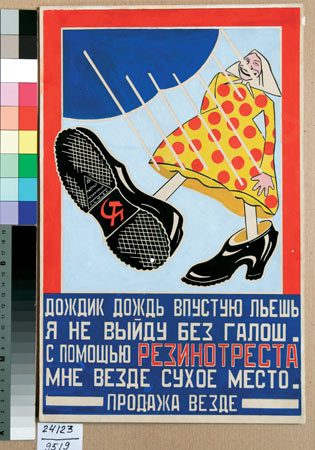
However word and image are rarely fused. Words and letters stray into paintings, in a trick picked up from the Cubists. But mostly they follow parallel courses, as if cut into different channels. – separate canals set against separate museums. Again, the Constructivists stole ahead. It is not just that, for example, Rodchenko frequently collaborated with the Futurist poet Mayakovsky. Their works incorporated the iconography of type, where text was incorporated in the design and its shape taken to be as important as any other element. Popova’s ‘slogan posters’ often incorporated nothing but type, yet are visually compelling.

Instead, as the exhibition alludes without quite saying, Marinetti pioneered perhaps the biggest innovation of Futurism – hype. He wrote not reasoned treatises but pithy sound-bites, calculated to provoke not thought but outrage, which he got not into scholarly journals but onto the cover of Le Figaro. He was not the vacuous celebrity of today, for his biting words still resound over the years. But he was a celebrity, the self-made poster boy of shock. Marinetti was the Stan Lee of modernism.


War As Art By Other Means:

But perhaps the ultimate reason to prize Constructivism over Italian Futurism is not artistic but political. While we might think of Fascist Italy and Stalinist Russia equally dimly, we tend to make different allowances for their adherents. In Russia there may have been a genuine desire for egalitarianism, however hopelessly misplaced – while the fascists proclaimed their noxiousness from the start. This website perhaps sums up the popular view of Italian Futurism, listing their accomplishments then adding “too bad they were all fascists.”

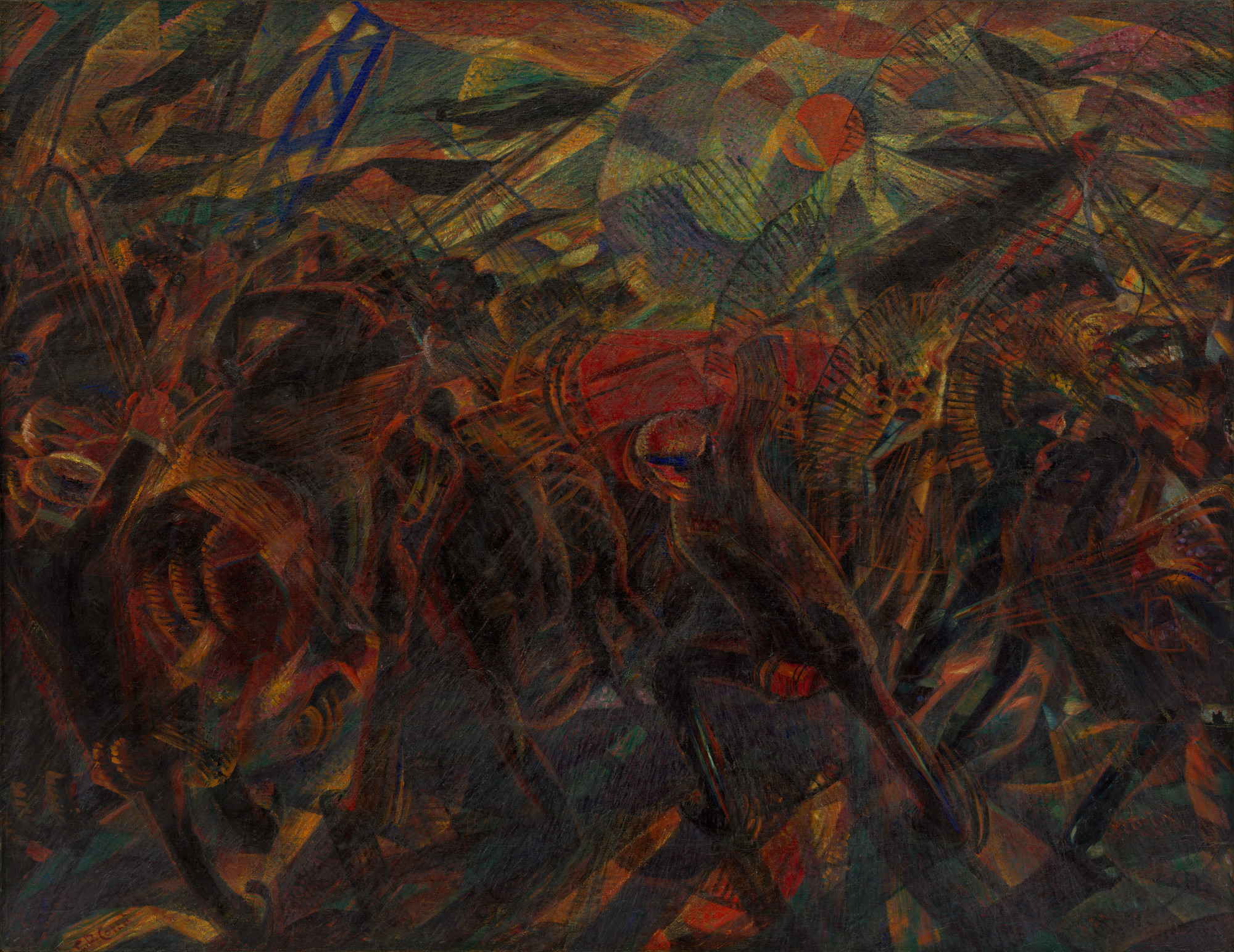
Yet Stewart Home has argued “to dismiss Futurist politics as fascist is as common as it is incorrect.” (The Assault On Culture, Unpopular Books) Indeed, perhaps they were even anarchists! The First Manifesto celebrates anarchism, while in 1911 Carra painted ‘The Funeral of the Anarchist Galli’ (above). Galli had been killed by police during a general strike, who then attempting to prevent his funeral becoming a rallying point. Carra had been present at the ensuing riot.

Yet however powerful the painting, we should not mistake present for involved. The show later notes how Russolo’s ‘The Rebellion’ (1911, see up top) presents “revolutionary violence in a somewhat abstracted form, removed from any specific, social or political context” – comments which could equally apply to Carra. Similarly, the First Manifesto celebrates “the destructive gestures of the anarchists” alongside ““militarism, patriotism” as “the beautiful ideas which kill.” It later asserts “except in struggle, there is no more beauty.”

In short, what is being celebrated about the anarchists is that they’re good for a punch-up. This is the cartoon anarchism of brazen bomb-hurling. Marinetti was a political magpie, chasing any colour provided it was gaudy. While I could find nothing online about Galli, given the era was a high-point for Italian anarchist movements, it seems unlikely he’d welcome such a ‘celebration’ of his politics.

The Futurists’ infamous amour for war came out of a similarly boyish excitement for action. Peace is boring, but a still life while war is an action painting! Even their buzzword ‘avant garde’ was itself appropriated from military terminology. This naiveté was extended, for when Italy didn’t at first join the war they joyously depicted it anyway. Marinetti told his brethren “try to live the war pictorially, studying it in all its mechanical forms.” He personifies the juvenile rush to enlist we read of in history books but struggle to understand.

Perhaps fittingly, the paintings here become almost abstract, writhing forms welling up into shape. (Balla’s 1915 ‘Forms Crying Out Long Live Italy’ is as tellingly titled as Carra’s ‘Tram’.) Artistically these works are splendid, an astonishing development in so few years. But their lack of anything even representing the figure suggests the price of human life had been forgotten along the way.

A year after the war ended Marinetti notoriously joined the National Fascist Party, though it’s sometimes forgotten he walked out again the following year. (Admittedly as Mussolini obstinately remained in power he seems to have regretted this rash gesture, and sought ways to re-gratiate himself.) As we now see Fascism and modernism as implacable foes, this might seem as inexplicable as it is indefensible. If Fascism now appears as something monolithic and contemptuous of artistic experiment, so it became. But in order to gain power in this era it had to become a spoiler product for other, more genuinely revolutionary movements. Hence it tried to keep a foot in both classical and modernist camps. (Being named after a symbol of the Roman Empire.) Marinetti was far from the only sucker. Once in power, it strengthened its ties to classicism – provoking his walkout. (Needless to say, his motives were aesthetic not humanitarian.) Yet only much later did Italy import Nazi Germany’s hostility to “degenerate” art.


The Future – No Place For Girls?

A Russian contrast to Carra, on show in the same exhibition, might be Natalya Goncharova’s cubo-futurist ‘The Cyclist’ (1913). While the Italians celebrated the self-powered mechanism of the tram or the indivisible nature of the urban crowd, Goncharova depicts an individual human figure fused with his machine, in a kind of partnership. Later this focus would sour into the heroised workers of Soviet ‘realism’, but here the political statement is genuine. As Gil Scott Heron would later put it, “the revolution will put you in the driving seat!”

How significant might it be that this work is by a woman? Futurism is in general open to the charge of being phallocentric, mechanistically mindless, boys playing with their toys. This was a charge Marinetti was keen to take on, with his “scorn for women” and clarion calls to “fight feminism”. Yet three-fifths of the ‘5X5’ exhibition had been women, while an old Royal Academy show had focused on six Russian women artists (‘Amazons of the Avant-Garde’, 1999/2000). Even the boys had championed their cause, one of Rodchenko’s propaganda posters proclaiming ‘The Trade Union is a blow to women’s enslavement, and a defender of female labour’!

Yet if they were present, if they were even encouraged, were these women artists really painting on an even easel? It would be a simplification to suggest that Rodchenko designed buildings and Popova cups and saucers – but not that much of a simplification! For example, both designed fabrics yet Rodchenko always worked for men’s clothing. As you walk through their exhibition, you don’t entirely shake the feeling that women’s art was a variant of women’s work.

This view is compounded by a clip from Kuleshov’s 1927 film ‘The Female Journalist’, on which Rodchenko worked. Not only were few films of the time titled ‘The Male Journalist’, the title character is a neurotic ‘female’ juxtaposed against the productive activity of some male workers. (‘Neurotic’ of course being associated with ‘petit-bourgeois’ in the culture of the time.)

Of course when even these advances were later rolled back by Stalinism, it feels almost like carping to mention them. Nevertheless, a limited advance should be labelled as such.

My Future Is Finer Than Yours:

In case it’s not yet been made obvious, we here proclaim the Russians as the more progressive force. It’s rather like the difference between punk and post-punk. Vibrant, powerful and recklessly audacious, punk may grab your attention first. But after a while this swagger subsides. It then comes to feel not just one-note but beset by its own contradictions, it can shout and proclaim but rarely actually argue. Post-punk creeps up upon you more slowly, but you eventually realise that while it may be less gesticulatory it’s actually the more audacious one.

Of course the Constructivists came later, at most only five years later, but those years had been busy ones. Perhaps the Italians’ greatest defence is that they had always set themselves up for such a fall, never claiming their revolution to be complete. “When we are forty”, they insisted, “let younger and stronger men than we throw us in the waste paper basket like useless manuscripts!” Their succession by the Constructivists might have come more quickly than even they thought, but they only considered themselves one station in an ever-speeding journey.

However, is it possible to over-accentuate the differences? Both exhibitions place Cubo-Futurism at their periphery, while a focus on it might emphasise their linkage and continuity> Moreover, do both actually share the same failings and it’s merely that the Constructivists fail a little better? After all, they share the reductive functionalism we’ve now come to see as dehumanising. Even when human forms are incorporated, it’s only ever to epitomise some bigger idea or wider force. Figures often morph into their clothes, machines or just the overall composition. Men don’t express ideas, so much as ideas express themselves through the medium of men. Rodchenko in particular seems almost to define idealism in a literal sense, using art as a blueprint to build a better world from the noblest of diagrams. As such idealism beached against war and dictatorship, this gives us pause to reflect on uncritical optimism.

But more importantly, to quote Marinetti one last time, perhaps we also react this way because we do not remember even being alive. We fear the loss of an ‘individualism’ defined by brand-name consumption, while shying away from seeing ourselves as active forces in the world. We’re no longer Futurephilic, and assuming we can hasten its arrival, but Futurephobic yet assuming we can do nothing to prevent its advance. The Aphex Twin summed up our view, “the future is a registered trademark.” Unlike Popova, we accept the world as it is, without even asking whether we believe in it.

More on ‘Futurism’ (including booking info) here.
Archived info from ‘Defining Constructivism’
here.

Tuesday, 18 August 2009

AWAY WITH THE FAIRIES IN THE CITY OF DREAMING SPIRES

My report on Caption 2009


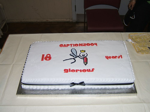
The cake, it does not lie. For Oxford’s Caption comics convention really was eighteen years old last weekend! As I’m yet to miss a year, mathematics would at this point seem to suggest that I have been to eighteen of them. But whenever I try to think about that it makes my head spin, so let’s talk about something else...

Rich Johnston’s report perhaps sums up best the unique atmosphere of Caption, with his gamely attempt to compare it to America’s largest con in San Diego. (Rather reminding me of the Attila the Stockbroker poem ‘Southwick is Like Amsterdam, Only Smaller’.) He closes events with a shot of cartoonist Terry Wiley nipping out for more loo roll, as the centre has run out. For the sake of the gag, I’d like to tell you there that Terry was a guest. But, as Caption makes so little distinction between guests and attendees, that sort of thing is tricky. Terry has been a guest in previous years, but as even I’ve been a guest before now I suspect that counts for little.

Way back in 1992 Caption was started by a clutch of cartoonists, who figured no-one was putting on the sort of convention they wanted to go to - so they might as well do it themselves. In the process they somehow engendered some monster, forever re-replicating itself on a duplicating machine, that lumbers on to this day. At a time where everyone in the small press scene wanted to talk about distribution (mostly complaining at the lack of it), their event completely ignored the whole question. You just dumped your wares at one central stall, then forgot all about them until it was time to pick them up again at the end. Caption was a kind of extended front room, where those who made comics could meet up, drink, draw and do a whole lot of hanging out.

Though things didn’t always run in that order, for Caption is absolutely littered with pens and pads. (Something I don’t think I’ve seen at any other convention.) The pads are always full and the pens driven to their dried-up death before the weekend ends. Drawing games normally spring up spontaneously, at a roughly equivalent rate to people’s alcohol consumption. One panel was titled ‘You Should Totally Run Your Own Con, Dude’. But that’s pretty much what happens here anyway. Like the kids from Fame, the attendees put on a show right here. Caption is a magnet and a playpen for people as mad as you. Then times by nineteen.

To return to our baking theme, the talks and events are therefore merely the icing upon a cake which bakes itself. But they’re easier to talk about so let’s home in on them...

Every year has a theme, this time ‘away with the fairies’. Always somewhat voluntary, some themes seem to ‘stick’ better than others. This time the fairies didn’t seem to transpire much at all, barely mentioned even during the final panel featuring Mark Stafford’s ’Cherubs’ and Jaime McKelive’s fairy-friendly ’Suburban Glamour’. This was perhaps a bit of a wasted opportunity, as one of the articles in the programme (by co-organiser Selina Lock) had already made the necessary expansion from fairies to folk tales. It seems to me that comic have a more natural inheritance from folk tales than they do from film, painting, literature or any of those other things they all-too-easily get bundled in with. Maybe next year, people will believe in them better.


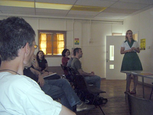
Instead we swapped fairies for the internet - focusing on the impending Longbox which (McKelvie informed us) will be like iTunes only for comics. Which is an exciting enough prospect. However, I’d earlier been to Sarah McIntyre’s eye-popping talk on children’s picture books. (That’s me on the left, looking like her scary stalker.) One of McIntyre’s points had been the greater relative size of books for children, and how that made it easier for them to get immersed in what they were reading – leading her to fantasise about an ‘instillation book’ big enough for adults to step inside. In fact one of the few criticisms I could make of her talk was the fact that it was mere slides, when it would have been so much sweeter to pick up those enticing-looking books and thumb through them. As it was, it was like looking at pictures of a decorated cake you couldn't actually taste... oh, wait I already did that...

Emboldened by this thought, I asked if there wasn’t something vital being lost when a physical comic gets replaced by pixels on a screen. A CD might come in nice packaging, but with a comic there’s no such separation between the object and its content – the two are one. McKelvie agreed readily that they were “different experiences”, but made two replies. First, that “young people” didn’t necessarily see things the same way as us. (Which fair made me chuckle, because he must have been one of the youngest of folk I’ve spoken to in ages!) Second, people can end up buying both, ‘trying’ with the download before ‘buying’ the object. (And indeed our concept of ‘ownership’ does seem to be becoming more conceptual, CDs coming with download codes for MP3s etc.)

We also discussed the idea that home printers might reach the level of sophistication where they could serve you up a collated colour comic just the way that shops used to sell them, essentially eliminating the question. Matt Brooker (aka D’Israeli) also pointed out a paradox that the download button was reasserting the authority of the flat page, taking the animations, sound effects and interactions back out of web comics in order to make them printable again. To think that, at the first Caption, I’d barely heard of the internet!

With fairies on the wane, robots seemed to mount a takeover for the year’s theme. (Come to think of it, Fairies vs. Robots would have made for a great convention T-shirt!) This was perhaps down to ‘Titanic’ Tony Hitchman’s quiz, now a Saturday night regular. He left us with two bits of useful advice, robots are best dealt with by a sharp kick to the head, guaranteed to set cogs a-spilling and save the day. And evil sentient computers are defeated by unplugging them at the back. Though steeped in those deliriously wacky DC comics of yore, Hitchman’s quiz belongs at Caption. Just because comics are primarily a sophisticated medium for tackling adult issues, doesn’t mean they can’t be stupid, goofy and juvenile as well.

We’re told Caption will return next year, but as yet no word on the theme. Me, I’m still canvassing for The Evil UnCaption. This comes from the old Star Trek episode, where the crew encounter their evil dopplegangers in a parallel universe. Everyone would be issued with false moustaches and goatees (the pan-galactic symbol for the sinister) and instead of sharing one big comics stall, vigorously defend their own whilst trying malevolent schemes to topple all the others. The Evilest Of Them All would be issued a prize at the weekend’s end, though of course that would probably just be a front for an assassination attempt. Or Caption could swap personalities with San Diego for a year, which might just be a different means towards the same end...

Anyway, whatever theme is finally hit on, I hope to see you there!

These photos and more from the Caption2009 Flickr group.

Wednesday, 12 August 2009

SO WHO STAYED WATCHING ANDREW RILSTONE?


Stop me if you’ve heard this one already, but it does deserve a non-bloodied smiley face...

After being silent since March, Andrew Rilstone has bounded back into blogging with nothing less than a sixty page PDF zine! This is like when Marcel Duchamp claimed to have retired from art, just to work on his biggest piece yet! In the circumstances I’m even willing to forgive him for calling My Chemical Romance a “punk band.” Though I’d already embarked on The Olde Print Days of Lucid Frenzy, it was a Bugpowder link to Andrew’s writings which encouraged me to start blogging. And he’s remained one of my favourite writers on matters comics and filmic.

Though having said that, he has at times reduced me to a state of teeth-gnashing envy. Sometimes he has said things I wish I could have said first, or even as well. (For example he points out that many of the moments of synchronicity in Watchmen aren’t there to make any specific point, so much as create a world of synchronicity which the story needs to marinate in.) At others, he says things which soon as said seem so bonecrushingly self-evident I feel a fool for never noticing them. (Stan Lee introduced an element of ‘realism’ to the superhero genre, but at the same time filled it with metafictional conceits by making “Smilin’ Stan” an audible presence in his own comics – of course he did!) It’s like I study every line, every damned line, only for Andrew to come along and point out some fresh angle of perspective that has been there all along. “But you were looking so hard at the trees, old bean. What about the wood?”

Such a perspective (and I use the word advisedly) is particularly welcome when comics like Watchmen and internet criticism combine into truly virulent nerdism. I’ve lost count of the websites I’ve seen which have gone through some comic, annotating it panel by panel, in their ceaseless search for ‘clues’. All the while oblivious to the fact that the medium of comics lies in, like, connecting the panels, dude. It’s like studying music by examining each note in turn. The technical term is “missing the point.”

One of the interesting features of Andrew’s zine is that it is just that – a zine. Partly this is a metafictional joke, a comment on the grubby things we read and wrote back when Watchmen first appeared. (Hence the use of retro fonts.) But its more than that, the various pieces at first seem to be about separate subjects (Watchmen, Supergirl, the comics you read as a kid). But you soon realise that these components all slot together into one overall argument, a single subject studied from different perspectives. (I got all carried away on his comments board and called this “argumentative origami”!) A series of blog entries, posted however closely together, would not have the same sense of simultaneity.

Of course there’s an irony here in that our actual back-in-the-day zines rarely did this, at least not at any conscious level. We merely tapped them out on typewriters or (for the fancy) word processors until we had enough words to release. (When you start to follow a writer everything they say becomes a piece in an overall puzzle you assemble of them in your mind. But each piece is standalone.) But like a modernist painting it demonstrates something zines can do which blogs can’t.

I left some (very) cursory comments on Andrew’s blog. But one of these days I really will write my own perspective on Watchmen...