googlee7ea825f63edb3f6.html
Showing posts with label Expressionism. Show all posts

Saturday, 16 November 2024

‘FRANCIS BACON: HUMAN PRESENCE’

National Portrait Gallery, London 


“We are human beings, our greatest obsession is with ourselves.”
- Bacon

The Self As A Moving Target

First off, don’t go thinking this is the equal of the Tate retrospective. Then again, that was fifteen years ago so this is the easier show to see now. And it has its moments of insight, as we’ll see…

For a story which gets so messy, with so much paint slathered across canvases, it starts off with surprising neatness. Post-War British art was dominated by Francis Bacon and Lucien Freud, with their return to figuration. Spurred by Freud’s first solo show and Bacon’s ‘Three Studies For Figures At the Base of a Crucifixion’ both in ’44.

And the two were friends. Freud’s wife is quoted commenting that they met for dinner almost every day, and often for lunch too. Yet they were similar the way bookends are, as complimentary opposites. Freud worked slowly, obsessively and always from life. Bacon tried that, but soon gave up on it. A trivial-sounding detail which becomes a thread to keep tugging at.

When he did use models, he normally brought in friends. Yet he was soon asking for them to be photographed instead. Even for his many self-portraits. He worked from photographs when painting the cast of William Blake’s head, despite owning a copy of it. He repeatedly worked on, in his phrase, distorted records, of Velazques’ ’Portrait of Pope Innocent X’ and Van Gogh’s ’Painter On The Road to Tarason’. But from reproductions, he never saw the originals. (In the latter case, it had been destroyed in the War, only reproductions existed.) Not the normal artist’s impulse.

And let us not forget the New York School were at this same time creating a style or art which they thought could hold photography at bay. Bacon’s instincts took him in the opposite direction.

One reason is a combination of collage and mutation-through-reproduction. After that first mark on a cave wall, all art has existed in the context of its influences, so in some way has been a reply to them. But with mass media this became more and more prevalent. The more that had already been said, the less and less could anything be added which wasn’t some sort of reply. It was in this context that Bacon chose to make his images from already existing images.

He kept a large, (and characteristically disordered) collection of photos and reproductions, from all sources - torn from the pages of art books or clipped from newspapers or cheap magazines. One photo (from 1950) shows some of these laid out on his studio floor, jumbled and paint-splattered, high art, history and nature studies thrown in together. It doesn’t look far from a Paolozzi collage of the same era. And from much the same motives, to break down creative hierarchies.

But there’s a bigger reason…

The show is full of photographs, to the point you can’t help but think a few more paintings might have been an idea. But that might well be how he wanted it, for he cultivated images both of himself and his studio (with its legendary messiness). They’re almost a part of his art, as much so as if he’d been a performer.


And two hung in the same batch give us our clue. ’Francis Bacon’ by JS Lewinski (1950, above) is a multi-exposure double image. While ’Francis Bacon At the Marlborough Gallery, London’ by Guy Bourdin (1986) shows his face in motion blur before one of his own images, inevitably creating a comparison. (That wasn’t to be tracked down. But then you’ve seen motion blur.)

And none of his paintings look exactly like either of these. But they look quite like both of them, there’s a familial resemblance. Even if we say there’s only motion blur because the photo “went wrong”, only a photo would “go wrong” like that. Photography had its own visual vocabulary, which painting could borrow like languages use loanwords. There’s a looser, more fluid approach to imagery which photography had enabled.

The shows says shrewdly that he sought to “exploit our familiarity with the traditional portrait form to shocking effect.” Because we know how portraits work, don’t we? For much of their history they were there to convey status, launder the reputations of usurpers and embezzlers by placing them loftily on the wall. Inevitably, they were still- in the way hieratic art was still.

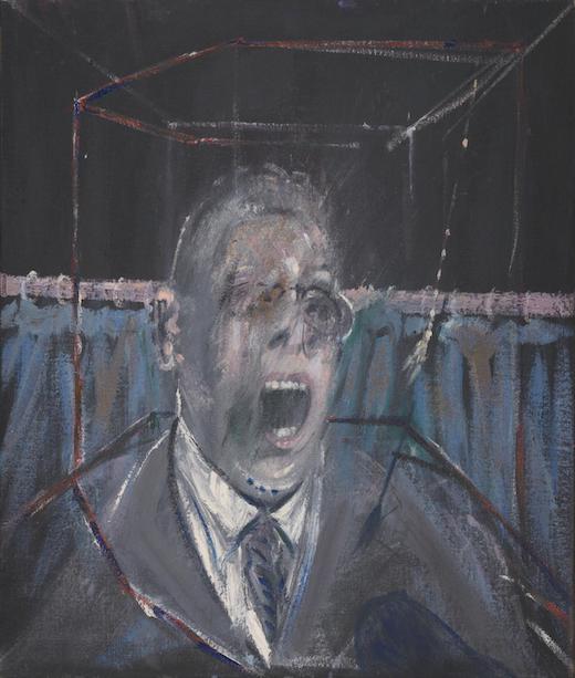
Bacon’s figures are plasticated, amorphous, sweeping curves of paint which neither go abstract or quite resolve into a face. Portraits are supposed to be adjacent to still lifes. Bacon’s figures seem to shift before us, slithering, ungraspable. We’re not the stuff of statues, we’re protoplasmic. Many have words like “study” in the title, like they’re unfinished and quite possibly unfinishable. Just look, for example, at  ’Portrait of Man With Glasses III’, (1963) below.


And if the portrait had to some extent been democratised in previous decades, we still assumed our identities were fixed. After all, above all things, we know who we are. Yet there’d been what David Bowie called “that triumvirate at the beginning of the century, Nietzsche, Einstein, and Freud. They really demolished everything we believed. 'Time bends, God is dead, the inner-self is made of many personalities’.” Bacon was using modern methods to convey a modern theme, while using his chosen genre to exploit the discrepancy between modernity and tradition.

It All Comes Into Colour (But Black and White Was Better)

Early Bacon wasn’t just monochrome, it was so murky you peer into his paintings like darkened rooms. When colour is used, it's not too different to spot colour in printing. You are often unsure what are objects in space and what are lines representing psychological states, like those wiggly lines in cartoons which represent anger and so on. Take 'Study For a Portrait’ (1949, below).


But by the early Sixties that had started to change. Works become bigger and brighter, as if someone just hit the light switch. Sizes enlarge and the figures correspondingly shrink, become more situated in a ‘real’ space. See for example the couch potato in another ’Study For a Self-Portrait’ (1963, below).


The show is laid out to present this as if its Bacon coming into his own. The first section is essentially a long corridor, which you travel through to arrive into a bright and spacious room. Except I feel precisely the opposite. There’s a nightmarish quality to the earlier works which is banished by all this light.

About the same time, he started to paint and re-paint a relatively small group of friends. (The show puts this down to the death of his lover Peter Lacy, in 1962.) And this large room is divided into sections, devoted to each of these. Which isn’t the way to go. It may have worked for Freud, but not here. The portraits don’t differ in style or imagery very much, their subject is more the person holding the brush than the one smeared across the canvas. Rather than his chief motive being fidelity to his subjects, he could switch from one to another mid-portrait. Bacon’s art at its best was universal, more than particular.

As Laura Cumming points out in the Guardian: “Likeness is almost beside the point… If it weren’t for the photographs threaded through this show, could you really tell [these subjects]? The one recognisable face is Bacon’s own.”


Except there’s one glaring exception to this rule, and that’s George Dyer. Their relationship was tempestuous to the point of violence, but he seems to have been Bacon’s great love. The show saves for its finale the 1973 triptych which portrays his suicide. But perhaps more interesting is ’Portrait Of George Dyer In a Mirror’ (1968), which looks like multiple images of him scalpel-bladed together. The presence of the mirror suggests truth, and recalls Bacon’s comment “no matter how deformed it may be, it returns to the person you are trying to catch.”

Overall, the image suggests Bacon was divided whether to capture or obliterate him. The flying flecks of white paint are added to other Dyer portraits and, as far as I could see, to no others. There’s little avoiding the suggestion that someone has been jerking off to this disturbing scene.


And there’s other upsides. An early work, ’Study For a Portrait’, (1952) was based on the well-known still from Eisenstein’s film ’Battleship Potemkin’ (both above). But while the broken eyeglasses remain the figure is swapped from female to male. Bacon’s earlier era was in general very male-dominated. Which, when combined with its themes, does start to stray towards man-painy. While in the later portraits women feature more. The poster image, for example, is of Muriel Belcher (up top).

Then there’s the small heads…

Most of Bacon’s paintings of this era were on an almost monumental scale. But at the same time, as the name might suggest, the heads aren’t even life size. With the show arranged around subject model, again and again these are hung adjacent to the large paintings. They look almost like punctuation marks between words. But you notice it quickly - the smaller is the better. See for example ’Three Heads of Muriel Belcher’ (1966, below). The poster image is the middle one.


The heads are normally arranged in triptychs like that, sometimes diptychs. And they look to me like they were composed together, with the combination in mind. (I hve no way of proving that. But that’s how they look.) They’re not sequential, like a mini comic strip. But when the individual images suggest movement anyway, lining them up like this enhances the sense. The eye’s movement across them comes to suggest movement within them.

At the time, that old Tate show seemed pretty comprehensive. So it must be a tribute to Bacon that there was more to say about him.

Saturday, 9 December 2023

'PHILP GUSTON’

Tate Modern, London


“Probably the only thing one can really learn is the capacity to be able to change.” 
-Philip Guston

A World To Win With Murals

Everyone knows the Guston story. It’s the one about the dissident American Abstract Expressionist, the one who went back to painting… gasp… things, to great controversy. In a style bordering on cartoony, which some also found controversial. Which included depictions of the Ku Klux Klan. Which also proved controversial.

But as the opening rooms of this show demonstrate, his origin story was almost bog-standard. He was even a teenage friend of the most Ab of all Exers, Jackson Pollock. He followed the familiar recipe, which as we’ve seen before, was a mixture of Surrealist practices and the scale of New Deal muralism.

We start off with some fairly standard Surrealist works, clearly indebted to de Chirico but with the silkily synthetic painting surface of post-Dali. There’s nothing wrong with them, but nothing particularly right about them either. They’re regular, when Surrealism needs to be estranged from us.

The murals are a different story, however. He’d soon joined the Block of Painters, a group of political muralists in Los Angeles. As these are somewhat challenging to transport, they often get left out of this story. But the Tate goes to efforts, including projecting roving sections of ’The Struggle Against Terrorism’ (1934) on a wall. But let’s focus on a drawing, specifically ’Drawing For Conspirators’ (c. 1930, below.)


Its as politically committed a work as any Berlin Dadaist ever spewed. Had it been given a thumbs-up by the critics and no more, it would have failed in its intent. It exists to make a point. Yet however politically charged it might be, its not a reportage image. In fact its as much a tableau as any Victorian ever painted.

You don’t question this, the crucified Jesus and the black lynching victim being placed next to one another, because there’s no attempt to convey any actual pictorial space. The setting’s a stage, not a place, the figures theatrical. And the creation of works from big, broad symbols… this segues quite neatly into Abstract Expressionism. The symbols just become more general, more universal, that all.

But also… yes, the Klan show up this early. And why wouldn’t they? This period, the inter-war years was their strongpoint. And while this work displays their notorious anti-black racism, they were as much anti-semitic and anti-immigrant. With Guston (birth name Goldstein) a Jewish child of immigrants. In 1932, another mural of his was defaced by the LA Police (then closely linked to the Klan) when they raided the centre which held it. Yet at the same time the era contained a sense of hope, the feeling that old certainties had eroded, that what gave danger also raised possibility. “There was a sense of being part of a change, or possible change” he commented afterwards.

Guston’s personal image bank was filled up then, and he continued drawing on it throughout his life. In his later return to the representational pretty much all that’s new in terms of imagery is the backdrops. (Which are of his adopted New York rather than his original Los Angeles.)

And why shouldn’t this be? After all, when we’re young aren’t we soft clay, impressionable and absorbing? We then progressively harden as we go through life, until our attitudes become impervious.


’Bombardment’ (1937, above) is Guston’s ’Guernica’. Literally so, like the more famous Picasso work it was painted in immediate response to the fascist bombing of that town. The unusual roundel design is used to create a vertiginous effect, explosion placed dead centre, figures flung out at you from it. War’s presented as a kind of ‘big bang’ event, gestating the world we live in.


’Gladiators’ (1940, above) is similarly war-based, only this time it’s not happening to but embodied by the figures, who look inseparable from their masks. The composition’s a swirl of ceaseless combat, your eye never coming to a focus point but forever rolling round. Particularly with the blue angle, the frame seems to be moving down on them. The violence feels menacingly real, but at the same time the weapons are toys, a dustbin shield, a wooden sword. And it's another tableau. The upper left figure outsizes the others, but in so symbolic a work it takes you a while to notice.


’Martial Memory’ (1941, above) is in many ways a successor work, incorporating many of the same elements. (“Guston and the dustbin lid motif, in this talk I will…”) But its a more static composition, working out from the central triangle of the main figure. It’s thing isn’t motion but density. It features, as the indicia puts it, “forms overlapping one another in a very dense manner”. The result is that it neither resolves to either a literal or allegorical reading, inhabiting a kind of ‘between’ space similar to Paula Rego.

In this work the figures have become children, who frequently appear in this period. It’s reminiscent of the way children will repeat back to you what’s on your mind. Inevitably, their response to a world of war is street games of battle. Which easily tip over into true fights of their own.


’The Porch' (1947, above) seems a transitional work into his later abstraction. There’s still some suggestion of pictorial space, but with a cruciform shape imposed upon it. And the figures are stretched, the way a scream is an elongated note.


And 'The Tormentors’ (1947/8) seems almost the next step along in a timeline, the foreground figures fading into inscribed lines, the red-and-black background darkening to dominate the composition. Yet those shapes look not just like they might oncer have been things, they retain some sense of anthropomorphism. (The title suggests we should look for pre-Klan figures.) Perhaps because there’s something primal about the work, as if made from some pre-verbal urge.

All would seem to bode well for Guston’s future abstraction…

”The Process of Creation”

…alas not.

Guston's reasons for turning to abstraction are textbook and exemplary, both the right ones and the best expressed. Briefly, it allowed him to just paint. He made a point of never stepping back from his canvases never pausing work to check on the overall composition, lest that interrupt the flow of paint. “I am not concerned with making pictures,” he commented, “but only the process of creation.” The action of painting the painting is the painting.


But the results don’t particularly honour that noble intent. ’Beggars Joys’ (1954/5, above, is quite typical, with the de-centred cluster of brighter strokes against a paler background. In fact its one of the better works, with its shimmering quality. But this is art for aesthetes.

At the time, with Ab Ex ascendent, these cemented his reputation. He represented America at the Venice Biennale in 1960, aged 47 (a neophyte in painting circles), followed by a Guggenheim retrospective two years later. But the truth is, in the New York School he was but one enrolment among many. There’s no suggestion he broke away for this reason, but the fact remains - if he was going to be Head Boy, he needed to found his own establishment.

The impression’s often given that his return to imagery was some sort of Damascene convention. Like he sat up in bed one morning and went, “hey, everybody - things!” This show demonstrates how slow and tortuous it really was.


In the early-to-mid Sixties black heads started appearing in his work, floating Zardoz-like over clouds of brushy grey. ’Painter III’ (1963, above) is one of the more developed examples, with a brush-sporting arm appended, even reflected in the title. It’s scarcely a great work, and in a room of essentially similar efforts it becomes both repetitive and unfinished. But its significance is in his timeline.

Did those heads just keep arising, unbidden, in his work? And did he break off when he saw what he’d done, alarmed at the forbidden imagery, only to do the same again? It seems a bit too romanticised. Plus these works were apparently shown at the time, not hidden away. Nevertheless, surely something of this sort happened.

From 1966 he then took an eighteen-month break from painting. (“You have to die for a rebirth”, he commented later.) And when he started again, it was with lines. Just lines. Over time these became simple doodles. Blown up to the size of small paintings, but still simple doodles of single objects. As basic as basic can be. But, like the heads, their significance is as steps on his timeline.

The phrase often used for Guston is ‘return to figuration’. Yet he started off painting things, and that’s significant. The first object we see here is a book. And, from an artist’s perspective, what does a book ‘mean’? It’s a repository of words, the alternative to images. If an artist paints a head, he must find a specific head. Even if he doesn’t model the work on a real head, if one comes from his imagination, it becomes a specific head once its painted. While in four letters the word ‘head’ can stand for all heads.

And the stripped-down, iconic way they’re painted is surely to circumvent this problem. A chair or a shoe is designed to represent chairs and shoes as directly as the word would. Significantly, he called these works a ‘visual alphabet’. And a great many items from this alphabet then reappear in his paintings. At the same time there’s something cartoony about them, which makes them least a little anthropomorphised.

Amid Idiot Evil

By 1970, he had fully worked up paintings which were shown at New York’s Marlborough gallery. And this is where the legend starts. Critics raged, former Ab Ex soulmates never spoke to him again, leading to him feeling like he’d been excommunicated. No less than John Cage was dismissive, only de Kooning positive. From that point on, and significantly, his main associates became not artists but writers and poets.

Okay, about time we looked at some…


’Open Window’ (1969, above) recursively hangs some of those 'visual alphabet’ pictures inside a larger work, works-within-a-work. But the window of the title makes them fairly accurate descriptions of a stripped-back urban environment. (And this the New York that classic Modernists were so rhapsodic about!) Downward strokes predominate, suggesting dumbed-down art as a response to a dumbed-down world. It’s reminiscent of the Matisse quote, that the build environment does to our eyes what prejudice does to our intelligence. And we’ll see that stripped-back colour scheme recur again and again, off-whites, chewing-gum-pinks, muddy reds and deep greens, lurid and cheap.

In a similar vein ’City’ (also 1969) reworks city buildings as Klan hoods, narrow windows doubling as eyeslits. As if the city itself was a product of, or perhaps producing, Klan ideology. And speaking of which…


The first room contained a 1924 photo of Klansmen in a car, publicising a white power lecture. An image which reappears in ’City Limits' (1969, above). Guston may not have ever seen it but he must have seen similar things, perhaps in person.

But what’s significant is that they are not depicted in the same way as the Klan of old, as in ’Drawing For Conspirators'. Their appearance, with those sinister costumes, had been designed to strike dread into their victims. But their role as racism boogeymen had waned over time. Racism clearly remained, but it was less embodied in the Klan. And so those pointy hoods started to look a little absurd.

If his personal image bank was filled up in those inter-war years, as he started to draw from it he knew he was spending old money to a changed world. So he paints not malevolent fascist entities but knuckleheads, goons, bozos, neighbourhood bullies. In fact they become a more generalised symbol for knuckleheads, goons and bozos. Their car has gargantuan wheels, yet three figures are crammed into a tiny bubble cab, complete with fag smoke. (You could read that giant car as their externalised self-image, and the diminutive figures as their actuality. If you wanted.)

Adrian Searle describes them as exuding “idiot evil”, and indeed they seem like henchmen without a criminal mastermind, wandering this way and that, often pointing forwards like they wouldn’t know which way to go otherwise. Their nearest comparison in contemporary art would be Crumb’s White Man, with his mantra “I must maintain this rigid position or all is lost.”

Ands the style they’re painted in is as different. Guston had once painted children reflecting adult concerns. Now he’s effectively doing the reverse, depictions of adults in a childlike manner which makes them essentially children. With those huge hoods, the Klan’s heads vanish into their toros, the way child art won’t differentiate head from body. They’re often depicted oversize, both from the child’s habit of ascribing size to significance and as a way of portraying their grasping nature. The banality of evil via the cartoonification of evil.

As is well known, this retrospective was originally planned a few years ago. Then, after the murder of George Floyd and the rise of Black Lives Matter, Washington DC’s National Gallery of Art in suddenly got cold feet over these images. Whereas of course when they’re relevant is precisely the time to show them! How could anyone get something so spectacularly wrong?

The answer is that the privileged forever mistake their status for smarts, when in fact it’s the reverse. Cushioned from the world’s sharp edges, they cannot see what we see. So they assume that they, the enlightened few, might be able to perceive these were anti-racist images, but what about us, the bewildered herd? As if someone could confuse Guston with DW Griffiths!

The only time either artists or black advocacy groups seem to have been involved in this is to complain it was un-necessary. Plus, all the furore when these works were first shown seems to have been over their representational form and their deliberately crude style. No-one then thought they were Klan-sympathetic. They were wrong - very wrong - about Guston’s art, but that didn’t make them cretins.

Further, the fact that galleries would worry then but go ahead now proves it wasn’t even the images being misinterpreted that worried them but the direction of social media trends. Potential flack coming down upon their own heads was a bigger deal to them than the knee on Floyd’s neck. Now black lives mattering is no longer this year’s thing, it’s safe to go ahead.

(Disclaimer: The Tate seem to have been more caught up in this delay than willing accomplices. And even then co-curator Mark Godfrey resigned from them in disappointment.)

And there another, equally important, dimension to this…

Klan Am I 

The Royal Academy show included a 1971 caricature of Nixon, skipped over here. Which may well be wise, as it can be played on too hard. Guston wasn't a 'political cartoonist'. More significant is all the self-portraits…


…such as 'The Studio’  (1969, above). It’s a painting of a Klansman painting a Klansman, brushes pushed to the foreground to emphasise this is a kind of self-portrait. Because as soon as Klansmen step from the sinister shadows and become regular bozos, we need to accept we are all part-Klansman. They’re our enemy, but not necessarily our external enemy. Guston said “it could be all of us. We’re all heels.” Or at another point, “I am the subject”. He’s shown smoking as he works in the accompanying filmshow, and I’d soon decided that any smoking Klansman was tagged as a self-portrait. (Which means that was also Guston in ’City Limits’.) 

By being a painting of someone painting, this foregrounds the graphic style, Guston painting himself as a Klansman in the way he depicts Klansmen. Klan men in a klan world in a klan style. And as Adrian Searle said, they “look exactly like they were painted by the kind of people they depict… some heavy, slow, intractable goon.”

Further, its significant the way the image is stacked - paint brushes before raised fingers before drawing hand before canvas. It’s not as dense as 'Martial Memory’, but it it feels crammed, claustrophobic, as if depicting an inescapable situation.


And this is enhanced further in ’Painting, Smoking, Eating’ (1973, above), by which point Guston was habitually painting himself as a one-eyed testicle. The horizontal figure actually only has a plate of food on him, the accumulation of objects is behind. But it's painted as if they weigh on him, accentuated by the flatness of the figure under the bedclothes. Guston called this stuff crapola, the detritus of life. And while critics’ claims to find Holocaust references in his work normally feels fanciful, the mass of discarded shoes here may well echo those photos of abandoned belongings in piles.


’Monument’ (1976, above) is like the antonym of those studio paintings, what Guston scuttled past on his forays out to buy more fags and tubs of off-pink. We grant a common identity to the crowd, simply by thinking of it as “the crowd”, while knowing at the same time it has none, its just an agglomeration of individuals. And so we get an apparition such as this, an assemblage of stamping feet without guiding heads, its bestial nature accentuated by the comparison of shoes to horse’s hooves.

There’s a famous quote from Guston: “what was happening in America, the brutality of the world. What kind of man am I, sitting at home, reading magazines, going into a frustrated fury about everything - and then going to my studio to adjust a red to a blue?” It’s blown up on the gallery wall, it takes up a page in the booklet. But it’s widely misinterpreted.

Guston was not such a fool as to imagine adjusting a red to an off-pink was a different matter. He wasn’t trying to recapture his politically committed youth, as if you could just transpose from one era to another, and from public walls to a gallery setting. He was using his work to ask himself just that question - what kind of man am I? If you didn’t care about the brutality, you weren’t a human being. On the other hand, if you didn’t care about your art, you weren’t an artist. So the artist cannot help but respond to world events, but at the same time cannot help but feel isolated from them. This art grapples with that conundrum.

Further, its now generally agreed that the New York School retained their leftist beliefs (apart from the occasions where they retained their anarchist beliefs), even when it wasn’t evident in their art. They would have all been aghast at what was happening in America. Which suggests Guston’s motivations were a combination of inner and outer, political outrage and a dissatisfaction with Ab Ex methods. And in saying this we don’t need to place one above the other.

Where did this new style come from? Robert Crumb, mentioned earlier, was soon complaining it had all been stolen from him. Yet he never really missed a chance to be vexatious. Both are really borrowing from the same source, the old American newspaper strips. It’s like arguing my band sounded like the Stones before yours did.

The show refers to this but, as is standard, insists that means George Herriman. Yet Herriman’s fluid, sketchy line could not be further from the blocky things stuck to these walls. Guston is borrowing from lesser-known but more regular newspaper artists, such as Bud Fisher. And he’s not even taking directly from Fisher or from any one of them. He’s taking from them on aggregate, the general way they depicted things, picking up on the common slang. Rather than trying to raise the comics style, Guston lowers himself to its base level. He’s more interested in their crudity, their scuzzy printing, their reduction of objects down to signs. And that’s why his pictures work.

Life After Klan

Though Guston is now defined by the crapola paintings, the style lasted less than a decade and the Klan had disappeared from them well before that. Laster works are more metaphysical, larger in scale and more spacious in content. They’re less fraught and frenzied, more contemplative. Expansive and calm oceans appear, as in ’The Ladder’ (1971, below.)


They’re perhaps best summed up by his comment “there’s nothing to do now but paint my life.” Guston said at the time that while he’s painting something he has no idea what it will be, and he didn’t see why that process should stop just because he’d stopped painting it. He quoted approvingly from Paul Valery, “a bad poem is one that vanishes into meaning.” He wanted back some of the inscrutability abstraction had afforded him.


Still later works swap off-white for much darker and more sombre hues, often full black. The motive for these is mortality, as both himself and his wife dealt with illness. ’Web’ (1975, above) is a particularly nightmarish image, the spiders dominating the horizon, their distance only emphasising how trapped the figure is. Whether his death is near or not, it remains inescapable. The reflections of two of his key colours, muddy red and green, might suggest it’s his art he’s trapped in.

Should we see this as a good exhibition? As you may have guessed from above, it presents a compelling timeline of Guston’s career. But that may be a better thing to write about than walk round, as it gives greater weight to lesser works when we could have had more Klan paintings. (Not something to quote out of context!) The Royal Academy show of 2004 effectively did the opposite, sweeping through his early years, encouraging us only to look for emergent symbols, in order to bring on the crapola. Neither porridge is quite right. And Guston would surely have exulted in remaining hard to pin down.

Saturday, 18 February 2023

‘MAKING MODERNISM’

Royal Academy, London


“She was an exceptionally strong, spirited personality, full of revolutionary spirit against all things timid and lukewarm.”

Visual Soliloquies

…that was said of Marianne Werefkin. (And said by Elizabeth Erdmann, should you like to know that sort of thing.) But you could apply it as easily to any of the three other artists featured here - Paula Modersohn-Becker, Kathe Kollwitz, and Gabriele Munter. All come from the classic era of Modernism, the early twentieth century. All lie somewhere in the interchange between Fauvism and Expressionism. All were, more or less, German. (Werefkin was Russian by birth, but lived in Germany and Switzerland for much of her life.) And, as you may have already guessed, all were women. Co-curator Sarah Lea has said the show “celebrates women artists on their own terms.” (See viclip, linked at end)

We kick off with photos of these four, then a room devoted to their portraits and self-portraits, a genre defined by Kollwitz as a “visual form of soliloquy”. And as said many times before, all portraits are a displaced form of self-portrait. But let’s narrow that field for now by looking at either self-portraits or portraits of other women. Of which there’s plenty. (Though at a time when there were all sorts of barriers to women being artists, part of the motivation may simply have been using what was to hand.)

Unusually, the poster image is the first thing we see, Munter’s ’Portrait of Anna Roslund’ (1917, up top). Equally unusually most versions of the poster give us the whole image. But the ones that don’t noticeably focus in on that pipe-smoking face, as a kind of icon of female empowerment. (Which makes the slightly generic show title a bit odd. Perhaps the Academy used up their good name back in ’99, when they staged ’Amazons Of the Avant Garde’.)

But, as Magritte might have said, ceci ne’st pas qu’un pipe. The main things about the pose is that there isn’t one. She sits casually, framed off-centre, and looks off as if more interested in her own thoughts than acknowledging us. Only the red bob looks particularly ‘feminine’. There’s a quiet air of self-assuredness to it, and we’re not surprised to discover Roslund was an author and musician.


Women as subjects rather than decoration, the easiest means to achieve this might seem androgyny. Which is what Modersohn-Becker uses in ’Portrait of a Woman in Black With Handkerchief’ (1906, above). But such works perhaps blur concepts in place of overcoming them. And it turns out there are smarter ways…


In her earlier ’Self-Portrait In Front Of Window’ (1900, above) she’s not trying to look ‘masculine’, she even sports a white bow. But the elements which hit you are the calmly meeting gaze and upraised chin. Symmetry is often held to bestow power in art, and here she uses to it convey an ordered, directed mind. She’s not there to look demure or appealing, but to announce her presence.


Let’s return to Modersohn-Becker a moment, with ’The Sculptor Clara Rilke-Westhoff’ (1905, above). The interesting element isn’t the composition so much as something which will convey less well via internet thumbnail, the painting style. She makes her subject look solid, present and … well, sculpted. As if, were you to touch it, it would have physical shape.


Then compare that to something she show smartly hung next to it. ’The Dancer Alexander Scharoff’ by Werefkin (1909, above). It’s not just the femme fatale expression, impish and inscrutable. The figure looks lithe and fluid, but with it she becomes slightly insubstantial. An effect enhanced by the background being the same shade of blue. As if women were things of spirit.


Then compare her to a portrait of Werefkin. To be precise, ’Portrait of Marianne Werefkin’ (c. 1910). (Not by one of our Fab Four but Erma Bossi.) Werefkin’s looking less alluring, but there’s the same swish sweep of clothing dominating the frame, the same pose that looks like a pose, with the head turned to profile. These are, I don’t deny, good paintings. They shouldn’t be ‘cancelled’, or whatever hysterical term the GB News clowns are using this week. It’s just that this is a more traditional way of representing women, while Modernism should be modern.

Women & Children First

The show makes much of this era deciding the child has an inner life, and isn’t just clay to be set in the correct mould. Didn’t the Romantics already do that? Well, sometimes things need to get discovered over again.


Werefkin’s ’Portrait of a Girl’ (1913, above) works quite differently to the portraits we’ve encountered so far. The radiant colours (painted in tempura, a favourite of hers), set in combination with the closed eyes make for a figure that’s quite present (for example, pushed forward in the frame) yet at the same time feels removed and inscrutable. She looks sensual and devotional, at the very same time.

Werefkin was in her Fifties at this point and age was supposed to hit you harder and faster in those days, so perhaps the beautific inscrutability of youth seen from the perspective of age is the point. The theory that all portraits are self-portraits seems to be scuppered here. There definitely seems something pre-Roaring Twenties about it. (Or alternately, I’m in my Fifties too so this may well just be me talking.)


Perhaps we shouldn’t make too much of Munter’s ’Portrait Of A Boy’ (1908/09, above) having so similar a title. Besides, her ‘boy’ looks more a child age. The rough way he’s painted rubs off on him, so the work looks immediate and he dishevelled. He looks at the same time defiant and vulnerable, caught on the canvas like an animal in a trap.

There are also naked portraits of children.

Uh-oh.

With the blunderbuss approach to censorship taken by our Google overlords, I’ve take to cautiously linking to paintings of nudes rather than thumbnailing them. This time I may well have done that anyway. Modersohn-Becker’s ’Seated Nude Girl, Her Legs Pulled Up’ (c. 1904) comes quite accurately self-described. And granted, we all know the defensive postures which children take on.

’Beta Naked’ (c. 1900) is by another artist outside the big four, Ottilie Reylaender. With the girl’s skin so pale and wan, she’s hard both to look at and away from. While her defiant return of our gaze only amplifies that awkwardness.

It’s curious that one title uses ‘nude’, an art genre which often has sexual connotations, and ‘naked’, a more general term just meaning undressed. (Though of course they’re coming to us through translation.) Particularly when they seem so similar. One says “go away”, the other “what are you looking at?”, but that’s not a vast difference.

The indicia tells us Modersohn-Becker had to bribe this girl a mark to pose naked, after which “I blushed inwardly and hated myself.” There’s little doubt that’s the goal here, to paint that discomfort. But that only raises the question - why paint the discomfort? It’s tempting to glibly respond that you don’t intend bribing young girls to get naked, so you don’t really need telling what it feels like.

Yes, it’s possible these works had more traction in their day, where there was far less concern over child protection. But that would scupper the show’s thesis, that this was the time which first saw children as people. Yet interestingly, other works by Modersohn-Becker do suggest precisely this, depicting small children life-size but captured by tiny frames, which keep them as the focus.

Four Artists Means Four Styles 

Women artists from this time were often kept in an obscurity they didn’t deserve. And rescuing them from that, even this belatedly, seems the right thing to do. But while the show acknowledges “each developed a distinctive style,” it does at times feel over-keen to present them as a group. When in actuality they didn’t all even know one another. Yes, they may all be Expressionist to some degree or another. But we should probably look at movements in Modernism as murmurations, rather than schools. And besides, really, what do you call a woman artist? You call her an artist, right? So let’s look at them more individually here.

It’s always tempting to see Modernism as a fascinating failure, which set itself the somewhat monumental task of transforming the way we look at art, which we study in order that we can fail better. The Russian revolution of aesthetics. But if you look at its artists on their own admittedly narrower terms, of whether they made the art they wanted to make, and very often it’s a great success.


Modersohn-Becker’s ’Still Life With Goldfish Bowl’ (1906, above), it hardly has the most enticing title. But the work itself is quietly rhapsodic! There’s a slightly naive quality to the depictions, particularly over those goldfish, which make it engaging. But mostly, it just is engaging. It has me half-convinced I’ve never seen a still life before, in fact it has me semi-convinced I’ve never even seen orange before. 

Modernism’s greatest challenge had been to escape the dead weight of art history, to see things again as if they were fresh and new. And here it’s like Modersohn-Becker doesn’t even see the obstacles to overcome, she just goes ahead and does it with no need of methods or manifestos. How did she manage such a feat?


A clue may lie in a work of hers from the previous year, ’Boy In the Snow’ (c. 1905, above). Much of its achievement may lie in placing the boy figure in the foreground, yet turning him so he looks at the same scene as us. It’s like we see through his eyes, take on his perspective of all this fresh snow.

We’re told Munter collected child art. And Modersohn-Becker, as we’ve seen, painted children frequently. My guess would be that she took similar inspiration from their art. Which was not imbued with any sense of exotica strange otherness to get sidetracked by. This was art made by Westerners, who had not yet been warped by the Western tradition because they’d not had time to learn it. No-one had ever needed to go to the South Seas in the first place.


Munter may be the least significant artist of the four, simply because she’s the least individual, the most representative of a style. For example ’Interior In Murnau’ (1910, above) is clearly indebted to Van Gogh’s interiors. A debt she wasn’t shy of acknowledging, she called a place she lived in the Yellow House, after his often-painted lodgings in Arles.

But on the other hand, this is a Van Gogh by someone who at least gets Van Gogh. The vibrant colours and expanded perspective serve to make an empty room (bar one distant figure) pulse with life. Her composition cleverly not only places the rag rug along the length of the room, it aligns it with the discarded shoes at one end and sideboard at the other, then crosses it against the floorboards. What could seem mere empty space instead pulls at the eye.


’Man In an Armchair’ (1913, above), as the show points out, aligns the man’s head with the table, and so compares it to the geometric objects of her folk art collection. It’s a witty demonstration of her style, built into one of her works. Notably, it’s achieved by flattening so many other objects, including the man’s torso and legs. The door is so straight there’s effectively an even line running right across the lower part of the painting. Only the two chairs have dimension. (The “man”, incidentally, is thought to be Paul Klee.)


As suggested over ’Portrait Of a Girl’, Werefkin’s vibrant tempuras make her art a distinctive from Modersohn-Becker and Munter. And if that was a splendid work, ’The Contrasts’ ( 1919, above), painted after moving to Switzerland, is possibly better still. Since Romanticism we’ve assumed depictions of mountains call out for the solidity of oil paint. Yet here the tempura makes them look shimmering and otherworldly, as vertiginously distant as clouds. (And, as anyone who’s been to the Alps knows, there’s times of day when they do glow like that.)

Moreover, they’re otherworldly enough that the humans below, bent over their daily tasks, are oblivious to them. Humans who are notably depicted more solidly. Only the statue atop the water fountain peeps from one realm to the other, enhancing the distinction.


Alas she goes on to repeat these contrasts with increasingly laboured emphasis, and decreasing effect. In ’Life Behind Them’ (1928, above) the humans are shown, ostensibly on some viewing bench, but obstinately fixing their eyes against those peaks. Their folded arms suggest this is a deliberate snub, as if they’ve fallen out with them. The title may be too on the nose, but then us visitors to such areas do often find the locals taking for granted what we gawp at.


Then with ’Eternal Path’ (1929, above) everything is pushed more into a symbolic realm. It virtually begs to be read metaphorically. The small figures at the base must climb the frame, to reach that white tower, but how? It’s almost the layout of a puzzle game. Which only takes you away from those vertiginous descending lines, and ultimately from the painting itself. Werefkin, you never needed to spell out what you were painting. You just needed to paint it.

Sorrow Not Confined

An alert reader like yourself, you’ve doubtless have noticed I’ve said nothing about Kollwitz as yet. That’s because, however different Werefkin is to the others, it’s Kollwitz who really seems at a remove. She was the only artist I’d heard of when the show was announced, and may have been included as the ‘name’. (Though notably she didn’t bag the poster.) For one thing she abandoned painting early, for the more reproducible print-making. But it’s the reason she did this which marks her out. Her art was politically motivated, and she found prints more disseminable. And all her works here are of human figures, rather than environments.


Because of this, she has a reputation for dourness. Which isn’t always the case. The charcoal drawing ’Lovers Nesting Against Each Other’ (1909/10, above) is warm and tender, created not by the composition but those sinuous lines. You feel less you’re looking at this embrace than it’s incorporating you.


…whereas the charcoal drawing ’Love Scene 1’ (1909/10)… well that’s a sex scene, okay, but as they grasp one another like wrestlers the title really questions whether it could be called ‘love-making’. It’s more like each person is convinced the other has something which they need to get at. It’s twisted and grotesque.


…and the etching ’Death And Woman’ (1910) demands to be read symbolically, if not existentially. Giving birth was then much more fraught with danger, Modersohn-Becker essentially died from it. And the female figure is grasped between the skeleton figure of death and the demanding child, less torn between them as brought down by a tag team.

There’s two tensions to her work. She saw Expressionism as “the expression of profound emotion through portrayals of the human body”. But its a style which often takes the body as a seismograph to display emotional states, contorting it past the limits of possibility. Expressionists are interested in how things look only insofar as that’s a signifier of how they feel. Yet she also took a strong interest in the actual human body, in anatomy. We’re told she was highly influenced by Michelangelo. And these are diverging roads. Ultimately, you have to pick one.

Also, her work is pitched between an expose of social misery, an inevitable result of a class system which should be done away with, and something more existential, concerned with the inevitabilities of birth and death. And this is a tension which is more creative. As she said “sorrow isn’t confined to social misery. All my work hides within it life itself.”

The big London galleries can sometimes feel like those ‘classic rock’ radio stations, which just play the established hits on rotation. Attempts to widen the field a bit further should be welcomed, and this show demonstrates well enough there’s more talent out there. (And raises the question of how many times you could do this before you ran out of artists worth discovering. Some while, I would guess.)

But the necessary price for that is this ‘bundle’ kind of a show, as if several lesser-known names add up to match one big one, copper put together to equal silver. And when a three-room exhibition is devoted to four artists, it inevitably ends up as a kind of appetite-whetter. Whereas in all likelihood, for at least three of these artists, this won’t be the start of a rediscovery but their belated moment in the limelight. I’d tell you what the solution to all this was if I knew it.

Saturday, 20 August 2022

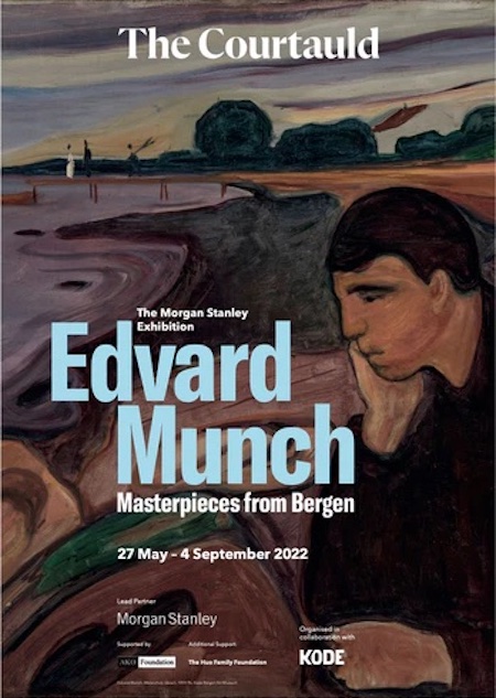
‘MUNCH: MASTERPIECES FROM BERGEN’

The Courtauld Gallery, London


From Daylight To Twilight (How Munch Became Munch)

The Munch paintings in this smallish two-room show more normally reside in a dedicated museum in Bergen, in fact they haven’t been seen outside of Norway before. Perhaps unusually, they come from all stages of Munch’s career. Let’s start at the start…

The prime example of Expressionism, we soon discobver, started out as an Impressionist. That may be like discovering a Punk musician originally played Blues. It may be the more surprising thing that those early works hold up so well. To get here you need to walk through the Courtauld’s impressive Impressionist collection, Monet, Manets and Degas on all sides. Yet they don’t particularly pale in this fine company.


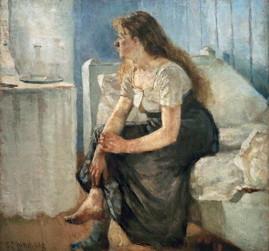
Take ’Morning’ (1884, above) with its captured moment in time, casual pose of the figure, precise play of light and the floorboards and side of bed seeming to extend out past you. It’s immediate, involving, like the painting’s not here but we’re there. It was a good enough stab at the style to flummox the Norwegian critics, who soon dubbed him ‘Bizarro’.


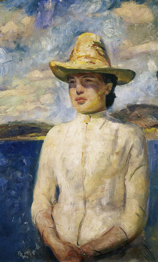
Or take ’Inger in Sunshine’ (1888, above), which manages to convey the sunshine despite being painted in Norway, and with what the show calls “shimmering colours”. Only the model’s impassive expression seems a departure.


But then try ’Summer Night: Inger On the Beach’ (above). It’s from 1889, only a year later. It takes the same model (one of his sisters), in a fairly similar outfit. But everything is now different, and Munch as we know him has arrived. She doesn’t look out but off, as if in a reverie.

The colours are flatter and more sombre. But two things stand out most of all. The lack of horizon line, the water extending past the edge of the frame. And that white dress makeing her the focus of the image, even though she’s not centred.

She isn’t placed before a setting, it’s built around her. This isn’t a slice of life but a psychodrama, a moodscape. Shoreline setting and twilight combine to create a liminal space, aids to help us guess what her pensive thoughts might be. As I said over the British Museum show of his prints: “Munch is perhaps the default example of an Expressionist artist, who painted not what he saw but what he felt.” In fact, the show is keen to say that it’s with this exact work that the shift occurred.


And he didn’t stop there. ’House in Moonlight’ (1893/5, above) is almost a series of theatre flats, where we work out what’s in front of what by placement, not perspective, the gate behind the woman, the house behind the gate and so on. (Only the very foreground, with the falling shadow, breaks from this.) And the greens look too green, the browns too brown, to be naturalistic. Everything we see here looks like a symbol.

Trapped In A Timeline

And ‘Woman in Three Stages’ (1894,) from the series ’The Frieze Of Life’ merely uses pictorial space as a backdrop to a light-to-dark timeline. Let’s get the obvious said first. The three stages of women, already referred to like points on a production line, are not-yet-ready-for-sex, ready-and-up-for-it and then past-her-sell-by. Just as with nature, Munch’s only interest in women seems to be what they can offer him. It shouldn’t be contentious to say this.


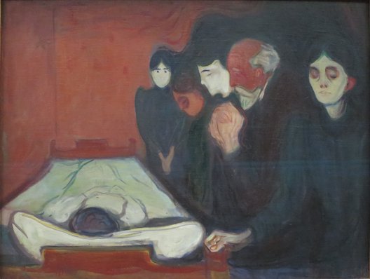
But let’s look more at how the theme recurs in other works on show here. At first glance, ’At the Deathbed’ (1985, above) more resembles the better-known ‘The Sick Child’ (1885/6). Both are inspired (if that’s the word) by the early death of his sister Sophie. Both split the frame, placing the sickly child on the left, the grieving adults on the right.

Yet in this work he inverts the figure and places her prone under a white sheet, as if already in her coffin. Which makes for a strong contrast to the assembled family, a cluster of black which extends beyond their mourning clothes to take up almost all the right section.

So we are almost back to the light-to-dark timeline of ’Woman In Three Stages’, merely with the middle figure removed. Sophie was fifteen when she died, but truncation makes this figure seem smaller. It’s as if she died before gaining the full awareness of death the adult figures are lumbered with, innocence your only possible protection against this world. It’s like the classic Larkin line amended: “Get out as early as you can, before the possibility of having any kids yourself has even arisen.”


’Four Stages of Life’ (1902, above), as the title suggests adds a stage. Though probably more significant is his arranging of the figures behind one another. The young girl isn’t just pushed to the front and given a red hat (with echoing flecks of red in her coat), she looks out at us, and so becomes our focus. She may even be pleased to see us.

While the figures receding along a receding road look progressively gloomier, and meet our gaze to lesser and lesser degrees, the third already seeming to wear a mask. With life reduced to a timeline, we can only focus our attention on the short-lived part that’s liveable.


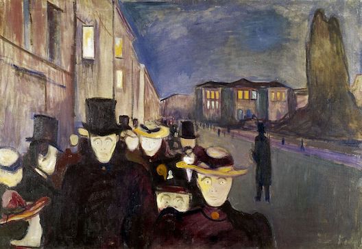
’Evening on Karl Johan’ (1892, above) resembles the print ’Angst’ (1896) from the British Museum show, and indeed Munch had fixations he’d repeatedly hammer on. But there’s an irony here that the deep perspective and pushing of figures to the foreground, almost out of the frame, is an Impressionist device that almost takes us back to the start.

Except with them it would convey the vim and bustle of street life. While he uses it to get us eyeballed by that dead-eyed clump of black, with their identically blank expressions. This is like the mourning family from ’At The Deathbed’ transplanted. Last time I used an Eliot phrase to describe the pallor of those ghoulish faces, “the skull beneath the skin”. Let’s add another one, “I had not thought death had undone so many.”

As we saw in the British Museum show, Munch was very much a Bohemian who associated with other Bohemians and (at least at times) exulted in shocking polite society. Yet as we also saw, rather than any of the libertinism and hedonism we associate with Bohemianism, he gives us very much the reverse.

His family background was Pietist, an uber-Protestant group who saw little good in this world other than a way out of it, via connection to God. And he doesn’t upend or challenge any of that. He simply cuts the connection, leaving us marooned and bereft. Chesterton famously said “When a man stops believing in God he doesn't then believe in nothing, he believes anything.” Munch proves this wrong. He very much believed in nothing.

Right at the end are a few works by later Munch where, taking on a more optimistic perspective, he sought to portray human vitality. Which seems the opposite to what you tend to expect, that people start out full of vigour and drive to change the world, and as they age feel mortality slowly closing around them.

But it must be said these works are simply less involving to look at. Whether this is because he was faking the look, like giving a wan smile, because he was built to glower in the gloom, or simply because optimism is a harder look to pull off than pessimism… there’s probably no way of knowing. Whichever it is, Munch’s home ground was the liminal spaces.