googlee7ea825f63edb3f6.html

Monday, 26 May 2008

BRIGHTON FESTIVAL: PART THE SECOND


MANIC ORGANIC
Thurs 15th May, Brighton Dome
…in which a selection of acts take the Dome’s original pipe organ, purchased in the Thirties, and put it through its paces.

The key image came straight away. When Robert Lippock and Beatrice Martini came onstage to take up their instruments, the organ and harp so dwarfed them they looked reduced to child size. The organ then remained a mighty block on stage, while various turns appeared to append it. Taking applause, one player gestured to it like it was a collaborator.

For Lippock and Martini’s set, we were pre-warned the miked-up organ might lead to an imperfect sound, with hiss and resonation. As so often, this merely added to the effect. It was hard to tell what was organ and what was electronics, with the latter bathed in the ‘warm’ organ sounds. The length of the improvisation obviously led to the discomfort of some in the audience. While it did at times develop slowly, this feels like part of the nature of improvisation. Some parts might not have made it into a final edit, if editing was to be done. But improvised music is more akin to a conversation than a realized script, with the joy of it where unexpected moments happen.

If the piece had a weakness, it was something else. Of course we want to hear the organ going full blast, that’s tonight’s equivalent of the money shot. Yet such bursts tended to overpower the harp, as if what had been set up was a conversation where one side had been handed a megaphone.

The ‘sacred selections’, positioned either side of the interval, were perhaps an extended interval in themselves. That was, after all, how the organ would have been used in its heyday. Of the two the more jokey first part worked the best, giving us a ‘happy hardcore selection’ just as popular numbers of the day have always been transcribed for organ. The second part was based on music by local bands, decided by popular vote. Of these only the last track (by British Sea Power) really came alive.

After Lippock and Martini, I was concerned how the organ might unsettle the Neck’s performance. When I’d seen them before, their improvisations had started with someone experimentally strumming a chord, just to see if it might take them somewhere. So keen were they to eliminate the pre-meditated, they’d even established the rule it couldn’t be agreed who would start. But here it starts with the organ, and (by their terms) jumping in with something already quite developed.

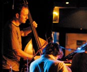
But these fears came to naught. Chris Abrahams held back on the organ power, mostly playing mere fragments of melodies or drone-based clusters that left space for the others to stick their necks in. The fully-fledged, powered-up organ didn’t come into force until the track’s climax.

This was enough to change the Necks sound, but not in the sense of skewing it. They’d previously sounded like building something up from the most basic level, like a castle from grains of sand. Here they were nearer to re-assembling something, like recreating a tree from chopped-down chunks. The chunks might not be going back up in the original order, nor even to the same tree. But none of that mattered, for the joy was all in the assembling. This made for the third time I’d seen the Necks, and each time a triumph!


MARK E SMITH
Sat 24th May, Old Court House

…in which the Fall frontman was in conversation about his recently released autobiography Renegade: The Lives and Tales of Mark E. Smith. As anyone who hasn’t been marooned on a South Sea Island for the past half-century will tell you, Mark E Smith pretty much is the Fall. But protagonists aren’t always the best people to tell their own stories, and this is perhaps truer for Smith than many. For one thing, he’s managed to propel himself through so long a career by forever looking forward. For another, judging by his alcohol consumption, it’s doubtful he’d remember much of it anyway.

But more to the point, when punk was regarded as heart-on-sleeves stuff, Smith made a virtue out of being elusive and multi-faceted – even when combining that with being fiercely polemical. He quite deliberately stirred up a mystique around his cryptic utterances, something he’s scarcely likely to burst now.

Though carefully set in the afternoon, the event did counter the notion Smith had finally pickled his last brain cell. He was smart and funny, but it felt like an exercise in the art of anecdote-as-evasion. (For example, when he was asked about the infamous Worthing gig where he got too drunk to stand on stage.) It perhaps didn’t help to have his ghost writer, Austin Collings, interviewing him instead of some more objective figure.

The autobiography does sound like something of a cash-generating exercise, the literary equivalent of selling your story to the News of the World. When someone asked why he didn’t just write the book on his own, it took me a moment to work out she was asking Smith not the ghost writer. While the Fall have never exactly behaved as money-making machine, its hard to fault him for this. But Mark E Smith’s history of the Fall is a little like Wellington’s history of Waterloo, it wouldn’t be the first book you read on the subject. As to where you should go, that’s another question…

MEDESKI, MARTIN & WOOD
Sat 24th May, Brighton Dome

Little could be said about this beyond “they came, they saw they got funky.” The band improvised their way so smoothly through jazzed-up funky workouts you felt like they could have played ten times as long without effort. Bringing in Airto Moreira as an extra percussionist added something to the sound, though it was perhaps a little disappointing the celebrated Dome organ only got incorporated for half a song. Still the Festival ended as festivals should- with a proper knees-up.

Tuesday, 20 May 2008

BRIGHTON FESTIVAL: PART THE FIRST

DAUGHTERS OF ALBION
Tues 13th May, Brighton Dome


The upside of staging folk as a multi-performer showcase night is that it escapes the narrow definition sometimes forced upon it. Folk can be treated as a given, a base ingredient like peas or potatoes which needs something tastier poured over it. But here folk has the space to appear multi-faceted, for example Bishi’s sultry cabaret numbers contrasting with June Tabor’s stark piano ballads. It also allows the performers to mix traditional songs with modern without anyone worrying too much.

The downside isn’t so much that the night divides into highs and lows. The track record was high, with only Kathryn Williams’ vapid gushings really letting the side down. (If, somewhat unfortunately, she seemed to be the compere and main act.) While I obviously already knew June Tabor or Norma Waterston, I hadn’t heard Lou Rhodes or Lisa Knapp before – and would happily do again.

The downside is more that things become fragmentary, moods getting broken as soon as established. (Even when the changeover between artists is pit-stop fast.) And, while folk is of course collective music, the attempts to unify everything with ensemble singalongs can risk feeling forced. (June Tabor notably only sang with her own pianist, coming onstage for the final group effort but not actually singing.)

It scored better than the recent folk showcase night The Imagined Village, through feeling less of a photo-op and being less encumbered by an agenda. It had a simple concept (women singing folk) which they’d clearly rather demonstrate than pontificate over. Even the odd male-penned song could come in without causing a ruckus. (June Tabor mused over her own lack of writing skills, “I just ring up Richard Thompson. It’s easier.”)

Perhaps the problem is all a different one, however. The way folk is generally perceived, multiculturalism has to be actively incorporated into it. With women it’s perhaps the opposite problem – they’re too associated with all the negative connotations of folk, it’s supposed conservatism and focus on the domestic. There are political songs here, such as June Tabor’s version of the anti-war theme Lili Marlene. But perhaps the real question is - what’s so wrong with songs about the domestic? It’s the place we spend most of our lives after all. Perhaps what these ‘womens’ subjects need is to be handled so supremely well they no longer feel trivial.

Examples would be the covers of Kate Bush’s This Women’s Work or PJ Harvey’s Down By the Water. Beneath the fables of kidnapping fish, Down By the Water is merely the story of a daughter leaving her mother’s home. (“Come back here man, gimme my daughter.”) The impassioned and distraught lead vocals are contrasted with the flatter, more intonatory chorus – the opposite of the feelgood, singalong chorus used elsewhere. They repeat the same lines but like a Greek chorus, transforming them into fatalistic resignation.

Perhaps inevitably the evening ends on Sandy Denny’s Who Knows Where The Time Goes, that Auld Lang Syne for the post-hippie generation. It’s appropriate for not being the conservative cry it might appear. The thought of being able to stop time, to live forever inside some idealised past, is not only unappealing but a modern notion grafted onto folk. Denny’s song suggests we live our lives unafraid of time (“I have no fear of time”), quite another thing entirely. In songs as in anything else we grow cumulatively, ideas building on other ideas like layers of sedimentary rock.

MESSIAEN ANNIVERSARY CONCERT
Mon 19th May, Corn Exchange


The evening’s proceedings kicked off with Gavin Friday (of the Virgin Prunes) reading a Garcia Marquez story to a musical accompaniment. The Handsomest Drowned Man in the World wasn’t one I previously knew, but proved a rich treasure. Essentially a fable about the naming of things versus their material existence, it portrays a giant drowned man at first mythologised (“he could have drawn fish out the sea simply by calling their names”) but then humanised and diminished through being given a name himself.

This would seem to make a perfect subject for musical treatment, with the music standing in for the strength of the physical world against the spoken word. Indeed, as you might expect, the music spent much of its time mimicking the sway of the sea. Unfortunately, though Friday read ebulliently, Ian Wilson’s score was adequate but not especially memorable. While of course it shouldn’t overpower the words, for much of the time it was merely ambient – and not in the good sense of the term. As over the Drowned Man, the words finally won.

Perhaps the key to Messiaen’s Quartet for the End of Time is that it was composed whilst he was interned in a German prison camp during the war. (The instrumentation was decided upon solely because they were the only four instruments to hand.) You quickly get the sense of a man merely physically confined, whose imagination remained unbounded. Despite the title (from the Book of Revelation), it doesn’t feel like the end of anything so much as the transformation. Notes progressively stretch, shimmer and quieten – as if the music was composed on the edge of human perception and then slowly moves away. As he said himself, he intended to “bring the listener closer to eternity in space, to infinity.” You often felt like that famous scene in Frankenstein, lunging and grasping for those notes just as they disappeared. By the time it arrived the ‘silence’ at the end seemed very much part of the piece, with the audience waiting for it to pass before applauding.

If you wanted a real-world metaphor, imagine climbing a mountain path made from stone-hewn steps. As you ascend the steps become less and less defined, and stretch further apart. But even as they gradually disappear they serve as a guide and pointer to the direction you’re intended to travel in. Devoutly religious, Messiaen isn’t someone to turn to if you want your art empirical and materialist. But that doesn’t make his piece escapist or art for art’s sake. Never was a piece of music more composed as a meditational aid.

Almost everyone seemed to agree that the more successful sections had been the solos or duets, over where the full quartet was playing – and perhaps that’s significant. The piece loosely follows an alternating dynamic, the slower and more serene passages chopped in with the more rhythmical movements. The latter had their moments, reminiscent of the convulsive rhythms of Stravinsky rather than the mannered world of chamber music. Yet they not only failed to match the exquisite beauty of the softer sections but often seemed (at least to my cloth ears) unintergrated – as if we weren’t listening to the parts of an overall composition but a series of separate pieces. Nevertheless, as mentioned, the highs were very high…

Sunday, 11 May 2008

DUCHAMP, MAN RAY, PICABIA

Tate Modern, 21st Feb – 26th May (…another exhibition I review while it’s still open! Three weeks… three shopping weeks before this shuts!!!)


i) Against All Art
It’s interesting to see this show so soon after the orthodox Modernism on offer in From Russia. This couldn’t be a comparison any more by way of contrast; it’s like yang to yin, anti-matter to matter or… closer to the point… anti-art to art.

Most Modernist movements were about kickstarting art into catching up with progress, finding a new method of painting that would place it beside telephones and automobiles instead of haywains. These guys, however, would rather be a spanner than the works and had soon vowed to offer art not a helping hand but a thumbed nose. They set themselves against both art and their times, in a bid to render problematic the very notion of individual expression. They didn’t want us to see art in a new way, they wanted to create works which restrospectively undid all the old ways. Picabia called it “the disintegration of the concept of art.”

However about the worst thing you could do to this show, worse even than take it as an art exhibition, would be to portray it as chinstrokingly dull and academic. (“But then what is art? Hmmmm…”) Instead of the hermetic, cerebral world of movements and manifestos it’s relentlessly playful and often laugh-out-loud funny. The endless tongue twisters, puns, in-jokes and false identities don’t come across as sugar on the medicine but integral to the point. Picabia enthused over “lively, childlike, happy art.” Traversing it’s like spending an afternoon in the company of acute philosophers who are simultaneously master raconteurs. Though their agenda’s entirely negative you emerge exhilarated not constrained. Duchamp described its ”nihilism” as “a way to get free.”

That three-name title comes in here, in it’s way as innocuous-sounding but significant as was From Russia. It’s chiefly significant for what it doesn’t say – Dadaism. Instead of a blow-by-blow account of a movement we have instead the story of a three-way friendship, of the sparks that flew between three active minds. (It also helps considerably that the rooms are as often arranged thematically as chronologically.) While of course all art movements have different wings, their singularity here is such that you start to wonder whether ‘Dadaism’ is a useful term after all.

The Berlin Dadaists in particular were rigorously anti-art, embracing the Marxist notion that it was nothing more than the imposed culture of the ruling orders. (“There is art”, asserted Grosz, “so the bourgeoisie have something to hang in front of their wallsafes.”) But these three were not politicos but philosophers, seeking not to smash art items but challenge its very concept. Duchamp spoke of “denying the possibility of defining art”, perhaps suggesting his aim was not so much to slay art as render it forevermore volatile and unsafe. Perhaps correspondingly there’s no sense of urgency to their project, or for that matter very much concern whether they even succeed or not. Quite often they refer to their own work in terms of a Zen exercise, which might well be both futile and worthwhile. Duchamp commented “my intention was always to get away from myself, though I knew perfectly well that I was using myself. Call it a little game between ‘I’ and ‘me’.”

Their feet were planted, of course, in different ground. You can read in any art book about Dada being a reaction to the horrors of the First World War. The Berlin Dadaists were certainly responding to the devastation and political turmoil they saw about them. But our three here began the anti-art path in the early Nineteen Tens, before the war. (Even if the show’s own press release seems confused about this.) Similarly, though outside of this show’s remit, Russian Dada preceded the war – though there it confusingly called itself ‘Futurist’. Moreover, their antagonism to art doesn’t seem to have stopped them leading d the fairly privileged life of the successful artist-playboy, jetting between Paris and New York and generally living it up. (Picabia may have owned up to a hundred and fifty cars!) And of course, as an American, Man Ray, would have been barely affected by the war for most of its duration.

The Great War’s importance is doubtless overplayed anyway. Reading art books you sometimes picture two guys in the trenches, one saying bitterly to the other; “You know what I blame for all this? The traditionalist form of painting!” the smarter money would be on looking at what a transforming time the Tens and Twenties really were. If, to borrow the show’s byline, this was “the point art changed foreover”, it’s correspondingly the period where society shifted too. Adam Curtis has called the last century ‘The Century of the Self’, but it was in these incubator decades that the notion of the private self was truly cooked up. Before then most people were defined by little more than their social location, and lived essentially to replace and duplicate their parents. Outwardly paradoxically the rise of the private self also had its corollary in the rise of mass production. You define your self against that mass, but you create that definition through the items you consume.

Partly as a result, Modernist art objects had their own paradoxical relationship to this period. As argued in the From Russia review, for all it’s futuristic claims “Modernist art relied upon a Medieval means of subsistence”, single hand-made objects purchased by a patron. A benevolent patron would publicly display his goods, like a landowner throwing the village a feast. In fact in an era of mass production, the personalised, handmade quality became a feature people expected of art. In short, the artist epitomized the self as the concept grew in importance to a society becoming increasingly anonymised. In the very early days of Modernism, three of its practitioners saw through all that and turned instead to upending it. Their aim, in Duchamp’s pithy phrase, was “to annihilate the ego of the artist.” (A quote which really should be in the show, but isn’t.)

Perhaps their philosophy is best expressed in one of the films shown here Ent’racte (directed by Rene Clair, but scripted by Picabia). Though interpreting such things may be a fool’s errand, I couldn’t help but see the funeral procession as their impression of art – something revered in a stately fashion, but dead. The procession then speeds up, first into a brisk canter then careering out of control, a parody of the Modernist notion art must be “speeded up” into current times. (It flies past cars and bicycles.) Finally the carriage-hearse crashes and a magician emerges from the coffin who makes everyone disappear, including (finally) himself – anti-art personified. The magician is perhaps a fusion of all three, though he makes me think most of Duchamp.


ii) Movement Against Progress
Consequently, it’s possible to read the show as a toolkit designed to dismantle Modernism. Modernism frequently concerned itself with reflecting society’s self-belief in progress, which often took the form of capturing motion – society was no longer bound by tradition but dynamic and forward-looking. (This was particularly true of Italian Futurism, their first manifesto boasting “we have created eternal omnipresent speed.”) We see motion again here, but almost all of it is circular. There are simply so many circle motifs on view that they can’t be coincidental, and are surely a kind of skit on notions of linear progress. They are also frequently married to the portrayal of dancing, which also conveys their playful approach. Ent’racte, for example, has repeated cross-cuts to the below-view of the undulating skirts of a dancer, while Duchamp’s first readymade (more on those later) was a bicycle wheel.

One of the main places we see circles is in cogs and gears. As we’ve seen Modernism often had a contradictory relationship to the machines – frequently venerating them, yet continuing to insisit upon the authentic touch of the individual artist upon his work, as if that ‘’private self’ was merely being poured out onto the canvas. So our boys chose to collide these two in what Picabia called ‘mechanomorphic’ drawings. These often blurred the distinction between the human and the machine, with a particular favourite the reduction of sex to the mechanical. (However, the distinction might not have been as clear-cut as some make out. Leger for example, a loose associate of this crew, often painted man-machine combinations but in a much more positive light.)

This interest also spilt over into an appropriation of the style of technical drawings, with machine diagrams themselves sometimes merely plagiarized. (Picabia took a set of these then claimed them to be ‘portraits’ of various associates, defying us to see the person in the gears.) These drawings became a way to (in Man Ray’s words) “remove all traces of manual dexterity” from the art. Works instead became diagrams of ideas, aiming to explain the workings of concepts in the most lean and economical matter possible. Duchamp later bundled the notes he made creating Large Glass into a work in their own right. And you suspect if he’d have had to get rid of one of the two, it wouldn’t have been the notes…


iii) Art From the Assembly Line
But if the three took up arms against many foes, you get the feeling painting was their Moriaty. So you’re not surprised when they abandon painting altogether; for kinetic art objects, photographs, works on glass instead of canvas and much else. Man Ray declared himself “free” from “the sticky medium”! But perhaps their greatest escape lay in what Duchamp would later call his biggest contribution – the readymade.

To understand what readymades are we must first understand what they aren’t. Picasso once ‘made’ a sculpture that was nothing more than a gas hob. Realising that if you turned it to an unusual angle it formed an image he liked, he found himself satisfied and exhibited it as it was. But Duchamp emphatically did not aesthetically appreciate the urinals, snow shovels and bicycle wheels he exhibited. When his urinal was rejected for exhibition as “plagiarism, a plain piece of plumbing”, he insisted it didn’t matter how the readymades were made. The point was he, the artist, had chosen them. He’d then insist that he’d taken care to choose the objects as randomly as he possibly could, that they were “object[s] that absolutely do not interest you… which do not have any chance of becoming attractive or beautiful.”

Norbert Lynton has written on the importance of collage for the Dadaists, as “works of art that tease and threaten our awareness of all art [by] juxtaposing pieces stolen from the world.” You will find very little collage in this show, but the readymades bear close similarities – it is merely the feature they are juxtaposed against is their gallery setting.

‘Readymade’ was then a colloquial American term for a manufactured good, a ready antonym for hand-made. With mass production then in relative infancy, Duchamp is juxtaposing it against the artist’s cult for original and unique objects. Many objects here (not just the readymades) are actually latterday copies. In an art show, that would be heresy. Here it allows them to make their points better.

The random means by which the readymades were chosen would also become a watchword, as works were devised to be more and more subject to chance processes. Duchamp went to great lengths to ensure that almost every shape and form on Large Glass was chosen by chance, devising elaborate stratagems to limit his own involvement. One day it was packed poorly for transport and the glass cracked right across. (A detail not reflected in the copy on show here.) Exultant, he pronounced it “finished!” Systematically, all the hallmarks of the artist are swept away…

iv) What Dada Did Next
So if the rapid social developments of the Tens and Twenties incubated anti-art, what then? Having changed the concept of art forever, what do you do for an encore?

Its generally agreed Duchamp’s hit singles were the urinal and moustachioed Mona Lisa, while Large Glass is his album track. But his greatest work is surely something else. Like the magician in Ent’racte, he upended everything them disappeared. Though his retirement from art was largely symbolic, that doesn’t prevent it from being his most effective statement. Art is supposed to be a compulsion, a calling. Duchamp calmly stated he’d rather play chess. (I’d always romantically pictured him sitting by a board in some Parisian cafĂ© all day, but it turns out he played competitively for France.) It was as if he saw his job done, art upended, so had no reason to stick around.

However, that grand gesture doesn’t mean his work led to a dead end, or only made sense inside of an era. Neither (despite most reviews of this show) was his influence only felt by chancers like Damian Hirst. The conceptual art movement was a logical step forward from Duchamp’s work. If the art object itself is immaterial to the concept, why not do away with it and just have the concept? That way no-one will be distracted by the silly snow shovel at all!

Another place we see Duchamp’s influence is in post-punk. If punk had been more attracted to Berlin Dada’s iconoclastic fury, Duchamp’s detached cerebrallism supplied post-punk with the perfect rejoinder. When, after the break-up of the Pistols, John Lydon announced a new band that would be “anti-music of any kind” it’s hard to think of anyone else. Lydia Lunch even name-checked him: “I consider myself a conceptualist. I feel more akin to Marcel Duchamp than any musician ever.”

Rachel Campbell-Johnston opened her piece in The Times, by saying “as far as art history is concerned, it was like mixing ammonia, nitrate and a match.” Duchamp is soon revealed as the match, but who is who for the others? In The Independent, Charles Darwent is less circumspect:
“it's clear that we are dealing not with a three-legged race but with gold, silver and bronze… Over Francis Picabia's inclusion, hangs the question: why bother?”

With Duchamp and May Ray’s subsequent activities better-known, why not focus on Picabia here? It’s true at first he looks washed up, the only one to stick with painting. His ‘Transparencies’, paintings composed of classical images but overlaid, just make you think how much better they’d be if they were overprints rather than overpaintings, pages shoved through a printer twice to really create a chance element. As it is their cluttered forms suggest someone trapped in painting. (Or, in the case of the work Otaiti, buried alive in it.)

But his later, more lurid and pulpy paintings are a triumph. Stolen from porn mags, packaging and pulp illustration (in the way he previously stole from industrial design), they exude roughness and bad taste. Pilloried in their day as both incomprehensible and retrograde, they now look ahead of their time. Even his final works have their appeal – minimalist cosmic scapes, like later Miro but with a more visceral quality. Picabia perhaps does desrve the bronze of the three. But they don’t award the bronze for just showing up! It’s a prize handed out to those who stood above the pack.

v) After Art Changed
Duchamp later commented “I was trying to destroy certain traditions, to leave the field clear again for a new approach to things.” So what does this show have to offer us today, beyond historical curiousity? It’s perhaps ironic to see this show only three weeks apart from From Russia, Modernism and its antithesis head-to-head. And in perhaps the most uncharacteristic thing I’ve ever put to print, perhaps From Russia is the show we need to see today.

If Man Ray had found painting “sticky”, we’re now mired in a cloying swamp of post-modernism. If the ego of the artist has been annihilated, as a privileged person possessing a special insight into things, has that merely left us with the Damian Hirst syndrome – the artist as celebrity? (You can see the unintentional roots of that in the three-way in-jokes here, clear as day.) After the Readymade, modern novels often list brand names as triggers for characters – people become Gucci-shoes wearers and the like. Is detatched cool, the very source of attraction for the post-punks, now all played out? Was a war with art best not won but made into struggle to be fought in perpetuity. We can’t authentically recreate Modernism any more than we can take a Tardis back to 1911. But perhaps what we need to be reminded the most is that a bit of commitment isn’t always such a bad thing to aim at after all.

Monday, 5 May 2008

‘I’LL MAKE NO SUBSCRIPTION TO YOUR PARADISE”: GETTING CRITICAL ABOUT CRASS


A condensed version of this piece appeared in Last Hours 17

Back when the countdown to the invasion of Iraq was on, I was busily telling everybody the reason for my war opposition - I feared it would lead to Crass reforming. This proved prescient because, after years of rumour, an anti-war benefit did go ahead under the rebranded heading Crass Collective. (As if they’d previously behaved as an autocracy or something.) This in turn led them to sporadically resume performing, though you now need to call them the Last Amendment.

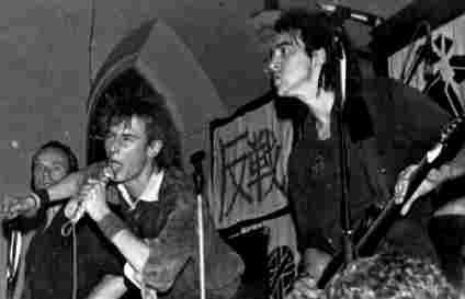
As this story might suggest, back in the day I had little empathy for Crass. I can remember the moment of surprise when I discovered that the sweary bovver band were actually singing about anarchy and peace. But that didn’t make me any more enamoured of them. That may have been partly down to the tribal nature of youth culture. No small part was due to the notoriously terrible state of their ‘music’. (I listened happily to Throbbing Gristle, the Fall or Neubauten, none of them exactly top-forty-friendly outfits, but drew the line at Crass’ tinny rantings.) But, though I wouldn’t have been able to define it at the time, there also felt something confining about their strictures – something strangely at odds with their message of personal liberation.

Crass’ brand of anarcho-punk was and remains controversial, stirring up devotion, hostility and plain bewilderment in roughly equal measure. Joe Banks (aka Disinformation) has claimed their recordings “change people’s lives forever, immediately they experience it for the first time.” (Sound Projector 10) The Punk 77 website describes them as “new puritans who criticised everything left right and centre and offered in its place some unfeasible nirvana which… would be peopled like themselves.” With the reformation and with renewed interest in the band (with two books and one documentary appearing), perhaps now is a good time to get beyond such polarised responses and develop a more nuanced response to what they did.

The band themselves fed the fire, often being absurdly self-aggrandising (“It is not grandiose to claim that we have been one of the most influential bands in the history of British rock…it was us who almost single-handedly created anarchy as a popular movement for millions of people.”) Perhaps the most hilarious case is their song Banned from the Roxy, which suggested they’d been censored for their radical vision (‘They said they only wanted well behaved boys, do they think guitars and microphones are just fucking toys?'), then compared the event to Mai Lai and Hiroshima. In fact, as they later admitted, they’d simply been booted off for being too drunk to play!

They were many who tried to use the band as a measure of anarchism’s failings in toto,portraying them as a strange cross between fulminating fanatics and hopeless idealists. However, as their more knowledgeable adversaries admitted, in actuality Crass ran a quite formidable operation on a shoestring. They not only launched their own independent label (which paid its way despite absurdly cheap prices) but raised cash for numerous benefits (often playing only benefits for years at a time), were instrumental in the Stonehenge free festival, persuaded bridal magazine Loving to give away their songs on a free flexidisc, had questions raised about them in the Commons… you probably already know all this to be reading about it.

Crass often claimed to have sold the equivalent of gold records which were ‘hyped’ out of the charts by a nervous music industry. Yet it is not enough to measure their success by units shipped. As they said themselves: “The true effect of our work is not to be found within the confines of rock'n'roll, but in the radicalised minds of thousands of people throughout the world.” The real question, is did they affect people’s minds for good or ill?

Though the band started gigging in 1977, it’s vital to understand anarcho-punk as something which followed the original punk wave. Of course anarcho-punks castigated the original punks for “selling out” on their early commitments, with a degree of stage shock which can only appear ridiculous today. But if anarcho-punk was full of invective about this, it was equally vehement about itself – it was propelled by self-criticism and negative energy to a degree that verged on fundamentalist. If Anarcho was a second chance, a means to avoid making punk’s mistakes all over again, this could only be achieved by setting yourself a Spartan lifestyle of permanent outsiderhood.

Crass’ crucial contribution to this was to add a generational layer. The majority of the band were old hippies, who had lived together in a commune since 1967. As Richard Cross argues in The Hippies Now Wear Black: “Importantly, Crass claimed punk as an extension and redefinition of elements brought forward from the culture of hippy…. Even so, Crass’s was never an uncritical reading of hippy, but rather a reclamation of what were seen as common principles… castigating the self-satisfied hedonism of sixties counter-culture, whilst romanticising its more consciously political elements. Disappointment with the decline and corrosion of hippy may help to explain the intensity of Crass’s subsequent investment in punk. It had to work where hippy had failed.”

In short, if the young anarcho-punks wanted a scene to express two years’ worth of festering resentment, here was a band who had twenty such years saved up! They’d seen Jefferson Airplane (‘all your private property is target for your enemy”) become Jefferson Starship (“we built this city on rock’n’roll!”) years before the Clash had appeared on Top of the Pops. Though the band even sang about this (‘Punk became a fashion just like hippy used to be/ And it ain’t got a thing to do with you or me’), at the time few got it. After all, punk had brandished the slogan Never Trust a Hippy. (Normally thought to be devised by Jaime Reid, himself an old hippie who now looks like a crustie!) So Crass’ critics would continually harp on their hippie origins. (One hilarious example being Special Duties’ ‘Bullshit Crass’ – ‘Commune hippies, that’s what they are/They got no money – ha ha ha!’) Their fans would either deny the whole thing or defend hippy ‘peace ‘n’ love’ values against the Pistol’s ‘negativity’. Both would miss entirely their motivation came from a critique of hippy.

Crass’ age advantage also contributed to their presenting themselves with a ‘sussed’ image. Against the cartoon shock of most punk, Crass could even come across as rigorous – slagging off not merely the Clash and the Pistols but Buddha, Jesus and Marx! Perhaps their critique of the Labour Theory of Value wasn’t the world’s most incisive (“Do you really believe in Marx? Marx fucks!”) But within a movement that was predominantly exceptionally young (often school age), they became anarcho’s central band partly through their appearance of having worked it all out.

However, despite this and despite frequently being painted as political fanatics by opponents, the band remained hippies first and anarchists second. Though they undoubtedly blurred the line between artist and activist, their mindset remained with their origins – in subculture. Many members later admitted that at the time they knew little of the meaning of the circle-A flags they’d hang behind their stage. (They’d earlier even flirted with the term ‘nihilist’.) However, this isn’t necessarily a criticism, cultural movements can have advantages over political ones. Many anarchists then (or even now) commendably sought to keep alive the memory of previous movements, in Russia, Spain etc. But they saw their own role as curators and archivists, seeking to keep the precious memory alive. This frequently turned inspiration into baggage. Crass conversely encouraged their fans to do something.

However, while political groups can easily become cults perhaps there is something inherently conformist about cultural ones. As Richard Cross says “anarcho-punk… would sustain and extend its influence through the self-directed activities of its adherents – who would form more bands, produce ever greater numbers of publications, set-up record labels and radical co-operatives.” Anarcho-punks were encouraged to behave not as fans or consumers, but to do it themselves. However, its arguable that the very success of this laid bare anarcho-punk’s greatest failure - the rallying call was often interpreted as duplicating for themselves what Crass had already done. Growth became cellular, spreading widely but only copies of the template. Bands who didn’t don the necessary black, detune their guitars and sing about the importance of a punk diet could find audiences antagonistic. “Anarchists can be a conservative lot, I’ve discovered”, Zounds’ Steve Lake was later to reflect.

While Crass were themselves often critical of this tendency (something we’ll come onto later), in some senses the form of anarcho-punk made this inevitable. The politics simply had to be cut down to fit inside the stenciled slogans and short shouty songs. In the short term, this vagarity was even beneficial as it allowed Crass to continually shift the terrain. One example is their involvement in the Stop the City actions, which were initially effective but soon stymied by a greater mobilisation of police. Crass then claimed that this ineffectiveness was actually a victory, as the lack of action had allowed participants to “get to know” each other instead! But in the longer term problems were being stored up…

Another downside of subculture Crass epitomized to the nth degree is a tendency to moralism and superiority. The Anarchist Workers Group found in anarcho-punk “the worst kind of elitism - the politics of ‘if everyone was like me wouldn't the world be a wonderful place.’ “ Their legendary antipathy to Christianity could easily be pinned to their perceiving it as a rival moral system. (Joe Banks concedes their “moral sensibility” had “similarities… to Christian idealism.” Meanwhile the Crass section of Southern Studio’s message board would suggest may old fans have now ‘found religion’ of some form.)

But this moralism was at it’s worst in the band’s attitude to class. Though rightly wary of Leftist groups like Socialist Worker, Crass then throw the baby out with the bathwater. Class divisions were supposed to come merrily tumbling down through the transforming act of putting on a punk gig with a low door price (‘Punk’s the people’s music, so you can stuff ideas of class/ Middle class, working class, I don’t fucking care.’) But in the meantime workers remained gullible minions, as yet deprived of the insights to be found on poorly printed lyric sheets. The disdain and contempt, unmissable in songs like Systematic Death (‘Poor fucking worker, poor little serf/ Working like a mule for half of what he’s worth’), is made more noxious when you consider that most of the band came from priveliged backgrounds. ’Not for me the factory floor/ Sweeping up from nine till four…’ Not even, it would seem, the knowledge that five is the standard clocking-off time.

But perhaps the most telling lines came on End Result, a sanctimonious diatribe against the workers they’d see entering the Ford plant near their commune base: ‘I hate the living dead and their work in the factories / They go like sheep to their production lines / They live on illusions, don’t face the realties / All they live for is that big blue sign / It says… Ford.’ Subcultures are of course voluntaristic. You choose to go to the punk gig that’s a benefit for animal rights. Here Crass completely lose the plot and assume that workers must similarly choose to enter their factories - quite oblivious that the bait of work is more often thought to be wages than the shininess of signs. For a band so obsessed with 1984 they might have paid more attention to Orwell: “if there’s a hope for the future, it lies with the proles.”

Then again… The opening track on Crass’ first release was blank (entitled The Sound of Free Speech), as the pressing plant had nixed the intended track (Asylum). Yet it was the plant’s workers, not the management, who had refused to handle the song’s “blasphemous” content. Simultaneously Joe Strummer was forgotting his own public school origins to dress himself in the boots ’n’ braces uniform of a rebel worker – an absurd stereotype which bore no relation to the realities of Thatcherite Britain. Oi took up this class-identity-as-fashion-statement, which made them one of Crass’ frequent targets. Perhaps an antidote to such romanticism was needed. As Sid Vicious pointed out “I’ve met the man on the street. And he’s a cunt.”

And it should also be said that Crass’ actions were often ahead of their stultifying rhetoric. For example, many anarcho-punks loftily refused to support the striking Miners unless they all collectively gave up eating meat. Crass, conversely, played them benefit after benefit – their last ever gig was for the Miners.

Nevertheless, deprived of any sense of class, Crass struggled with conceptions of power relations. At times this verged on the superstitious, for example in their fixation with the ominous year 1984; which would not only herald an Orwellian dystopia but usher in every conceivable nightmare – death camps appearing, nuclear bombs dropping, punks “selling out” to major labels. (The darkening political background of Eighties Britain gave a sheen of credibility to this apocalpse-porn.) Catalogue numbers counted down to this dread date, at which point it was preordained the band would split up. Against this ‘heavy shit’ talismans were raised that contained the magic needed to dispel power – singles than cost 45p or less, boutique-boycott clothing bought from Army Surplus Stores, righteous vegan diets, etc.

But they chiefly clung to their hippie origins - imagining power as ultimately nothing more than a state of mind. As the Bureau of Public Secrets put it in On The Poverty of Hip Life, "the hippie thinks that alienation is merely a matter of perception - 'it's all in your head'...existing conditions will go away as soon as everyone acts as if they didn't exist." (Crass’ critique of hippy consisted of dragging it back to basics, but never questioning those basics. As founder Penny Rimbaud was to claim in his book Last of the Hippies "if each individual can learn to act out of conscience rather than greed the machinery of power will collapse." It’s tempting to speculate whether a few days spent working under that big blue sign might have helped him face some of those ‘realities’.

Yet, before we side with the nay-sayers and dismiss Crass as nothing but old hippies hidden under new haircuts, we should add they were as much influenced by another tradition – an older one. Rimbaud later lamented “one of the major elements that people missed in us was the tradition of Dada. We used confusion and confrontation in much the same way.” (In fact he’d previously performed in Exit, a post-Dada outfit where instead of drums he played a bicycle wheel.). The Dadaist spirit of provocation cross-bred with the anarcho-punk fetish for denunciation to infuse the band. After all, why inspire when you can goad? Why bother slagging off Ford workers who weren’t there when you could insult your audience who were?

Punk’s Not Dead was already becoming a rallying call in anarcho circles, a claim it’s heart was still un-coopted by chainstores. Crass promptly wrote Punk is Dead. (‘I see the velvet zippies in their bondage gear / The social elite with safety pins in their ear / I watch and understand that it don’t mean a thing / The scorpions might attack, but the system stole the sting.’) They’d perpetually taunt their audience with singalong lines like ‘I’m not going to change the system, you’re not going to change the system’ or ‘Who’s your leader? Who do you watch?’

However, Crass’ Wikipedia entry remarks how “using such deliberately mixed messages was part of [their] strategy of presenting themselves as a ‘barrage of contradictions’ …” While in Wikipedia terms the reply might be ‘citation needed’ let’s use the parlance of the time – bollocks! It defies credibility that there was any “strategy” or masterplan hatched at the beginning, any perfect blend of wind-up and polemic plotted over herbal tea in their commune. Nevertheless, such assumptions are typical. While fans and critics of Crass would argue endlessly both would make the same elementary mistake – taking them at face value. Fans assumed they had it all worked out and were right. Their critics agreed with all of that right up to the last word. Yet on Where Next Columbus they had exposed all ideologies not as perfect systems but movements which merely start with someone’s “confusion”. They were no exception to their own rule.

In this way you’d need to contrast Crass with a contemporary band like Gang of Four, who chose quite deliberately to seek out and intensify the contradictions involved in being an anti-capitalist band. For example, they coined the collision term ‘militant entertainment’. Significantly Gang of Four chose to sign to a major label (EMI) but as as political gesture. “”The point for us was not to be ‘pure’”, they explained. ‘It wouldn’t be on our agenda to be on a truly independent label, as if such a thing could even exist.” Crass, conversely, could never completely break from their ‘sussed’ image.

Moreover, the content of their message was increasingly vying with the chosen form, the pedagogical pronouncements grating against their genuine desire to generate a critical audience. Crass therefore tended to batter their audience with their slogans, then curse them for fools should any of them follow any of it! This was no plan but simply a matter of trying to get the best from the bind they found themselves in. If they couldn’t transcend their limitations, they could do the next-best thing –exploit them. So these contradictions came to fuel the band at the same time they beset it - what made the mix conflicted also made it heady, what made it confused also made it vital and unpredictable.

Perhaps this was behind their decision to pre-emptively announce their own sell-by date; like a banger propelled by rocket fuel, they’d guessed into advance they were onto something powerful which could never be maintained. The music was moving further and further away from their basic ‘street’ sound, their final (little-heard) album was a set of poems recited over neo-classical music! (Rimbaud exulted: “I should think a lot of punks will be thoroughly pissed off, 'cause it doesn't say fuck in every song.”) Also, as the Eighties grew progressively nastier cracks began to appear in their once-unified façade, in particular over their pacifism.

In their wake some bands did continue to duplicate Crass’ weird, sometimes heady mix of Dada and dogmatism – Uncarved Block-era Flux or Ssh!-era Chumbawamaba. But Crass’ role as the aristocrats of anarcho went to Conflict. Songs titled Rival Tribal Revel Rebel or Where Next Columbus became songs titled Stand Up and Fucking Fight. For all their (quite unstaged) militancy and ceaseless run-ins with the authorities, Conflict’s relation to their audience was always to confirm and validate their beliefs and expectations. Things were pulled back inside a ‘right-on’ comfort zone, where the only remaining ‘punk’ element was the haircuts. Rimbaud later eulogised the early days: “Ideas were open, we were creating our own lives together. These were the glorious years before the free alternatives that we were creating became just another set of bigoted rules, before what we were defining as real punk became yet another squalid ghetto.”

Perhaps the era is best summed up by the autonomist magazine Aufheben. "Far too many anarchos simply changed their clothes, diet, drugs and musical tastes, deluding themselves that by doing so they were creating a new world within the belly of the old which would wither away once it recognized its comparative existential poverty.” Of course, if we were to wonder how well that worked out then hindsight could be our guide. But the beauty of Aufheben’s critique is that it continues at the point so many others stop... “But most of the criticisms of lifestyle politics, then and now, were and are mere defences by militants prepared to accept the continual deferral of pleasure in favour of the 'hard work' of politics. The desire to create the future in the present has always been a strength of anarchists. How one lives is political." Or as Rimbaud commented, when asked in the fanzine Mucilage if some fans weren’t going to the gigs just to have fun: “So fucking what? It's better than not having fun.”

In the run-off from their final record, a voice can be clearly heard intoning their final slogan – “we only did it for a laugh.” Crass attempted, perhaps harder than any others, to become more than merely a band. Though their efforts brought successes, those very successes soon tied them in a set of contradictions they were unable to cut through - so instead decided to emphasise. In the end, they are best understood not as political thinkers (and certainly not as musicians) but as provocateurs. And we were provoked! Some of us still are. That counts as a success.
Thursday, 1 May 2008

PRESS & RELEASE AND THE ARTISTS SPEAK!


Press & Release is a “celebration of artists’ books and independent publishing”, showing at Brighton’s Phoenix Gallery until June 7th. (Yes, Lucid Frenzy is finally covering an exhibition that’s still on!) Last Saturday I attended the Gallery Talk given by the show’s star turns – Jan Dirk de Wilde and Joyce Guley from deranged Dutch book-inventors Knust and Caroline Sury and Pakito Bolino from French art-brut imprint Le Dernier Cri.

Hearing them describe their work side-by-side, the differences between the two outfits became immediate. Knust (an anagrammatic mangling of the Dutch word for art) have been based in a cooperatively-run artists’ building in Nijmegen since the Eighties, producing limited edition books on supposedly redundant stencil machines and book binders. His flat tones only barely masking his dry wit, de Wilde gave a nuts-and-bolts account of his years grappling with archaic technology, sometimes vanishing to rustle up examples. At one point it became impossible to buy more ink for the machines, so they simply set about making their own! De Wilde proudly told us how this never quite dried, and was “leaving dirty finger marks after twenty years even.” (Interestingly, he went on to add stencil machines were now making a comeback – albeit disguised as photocopiers. One manufacturer had insisted to him their product wasn’t a stencil maker, until he’d explained that was the reason he wanted to buy it!)

Knust’s output echoes this. Though it often features nice, loose cartooning (similar to Gary Northfield) it’s the formal aspects of their packaging which imprints itself upon you– triangular books, cross-shaped books, books with hidden compartments and more. The exhibition was plastered with some of their patented foldable wallpaper, which allows itself to be folded back against the wall in different directions - but every option coming up with a finished picture. (A little like the Surrealist Exquisite Corpse game.) As they put it on their website, “Knust's only convention is the permanent re-inventing of the book.”

Le Dernier Cri, conversely, were very much iconoclasts. As they spoke from their gallery room, decked floor-to-ceiling in giant-size screenprints with books and comics dangling from Hellraiser chains, they described an animation in which an asylum resident papers his cell with his deranged drawings… it was suddenly like the room was the inside of their own heads! The work presented was from a wide range of artists from all over the world, working in many styles and forms, and yet it all felt stylistically unified somehow.

The content of their work is often extreme, with a section here reserved for over-18s and one show in Germany apparently closed down by the Police. (You will, I warn you, need a strong stomach.) However what’s memorable isn’t merely it’s ‘transgressive’ nature so much as the way those contents fused with the form – some of those screenprinted colours fairly shrieked at you. Small wonder their motif is a vomiting eyeball! As much as underground comics and outsider art current, Dernier Cri emerged from the Eighties Paris punk scene. Just like punk records never sounded like they could possibly have been made in the same studios as ELO albums, even as objects Dernier Cri’s books seem to have come from another world than DC comics.

If they were making music Dernier Cri would be a wild live act and Knust a tinkering studio outfit. Nevertheless whatever their differences they had more in common, making them a perfect pairing for an exhibition like this. With digital printing the financial incentive to use screenprints and stencils for low runs is slowly disappearing. However that merely lays bare their aesthetic appeal … they occupy a shifting midpoint, neither original art object nor (quite) mass-produced item. De Wilde spoke with relish about how the dirty inks of screenprinting worked best with rough paper, how there could never quite be uniformity of output and showed us ‘misprints’ like favoured children. It’s this very roughness which gives the work a warmth and sense of character, especially when set on a shelf of bland uniformity. My last two comics have had (respectively) a digitally produced and screenprinted cover. One has perfectly even colouring presented perfectly on glossy paper. The other is the one everyone looks at first on stalls…

A cynic about Brighton galleries, I didn’t expect to like anything else in the exhibition. While admittedly contents are mixed, it undoubtedly features some cool stuff. For example there’s the unbelievably intricate die-cut books of Kaho Kojima and Chisato Tamabayashi, the codices of Mayan women’s collective Taller Lenateros plus (perhaps inevitably) more by Mark Pawson of Disinfotainment.

But it’s perhaps Ben Thomson’s gallery design which makes this show feel such a special event. At every stage, the staid gallery response to presenting books is bypassed with wit and panache. A personal favourite was the cabinets containing sketchbooks, with gloved hand-holes to turn the pages like the books were under quarantine! Bookworm Alasdair Willis also turned in a fine poster, in a style reminiscent of small press artist Cool Cheese.

You can watch an attendance-whetting video of the opening night here.

I’ll be with my two types of comic at the Artists’ Book Fair on Sat 24th May

Thursday, 17 April 2008

FROM RUSSIA

French and Russian Master Paintings from Moscow and St Petersberg 1870-1925
Royal Academy 26th Jan-18th April (...yep, another exhibition I manage to review just as it closes!)


i) Modernism At Home and Abroad

That two-word title, the very thing which initially seemed doubtful about this exhibition, turns out to be it’s main source of strength. This isn’t Russian art but art “from Russia”; the disgorged collections of four museums from Moscow and St Petersberg. The poster boy for the show is not a Russian painting at all, but Matisse’s Dance II! The place where a bunch of paintings happened to get stuck after the Bolshevik takeover, doesn’t that sound like a somewhat arbitrary rationale for a show? An exhibition isn’t an illustrated essay, but neither is it pretty wallpaper. Shouldn’t it have some meaning and shape?

Admittedly it means omissions, some of which even an amateur like myself can spot. (Can you really have a Russian art show from this era without Mayakovsky or Rodchenko?) But, however arrived at, the chance to compare the Paris-based with the Russian artists throws both into relief, and even gives you something of a sense of what it must have been to be a Modernist artist in Russia at this time.

For one thing it impresses upon you how, in a world before colour photography, it was important where paintings ended up. It’s commonly agreed that the place to be for Modernism at this time was Paris. Those bohemians may well have been going hungry in their Notre Dame garrets, but culturally they couldn’t have been more sated! And this sense may have been more emphasised for the Russians than other foreign visitors. Modernism often quite consciously manifestoed itself as art for the modern condition. But unlike progressive France, its cities decorated with gleaming metal towers, Russia was quite definitely tailgating the transition from feudalism to capitalism. It’s Modernists weren’t reacting to something, they were trying to create it.

Of course even in the early Twenties Paris wasn’t off limits to Russian artists; despite the distance many went to study (or even live) there. But the pictures you saw there from thereon lived only in your memory, they weren’t on instant access as they would be today. When you read that, for example, Udaltsova created a copy of a Cubist Picasso for study, you get a sudden sense of time and place. When the artists’ group Jack of Diamonds organized exhibitions of French art, it’s reminiscent of the way before video budding directors formed film societies - the only way to see many movies then was to show them.

But the main sense you get as you walk these rooms comes from counting the limited number of French works,- then seeing their motifs being endlessly taken up, copied and referenced by the Russians. (For example Mashkov’s skittish mash-up of Cezanne’s Girl at the Piano). Perhaps it was like being a musician in late Fifties Liverpool; no-one plays R&B on the radio, shop rarely stock it, you can only pick the records up through random encounters with sailors. The music which does come you way you then inevitably fetishise.

… which inevitably works to your advantage. Sometimes the place to be is where everyone else is. But if what you want to do is something different, the crowd isn’t really the place. Even when, like Udaltsova, you try to copy something foreign you inevitably end up changing it. And if the picture you’re copying is essentially incomplete, as you can only access a limited number of the works, this effect is enhanced. Russian modernism was seeded by these paintings from France, but what came to birth was new hybrids and variants such as Neo-Primitivism and Cubo-Futurism.

ii) Modernist Folk

But of course the creative explosion in Russian art in this period can’t be reduced to distance alone. There’s a paradox afoot where the artists here saw themselves as a Modernist outpost in a sea of semi-feudalism, yet at the same time drew from a domestic wellspring of inspiration. Of course this paradox is in some ways inherent to Modernism, simultaneously looking forward while venerating the primitive. Yet ironically Modernism’s access to the primitive mostly came from the treasures of colonialism, the tribal masks of Picasso coming from France’s African colonies. Russia’s treasures, conversely, were domestic.

As Ann Dumas puts it in the catalogue “Russian artists were becoming increasingly conscious of their national artistic heritage. The cheap, popular woodcut prints (lubki), toys, painted trays, fairground hoardings and shop signs of Russian folk art, as well as icons, became new invigorating sources of inspiration.” This was perhaps a consequence of Russia’s unique status in Europe, it’s vast size and still-near-feudal relations in the countryside. (Perhaps a similar argument could be made for Mexico.)

There even seem to have been attempts to break out of the urbanity of Moscow and St Petersberg into the Russian heartlands. As early as 1870 the Society for Travelling Art Exhibitions (soon known more catchily at the Wanderers) were literally trying just that. I don’t know if they made it as far as the Kamchatka peninsula, but the idea’s a cool one. (Later Mayaokovsky was taking muralled-up trains around the country as mobile art exhibitions, but that doesn’t get a mention here.)

If these folk roots gave Russian Modernism much of its vibrancy, perhaps it also weighted its approach to a classic Modernist dilemma. Though Modernism was in general left-leaning, it was often pitched upon the conflict between the individualist and the collective. Perhaps Expressionism, with its emphasis upon capturing the subjectivity of experience, was Modernism at its most individualist. But most works on show here suggest Russian art was inclining towards the collective.

Perhaps the political context also comes in here. From Repin’s celebratory 17 October 1905 onwards, we’re reminded how it was not France but Russia which was politically cutting edge. From 1917 Russia suddenly felt a new country (in both senses), and an uneasy state tolerance of radical arts was perhaps misread as encouragement. (All of which is of course slid over by this exhibition.)


iii) Join the Dance

Ironically, perhaps the main exemplifier of this on show is the French poster boy itself - Matisse’s Dance II. It’s true that the picture owes much of its impact to its colour sense, as limited as it is vivid. In his later years Matisse worked only through tearing and shaping coloured card, and the roots of that style are visible here. However, the limitations of only seeing this work through its colour scheme are shown later in the exhibition, by one Russian work which is nothing but an inferior copy. Kuzma Pretrov-Vodkin’s The Playing Boys (painted two years later in 1911) duplicates it like a covers band copying the same chords – but getting nothing of the sense.

In a fitting phrase the exhibition describes the “radical simplifications” of Matisse’s figurework. The figures don’t just hold hands so much as form a circle, as if the composition has caught them at some midpoint in shedding their individual shape. Only one of them seems to have a face left, and that is the most basic cartoon arrangement of features. The circle itself is not geometic but loose, flowing and ululating. The figures combine with the colour scheme in a very simple image, yet you feel if you added or took anything away the whole thing would come crashing down. It’s a Bacchic paen to the loss of self, and the invitation to us is to join in and step inside… (Tellingly it was nearly destroyed for its “decadence”, not when painted but during the Stalinist era.)


iv) Let No Painting Be Our Master

There’s a stock point in these exhibition reviews where I complain about the focus on painting. This is something akin to my complaining when superhero films contain plot holes or prices go up at Christmas. It’s doubly disappointing when so much Russian art was moving away from painting; into posters, photomontage, film and theatre design or Constructivist works, to see a show subheaded “master paintings”. There seem to have been two broad approaches. Diaghilev of Ballets Russes, an important svengali in visual arts, staged “productions in which music, choreography and design were fused.” This is akin to Susan Sontag’s theory of Syaenthesis, where all works of art would come together into one. Meanwhile Tatlin’s Constructivism sought not to fuse the arts with each other but press them into the service of design and engineering, to “take control of the forms encountered in everyday life.”

(Albeit with mixed success.Tatlin’s Corner Counter-Relief makes much of using ‘proletarian’ materials such as rope and wire. But it just reminds you of trustafarians appropriating ‘workers” clothes, such as dungarees and cloth caps when they want to look rebellious. Tatlin went on to reject painting as inherently ‘bourgeois’, but ironically his paintings outshine this effort.)

Of course, while all this is sometimes alluded to, we can’t expect any more from the stuffy Victorian Academy…

…actually, they do a few things. A room is given over to Tatlin’s Monument to the Third International (what everyone calls the ‘Tatlin Tower’.) The labels even make a sly comment about it being planned as taller than the Eiffel Tower, suggesting something of a pissing contest. But they mostly attempt to fill in the gaps with blow-up photos - of contemporary exhibitions, film or theatre designs and costumes etc. These aren’t adequate but do achieve a surprising amount in bringing the work to life, in one case changing your response to it almost entirely.

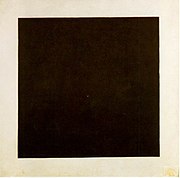
Malevich’s infamous Suprematist tryptich comes in here, the infamously geometric black square, circle and cross. The crowds did not seem to be gathering overly around these works, at least not on the day I attended. But when you see a picture of him stretched on his deathbed, the Black Square above his head in an almost all-white room, you suddenly get the sense of a man looking past this world to stare into the infinite. You would need a heart of stone not to be moved.


v) Please Patronise Us!

Another couple of photos show some of these paintings not on the walls of exhibitions but adorning the houses of their wealthy patrons, Sergei Shchukin and Ivan Morozov. These collectors shouldn’t be parodied as mere pretentious flaunters of wealth. They seem to have been keen followers of Modernism, supporting important artists (including Matisse) from early in their careers, plus they often exhibited their purchases publicly. And this was all at a time when Modernism was genuinely shocking. (It’s darkly amusing that their reward for supporting the radical arts for so many years was to have their collections “nationalised” by the Bolsheviks, as the catalogue delicately puts it.)

However it’s worth reminding ourselves how Modernist art relied upon a Medieval means of subsistence; for example both collectors employed artists to decorate panels in their mansions as well as sell them paintings. (This was perhaps part of the impetus away from painting, towards more ‘democratic’ forms such as poster design.) And it is frustrating to realise you are only hearing the sunny-side-up stories. For example, Shchukin commissioned Matisse’s Dance II to decorate his home, but got cold feet when confronted with its bawdy nature. Of course he got over this. But if he hadn’t and the work was never finished, would we ever know of it?

Nevertheless it’s a boon that the show even touches on such normally overlooked subjects, rather than presenting artists as inhabiting some higher realm than such worldly stuff. This was given an extra, unintentional fillip when descendants of the original purchasers threatened legal action to get their property back. A law had to hastily drafted to allow the exhibition to go ahead. Modernist art may point at another world. But it’s nailed to a wall in this one.

Needless to say, if I could ever visit Paris in this period I would be there in a flash. After all, it’s commonly agreed that the place to be for Modernism at this time was Paris. Well, people don’t know nothing. There’s a degree to which the rush to Paris just gained it’s own momentum – artists went to Paris because artists went to Paris. But perhaps Modernism in Russia was more like Modernism in Germany, except more so. Art was neither inspired by social events, nor sought to influence them with its rhetoric. Society seemed to be morphing before your eyes, and artists came to feel their work was fusing with social events – they saw themselves as quite literally making another world. You come out of this exhibition with an exhilarating sense not just of experimentalism but possibility. Yet of course much of that sense comes from the cut-off date of 1925. You could perhaps play a black joke and add on an extra room for radical art in the Stalinist era, then leave the space empty…

Sunday, 6 April 2008

THIS YEAR'S WEB & MINI COMIX HAUL


Getting my haul of comics home from this year’s UK Web & Mini Comix Thing, I discovered that unbeknownst to myself I had purchased only comics about seasons or comics about ghosts. I’ll post about both in turn, with a break for ice cream in the middle…

Part One: Seasons

I found Jeremy Dennis in archetypical pose, sitting behind her stall hand-sewing gold leaves into the cover of her latest offering Scattered Leaves.(Guess which season! Go on, guess!) I’ve been reading Jeremy’s comics since the dawning days of the early Nineties Oxford fanzine Stomping Scene, so I’ve been in prime position to watch how her work’s changed. She started out with quite soapy stories, most notably the studenty bed-hopping antics of Three in a Bed. But what seems to have precipitated a big change in her work was when she started drawing her on-line Weekly Strip, which then gets serialised into comics such as this one.

Jeremy told me at the Thing she often thinks up these while walking to work in the morning (in fact one strip features her doing just that), and many of them seem to take place in that hazy interchange between sleep and wakefulness. To my mind it’s like a novelist taking to poetry, with the ever-present nine panel grid working as her meter. Some strips start off with reality before departing on some strange tangent. (For example seeing a fat pigeon in her garden triggers a flubby-winged flight of fantasy.) Some are out and out strange and surreal. But even the ones taking place in the ‘real’ world never just serve up dry facts but take on a numinous aura of subjectivity. The on-line Weekly Strip may work as a galvanizing device for production, but I prefer my comics in print – and anyway I think you glean a better sense of things by reading a bunch of these.

As the stitched cover might suggest, Jeremy tends more to comics-as-art-objects than high runs. To get yourself a copy, try contacting her via the web link given above.

Before you accuse me of being seasonally obsessive, it was at Will Kirkby’s own suggestion that I picked up his Fireflies and Seasons, with its distinctly autumnal feel. One of my complaints about the Web & Mini crowd is that everyone seems so influenced by manga yet seem to suffer from such limited perspective of it. Thankfully Kirkby seems more influenced by the animistic, fable-like world of Miyazaki than by endless parades of giant robots. His style is exquisite and his sense of page design strong. My one criticism… I get the fact he’s not telling fast-paced adventure stories and his characters are no doubt supposed to look inscrutable, but could they have at least some variety in expression? You can order from Will via PayPal.

Garden Funnies describes itself as “the world’s leading horticultural sequential art anthology” and (unusually for small press publications) aims at an all-ages audience. Since fruit and veg bloom in the Autumn, I contend it fits neatly into my seasonal theme! It has some great artists (especially Richard Tingley and Alex Potts) but it’s the neatness of the package that really sells it. The pocket size suits the tone and that green spot colour really puts you in mind of things horticultural! One of the singular features of comics, after all, is the way that the design and the packaging doesn’t really separate itself from the contents in the way it would for a book or CD – they all morph together into one seamless gestalt thing! You can buy Garden Funnies online from the Samu shop, and - for anyone keen to put their produce on show - they’re also after submissions.

Behind a gloriously Wintry screenprinted cover, Hey Monkey Riot: Winter collects a full season’s worth of Edd’s daily updated online strip. (There was also an Autumn one I didn’t pick up.) It’s charmingly palatable stuff, but I would make two criticisms.

Firstly, the restrictions of a three-to-four panel format can be harder to write than longer pieces. In particular it seems to impose a kind of gag structure, two to three panels of set-up then the pay-off. Yet as Eddie Campbell (the pioneer who introduced me to autobio comics) lamented in an old Alec strip: “When you tell and retell a story you tend to streamline it, give it a dramatic shape, leave out nice little touches”. Sometimes I feel like Edd is chopping his strips into comic-book patterns rather than following life’s rhythms and undulations, surely the point of a diary strip. (I may be being unduly unfair to Edd here, reading his comic so soon after Jeremy’s, which I felt did very much the opposite.)

But if I prefer Edd’s longer comics such as Hey Monkey Riot 3 I also have another reason. Edd’s perhaps one of the few people drawing autobio comics who actually does interesting stuff! There’s less of Edd’s political activism in Winter, in fact he even describes himself as a “possibly lapsed anarchist” in the blurb! Hey Monkey Riot 3 was more interesting in detailing the trials, tribulations and (mostly) misadventures of his attending the recent anti-G8 protests in Germany. It was reminiscent of Isy’s Morgenmuffel zine, an angle on activism which is celebratory rather than polemical, yet also unafraid to point out absurdities.

You can order Edd’s comics online from the link above. He only produced fifty copies of Autumn and Winter, though, so maybe you should get moving!

From Edd’s Winter comic to Sean’s comic Ed… do try to keep up! Sean Azzopardi’s Ed 4 was the one comic actually set in Summer, perhaps a result of Sean’s deep devotion to sitting in gardens. Sean’s a great artist, and Ed an iconic-looking character, but after four issues it may be time he took Ed to pastures new. Perhaps the emphasis on Ed as an artist, battling to find motivation or follow his muse, makes things too self-referential. Again, you can by this from the online shop.

This year’s Web & Mini happened slap-bang in the middle of Easter weekend. Of course, long before Easter came to be about chocolate bunnies who died for you, it was a festival for the start of Spring. And of course setting a date for such a thing is just asking for trouble. After an absurdly mild Winter, the cold came back. It was that biting cold, the sort that seeps straight through you without bothering with ostentatious signs like snow flurries. It even hailed on me when I ventured out for sarnies and drinks, though I was more annoyed by the fact it stopped again as soon as I got back to the venue. On the train home, the rails and railway bank gleamed white against the night, as if the world had slipped into negative. By Wednesday I was back to eating my lunch sitting out in the park. When I woke up this morning, a full week after the shift to Summer time, the snow was already deep.

Comics happen in a proverbial, idealised world, never more clearly than when they set a Season. If a comic’s set in Winter, expect to see the characters sport scarves and wooly hats from one cover to the next. Autumn will always be depicted by perpetual falling leaves, as if those trees are inexhaustible. But the real world is fickle and unpredictable, where the seasons are no more set than people’s moods…

Part Two: Ghosts

Ghosts by John Allison (of Scary Go Round fame) is admittedly a slight story, nor will it win any prizes for innovation or originality. (How many comics have we had which starred two sassy-yet-ditzy gals by now?) But where it comes alive is through its charm. The tale’s described as “very mildly bone-chilling”, the ghost doesn’t even attempt to be scary but just merrily plays the trumpet all hours of the day and (more often) night. At one point we even see a beautific smile break across his face, like he just wants to be friends with the living. Were it not for the sharp and self-reflective dialogue, it would read like a children’s story. (I mean that as a compliment!)

Ultimately I came of think of the ghost as the spirit of creativity - recklessly waking the girls up with its wild and wacky notions, interrupting the cool ennui of their pop-tart-munching existence. So it’s not surprising the solution isn’t to exorcise it but find a direction for its energies… I can’t say more without heading into spoiler country!

From Girl Spy, the only other SGR comic I’ve read, I’d reckoned Allison’s art only worked in colour – it was the cheery colour sense which had really carried the artwork. So I was interested to see Ghosts was done in spot colour, yet working so well I immediately bought it. Party it worked through only being in spot colour, all shades of blue without a hint of black. (Upon my quizzing Allison admitted pinching this idea from Top Shelf comics – but a good idea is worth pinching!) But it worked mostly because Allison had abandoned the drawing tablet for the old-fashioned line, and proven himself a superb linesmith. The drawn line gives the characters such a buoyancy and life you don’t miss the full colour. On his website, Allison mentions he’s now reverted to lines on paper full time. Ghosts is available from SGR’s online shop.

I’ve picked up a handful of issues of Hope For the Future over the years and enjoyed them. It’s admittedly very post-Buffy in set-up (flippant-tongued teens encounter the supernatural), but it’s generally handled with enough wit and skill to get away with it. Here for example one gang member is told to dress up for a Nineties rock night; only when he turns up in his flannel shirt does he find they’re actually travelling back ten years in time.

The earlier issues I’d picked up had been drawn by scripter Simon Perrins himself, in a cartoony but rounded and semi-realistic style. Issue 7, however, is drawn by Andrew Livesy in a more stylized fashion – an assortment of angular lines, almost reminiscent of Dylan Horrocks. Despite the slightly jarring feature of the cover being in the original style, the new look lends itself to the story quite quickly and you follow the characters even though they’re now depicted so differently. This is partly because of the reader’s ability to accept the ‘reality’ of quite stylized work, but perhaps mostly because Livesy’s work is so strong. The full-page reality-bending montage panels are particularly effective. Checking the website I note the comic’s actually up to issue 10, suggesting it was Livesy’s art which caught my eye.

Being someone who has to work in at least one complaint, I’ll mention the fact that some panels are far too wordy. To avoid covering up too much artwork they instead shrink down the text, but this just makes it hard to read! This may be something to do with Perrins surrendering the art chores, as earlier issues didn’t suffer from this. Anyway the flaw is frustrating partly through its pointlessness, Perrins is a sharp writer with no need to hide behind verbosity.

Hope For the Future is yet another title to have it’s own online shop malarkey.

Knuckles the Malevolent Nun is a collection by Cornelius Stone and (mostly) Roger Langridge. It’s material from the can, so that kind of makes it a ghost, doesn’t it? Its superlative stuff, with the only criticism that I could possibly make is that Langridge’s more recent stuff is even better, so this now doesn’t look quite as good! If you need a starting point,check out Fred the Clown and check his progress back to Knuckles. Knuckles is ceaselessly inventive in a crazy, Goonish way but there can be something almost too frenetic about it, like the ideas were coming out so fast they were bashing into each other. With Fred it’s like Langridge became the master of his ever-powerful imagination…

Guess what? You can buy this online! Whatever did I ever go out in that freezing hailstorm for?

Douglas Noble describes his new issue of Strip For Me, A Man of Certain Talents, thusly: “It’s a puzzle about identity, set in a world without names. Where no answers are supplied and the questions are left unsaid.” I expect ghosts come into it somewhere… Like most of his comics I couldn’t really tell you what this is actually about, in fact I often find the more I think about them the more elusive they become. It’s the sort of thing where you’re better off savouring the mystery than trying to come up with a ‘solution’. Two quick comments about Noble’s work! First, there’s much more skilful artists in the world but Noble’s a skilful creator who can use his relatively limited chops highly evocatively. For example, he captures movement poorly but devises stories where that seeming limitation just doesn’t matter. And second I find his stuff always works better in issue-length stories, like here, rather than in shorter snippets. Inevitable webshop link here.

While I didn’t manage one new comic for the Thing, Paul O’Connell of The Sound of Drowning has to go and upstage me with two – without even turning up himself! Love is War was a cool strip in an even cooler package, but what really grabbed me was the mini She’s Leaving Home with art by Lawrence Elwick. I’d previously only seen a few examples of Elwick’s work at a comics show in a local Brighton gallery, but judging by this comic he’s got great things ahead of him! The art reminds me, not so much in linework as in storytelling, of some of Glibert Hernandez’s stuff- the combination of cartooniness and childlike perspectives, yet with an undercurrent of menace. And as someone who’s frequently been asked “what, you make up words for the balloons?” I always love it when someone scripts a silent comic!

Like most comics from The Sound of Drowning stable, apparently these comics come in limited editions. They aren’t on the inevitable online shop yet, but keep an eye out…

This is probably quite a random selection based on my meanderings throughout the day, on brief excursions from behind my own stall. I definitely saw other things I meant to pick up, but somehow the fates conspired…

Thankfully there seems to be a tumult of similar-flavoured events coming up guaranteed to empty your pockets of change and clutter your bedroom! ScissorsPaperStone (12th April) is an artist’s book fair, but I know Sound of Drowning at least will have a table there – and, as said several times above, there’s only the thinnest of lines between the two things. I’ll be staffing tables at both the London Zine Symposium (April 27th) and the Artists Books Fair in Brighton (24th May), so if you’re passing say hello. Then the ever-reliable Caption convention will be back on 9th and 10th August. Of course the year is yet young, so we may even see more…