googlee7ea825f63edb3f6.html

Thursday 17 April 2008

FROM RUSSIA

French and Russian Master Paintings from Moscow and St Petersberg 1870-1925
Royal Academy 26th Jan-18th April (...yep, another exhibition I manage to review just as it closes!)


i) Modernism At Home and Abroad

That two-word title, the very thing which initially seemed doubtful about this exhibition, turns out to be it’s main source of strength. This isn’t Russian art but art “from Russia”; the disgorged collections of four museums from Moscow and St Petersberg. The poster boy for the show is not a Russian painting at all, but Matisse’s Dance II! The place where a bunch of paintings happened to get stuck after the Bolshevik takeover, doesn’t that sound like a somewhat arbitrary rationale for a show? An exhibition isn’t an illustrated essay, but neither is it pretty wallpaper. Shouldn’t it have some meaning and shape?

Admittedly it means omissions, some of which even an amateur like myself can spot. (Can you really have a Russian art show from this era without Mayakovsky or Rodchenko?) But, however arrived at, the chance to compare the Paris-based with the Russian artists throws both into relief, and even gives you something of a sense of what it must have been to be a Modernist artist in Russia at this time.

For one thing it impresses upon you how, in a world before colour photography, it was important where paintings ended up. It’s commonly agreed that the place to be for Modernism at this time was Paris. Those bohemians may well have been going hungry in their Notre Dame garrets, but culturally they couldn’t have been more sated! And this sense may have been more emphasised for the Russians than other foreign visitors. Modernism often quite consciously manifestoed itself as art for the modern condition. But unlike progressive France, its cities decorated with gleaming metal towers, Russia was quite definitely tailgating the transition from feudalism to capitalism. It’s Modernists weren’t reacting to something, they were trying to create it.

Of course even in the early Twenties Paris wasn’t off limits to Russian artists; despite the distance many went to study (or even live) there. But the pictures you saw there from thereon lived only in your memory, they weren’t on instant access as they would be today. When you read that, for example, Udaltsova created a copy of a Cubist Picasso for study, you get a sudden sense of time and place. When the artists’ group Jack of Diamonds organized exhibitions of French art, it’s reminiscent of the way before video budding directors formed film societies - the only way to see many movies then was to show them.

But the main sense you get as you walk these rooms comes from counting the limited number of French works,- then seeing their motifs being endlessly taken up, copied and referenced by the Russians. (For example Mashkov’s skittish mash-up of Cezanne’s Girl at the Piano). Perhaps it was like being a musician in late Fifties Liverpool; no-one plays R&B on the radio, shop rarely stock it, you can only pick the records up through random encounters with sailors. The music which does come you way you then inevitably fetishise.

… which inevitably works to your advantage. Sometimes the place to be is where everyone else is. But if what you want to do is something different, the crowd isn’t really the place. Even when, like Udaltsova, you try to copy something foreign you inevitably end up changing it. And if the picture you’re copying is essentially incomplete, as you can only access a limited number of the works, this effect is enhanced. Russian modernism was seeded by these paintings from France, but what came to birth was new hybrids and variants such as Neo-Primitivism and Cubo-Futurism.

ii) Modernist Folk

But of course the creative explosion in Russian art in this period can’t be reduced to distance alone. There’s a paradox afoot where the artists here saw themselves as a Modernist outpost in a sea of semi-feudalism, yet at the same time drew from a domestic wellspring of inspiration. Of course this paradox is in some ways inherent to Modernism, simultaneously looking forward while venerating the primitive. Yet ironically Modernism’s access to the primitive mostly came from the treasures of colonialism, the tribal masks of Picasso coming from France’s African colonies. Russia’s treasures, conversely, were domestic.

As Ann Dumas puts it in the catalogue “Russian artists were becoming increasingly conscious of their national artistic heritage. The cheap, popular woodcut prints (lubki), toys, painted trays, fairground hoardings and shop signs of Russian folk art, as well as icons, became new invigorating sources of inspiration.” This was perhaps a consequence of Russia’s unique status in Europe, it’s vast size and still-near-feudal relations in the countryside. (Perhaps a similar argument could be made for Mexico.)

There even seem to have been attempts to break out of the urbanity of Moscow and St Petersberg into the Russian heartlands. As early as 1870 the Society for Travelling Art Exhibitions (soon known more catchily at the Wanderers) were literally trying just that. I don’t know if they made it as far as the Kamchatka peninsula, but the idea’s a cool one. (Later Mayaokovsky was taking muralled-up trains around the country as mobile art exhibitions, but that doesn’t get a mention here.)

If these folk roots gave Russian Modernism much of its vibrancy, perhaps it also weighted its approach to a classic Modernist dilemma. Though Modernism was in general left-leaning, it was often pitched upon the conflict between the individualist and the collective. Perhaps Expressionism, with its emphasis upon capturing the subjectivity of experience, was Modernism at its most individualist. But most works on show here suggest Russian art was inclining towards the collective.

Perhaps the political context also comes in here. From Repin’s celebratory 17 October 1905 onwards, we’re reminded how it was not France but Russia which was politically cutting edge. From 1917 Russia suddenly felt a new country (in both senses), and an uneasy state tolerance of radical arts was perhaps misread as encouragement. (All of which is of course slid over by this exhibition.)


iii) Join the Dance

Ironically, perhaps the main exemplifier of this on show is the French poster boy itself - Matisse’s Dance II. It’s true that the picture owes much of its impact to its colour sense, as limited as it is vivid. In his later years Matisse worked only through tearing and shaping coloured card, and the roots of that style are visible here. However, the limitations of only seeing this work through its colour scheme are shown later in the exhibition, by one Russian work which is nothing but an inferior copy. Kuzma Pretrov-Vodkin’s The Playing Boys (painted two years later in 1911) duplicates it like a covers band copying the same chords – but getting nothing of the sense.

In a fitting phrase the exhibition describes the “radical simplifications” of Matisse’s figurework. The figures don’t just hold hands so much as form a circle, as if the composition has caught them at some midpoint in shedding their individual shape. Only one of them seems to have a face left, and that is the most basic cartoon arrangement of features. The circle itself is not geometic but loose, flowing and ululating. The figures combine with the colour scheme in a very simple image, yet you feel if you added or took anything away the whole thing would come crashing down. It’s a Bacchic paen to the loss of self, and the invitation to us is to join in and step inside… (Tellingly it was nearly destroyed for its “decadence”, not when painted but during the Stalinist era.)


iv) Let No Painting Be Our Master

There’s a stock point in these exhibition reviews where I complain about the focus on painting. This is something akin to my complaining when superhero films contain plot holes or prices go up at Christmas. It’s doubly disappointing when so much Russian art was moving away from painting; into posters, photomontage, film and theatre design or Constructivist works, to see a show subheaded “master paintings”. There seem to have been two broad approaches. Diaghilev of Ballets Russes, an important svengali in visual arts, staged “productions in which music, choreography and design were fused.” This is akin to Susan Sontag’s theory of Syaenthesis, where all works of art would come together into one. Meanwhile Tatlin’s Constructivism sought not to fuse the arts with each other but press them into the service of design and engineering, to “take control of the forms encountered in everyday life.”

(Albeit with mixed success.Tatlin’s Corner Counter-Relief makes much of using ‘proletarian’ materials such as rope and wire. But it just reminds you of trustafarians appropriating ‘workers” clothes, such as dungarees and cloth caps when they want to look rebellious. Tatlin went on to reject painting as inherently ‘bourgeois’, but ironically his paintings outshine this effort.)

Of course, while all this is sometimes alluded to, we can’t expect any more from the stuffy Victorian Academy…

…actually, they do a few things. A room is given over to Tatlin’s Monument to the Third International (what everyone calls the ‘Tatlin Tower’.) The labels even make a sly comment about it being planned as taller than the Eiffel Tower, suggesting something of a pissing contest. But they mostly attempt to fill in the gaps with blow-up photos - of contemporary exhibitions, film or theatre designs and costumes etc. These aren’t adequate but do achieve a surprising amount in bringing the work to life, in one case changing your response to it almost entirely.

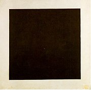
Malevich’s infamous Suprematist tryptich comes in here, the infamously geometric black square, circle and cross. The crowds did not seem to be gathering overly around these works, at least not on the day I attended. But when you see a picture of him stretched on his deathbed, the Black Square above his head in an almost all-white room, you suddenly get the sense of a man looking past this world to stare into the infinite. You would need a heart of stone not to be moved.


v) Please Patronise Us!

Another couple of photos show some of these paintings not on the walls of exhibitions but adorning the houses of their wealthy patrons, Sergei Shchukin and Ivan Morozov. These collectors shouldn’t be parodied as mere pretentious flaunters of wealth. They seem to have been keen followers of Modernism, supporting important artists (including Matisse) from early in their careers, plus they often exhibited their purchases publicly. And this was all at a time when Modernism was genuinely shocking. (It’s darkly amusing that their reward for supporting the radical arts for so many years was to have their collections “nationalised” by the Bolsheviks, as the catalogue delicately puts it.)

However it’s worth reminding ourselves how Modernist art relied upon a Medieval means of subsistence; for example both collectors employed artists to decorate panels in their mansions as well as sell them paintings. (This was perhaps part of the impetus away from painting, towards more ‘democratic’ forms such as poster design.) And it is frustrating to realise you are only hearing the sunny-side-up stories. For example, Shchukin commissioned Matisse’s Dance II to decorate his home, but got cold feet when confronted with its bawdy nature. Of course he got over this. But if he hadn’t and the work was never finished, would we ever know of it?

Nevertheless it’s a boon that the show even touches on such normally overlooked subjects, rather than presenting artists as inhabiting some higher realm than such worldly stuff. This was given an extra, unintentional fillip when descendants of the original purchasers threatened legal action to get their property back. A law had to hastily drafted to allow the exhibition to go ahead. Modernist art may point at another world. But it’s nailed to a wall in this one.

Needless to say, if I could ever visit Paris in this period I would be there in a flash. After all, it’s commonly agreed that the place to be for Modernism at this time was Paris. Well, people don’t know nothing. There’s a degree to which the rush to Paris just gained it’s own momentum – artists went to Paris because artists went to Paris. But perhaps Modernism in Russia was more like Modernism in Germany, except more so. Art was neither inspired by social events, nor sought to influence them with its rhetoric. Society seemed to be morphing before your eyes, and artists came to feel their work was fusing with social events – they saw themselves as quite literally making another world. You come out of this exhibition with an exhilarating sense not just of experimentalism but possibility. Yet of course much of that sense comes from the cut-off date of 1925. You could perhaps play a black joke and add on an extra room for radical art in the Stalinist era, then leave the space empty…

Sunday 6 April 2008

THIS YEAR'S WEB & MINI COMIX HAUL


Getting my haul of comics home from this year’s UK Web & Mini Comix Thing, I discovered that unbeknownst to myself I had purchased only comics about seasons or comics about ghosts. I’ll post about both in turn, with a break for ice cream in the middle…

Part One: Seasons

I found Jeremy Dennis in archetypical pose, sitting behind her stall hand-sewing gold leaves into the cover of her latest offering Scattered Leaves.(Guess which season! Go on, guess!) I’ve been reading Jeremy’s comics since the dawning days of the early Nineties Oxford fanzine Stomping Scene, so I’ve been in prime position to watch how her work’s changed. She started out with quite soapy stories, most notably the studenty bed-hopping antics of Three in a Bed. But what seems to have precipitated a big change in her work was when she started drawing her on-line Weekly Strip, which then gets serialised into comics such as this one.

Jeremy told me at the Thing she often thinks up these while walking to work in the morning (in fact one strip features her doing just that), and many of them seem to take place in that hazy interchange between sleep and wakefulness. To my mind it’s like a novelist taking to poetry, with the ever-present nine panel grid working as her meter. Some strips start off with reality before departing on some strange tangent. (For example seeing a fat pigeon in her garden triggers a flubby-winged flight of fantasy.) Some are out and out strange and surreal. But even the ones taking place in the ‘real’ world never just serve up dry facts but take on a numinous aura of subjectivity. The on-line Weekly Strip may work as a galvanizing device for production, but I prefer my comics in print – and anyway I think you glean a better sense of things by reading a bunch of these.

As the stitched cover might suggest, Jeremy tends more to comics-as-art-objects than high runs. To get yourself a copy, try contacting her via the web link given above.

Before you accuse me of being seasonally obsessive, it was at Will Kirkby’s own suggestion that I picked up his Fireflies and Seasons, with its distinctly autumnal feel. One of my complaints about the Web & Mini crowd is that everyone seems so influenced by manga yet seem to suffer from such limited perspective of it. Thankfully Kirkby seems more influenced by the animistic, fable-like world of Miyazaki than by endless parades of giant robots. His style is exquisite and his sense of page design strong. My one criticism… I get the fact he’s not telling fast-paced adventure stories and his characters are no doubt supposed to look inscrutable, but could they have at least some variety in expression? You can order from Will via PayPal.

Garden Funnies describes itself as “the world’s leading horticultural sequential art anthology” and (unusually for small press publications) aims at an all-ages audience. Since fruit and veg bloom in the Autumn, I contend it fits neatly into my seasonal theme! It has some great artists (especially Richard Tingley and Alex Potts) but it’s the neatness of the package that really sells it. The pocket size suits the tone and that green spot colour really puts you in mind of things horticultural! One of the singular features of comics, after all, is the way that the design and the packaging doesn’t really separate itself from the contents in the way it would for a book or CD – they all morph together into one seamless gestalt thing! You can buy Garden Funnies online from the Samu shop, and - for anyone keen to put their produce on show - they’re also after submissions.

Behind a gloriously Wintry screenprinted cover, Hey Monkey Riot: Winter collects a full season’s worth of Edd’s daily updated online strip. (There was also an Autumn one I didn’t pick up.) It’s charmingly palatable stuff, but I would make two criticisms.

Firstly, the restrictions of a three-to-four panel format can be harder to write than longer pieces. In particular it seems to impose a kind of gag structure, two to three panels of set-up then the pay-off. Yet as Eddie Campbell (the pioneer who introduced me to autobio comics) lamented in an old Alec strip: “When you tell and retell a story you tend to streamline it, give it a dramatic shape, leave out nice little touches”. Sometimes I feel like Edd is chopping his strips into comic-book patterns rather than following life’s rhythms and undulations, surely the point of a diary strip. (I may be being unduly unfair to Edd here, reading his comic so soon after Jeremy’s, which I felt did very much the opposite.)

But if I prefer Edd’s longer comics such as Hey Monkey Riot 3 I also have another reason. Edd’s perhaps one of the few people drawing autobio comics who actually does interesting stuff! There’s less of Edd’s political activism in Winter, in fact he even describes himself as a “possibly lapsed anarchist” in the blurb! Hey Monkey Riot 3 was more interesting in detailing the trials, tribulations and (mostly) misadventures of his attending the recent anti-G8 protests in Germany. It was reminiscent of Isy’s Morgenmuffel zine, an angle on activism which is celebratory rather than polemical, yet also unafraid to point out absurdities.

You can order Edd’s comics online from the link above. He only produced fifty copies of Autumn and Winter, though, so maybe you should get moving!

From Edd’s Winter comic to Sean’s comic Ed… do try to keep up! Sean Azzopardi’s Ed 4 was the one comic actually set in Summer, perhaps a result of Sean’s deep devotion to sitting in gardens. Sean’s a great artist, and Ed an iconic-looking character, but after four issues it may be time he took Ed to pastures new. Perhaps the emphasis on Ed as an artist, battling to find motivation or follow his muse, makes things too self-referential. Again, you can by this from the online shop.

This year’s Web & Mini happened slap-bang in the middle of Easter weekend. Of course, long before Easter came to be about chocolate bunnies who died for you, it was a festival for the start of Spring. And of course setting a date for such a thing is just asking for trouble. After an absurdly mild Winter, the cold came back. It was that biting cold, the sort that seeps straight through you without bothering with ostentatious signs like snow flurries. It even hailed on me when I ventured out for sarnies and drinks, though I was more annoyed by the fact it stopped again as soon as I got back to the venue. On the train home, the rails and railway bank gleamed white against the night, as if the world had slipped into negative. By Wednesday I was back to eating my lunch sitting out in the park. When I woke up this morning, a full week after the shift to Summer time, the snow was already deep.

Comics happen in a proverbial, idealised world, never more clearly than when they set a Season. If a comic’s set in Winter, expect to see the characters sport scarves and wooly hats from one cover to the next. Autumn will always be depicted by perpetual falling leaves, as if those trees are inexhaustible. But the real world is fickle and unpredictable, where the seasons are no more set than people’s moods…

Part Two: Ghosts

Ghosts by John Allison (of Scary Go Round fame) is admittedly a slight story, nor will it win any prizes for innovation or originality. (How many comics have we had which starred two sassy-yet-ditzy gals by now?) But where it comes alive is through its charm. The tale’s described as “very mildly bone-chilling”, the ghost doesn’t even attempt to be scary but just merrily plays the trumpet all hours of the day and (more often) night. At one point we even see a beautific smile break across his face, like he just wants to be friends with the living. Were it not for the sharp and self-reflective dialogue, it would read like a children’s story. (I mean that as a compliment!)

Ultimately I came of think of the ghost as the spirit of creativity - recklessly waking the girls up with its wild and wacky notions, interrupting the cool ennui of their pop-tart-munching existence. So it’s not surprising the solution isn’t to exorcise it but find a direction for its energies… I can’t say more without heading into spoiler country!

From Girl Spy, the only other SGR comic I’ve read, I’d reckoned Allison’s art only worked in colour – it was the cheery colour sense which had really carried the artwork. So I was interested to see Ghosts was done in spot colour, yet working so well I immediately bought it. Party it worked through only being in spot colour, all shades of blue without a hint of black. (Upon my quizzing Allison admitted pinching this idea from Top Shelf comics – but a good idea is worth pinching!) But it worked mostly because Allison had abandoned the drawing tablet for the old-fashioned line, and proven himself a superb linesmith. The drawn line gives the characters such a buoyancy and life you don’t miss the full colour. On his website, Allison mentions he’s now reverted to lines on paper full time. Ghosts is available from SGR’s online shop.

I’ve picked up a handful of issues of Hope For the Future over the years and enjoyed them. It’s admittedly very post-Buffy in set-up (flippant-tongued teens encounter the supernatural), but it’s generally handled with enough wit and skill to get away with it. Here for example one gang member is told to dress up for a Nineties rock night; only when he turns up in his flannel shirt does he find they’re actually travelling back ten years in time.

The earlier issues I’d picked up had been drawn by scripter Simon Perrins himself, in a cartoony but rounded and semi-realistic style. Issue 7, however, is drawn by Andrew Livesy in a more stylized fashion – an assortment of angular lines, almost reminiscent of Dylan Horrocks. Despite the slightly jarring feature of the cover being in the original style, the new look lends itself to the story quite quickly and you follow the characters even though they’re now depicted so differently. This is partly because of the reader’s ability to accept the ‘reality’ of quite stylized work, but perhaps mostly because Livesy’s work is so strong. The full-page reality-bending montage panels are particularly effective. Checking the website I note the comic’s actually up to issue 10, suggesting it was Livesy’s art which caught my eye.

Being someone who has to work in at least one complaint, I’ll mention the fact that some panels are far too wordy. To avoid covering up too much artwork they instead shrink down the text, but this just makes it hard to read! This may be something to do with Perrins surrendering the art chores, as earlier issues didn’t suffer from this. Anyway the flaw is frustrating partly through its pointlessness, Perrins is a sharp writer with no need to hide behind verbosity.

Hope For the Future is yet another title to have it’s own online shop malarkey.

Knuckles the Malevolent Nun is a collection by Cornelius Stone and (mostly) Roger Langridge. It’s material from the can, so that kind of makes it a ghost, doesn’t it? Its superlative stuff, with the only criticism that I could possibly make is that Langridge’s more recent stuff is even better, so this now doesn’t look quite as good! If you need a starting point,check out Fred the Clown and check his progress back to Knuckles. Knuckles is ceaselessly inventive in a crazy, Goonish way but there can be something almost too frenetic about it, like the ideas were coming out so fast they were bashing into each other. With Fred it’s like Langridge became the master of his ever-powerful imagination…

Guess what? You can buy this online! Whatever did I ever go out in that freezing hailstorm for?

Douglas Noble describes his new issue of Strip For Me, A Man of Certain Talents, thusly: “It’s a puzzle about identity, set in a world without names. Where no answers are supplied and the questions are left unsaid.” I expect ghosts come into it somewhere… Like most of his comics I couldn’t really tell you what this is actually about, in fact I often find the more I think about them the more elusive they become. It’s the sort of thing where you’re better off savouring the mystery than trying to come up with a ‘solution’. Two quick comments about Noble’s work! First, there’s much more skilful artists in the world but Noble’s a skilful creator who can use his relatively limited chops highly evocatively. For example, he captures movement poorly but devises stories where that seeming limitation just doesn’t matter. And second I find his stuff always works better in issue-length stories, like here, rather than in shorter snippets. Inevitable webshop link here.

While I didn’t manage one new comic for the Thing, Paul O’Connell of The Sound of Drowning has to go and upstage me with two – without even turning up himself! Love is War was a cool strip in an even cooler package, but what really grabbed me was the mini She’s Leaving Home with art by Lawrence Elwick. I’d previously only seen a few examples of Elwick’s work at a comics show in a local Brighton gallery, but judging by this comic he’s got great things ahead of him! The art reminds me, not so much in linework as in storytelling, of some of Glibert Hernandez’s stuff- the combination of cartooniness and childlike perspectives, yet with an undercurrent of menace. And as someone who’s frequently been asked “what, you make up words for the balloons?” I always love it when someone scripts a silent comic!

Like most comics from The Sound of Drowning stable, apparently these comics come in limited editions. They aren’t on the inevitable online shop yet, but keep an eye out…

This is probably quite a random selection based on my meanderings throughout the day, on brief excursions from behind my own stall. I definitely saw other things I meant to pick up, but somehow the fates conspired…

Thankfully there seems to be a tumult of similar-flavoured events coming up guaranteed to empty your pockets of change and clutter your bedroom! ScissorsPaperStone (12th April) is an artist’s book fair, but I know Sound of Drowning at least will have a table there – and, as said several times above, there’s only the thinnest of lines between the two things. I’ll be staffing tables at both the London Zine Symposium (April 27th) and the Artists Books Fair in Brighton (24th May), so if you’re passing say hello. Then the ever-reliable Caption convention will be back on 9th and 10th August. Of course the year is yet young, so we may even see more…