In the world of my mind this post would have gone up straight after the Academy’s ‘Revolution: Russian Art’ show, rather than four months later. My planning it seems is scarcely any better than Stalin’s. But on the upside it does mark my starting to catch up on my art exhibition reviews. As an added inducement to the reader, this time each section… yes, really, each section… has it’s own opening quote, and not all of them are by Mayakovsky.

“The streets shall be our brushes, and the squares our palettes.”
- Vladimir Mayakovsky
On The Up
“Hey, you! Heaven! Off with your hat! I am coming!”
-Mayakovsky
Let’s cheat completely by starting with a work from another show – a film-clip from Friedrich Ermler’s ‘Fragment of an Empire’ (1921), shown in the Academy’s ’Revolution: Russian Art’. A solider is shown returning from the front to Petrograd. Almost like Rip Van Winkle, the long-bearded man arrives in a futuristic scenario which bewilders him.
To borrow from the show’s title, propaganda this film surely was. But was it not revolution but simply a lie, a mask for brute realities? In fact the truth... the actual truth of these times is more complicated. And so, inevitably, was the art.
This show is based around six unrealised architectural projects, all intended for Moscow. (Which had become the Russian capital shortly after the revolution.) This takes it somewhere different to the Academy’s ‘Building the Revolution’ exhibition, which was concerned with the history of buildings which had survived.
In exhibition book Jean-Louis Cohen’s essay ‘Lissitzky’s “Amerikanizm”’ describes El Lissitzky’s role as a “travelling salesman” between East and West. It also reprints an essay of Lissitzky’s own, titled ‘”Amerikianism” in European Architecture’ (1925).
America was a New World country which had largely pioneered the use of skyscrapers, greatly influencing Russian architects. But it was also an avowedly capitalist nation which refused to recognise the Soviet Union, which through the White Armies had actively tried to destroy it. Arguably, Lissitzky tries to square this circle when he insists “Europe today is more American than America itself”.
And being more American than America of course largely meant being bigger than America, bigger being simply another word for better. The pissing contest of the Cold War is already here in earnest. The Palace of the Soviets, for example, was not only designed to be the tallest building in the world (stealing the crown from the Empire State Building), but to be topped by a hundred metre statue of Lenin – despite the fact that the Moscow climate would mostly obscure it with clouds. A full-size reproduction of one of the fingers, four metres tall, is somewhat surreally on show. One section of the show is appropriately titled ’Colonizing the Sky’.
Yet if this show merely recorded the to’s and fro’s between two super-powers, which didn’t even divide in aesthetics much let alone ideology, it would be of academic interest only. Happily, that’s not the case…

We’re told skyscrapers were then often called “cloud pressers”. (Though not whether this was local to Russia or not.) And even that minor variant of the term is enough to revitalise the metaphor in your mind. For example Lissitzky’s ‘cloud iron’ buildings (above) have a distinct, megalith shape distinct from the geometric block or tapering tower we’re so used to. But that just leads us into the most significant thing about them...
He conceived of a ring of these around Moscow, people living up above while the street level was reserved for transit and communications. The city was to be not an accumulation of places which happened to be clustered together, but as a set of connecting nodes.
Meanwhile, ’The Problem of the Scientific Organisation of Life’ by Nikolay Kuzmin not only designed a model miners’ apartment house but broke down their day into blocks, some as short as two minutes. Or at least from rising at 6am to 5.25pm after which he indulgently decreed “from here life dictates it’s own timetable”. Worker’s lodgings are no longer a refuge from, but an adjunct to the workplace. They helpfully wake you up in the morning and switch your lights out at night. They regulate your non-working hours almost as thoroughly as your working ones.
Two conceptions seem at work, which are surely rivals. One is based around not just the workers taking over the existing Moscow, but building an entirely new Moscow better adapted to their needs. The city becomes almost a kind of steel exoskeleton built at their arms and legs. With the other, the new architecture is more a mould in which the worker is poured to shape him. Contemporary Architecture magazine called for new buildings “that creates new social types” (1928).
The human body is itself likened to a machine, the USSR Conference on Workers’ Vacations stating “like a machine a person needs repair and recuperation: socialist leisure restores the proletarian machine-body.” Recuperative Health Factories were to be built, such as the one Sokalov designed for tired Muscovites by the Black Sea. It’s scarcely uncoincidental that infographic reductions of the human form, not previously widely seen, become common. If the world was to be transformed man must be too, and in art at least transformed physically, made by tools into a tool.
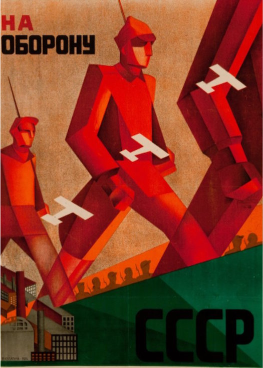
And this is perhaps at it’s clearest in Valentina Kulagina’s poster ‘To The Defence of the USSR’ (1931, above), in which robotised figures march dynamically out of the frame. They could even be produced in that factory on the lower left, along with their planes and guns. These are salutary reminders that true dystopias are all failed utopias.
Perhaps armed with our knowledge of what came next, we cannot help but notice the distinction which we perceive as a clash. For example Rowan Moore’s Guardian review commented on how “designs of wild ambition combine with homages to science and pedantic prescriptions for dividing up a worker’s day.” But it’s a distinction which, largely speaking, we make that they didn’t. And we make it precisely because for us it’s happened, because we can look back on it. (This of course cycles back to what was said about the Revolution in the Academy show write-up.)
Architecture as Fantasy, Science As Fiction
By setting itself in Moscow the show bypasses the era's most famous example of unrealised architecture, the Tatlin Tower (which was intended for Petrograd). And this lays the ground for Tatlin’s influence over the show to be exceeded by that of his arch-rival, Malevich. Yet that happens in a surprising way…
One day I was confidently explaining that Malevich was unable to realise his Suprematist visions in three dimensional space, that threshold tableware wasn’t really a thing. Then pretty much the next show I see, and El Lissitzky is doing it like he doesn’t even see the problem. And in so doing he came to influence both the Bauhaus and De Stijl. This is perhaps at it’s most pronounced in his children’s book ’Of Two Squares: A Suprematist Tale’ (1922) where he anthropomorphises those two squares (after Malevich, one black, one red) into a narrative. It’s an indication of how little we need images to contain for us to ‘read’ them.


But more significant here are his diagrammatic, geometric Prouns (Project for the Affirmation of the New, the acronym works in Russian). These demonstrate how artworks and architectural diagrams overlap to the point where it’s impossible to see the joins. Compare his lithograph ‘Proun 1E (The City)’ (1919) to Gustav Klutski’s ‘Architectural Study’ (1921/2, both above). (A 3D version of the Proun is also on show, though made by Henry Milner in 2009.)
But then Suprematism, even in its ‘pure’ rarified form suggested motion and often pictorial depth, even when it lacked an actual Z axis. In the guidebook, Eszther Steierhoffer describes Malevich’s art as “implying a sensation of levitation”. The disciples were merely going where the master couldn’t follow, taking up his dynamic forms more than the heraldic black square he used in place of a signature. Take for example Ilya Chashnik’s ‘Vertical Axes in Motion’ (1922/3, below).

Chashnik also demonstrates how recurrent verticality is here, the indicia remarking on “aviation motifs featuring prominently.” The show is so stuffed with audaciously imaginative but unsurprisingly unrealised projects it would be hard to sort them, but a favourite of mine was Seregy Gruzenberg’s proposal for a ‘Columbus Flying Monument’ (1923) an aerial sculpture which, while huge in size, would have drifted around the Earth like a stray balloon.

The notion this verticality can become literally gravity defying, already incipient in the flat iron buildings, can be seen in spades in two photo-collages. In Rodchenko’s ’Circus Acrobats’ (1938, above) two trapeze artists appear in the heavens, past a rocket ship. While in Piotr Gladzhev’s photocollage ’Female Tennis Players’ (1924), the players look as though they’ve leapt up into the sky. Though I could only find an image for Rodchenko, Gladzhev may be the more radical. If one figure stands on the wing of a plane, the image still feels as though they have hurled themselves up to this height. It’s as if the more more involved they grew in their game, they less connected they became to the ground. It’s an image of dizzying exhilaration.
(Like the cloud-pressing skyscrapers, these images may belong to their era as much as their place. In America, Phoebe Jane Fairgrave – among others - would wow audiences not just by wing-walking but dancing the Charleston while up there. But the notable thing is how readily they do fit into their place.)
And this new architecture of verticality might remind us of the ‘future city’ of science fiction. Given that one of Russia’s main proto-revolutionary art movements was called Futurism, we might expect to see some of the futuristic side of science fiction here. But alongside such techno-fetishism its cosmic dimension is also present, whose concerns are almost – and sometimes literally become – eschatological.

For example Ivan Ledinov’s ’City of the Sun’ series, with their clusters of elegantly slender towers which may or may not be mirages, seem to exist in the interchange between Suprematism and science fiction. (See ’City of the Sun, Distant View’, 1943/59, above.) Some are painted simply on plain board, as if a form of science fiction folk art. Yet for all his spaciness, Ledinov still contributed designs for buildings -including the Lenin Institute and even the United Nations Building.
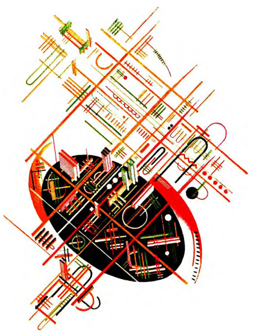
While in 1933 Yakov Chernikhov produced a book self-styled as ’101 Architectural Fantasies’. Some might have been vaguely realisable, at least to the degree that they vaguely resembled buildings. With others, such as No 57 (above), ‘architectural’ might seem merely a synonym for geometric. Certainly it looks as influenced by Kandinsky as by Malevich. Yet while Chernikhov made no architectural designs he produced a book on design theory. There’s also a slideshow of entries for the design of the 1924 Lenin Mausoleum, which show a huge variety not only in styles and approaches but in attitudes to viability. Not a few we’d regard as outsider art.
Why should this be? Why, when the period finally granted so many opportunities to build did people stick with paper fantasies? Why, when it threw up so many immediate problems, when bellies so often rumbled, did people seem so unconcerned with even making a division between the practical and the fantastical?
Of course this question takes us back to Malevich. As said of his Tate retrospective “he was tapping into some heightened realm of pure geometry, something which could only exist through being painted – but was no less 'real' for all that. His term Suprematism does not relate to 'superb' but 'above' or 'beyond'.”
Take that titular term ‘imagine’. It may conjure up images of John Lennon at his grand piano, of the innocently well-meaning, as hopeless as they were hopeful. Yet the crucial thing was that the chains that tied us to the old world were finally broken. Now we were living in the future, today was already tomorrow. What wasn’t possible immediately was sure to be so soon.
We had brought an end to capitalism in order to stop merely imagining and start building, but it was more than that – we meant to unfetter our imaginations. This wasn’t an end to dreaming, it was the start of dreaming. “Demand the impossible” and “let imagination rise to power” were not Russian revolutionary slogans, they arose later. But their sentiment is widespread here regardless.
Making New Men + Women
“The proletariat must destroy the family as a prime device of oppression and exploitation”
-Nikolay Kuzmin, 1928
One of the most recognised icons of post-revolutionary Russia, perhaps second only to the Hammer and Sickle, is the muscled man in a cap brandishing a lump hammer. And the veneration of that strapping male worker can be quite unguardedly homoerotic. Mayakovsky, always able to sum things up in a choice quote, insisted in ‘27 “there is no more beautiful clothing in the world than the bronze of muscles and freshness of skin.” Which normally goes only one way. Traditionally in art the more man is associated with the machine, which was at least in part about making him appear ‘manly’, the more women are with nature.
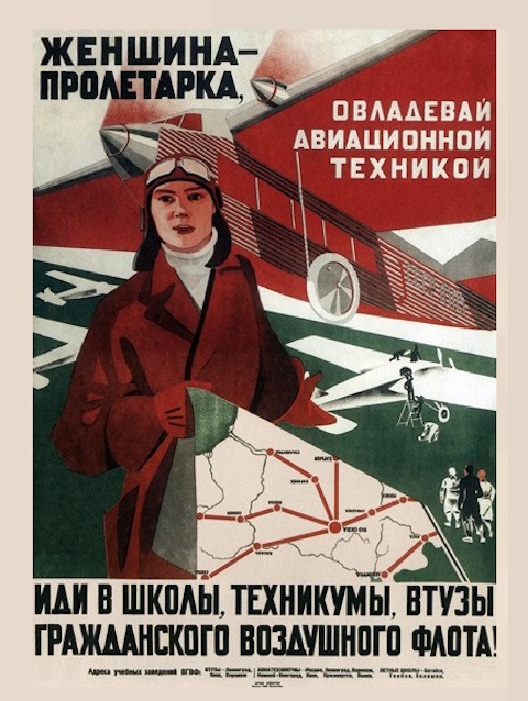
Yet here we see the very opposite. My guess would be that, is out of any Modernist movement, Russian Futurism had the highest number of women artists. And their work was often explicitly liberational. Maria Bri-Bein’s ‘Woman Proletarian’ poster (1931, above), has as it’s full text “women proletarian, seize aircraft, go to schools and colleges of civil aviation”. But neither do we see the muscled-up women, the girls-can-be-boys, the ‘women can make it work’ of Rosie the Riveter. The woman pilot in this image holds not a hammer but a map. The main instruments she needs to fly that giant plane are that map and her brain. She doesn’t need to be as strong as machines because these days we have machines for that.
Equality between men and women had been declared as early as 1918. Yet as the show sagely states “the emancipation of women was ultimately aimed at adding women to the workplace”. A poster for “nurseries, playgrounds, kitchen factories, canteens and mechanical laundries” openly boasts that this way “we will get 1,600,00 new working women” (unknown artist, 1930). The Bolsheviks’ embracing of women’s emancipation from ‘women’s work’ was ultimately merely tactical.
In Britain, during both World Wars, labour shortages meant women were encouraged out of their traditional roles. The fact that this lasted for a more extended period in Russia just shows how much of a war footing society was on.
And even within the art world, as Futurism became Constructivism, as art became chiefly interested in its practical application, women artists started to separate off into more traditional ‘female’ media, such as textile design. As said of the Tate’s earlier ‘Rodchenko and Popova’ show: “It would be a simplification to suggest that Rodchenko designed buildings and Popova cups and saucers – but not that much of a simplification!... As you walk through their exhibition, you don’t entirely shake the feeling that women’s art was a variant of women’s work.” Women’s gains were not illusory, but at best limited and conditional.
The New Idolatry
”We say Lenin, but we mean the Party”
-Mayakovsky
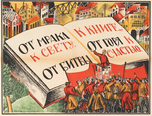
Nikolay Kogout’s poster ’From Darkness To Light’, 1921, above), was designed as part of the official Liquidation of Illiteracy campaign. It’s full text reads “From Darkness to Light, From Battle to Book, From Misery to Happiness.” A gargantuan book stands open before some workers, pointed to by an orator in a red starred hat. Yet behind both is a cityscape, while greenery is pushed to the lower left of the composition.
And why? Illiteracy affected both workers and peasants, as emphasised in the text of another poster “Peasants and Workers! You Mastered the Rifle, Now Master the Quill” (1920, artist unknown). But as said over the Academy’s more recent ‘Revolution: Russian Art’ show: “to them, nature was now out, mysticism was now out”.
If nature was made up of curves and inclines, then we wanted straight lines and sharp angled edges. There is more of a visual connection between the bold geometric letters, and the straight sides or pure curves of those buildings than there would be with a nature scene. Note how some of the buildings are themselves shown sporting text.
And this visual similarity reflected ideology. Urbanisation and literacy are both seen as other terms for modernisation. The book, the plan, the diagram, the cityscape – all are being equivocated.
And, from a Western perspective, there seems something going on akin to Protestantism. Protestantism used the printed word to quite literally overwrite the image, in a bid to obliterate Catholic iconography. It wanted to strip Churches of their finery and instead fill them with Bibles. And this opposition to the fetishisation of images often became a fetishisation of the printed word.
In another quote from the Academy review: “The plan itself seemed interchangeable with communism, an ordering of things in opposition to the free-for-all ‘anarchy’ of the market... Like the Bible to an orthodox Christian, the Plan became the book of answers which could not be questioned, the book so important as to require guarding by the clergy.”
So for all the denunciation of icons, the era became exceptionally adept at producing them. It’s true that while the population remained largely illiterate, it had to be reached visually. As said over the Academy show, “only the image was going to spread the word”. Yet the dictionary gives two definitions of the term ‘icon’, which essentially reduce to “devotional image” and “representative symbol” - Jesus on the cross and those figures on toilet doors.
Yet these definitions are in practice mingled. You might, for example, expect to see frequent images of Lenin. But within these he strikes the same few stock poses, like the red version of classic Christs. For example he’s often shown with one raised arm, the pose used on the exhibition poster up top. (An appalling poster to advertise a museum devoted to design, but never mind that now.) Sometimes he’s pointing up, sometimes with fingers outstretched as if reaching to shake hands with a giant. Whichever, the iconography is of an elevated figure gesturing still higher. All of which is accentuated by the way that his death merely multiplied the images made of him. Mayakovsky pronounced him “even now, more alive than the living”.

Mikhail Balyasny’s ‘We Will Make the USSR the Country of Socialist Industry and Electrification’ (1930, above) centralises this figure, but makes of it a bold red silhouette, like it should be so familiar as to not require filling in. While John Heartfield’s ‘Montage of Lenin Over Moscow’ (1931) projects that silhouette half across the city. In Alexander Medvedekin’s film ’New Moscow’ (1938) Lenin’s statue is shown from below, as banks of airplanes fly above him. It’s like with that upraised arm he’s conducting the whole affair from that lofty perch.

And yet this seems to vie with the frequently-used form of the photo-collage. Perhaps this partly comes from our inevitable tendency to contrast them with the smoothness of modern Photoshop images, but they look rough-hewn, manipulated into existence. And the result is that they assert boldly, not insinuate, they seem innately disruptive, unafraid of their propagandist role. In Valentina Kulagina’s cover to ’Krasnaya Niva No. 12’ (1930, above) the black and white figures are not only shoehorned into those gridded streets, and juxtaposed against their boldly colourful surroundings, thee’s no attempt to find aerial views of them. They look like a demo of people of vastly different sizes, all lying on their backs.
Plans Unrealised
”There is no final one; revolutions are infinite”
-Zamyatin
Of the six unrealised buildings, the Palace of the Soviets (the one Lenin’s huge statue was supposed to top) might serve best as a summary of its times. It was to be built on the site of the Cathedral of Christ the Saviour, which Stalin had dynamited in 1931. The destruction was filmed, with lingering close-ups of its iconography as if parading its guilt. To complete the site’s trajectory, it’s fairly close to the spot where one of El Lissitzky’s cloud irons would have been.
The winning design was submitted by Boris Iofan, who had studied under Armando Brasini – a fascist architect favoured by Mussolini. Kaganovich, Stalin’s appointee to the Moscow Soviet, had effectively decreed that by virtue of the Revolution Russia was already Socialist, so any suggestion of further change was suspect if not actually counter-revolutionary. And this palace looks… well, like a palace. It’s described in the guidebook by curator Dejan Sudjac as “the Socialist Vatican”.
War put a halt to construction, though Sudjic suggests it’s grandiosity was unachievable anyway. Khrushchev later made the site into an open-air swimming pool. Then, from 1995, the original Orthodox Cathedral was rebuilt, and was where Pussy Riot performed their “punk prayer” protest. The swimming pool looks by far the best option. And I’m not even kidding. A brief film-clip suggests it was heated for year-round use, and shows bathers climbing out from the steam amid icicle-dripping rails.
But we already know Stalinism was despotic. A more interesting question might be – what does any of this mean for today? The show’s video comments how “the contemporary landscape is populated by their dreams and ideas”. We can find examples of this aplenty, such as ‘paper architects’, who don’t necessarily design to be built, now being much more common.
But of course this merely betrays their weaknesses, rather than addressing their strengths. It portrays them as literally an avant garde, planning for a future who was only realisable later. Which is to suggest they were never really that radical, that disruptive, that all existing society needed to assimilate their innovations was a little time. And yet our world is only their future in a linear sense. It’s a world they would neither want nor even recognise.
It’s like a window had cleared, and it was briefly possible to peer through into a future different from the present, before it occluded again. Looking at those city plans arranged around a bending river inevitably makes you try and project how it would have been had all this been happening in London. As the show amply demonstrates, there’s no neat transposing from then to now, no merely taking up of old blueprints. But hopefully one day we shall find out.
Coming soon! From Moscow to Washington…
No comments:
Post a Comment